Des&Res 2. How to bring Lab closer to the streets

Today, design is rapidly developing in various areas of our lives. Design thinking began to be used in medicine, biology, products, and much more. People realized that by combining different disciplines we can achieve much better results. At the university, we are often told that by gathering specialists from different fields, we can consider the same project from different angles and understand it more holistically by looking at it from the faces and perspectives of different people. Now global companies clearly select employees with different backgrounds and different temperaments to work on the same task. At Design Week 2022 in Graz, we also had such an amazing experience.
This year, as students of Fh-Joaneum, we had the opportunity to work at Karla Molins Pitarch’s workshop, which was called UXD How to bring Lab closer to the streets. We spent a whole week working on the project from the very beginning to finish. The task was to understand and convey complex information with the help of design for people who are not related to biology in any way. The tutor divided us into two-person groups and we, as people with different backgrounds, had to design something new for our consideration.
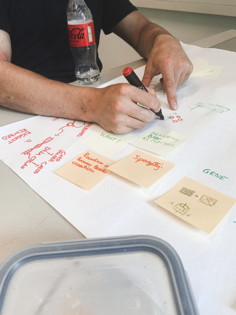
From day one, we received a special Toolkit designed by Karla. It was supposed to help us in the process of creating our product. The purpose of the toolkit itself was to unite people from different areas and facilitate the process of joint work with the help of detailed information describing each step in the design process. The toolkit itself contained such subdivisions as knowledge, transdisciplinarity, applied design research, and outreach. Everything started with the lab and led to the street. Each of the divisions contained points that had to be completed in order to move to the next step. Each of the divisions was described in detail so that people who encountered the process for the first time could find everything they need and understand what to do next. Personally, the toolkit really helped me, even though I have been working with the design thinking method for quite some time. He helped me remember the process and follow it in detail. I plan to use it also in the process of writing my master’s thesis.
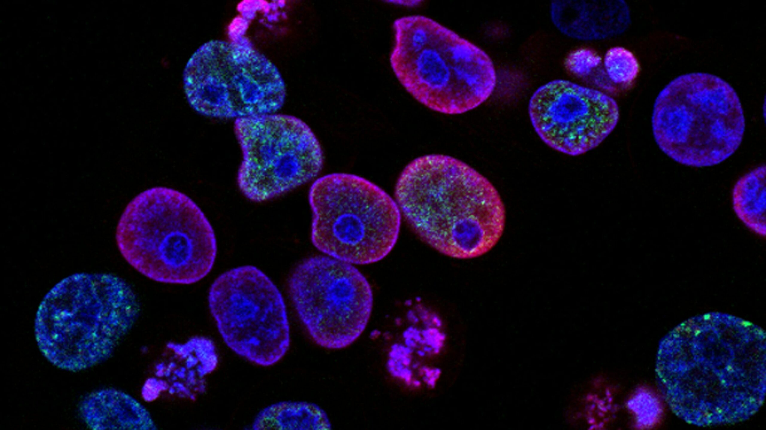
Unfortunately, we, people who did not have general knowledge of the topic of biology, needed to understand the theme of our workshop from the basics. Our task was to realize what chromatin is and how DNA is built on its basis. We needed to create some design system that would tell people who need clarification what exactly chromatin is.”Chromatin is a nucleoprotein that forms the basis of chromosomes. It consists of DNA and proteins (mainly histones). Chromatin is found inside the nucleus of cells of eukaryotes and archaea that have histones. In a broader sense, chromatin is sometimes also called the substance of the nucleoid in bacteria. It is in the composition of chromatin that genetic information is realized, as well as DNA replication and repair.
The first day was quite busy. We were divided into two personal groups and we started brainstorming. The task was a joint effort to understand what chromatin is and show us what it is associated with the studs. In the further process, it really helped, because many of us found the beginning of bare ideas in brainstorming. My colleague and I decided to design a game that would mechanically show the operation of chromatin and DNA. We decided to target schools and educational institutions as places to use the game, and students became our main target group. The most difficult thing was to explain to someone what chromatin is if you are not an expert in it yourself. Especially when you have one day of experience with the topic.

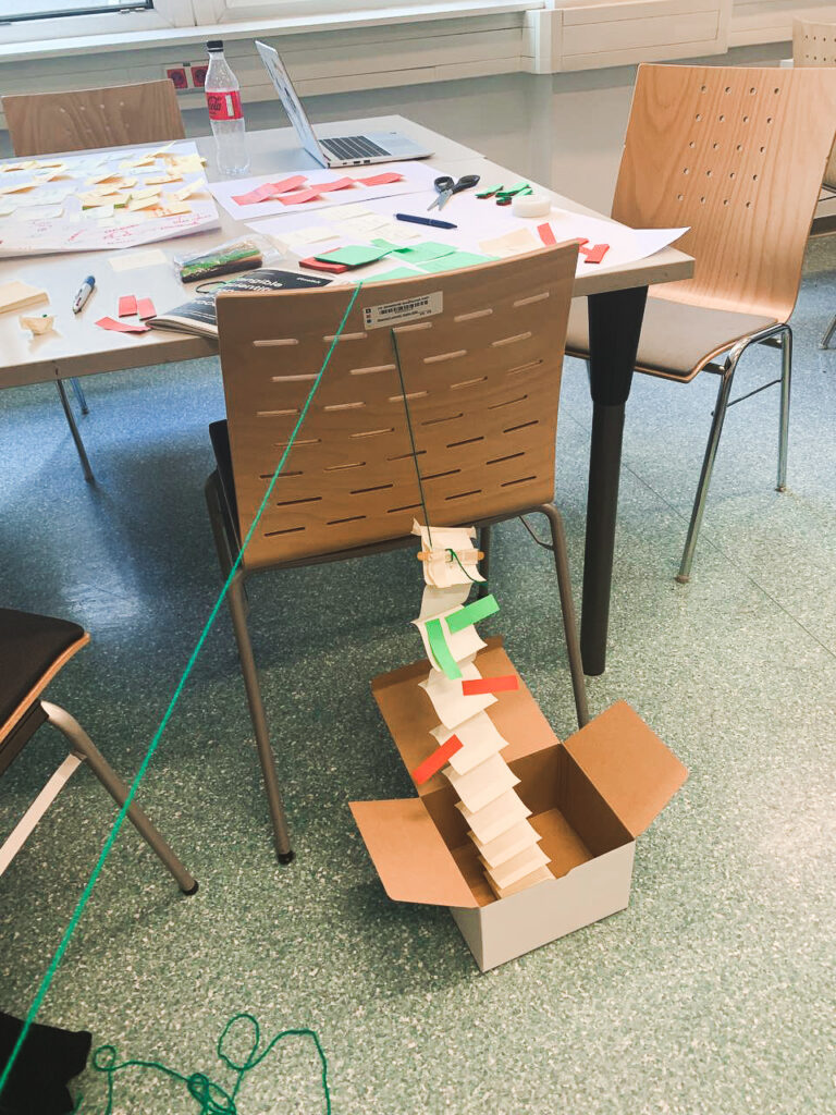
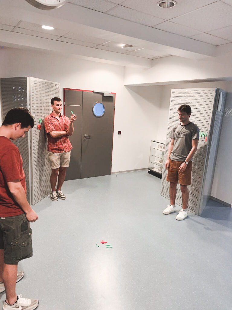
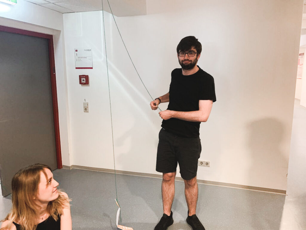
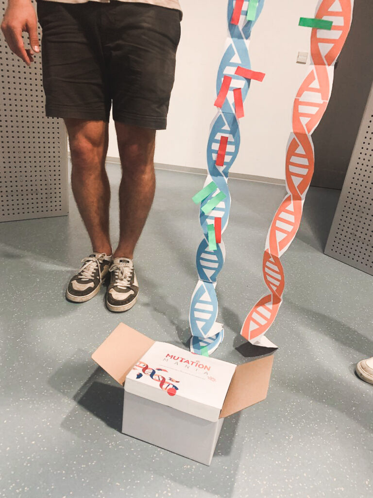
The next day we were scheduled to design low-quality prototypes and we moved to the next stage with Carla’s toolkit. We were still trying to figure out how chromatin works and how to show it in a game for children so that they do not lose interest and it helps them in the learning process. The main element in the game was the transfer of genes from one DNA stream to another. We wanted to give children the opportunity to collect good genes and get rid of bad ones. It was important to involve the players in the process and allow them to play a major role. After the first layouts and attempts, we decided to test the game on our colleagues in order to identify the main problems in the process and be the first to receive feedback from users. After the testing process, we realized that we made several mechanical mistakes in the game itself and that is focused on the process of creating DNA and not on chromatin. In the end, we added a few interesting things so that the main thing in the game still remains chromatin. In order to better understand the processes that take place during the creation of DNA, we began to look for people in our circle of friends who are professionally connected with biology, this really helped in the final result. The last day turned out to be the most difficult because it was then that we had to finish all the drafts so that we could present them well the next day. Under the pressure of time and our efforts, we tried to finish everything before the final deadline.
A little about the game itself. The game is based on the process of DNA creation and gene transport. The main element is the player, which is attached to his individual DNA. When a player chooses to collect more good genes from a chromatin point or throw bad genes at one of their opponents, they open themselves up and are vulnerable to attacks. The game is designed for 2+ players because the main task is to take away as many good genes as possible. The person with the best genes wins. Also, the game stops when the first player gets rid of all bad genes.

The whole design week ended with a presentation, everyone could show what he had been working on all these days. Personally, I want to add that I would never change my workshop to another one. An incredible experience, working with wonderful people, and a wealth of knowledge. The week turned out to be productive and interesting.

“A very long Wait”

#The Topic

“One month after my episode I finally got the device, I wore it for 2 days, and then I gave it back. My doctor called me 10 days after, I will have to go through the process again because she needed more data. So… almost two months will be passed by the time I get a diagnosis. It’s a very long wait”.

This is one comment I got from one of the patients I interviewed. The feeling of being involved in a process that takes a lot of time to give a result back creates a feeling of uncertainty in the patient while waiting for a diagnosis. This can lead either to anxiousness or tedium depending on the patient’s personality.


The old-school Holter devices method of data transmission relies on the patient returning the device, downloading the data to the hospital, and analyzing it by the doctor. In addition to time, the effectiveness of the collected data is questionable due to the fact that these devices record information for two days in which there may or may not be heart rhythm disturbances.

New devices are testing the use of advanced algorithms that allow data to be recorded 24/7, offering clear advantages when it comes to making a proper diagnosis. In addition to this, they allow the possibility of comparing with other data already recorded from patients with similar indications, which can facilitate the analysis process.

The use of this new technology is not yet fully widespread, but it is obvious that this is the way that must be taken to increase the speed of diagnosis, facilitate the doctors’ work, and care about the patient’s mental health. Maybe the use of this type of new generation holters, which can be easily used by patients at home, combined with specific and occasional medical tests (if necessary) carried out in the hospital by more complex devices that can record more interesting data, is the recipe that offers both better results and better user experiences. But, could domestic use devices reach the complexity of hospital devices without leaving aside their comfort of use for the patient? Probably, but when? Is it going to be a very long wait?

Pocket ECG Holter Monitor | New Generation of Holter Monitors

Medising trends

People are realizing more and more that design in medicine is very important. Previously, companies producing medical devices strongly focused on the engineering aspect, where now, over several years, significant progress can be noticed in the aspect of design. The aim of cooperation with designers is to increase the satisfaction of patients and medical staff, i.e. direct users. The design is directly oriented towards improving the relationship between the user and the devices by changing the appearance of the other to reduce fear and stress for the patient. The positive psychological effect achieved by using well-designed medical equipment improves the relationship between the patient and the doctor too. Designers are able to design useful interfaces with functionalities that can be guessed by looking at them.
The Philips company began research under the name Ambient Experience Design, which was to combine medical engineering with design to increase the level of patient satisfaction. As part of the program, rooms with computed tomography have been equipped with equipment of pleasant soft shapes. In addition, smoothly changing lighting and displaying pictures on the walls during the research, absorbing the attention of children and relaxing adults. It turned out that thanks to this, patients are less afraid of tests and are calmer, and the tests themselves have to be repeated less often because the number of errors resulting from undesirable movements of the patient has decreased. The DLR Research Institute has developed a robot design that could assist in surgical operations. The robot has a part that is similar in shape to a human arm, thanks to which they can efficiently assist the surgeon without taking up too much space. In addition to the robotic arms, the MIRO project also includes compatible designs of the operating table, the surgeon’s console, and the support system supporting the robot arms. The casings of all devices are easy to clean and carefully hide all mechanical elements and electronics. The project was awarded the IF Product Design Award in the “advanced studies” category.
Nowadays, we can see some standout design trends in medicine. The first is the ability to communicate between the patient and the device. Another important trend concerns the change of the language of shapes, spaces with large smooth surfaces broken by sharper lines beginning to dominate. The dominant color is white, complemented by small color accents which, due to their neutrality, look clean and modern. The important part is to make the medical devices be clean and not just pretend to be clean, hence the growing popularity of smooth, shiny materials that are easy to clean and which, in combination with the white where even small details are visible.
The medical design has great potential due to the enormous variety of areas, and at this time it badly needs specialists who will be able to develop and support progress in this field.

Analyse Deceptive Design Pattern

In this short blogpost I want to analyze one examples of a deceptive design pattern* that I stumbled across during my research in detail.

On every detail page of an apartment on airbnb there is a small overview on booking dates and prices (left image). The whole container is basically divided in two parts: a summary with a CTA and the calculation underneath. The hierarchy within this module is clear as the price per night is highlighted with big, bold font style. They use this number as the most representative value even if there are some additional fees added later on and it is not possible to book the apartment at that price. So to get the „real“ price per night the user has to manually divide the overall price for the stay including the service fee by the nights. The CTA is placed above the calculation, therefore some users might click on the pink button before they read about additional fees. Furthermore the weekly discount is displayed twice and highlighted whereas the fee is just in default text style. My suggestion to correct this deceptive design pattern* is to use the correct price per night including all fees, add a plus to the service fee amount and move the CTA to the bottom (right image).

* formerly called “dark pattern”

Living with a Heart Rate Monitor

# The Topic

heart rate monitor (HRM) is a personal monitoring device that measures heart rate in real-time or records the heart rate for later study. It is commonly used to collect heart rate data while performing various types of activity which are part of the patient’s day-to-day life. Portable medical devices are referred to as Holter Monitor which is designed for everyday use and does not use wires to connect.

Modern heart rate monitors commonly use one of two different methods to record heart signals: electrical and optical. Both types of signals can provide the same basic heart rate data, using fully automated algorithms to measure heart rate.

_ Electrical Devices: The electrical monitors consist of two elements: a monitor/transmitter, which is worn on a chest strap, and a receiver. When a heartbeat is detected a radio signal is transmitted, which the receiver uses to display/determine the current heart rate. This signal can be a simple radio pulse or a unique coded signal from the chest strap.

_ Optical Devices: More recent devices use optics to measure heart rate by shining light from an LED through the skin and measuring how it scatters off blood vessels. Smartwatches and cell phones can be included within this category, but their use for medical purposes is limited even though the accuracy in detecting several diseases increased significantly in recent years. Many professionals recommend anyway their use as support in data collection processes.

# Holter Monitor

A Holter monitor is a small, wearable device that keeps track of your heart rhythm. The doctor may want the patient to wear a Holter monitor for one to two days. During that time, the device records all heartbeats. This procedure can be repeated several times if the medical practitioner requires it to accomplish the goal of the overall study.

A Holter monitor test may be done if a traditional electrocardiogram (ECG) doesn’t deliver enough information about the heart’s condition. A Holter monitor may be able to spot occasionally abnormal heart rhythms that an ECG missed due to the short time that the patient is hooked up to the machine. The medical practitioner uses information captured on the Holter monitor to figure out if the patient has e a heart rhythm problem or a heart condition that increases your risk of an abnormal heart rhythm.

# What Patients say:

After interviewing two patients who had to wear the Holter monitor due to different heart conditions, plus the information collected in different clinical studies, these would be the most significant insights referring to the patient experience:

_ Most of the patients found the device uncomfortable. Sometimes, some of their daily activities were difficult to carry out due to the device.

_ Some patients had difficulty putting the device back on after showering. Due to this, the collected data wasn’t accurate.

_ Even though the majority of patients expressed full trust in their doctors, many did not feel involved in the process. They simply had to “follow orders” but did not understand what kind of data was being measured.

_ Some patients experienced a feeling of vulnerability when they gave the device back to their medical facility. Although the device was uncomfortable to wear, it made them feel safe, assuming that their heart was being controlled. Once they removed it, that feeling of security disappeared.

_ Some patients experienced skin allergies due to the adhesive tape on the device.

# What Doctors say:

After interviewing a cardiology physician and a general practitioner, I was able to gather the following insights:

_ It is difficult to ensure successful measurements with elderly patients due to the technical requirements of the device. The majority of patients using this device are older than 60 and sometimes they need to repeat the procedure more than once.

_ Although the device collects valuable information, some conditions, which might be symptoms of more serious heart problems, go unnoticed. (ex. certain types of arrhythmias).

_ They get frustrated because they cannot find the time to explain all the details of the procedure to their patients and they feel patients’ dissatisfaction and uncertainty.

_ “It takes too long to get the data that we need”. Patients must return the device back to the medical center, then the technicians extract the data from the device by connecting it to their system, then the data are included within the patient’s records and saved in databases. Only then doctors are able to have a clear vision of what is going on with their patients.

# Compared with other Devices for Heartbeat Monitoring:

Despite the fact that the Holter monitor is one of the most used devices to measure the heartbeat even today, for a few years, other heartbeat monitors have been coming onto the market offering significant improvements for patients. This is the case of Zio Patch, from iRythm Tech.

But even though this new monitoring option is more manageable, less cumbersome, and has a higher level of data accuracy than the original Holter Monitor, it requires longer use than the Holter Monitor to detect the same number of conditions. This makes procedures a bit harder to perform with both children and the elderly.

As mentioned before, many smartwatches and mobile phones can provide a service similar to heartbeat monitors but are not capable of perceiving certain abnormalities that may indicate heart problems. They are a very good aid for home use because they measure many different parameters such as oxygen saturation, thanks to the use of sensors including accelerometers, gyroscopes, and GPS.

# Conclusions and Challenges

Finding the ideal device is not easy. Both patients and medical professionals have needs that should be met in order to succeed when going through these procedures, and it seems that if you try to improve one part, the other will get worse.

For me, the main challenge is to rethink the design of the device. It is clear to me, that it needs to be something free of technical assistance. The ease of use must be a basic requirement due to the characteristics of the patients who generally use this type of device.

On the other hand, it should offer some kind of interface that could deliver clear information to patients, making them understand what data is being collected. This is already offered on smartphones or smartwatches.

And last but not least, the data collection. The more accurate data collection in the shortest possible time, the medical professionals will be able to deliver better diagnoses in less time. In this way, they will be able to care about the psychological needs of patients before, during, and after the procedures. In my opinion, finding a way to shorten the process from data collection until professionals can access and evaluate this data, should be a priority.

# References:

https://www.healthline.com/health/holter-monitor-24h#results

https://www.mayoclinic.org/tests-procedures/holter-monitor/about/pac-20385039

https://medicompinc.com/introducing-newly-improved-holter-monitoring-system-medicomp/

https://www.ncbi.nlm.nih.gov/pmc/articles/PMC3882198/#:~:text=Extending%20arrhythmia%20monitoring%20periods%20results,patients%20than%20the%20Holter%20monitor.

https://noticiasdelaciencia.com/art/9874/mediciones_cardiacas_constantes_con_un_nuevo_y_pequeno_dispositivo_adhesivo

App Cancer.Net

One of the first steps is to begin analysis from an understanding side of a patient. The reason is very simple, there is a lot of information about this in the global network.
First, I started by analyzing some of the applications that help patients in the treatment process. Today we’ll take a look at Cancer.Net specifically. I liked the application because it is really user-friendly and it has many functions that help in various aspects of a cancer patient’s life.
The application helps to track the symptoms and add new ones if they appear, write them down in the calendar and watch how the treatment process is going. If the patient has any questions, he has the opportunity to contact a specialist and ask him a question, and the program already has basic questions to which you can immediately find an answer. The application allows them to add doses of all pills that the patient takes. You can write down the date when you need to take the next dose, take a photo in case they forget what the box looks like, and also write down short notes to themselves in the future. Patients have the ability to add their own health care provider for better contact with the hospital and make the next appointment. A patient always has access to data about his health, which the program takes from the smartwatch and phone.

If you want to see it, I will leave you a link to the application here: https://www.cancer.net/navigating-cancer-care/managing-your-care/cancernet-mobile

Data visualization in health systems.

Knowledge is power. Nowadays all kinds of sensors are continuously gathering data about our behavior, our physical activity levels, and different health indicators like blood pressure, blood oxygen levels, and more. All of this can be monitored through phones, smartwatches and other IoT devices conceived specially for medical applications

What happens with all this data? Raw data is useless if we don’t know what we are looking for.

A good strategy for data visualization is the key to the proper use of data.

When trying to create a better user experience for both health professionals and patients, we need to distinguish which information is needed for each side and how it should be presented:

Medical Staff:  An overloaded system can be helped by synthesizing and simplifying the amount of data that the doctors need to analyze.

A good presentation of numbers and facts can help the doctors identify low-risk patients faster, so they can prioritize and leave more time for those who really need it.

Patient: Being a patient is already a stressful situation. Medical terms that patients are not familiar with and uncertainty don’t help make the situation more comfortable. Feeling lost and uneducated is not the feeling of reassurance that a medical visit should give.

Presenting facts and figures in a clear and didactic way will make the patient feel included in the process and learn about the condition, gaining implications for the treatment.

_ Literature

http://ehealthmasterminds.com/visualize-your-data/

https://www.eecs.harvard.edu/~kgajos/papers/2020/fischer20visualization.pdf

https://www.therapeuticshub.com/data-in-healthcare/

Kids and Interaction (II): UX for kids. Does UX change when it is aimed at kids?

In order to approach the problem from the initial topic, which aims to study interaction for children in educational exhibitions, it is necessary to divide the problem into parts.

Therefore and starting from the beginning, it is time to study and analyse the differences in UX for adults and children. Creating an interface for kids is not simply a matter of using something made for adults and then changing the language for “dummies”. Designing interfaces for children goes much further than that.

One of the most important and most frequently mentioned issues throughout the different articles reviewed is the importance of focusing the design on the right age group. The age steps in children are much stronger than in adults. When we create a prototype aimed at older people, we can determine a target with an age range of 20 years difference. In contrast, in children the difference of 4 years of age already implies big changes related to skills and abilities. That is why in the next analyses we will try to focus the search on a target age range of 6 to 8 years, ages at which children are able to read, but still have a limited vocabulary.

After reading a large number of articles related to the subject, we have extracted the most important points (even though they may sometimes seem obvious) that have been most frequently repeated among authors. Some of the things to keep in mind are:

  • Children need instant feedback with every action. This means not only informing the user that something has been clicked, but also keeping in mind that problems need to be broken down into small pieces.
  • Multiple navigation is complicated to understand, so it is easier for them to receive information in the form of a story. This means that storytelling is key in children’s interfaces.
  • Reading ability varies with age, but it is true that children usually avoid reading. So, if texts are added, they should be very concise, adapted and direct.
  • The adaptability of the interface takes into account several concepts such as font size and colour. In case of interfaces for children, font sizes should always be between 12pt and 14pt and colours should be saturated and vivid. This is a concept that normally in interfaces for adults can be distracting, but it is something that keeps children interested and connected with the content. A similar idea includes the use of sounds and animations.
  • Children tend to have an explorative attitude towards interfaces, “mine-sweeping” the screen.
  • Finally, it is important to bear in mind that children tend to take everything they see literally, so it is necessary to think deeply about the use of icons and images.

With this little research, it is time to look at existing children’s displays that may or may not meet these points.

REFERENCES

Kosa, M. ‘Children-first design: why UX for kids is a responsible matter’, UX Collective, 6 January 2018, <https://uxdesign.cc/ux-for-kids-responsible-matter-802bd12fe28c>

Molnár, D. ‘Product Design For Kids: A UX Guide To The Child’s Mind’, uxstudio, 31 July 2018 <https://uxstudioteam.com/ux-blog/design-for-kids/>.

Nielsen, J. & Scherwin, K. ‘Children’s UX: Usability Issues in Designing for Young People’, Nielsen Norman Group, 13 January 2019 <https://www.nngroup.com/articles/childrens-websites-usability-issues/>.

Osborne, P. ‘UX Design for Kids: Key Design Considerations’, UX Matters, 6 January 2020 <https://www.uxmatters.com/mt/archives/2020/01/ux-design-for-kids-key-design-considerations.php>

GameDaily Connect. (018, June 28). UI/UX Design Principles for Kids Apps | Ashley Samay [Video]. YouTube. https://www.youtube.com/watch?v=ud0CJ-27QQU&ab_channel=GameDailyConnect

Digital symptom tracker for doctors treating cancer patients.

Today, all areas of our lives are experiencing a global digitalization. The field of medicine is no exception, but unfortunately, cancer still remains one of the worst diseases in the world. “Cancer” is the term used to describe a group of diseases that vary in type and location, but share one thing in common – remarkable cell growth beyond control. Under normal circumstances, the growth of all our cells is tightly controlled. But when the control signals of one cell malfunction and the life cycle of a cell is disrupted, the cell divides. Uncontrolled growth continues and the result is an overgrown mass called a “tumor”. From global austrians statistics we can see that there are 41,200 people newly diagnosed with cancer. Risk of getting cancer before age 75 is 25.5%. Every year 20,400 people dying from cancer. As we can see, this is still a global problem.

As a designer, it always seemed to me that we should use all our skills to help people. That’s why I want to develop in the direction of design for medicine, because that’s where we need to invest a lot of our resources. The pandemic has shown that the global health system is not working as it should and we need to fix it.

The purpose of this project is to help doctors collect data at all stages of the disease. The program should allow them to monitor medication, record treatment progress, and create visualizations of the disease in the patient’s body. The program should help monitor many cases of cancer in different patients, which in the future could help fight the disease more effectively.

The next step is to contact organizations that help people with cancer. The goal is to understand the needs of one of the audience of the program.

Olena Davletshyn