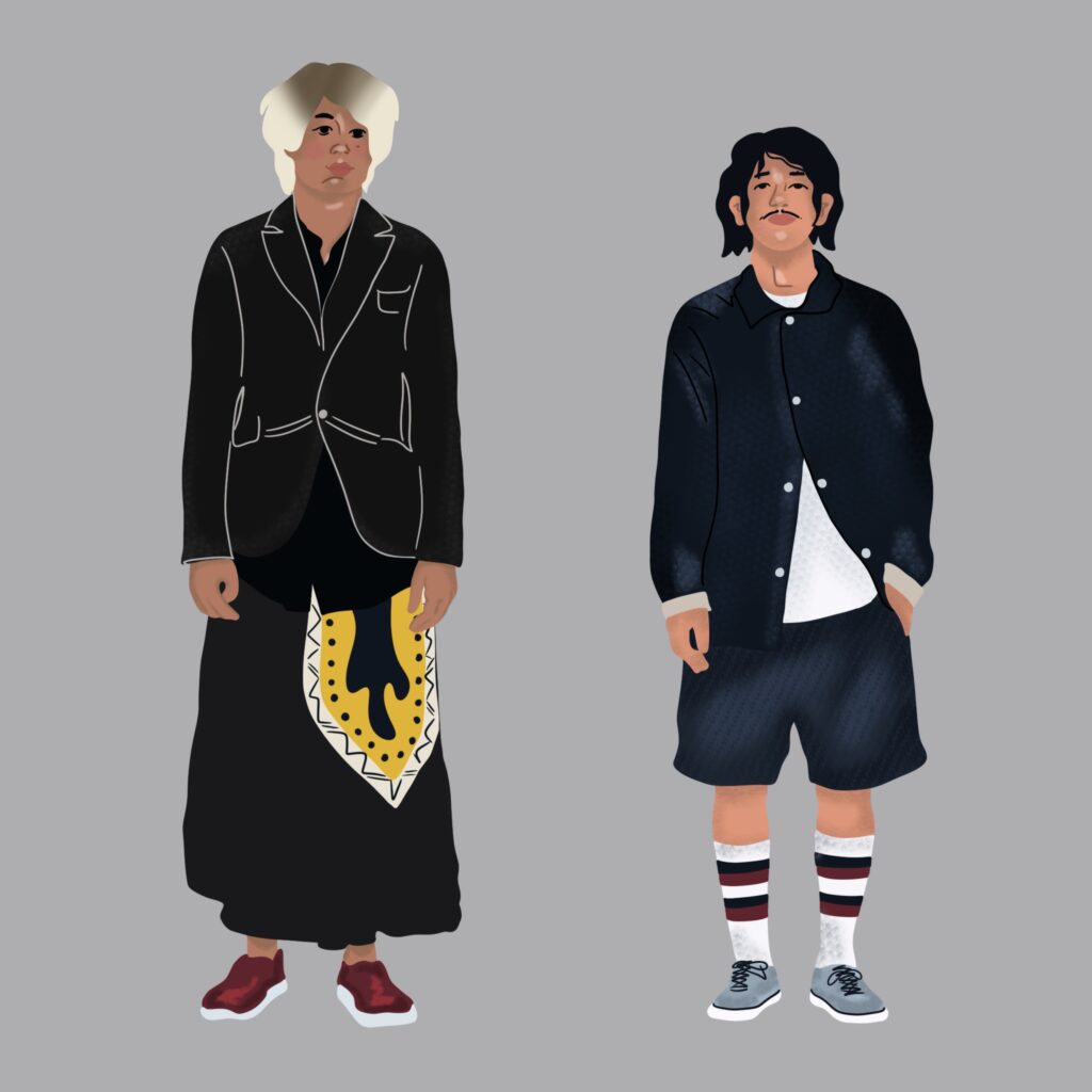
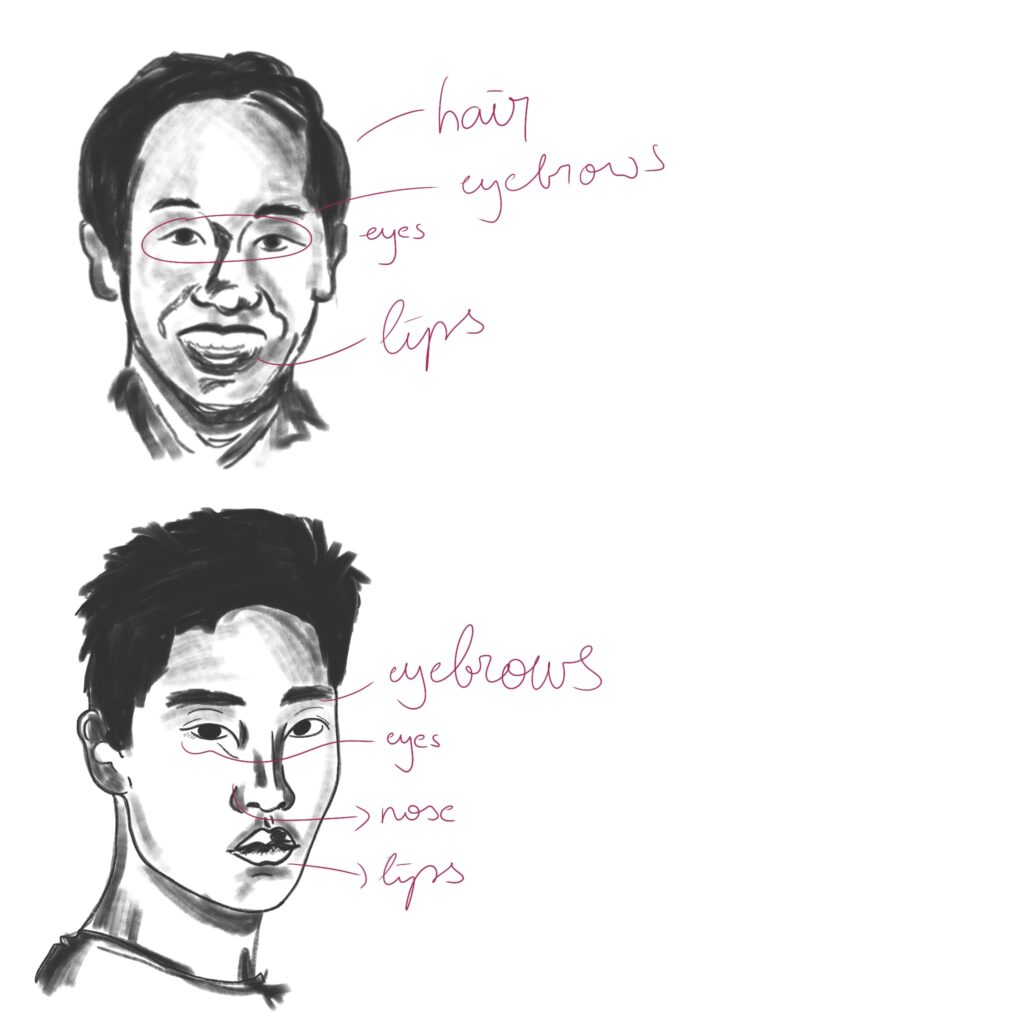
In my last blog entry, I experimented with inclusive character design in the field of: having one common theme (doing yoga) and then drawing different people in this situation. This time I focused on ethnicity and gender (Japanese (young) man) and tried to really understand:
Features
Clothing
Characteristics
I realized that it’s hard for me to stick to drawing people how they really look like and not to “Europeanize” them aka giving them features which are typical for Europeans like bigger lips or eyes etc.
I think it needs a lot of practice to really understand ethnicities and to draw them correctly without making them too European or too stereotypical.
In this chapter, the project’s progress, made during the second semester, will be evaluated and successful as well as failed outcomes will be discussed. The evaluation will be based on the goals that were set out to be fulfilled during the second phase of the project.
Goal Number
Description
Goal 1
Determine and acquire necessary equipment
Goal 2
Determine ideal placement of sensors and microcontrollers on guitar neck and pick/right hand and install them accordingly
Goal 3
Program microcontrollers to pick up the movements of the fretting and picking hands using the Integrated Development Environment (IDE) by Arduino
Goal 4
Program a Pure Data patch that handles the incoming data and transforms it to useable parameters to trigger effects
Goal 5
Either program custom effects in Pure Data or integrate Pure Data in a DAW to trigger commercial effect plug-ins
Goal 6
Determine suitable effects and parameters to be triggered by the movements of the fretting and picking hands
As far as the first goal is concerned, it can be stated that this task was accomplished. As outlined above, the necessary and suitable equipment for both the left and right hand setups was determined. This was achieved by thoroughly researching potentially suitable components and submitting them to tests in order to identify the best solution possible.
With regards to the choice of a microcontroller, the Arduino Leonardo was chosen over the Arduino UNO due to its built-in USB communication and USB MIDI device capabilities. Albeit the Leonardo being rather big and unwieldy, it was decided to stick with it during the experimental phase on simplicity grounds since it could be borrowed from the FH JOANNEUM. However, it is likely that a smaller microcontroller with similar performance such as an Arduino Micro will be used for the final setups in project phase three.
Regarding the sensor for the left hand setup, diligent research and a direct performance comparison lead to the decision to use a time-of-flight sensor to pinpoint the position of the guitarist’s hand along the neck instead of the initially planned ultrasonic sensor. After evaluating the specifications of several ToF sensors, the sensor of the type VL53L1X was finally chosen.
For the right hand setup on the other hand, a suitable IMU sensor was found rather quickly. Although an MPU9250 was briefly considered and used during an initial Arduino library test, it was then dropped for a BNO055 sensor, following the recommendation of the author’s supervisor.
Of course, next to these main components, other equipment including cables, breadboard, electronic components, etc. were acquired.
All in all, this goal has been largely fulfilled with some improvements possible in the third phase of the project.
As outlined above, the usual positions of the fretting hand have been determined and subsequently analyzed. This analysis led to the conclusion that, unfortunately, the posture and the exposed reflection area of the fretting hand vary a lot depending on what is played, with major differences between playing barre chords and single notes for instance. These inconsistencies in hand posture were and still are a major constraint to the left hand setup and its flawless implementation into the natural playing style of a guitarist.
As far as the ideal place and installation of the sensors is concerned, a lot of progress was made with regards to the left hand setup. Based on the afore-mentioned analysis of the hand posture, several attachment devices were made for the ultrasonic as well as the ToF sensors and, subsequently, compared. One position in particular (IMAGE) proved to be better than the others, albeit being not perfect. The position chosen works best for barre chords as well as the Solo Mode application.
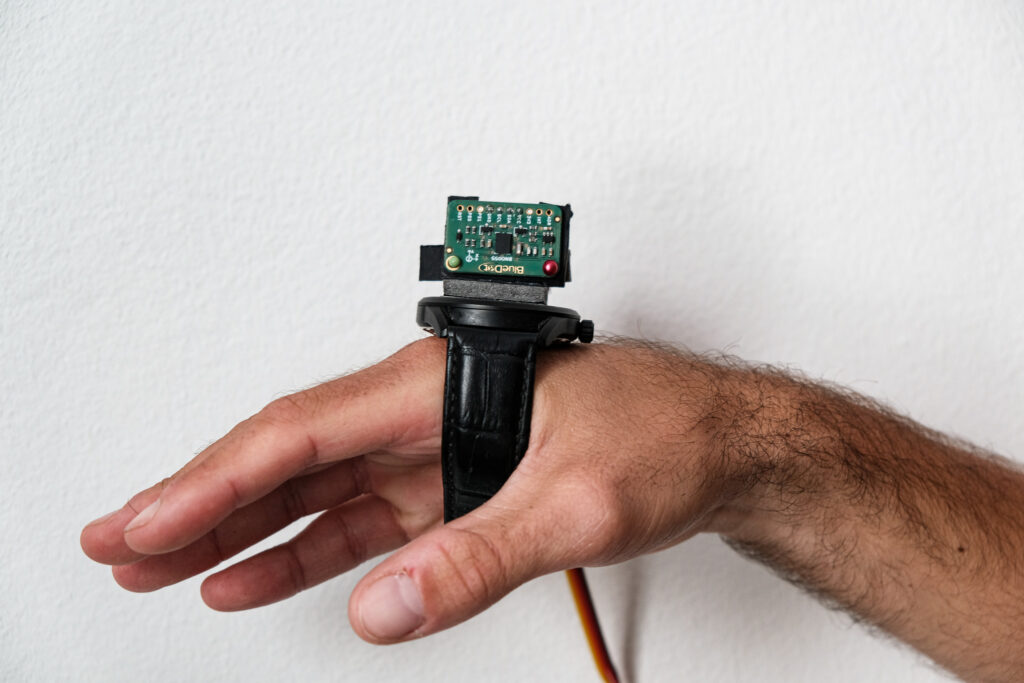
Regarding the attachment device of the right hand setup, there is definite room for improvement. The wristwatch solution was sufficient for the experimental phase and proved that placing the sensor on top of the back of the hand serves to get useful sensor data. However, it is unsuitable for the final product. While a wireless solution is optional for the left hand setup, the right hand setup would certainly benefit from the lack of cables. It would enable an even more natural playing of the guitar.
Here, definite progress was made, especially with the left hand setup. With no prior experience in programming the learning curve was quite steep, and a lot of time had to be dedicated just to learn basic coding techniques.
Regarding the left hand setup, Arduino sketches were made firstly for the ultrasonic sensor and, subsequently, for the time-of-flight sensor when the former proved to be unsuitable. In addition to code needed to access the basic sensor data, the mathematical relationship of the guitar fret spacings was established, fret ranges were determined and finally implemented in the code. Next to absolute distance measurements, detecting the fret numbers is possible up to the ninth fret which already enables applications such as the Solo Mode.
The code for the right hand setup on the other hand is not yet as advanced mainly due to time constraints. Using a library, orientation, acceleration, and calibration data could be obtained from the IMU sensor and transmitted to Pure Data via MIDI. The y value from the orientation data is the only data so far that is suitable for further use to control effect parameters of a Wah Wah effect. Here, more variety in data usage would be desirable.
Lastly, different data transmission techniques were tested and evaluated. A lot of time was spent with first MIDI USB libraries and then MIDI only libraries with transmission suffering from a lot if lag initially. Serial port communication proved to be the first viable solution, fast enough to control effect parameters. Finally, the latency problems of MIDI could be eliminated. The current setups work via MIDI communication using a MIDI cable. For the third phase, a wireless means of data transmission would be desirable – especially for the right hand setup.
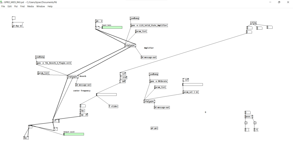
This goal was achieved to a large extent. Albeit initially working only with great latency issues, making a patch that receives MIDI data and is able to use it for further processing was achieved rather easily. The interim solution, serial port communication, took some more research but once the basic method was discovered, its application was straightforward. For the left hand setup, the incoming fret numbers can be either used directly to control effect parameters or, using the “moses” object for instance, a fret threshold can be set to make an ON/OFF switch. The patch for the right hand setup is very similar to that of its counterpart and effect parameters can be controlled.
As far as goal 5 is concerned, mixed results were achieved. Working with the digital audio workstation (DAW) Steinberg Cubase Pro 11 proved to be more difficult than previously anticipated and, consequently, it was decided to work with Pure Data only during the experimental phase. Nevertheless, in order to ensure a seamless integration into the guitarist’s natural workflow, a DAW integration of the final product is desirable. Thus, it will be tried to accomplish this in the third phase of the project.
Regarding the decision between using self-made effects or third-party plugins, both approaches were tested. The first patch contained a self-made delay and overdrive/distortion effect which proved to be useful for the first test but had definite shortcomings tonal quality-wise. Thus, the patches from then on used the object “vstplugin~” to implement third-party plugins in the Pure Data environment. The exception is the Wah-Wah effect for the right hand setup which is self-made and works well.
With a stable data transmission between Arduino and Pure Data achieved at a relatively late stage of the semester, this goal could not be fully achieved. Tone experiments involving several effects and their parameters were conducted. For the Solo Mode application of the left hand setup, an amplifier, reverb and delay were tested. Less tonal experimenting was done with the right hand setup: three effects tremolo, phaser and Wah Wah were tested with only the latter representing a reasonable effect to be controlled by the right hand setup.
It is evident, that only the surface has been scratched so far and much more in-depth research and experimenting in both setups will be needed to really provide practical applications for extending the range of possible guitar sounds.
In conclusion, it can be stated that all tasks set to be done during the second phase of the project have been approached and tackled with the majority of goals at least partially achieved. Additionally, setup compatibility with working hypotheses 1 and 2 was consistently ensured, with all effects working so far not invading the usual way people play guitar. As stated in the Exposé and in chapter 4 of this documentation, the overall aim of the second phase was to develop working setups that are sufficiently reliable and allow for further practical research regarding suitable effects, playability and performability. While the left and right hand setups are far from being a final product or ready to be tested by other guitarists, the second, experimental phase yielded a lot of progress. Overall, it can be affirmed that the left and right hand setups, albeit having shortcomings in some areas, are advanced enough to serve as a base for further practical research in the third semester.
Here, the first goal was to get basic sensors readings in general with the next step being to figure out what kind of readings are suitable for controlling effect parameters.
In order to establish which data is needed and how it should be used, the data values of x, y and z and their changes were analyzed while performing strumming movements with the sensor strapped to the hand.
With the IMU +Arduino outputting orientation data, it became clear that the y value could prove useful for controlling effect parameters while strumming the guitar. The range of values of y was analyzed for the up and down strumming movements and the established range subsequently constrained. Then the range was remapped to MIDI values from 0-127 and, using the same data transmission techniques as the left hand setup (so firstly serial bus communication and, subsequently, MIDI), sent to a Pure Data patch similar to the one for the left hand setup.
Next to orientation data, experiments were conducted with accelerometer as well as linear accelerometer data in the same manner.
Using IMU data in Pure Data
In the Pure Data patch, the incoming orientation and (linear) acceleration data was used to control several effects and their parameters. Using the aforementioned “vstplugin~” object, the following effects were tested:
MTremolo by Melda Production
MPhaser by Melda Production
However, the incoming IMU data proved to be not reasonable for these effects. The linear and normal acceleration data could not be used at all. The orientation data was working to some extent, but no practical application of its effects was immediately discovered.
The first success using the IMU data was the Wah-Wah effect. Using the “vcf~” object, a bandpass filter was made with an adjustable fader going from 280 Hz to 3000 Hz center frequency (the normal operating range of a Wah-Wah pedal) and a Q-factor of 4. Using the y value from the orientation data, the center frequency was controlled through strumming movements of the right hand. The resulting sound was similar to that of a “real” Wah-Wah pedal and could be achieved solely by the natural strumming performed during playing.
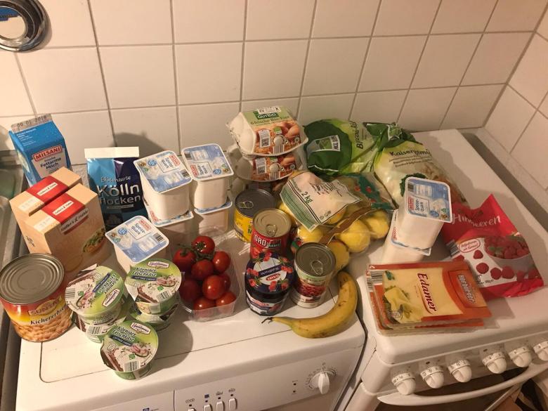
In meinen letzten Posts habe ich ja schon erwähnt, dass Recycling zwar beim Einkauf beginnt, im Grunde liegt die Verantwortung aber auch bei Herstellenden, die unklare Bedingungen schaffen, nach wie vor billig produzieren und es oft eine Frage des Einkommens ist, ob nachhaltige Produkte bzw. recyclebare Produkte ihren Weg in unsere Einkaufswägen finden.
Unter “typischer Einkauf” findet sich dieses Bild auf Platz 2 der Google Bildersuche. Dieser Einkauf gehort laut Quelle einem “funktional-gekleideten, Mitte-20 jährigen, der bei Aldi einkauft”. Eine auf den ersten Blick eher schwierige Einteilung und ob es wirklich repräsentativ ist, kann ich vermutlich bezweifeln. Allerdings lässt sich aber trotzdem ein relativ nachvollziehbares Bild davon machen, mit welchen unterschiedlichen Verpackungen wir es täglich zu tun haben. Und das ist vor allem in großen Mengen Plastik.
Verpackungen sind laut Markus Joutsela, Unterrichtender auf der Aalto Universität in Helsinki, beschreibt Verpackungen als besonders entscheidend, wenn es um Müllvermeidung oder Zirkularität bei Materialien geht, da nahezu welteit Menschen von dem Thema betroffen sind.
Every part of the packaging ecosystem and value chain is critical — from material choices, logistics and retail options to visual communication and branding. At each step of the way, there is an opportunity for a design intervention.
Markus Joutsela (2020)
Er beschreibt auch das Design als zentrales Element für die “User Experience and Education”.1 Es gibt einige Beispiele dafür in welche Richtung es gehen könnte. Sowohl kommerzielle Produkte, als auch Experimente/Awareness Projekte. Nachhaltiges Packaging Design muss, wie in einem vorigen Post bereits beschrieben keine grünen Pastellfarben enthalten, es sollte selbsterklärend sein und nur aus Komponenten bestehen, die auch tatsächlich notwendig sind und gebraucht werden. Es sollte klar erkenntbar sein woraus es besteht, wie es verwendet und auch wieder entsorgt wird.
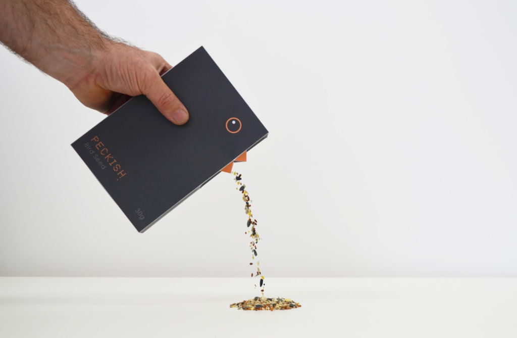
Quelle: https://www.yankodesign.com/2014/11/03/spooning-advantage/ Designers: Yang Guo, Qiaoge Yang & Wenju WuShohaib Iqbal: Bird Seed Quelle: https://packagingoftheworld.com/2016/07/peckish-bird-seed-student-project.html
Beide Beispiele haben gemeinsam, dass es sich um Verpackungen handelt, die aus einem Material bestehen – Papier/Karton. Natürlich kann nicht jedes Lebensmittel so verpackt werden. Besonders spannend fand ich allerdings die Geschichte zum zweiten Projekt, dem Produkt für Vogelfutter. Da es sich um ein Studierenden Projekt handelt, welches online gestellt wurde, gab es besonders viele Informationen. Das Produkt entstand aus einem Kurs heraus, bei dem die Aufgabenstellung folgende war: ” Take an item from a supermarket shelf that is worth £1 (approx.) and then re-design and repackage the item and in someway give the product “added value”, so it can be replaced on the supermarket shelf and sold for double the price.” Die Preisfrage, ob das Produkt nur aufgrund von Design einen höheren Preis erhalten sollte, ist etwas schwieriger zu beantworten. Da wir in einer Konsumgesellschaft leben, die dringend mehr Bewusstsein für ihre Gewohnheiten braucht, sollte grundsätzlich jedes noch so günstige Produkt Wert für uns haben und auch so aussehen. Der Preis eines Lebensmittel definiert sich außerdem auch oft noch durch die Bedingungen unter denen es produziert wurde und diese sind ebenfalls zu überdenken.
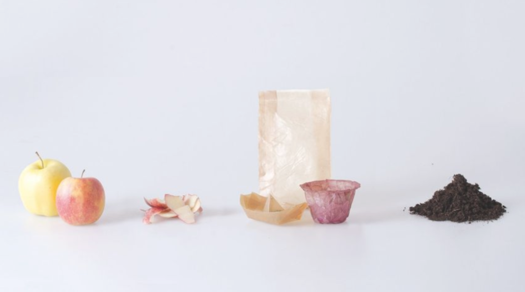
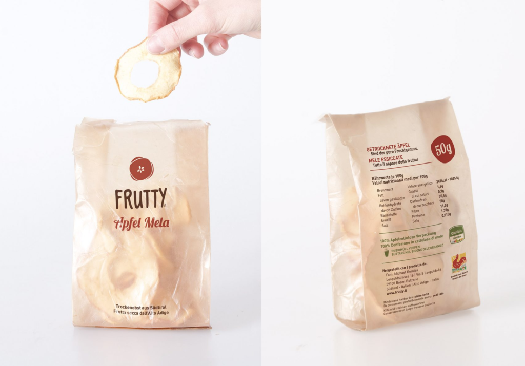
Projekt: From Peel to Peel, Emma Sicher, Free University of Bolzano Quelle: https://www.dezeen.com/2018/11/13/sustainable-food-packaging-emma-sicher-peel/Projekt: From Peel to Peel, Emma Sicher, Free University of Bolzano Quelle: https://www.dezeen.com/2018/11/13/sustainable-food-packaging-emma-sicher-peel/
Ansatz der italienischen Designerin Emma Sicher, für ihr Projekt auf der Freien Universität Bozen, war es biologisch abbaubare Verpackungen aus fermentierten Bakterien und Hefe herzustellen, um ein Umdenken bei Verpackungen zu schaffen. Unternehmen sollten Verpackungen als natürliche “Schale” der Lebensmittel andenken. Daher kam das Projekt zustande aus Obst und Gemüseresten plastik-artiges Papier herzustellen.2 Ebenfalls aus Fruchtabfällen ist die “Temporary Hanbag” des Design Studios “Sonnet155”.
Temporary Handbag von Sonnet155 Quelle: https://www.dezeen.com/2021/04/27/sonnet155-lobke-beckfeld-johanna-hehemeyer-curten/?li_source=LI&li_medium=bottom_block_1
Doch wie sieht das Packaging der Zukunft aus? Recyclebar? Biologisch abbaubar? Mittlerweile gibt es ein eigenes Masterprogramm in Spanien mit dem Titel “Beyond Packaging”, dass sich genau mit dieser Frage auseinandersetzt. Marc Panero, Graifker und Direktor des Masters erklärt in einem Interview über den Studiengang, dass reine Recyclebarkeit als Ansatz für die Zukunft nichtmehr ausreicht. Verpackungen müssen uns über unser Konsumverhalten aufklären. Er beschreibt in diesem Interview, dass Packaging Design bisher vor allem Markt getrieben war und die Bedürfnisse der Herstellenden befriedigen sollten. Design wird wiederum verwendet um eine emotionale Verbindung zwischen Menschen und Produkten herzustellen und damit das Kaufverhalten zu beeinflussen. Diese emotionale Verbindung muss neu konnotiert werden. Außerdem sei Packaging mittlerweile eine soziologische und politische Angelegenheit. Es gibt bestimmte, einzuhaltende Gesetze. Er argumentiert daher, dass auch andere Einflüsse aus Philosophie und Technologie in die Entwicklung von Packaging Ansätzen miteinzubeziehen wären. Unser Konsumverhalten, beschreibt er außerdem als sehr einflussreich, um Marken und Herstellende unter Druck zu setzen.3
1: Joutsela, Markus (2020): Purposeful packaging. online auf: https://helsinkidesignweek.com/2020/09/10/purposeful-packaging/?lang=en. Zugriff (20.06.22)
2: Hitti, Natashah (2018): Emma Sicher makes eco-friendly food packaging from fermented bacteria and yeast. online aus: https://www.dezeen.com/2018/11/13/sustainable-food-packaging-emma-sicher-peel/. Zugriff (20.06.22)
3: ELISAVA Disseny i Enginyeria BCN (2022). Master Beyond Packaging - Elisava. Montag, 7. März 2022 um 10:51 EST. https://vimeo.com/685507011. Zugriff (20.06.22)
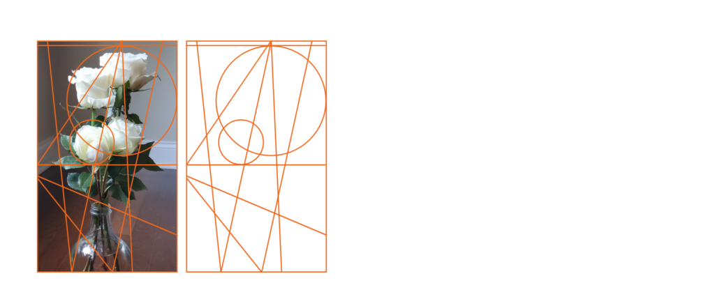
In this post, I want to continue my exploration of letters based on a grid, but this time I am going to take a picture as a base, from which I am going to generate a grid and furthermore a great variation of letters out of it. The reason why I want to try to generate a grid out of pictures is simply, that good pictures can always be analyzed by composition lines. There are many works dealing with this subject clearly and logically (e.g. Michaelangelo, Dürrer, etc.) from the renaissance to other periods of art history.
In fine art, the composition is the term for the formal construction of artworks, in the sense of the relationships between the various constituent graphical elements. The compositional line is almost always only partially materialized. Many sections of such lines will disappear, as it were, beneath the surface of the picture, but they remain very much present as an organizing principle in the image’s overall effect. The picture derives a large part of its impact from the attractors generated by its structuring vertices and lines.
In recent times, artists have played with construction lines, leaving them visible in the foreground as a sculptural element in their work. My intention in this chapter is to isolate the principle of the construction line and repurpose it as a design grid. We can attempt this with any picture that is relevant to the project. To introduce an additional layer of variation, we can modulate parameters to create a series of images from a single, shared source as the specification for our grid. This technique can be used in a partially reversed design process, to design typefaces.
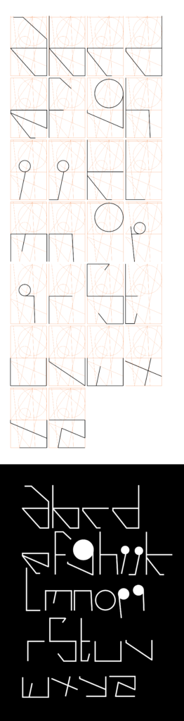
So having defined a grid based on the composition of a picture. I am not going to create letters out of it.
To sum up, for a lot of letters it worked out quite nicely, however, there are a few ones that don’t quite work right now: f.e. p, q, i, j, z, s. So now I am going to simplify the grid to a square-based one I had in my previous but, on which I am going to try to create variations based on letters I created on the image-based grid.
By shifting some parameters in the square grid one can easily adjust those letters which are not geometrically correct. to be continued…
Analyse zweier Type Specimen als Grundlage zur Gestaltung eines Type Specimen Books für die Schrift The Minimalist.
Hat man eine Schrift gestaltet, die man auch für andere interessant machen möchte, kommt man nicht umhin, sogenannte Type Specimen zu gestalten – also Anschauungs- sowie Anwendungsbeispiele der Schrift. Diese schaffen einen Überblick über die Schrift, vermitteln ihren Charakter und die unterschiedlichen Einsatzmöglichkeiten. Die Schrift The Minimalist, deren Entwicklung ich in den vorhergehenden Blogbeiträgen beleuchtet habe, soll nun mit einem Type Specimen Booklet präsentiert werden. Das finale Booklet wird erst in den kommenden Wochen fertig gestellt werden. Aus diesem Grund möchte ich in diesem und dem nächsten Blogbeitrag die Richtlinien eines Type Specimen Books näher beleuchten und erste Gestaltungen zeigen.
Type Specimen – Wovon ist die Rede?
Ein Type Specimen ist eine analoge oder digitale Publikation, die den Umfang einer Schrift und ihre Anwendung zeigt. Die Gestaltung von Schriftenbüchern zu ihrer Präsentation gehört seit jeher zum Handwerk von (Schrift-)Gestalter:innen. Früher wurden Type Specimen von Setzereien und Druckereien angefertigt, da Druckmedien direkt vor Ort gestaltet wurden. Heute werden Type Specimen entweder von den Type Designern selbst oder den Type Foundries, die sie vertreten, gestaltet. Früher galt es zu zeigen, welche Schriften eine Druckerei im Repertoire hatte. Somit umfassten die Schriftenbücher unterschiedliche kurze Texte, gedruckt mit den verfügbaren Lettern. Mit der digitalen Gestaltung von Publikationen nahmen Umfang und Ausdruck der Type Specimen zu. Heute zeigt man unterschiedliche, oft sehr experimentelle Gestaltungen mit derselben Schrift, um ihren Charakter zur Geltung kommen zu lassen und – wenn möglich – ihre vielfältigen Anwendungsmöglichkeiten zu zeigen. Der Sinn eines Type Specimen ist jedoch derselbe geblieben: Schriftgestalter:innen möchten ihre Schrift zeigen, sie erklären und damit bewerben, um sie für Grafiker:innen interessant zu machen, die die Schrift kaufen und verwenden könnten. (Vgl. Lupton)
Beispiele von Type Specimen – Analyse zweier Schriftmusterbücher
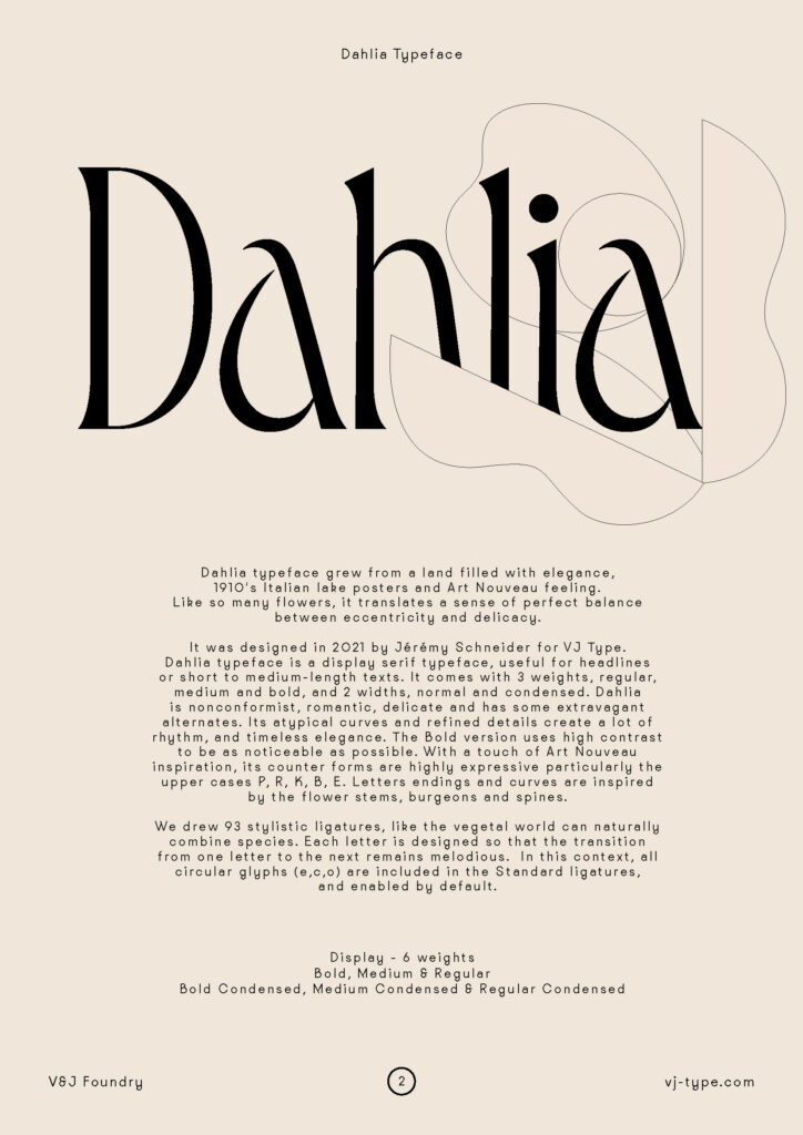
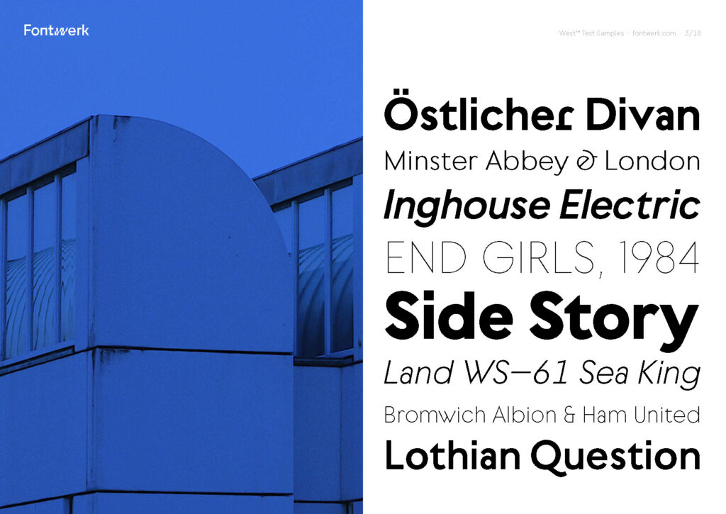
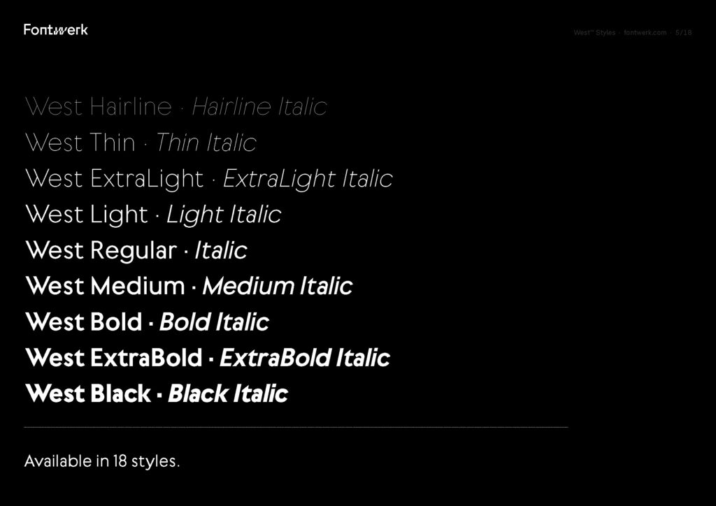
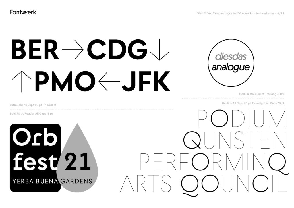
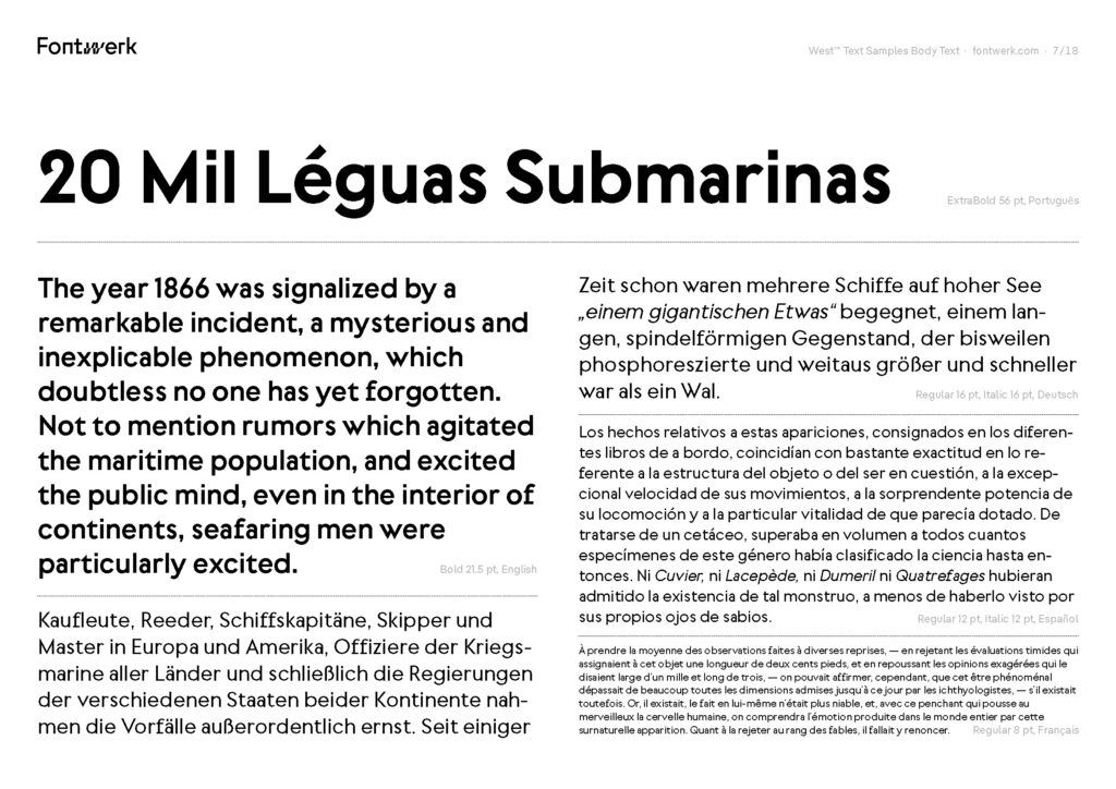
Type Specimen können prägnant oder sehr umfangreich sein – je nachdem wie es die oder der Schriftgestalter:in. für notwendig erachtet. Anhand zweier Type Specimen, eines der Schrift Dahlia der Type Foundry vj-type des Designstudios Violaine et Jeremy und ein zweites der Schrift West von Daniel Perraudin, verfügbar über Fontwerk, möchte ich nachfolgend die unterschiedlichen Teile der Specimen analysieren. Die analysierten Strukturen sollen auch als Basis für das Type Specimen Book meiner Schrift The Minimalist dienen.
Analyse Type Specimen Dahlia
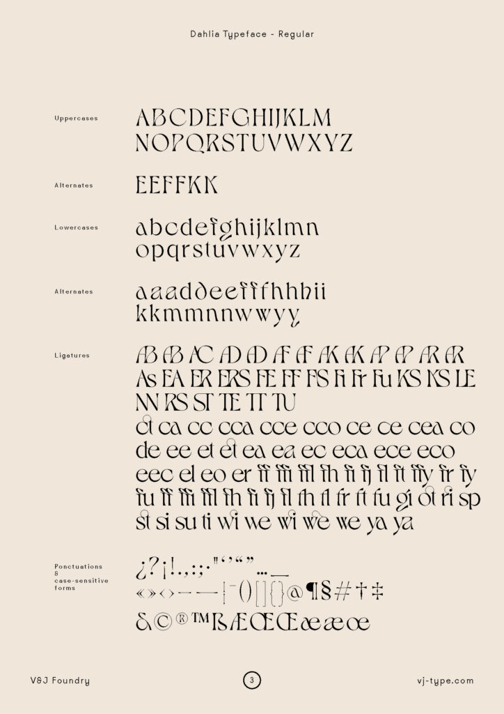
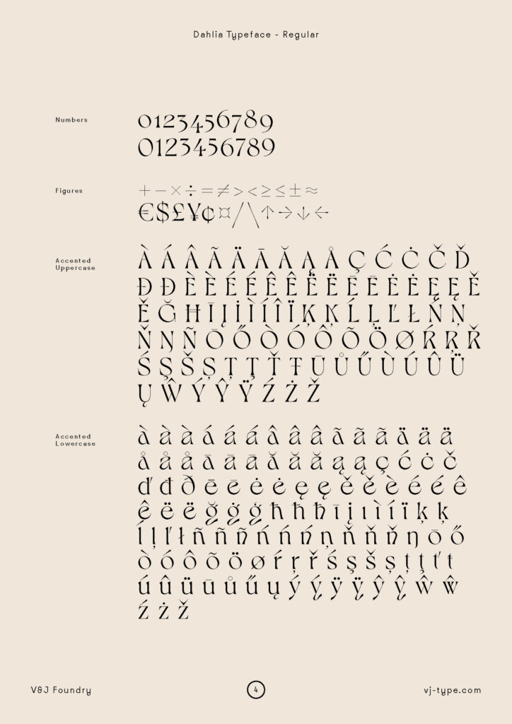
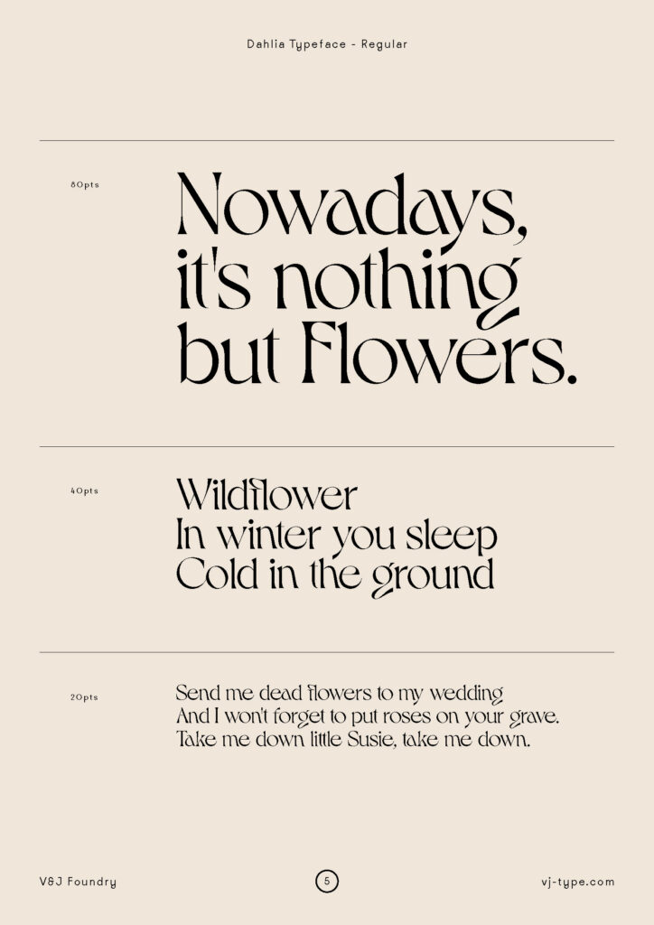
Das Specimen der Schrift Dahlia umfasst 34 Seiten. Die Schrift ist in drei verschiedenen Schnitten (Bold, Regular, Medium) verfügbar. Für jeden Schnitt wurden eigene Specimen-Seiten gestaltet. Dies scheint gerade bei Dahlia sinnvoll, da es sich um eine Display Font handelt, von der oftmals sicherlich nur ein Schnitt gekauft wird.
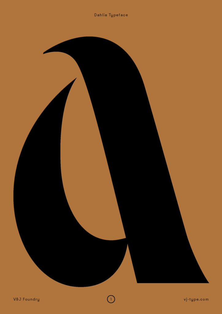
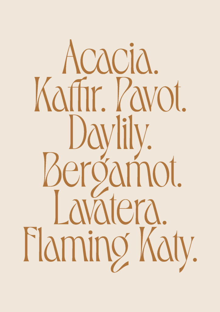
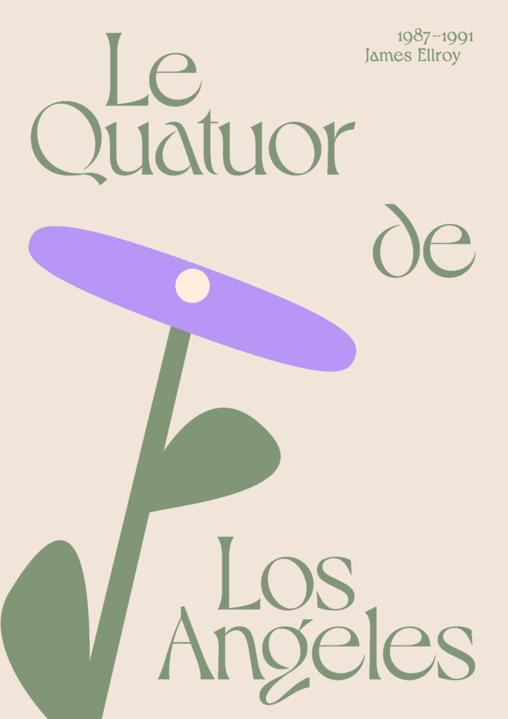
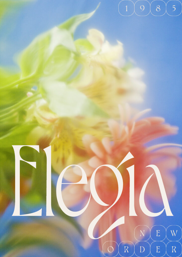
Nach dem Deckblatt, das die Glyphe a aus dem Regular-Schnitt zeigt, folgt ein kurzer Text über Entstehung, Charakter und Umfang der Schrift sowie die Möglichkeiten im Zuge der Open Type-Features. Nach zwei Seiten, die eine Gesamtübersicht über alle Glyphen eines Schnittes zeigt, folgen Schriftproben in unterschiedlichen Größen. Da es sich ausdrücklich um Display Fonts handelt, die sich für Headlines und kurze Texte eignen, zeigen auch die Schriftproben Texte in 80 pt, 40 pt und 20 pt. Die weiteren Seiten zeigen Gestaltungen mit den jeweiligen Schnitten Regular, Medium und Bold. Die Seiten zeigen oftmals Kombinationen aus Text und Illustration oder Fotografie. Dahlia wird als eine Schrift beschrieben, die von der Natur – vor allem von Pflanzen – inspiriert ist. Aus diesem Grund zeigen auch die Illustrationen und Fotos Pflanzen und Blumen. Alles dient der Betonung des Charakters der Schrift. Da es sich um Display Fonts handelt, die in ihrer Form sehr grazil und exzentrisch sind, macht dies durchaus Sinn: Die Gestaltungen zeigen, für welche Art von Design sich Dahlia eignet. Sie ist eine Schrift, die nicht überall und immer einsetzbar ist. Dem trägt auch das Specimen Rechnung. Abschließend folgen noch Seiten mit Einzelworten, die unterschiedliche Buchstabenkombinationen zeigen. Auch hier wird der Rhythmus der Schrift deutlich zur Geltung gebracht.
Zusammenfassend besteht das Type Specimen von Dahlia also aus folgenden Teilen:
1 Deckblatt
2 Beschreibung der Schrift (Stil, Umfang, Open Type Features)
3 Übersicht der Glyphen
4 Schriftproben in unterschiedlichen Größen
5 Gestaltungen mit Illustrationen und Fotos6 Einzelwörter (Buchstabenkonbinationen)
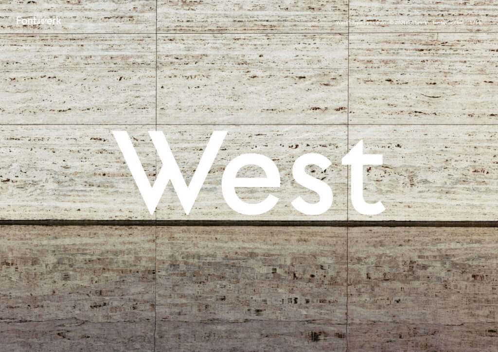
Analyse Type Specimen West
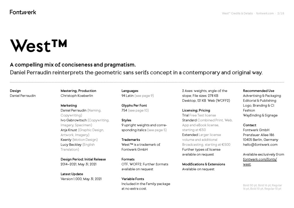
Das Specimen der Schrift West umfasst 18 Seiten. Auf das Deckblatt folgt ein Informationsblatt mit allen Angaben zu den beteiligten Personen: Daniel Perraudin als Schriftgestalter sowie die Teammitglieder der Type Foundry Fontwerk, über die West vertrieben wird. Bereits dieses Informationsblatt ist vollkommen in der West gesetzt. Somit zeigt bereits das zweite Blatt des Specimen, dass die Schrift von Headline bis Fließtext vielseitig einsetzbar ist.
West umfasst insgesamt neun Schnitte von Hairline bis Black und die jeweilige Kursive dazu, also insgesamt 18 Fonts. Zwei Seiten zeigen Worte, die in den unterschiedlichen Schnitten gesetzt wurden, ergänzt um jeweils ein Foto eines modernistischen Industriegebäudes. Die Fotos verweisen auf den Charakter der Schrift, der im Specimen selbst als „a compelling mix of conciseness and pragmatism“ beschrieben wird. Pragmatik und Prägnanz zeichnen auch den Modernismus in der Architektur aus, womit der Einsatz der Fotografie – wie beim Specimen von Dahlia – der Präsentation des Schriftstils dient. Die darauffolgenden Seiten bestehen aus unterschiedlichen Kompositionen an Wörtern, die in verschiedenen Schnitten und Stilen (normal oder kursiv) gesetzt sind. Die Kompositionen sind klar darauf ausgelegt, die Vielfalt und Flexibilität von West zeigen. Im Gegensatz zu Dahlia, einer exzentrischen Display Schrift, die um Aufmerksamkeit wirbt, ist West eine Grotesk mit eindeutigem, aber unaufdringlichem Charakter, die sich vielseitig einsetzen lässt.
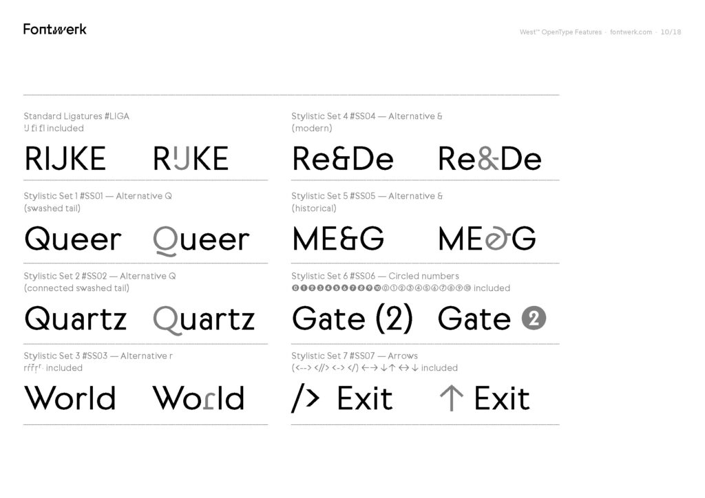
Der Großteil der Seiten ist der Präsentation dieser Vielseitigkeit gewidmet. Auf eine Gesamtübersicht über alle Schnitte und Stile folgen Gestaltungen mit Kombinationen aus Hairline und Bold/Black, die die Harmonie innerhalb der Schrift zeigen. Während sich bei Dahlia der Einsatz einer einzelnen Font anbietet, macht bei West vor allem die Kombination von Schnitten die Attraktivität der Schrift aus. Analog dazu steht auch im Specimen selbst ausdrücklich:The range of West is also something rather special in the geometric genre: nine font weights ranging from Hairline to Black, matching italics as well as variable fonts that are all included in the Complete Package, giving the user full flexibility, which is perfect for branding and editorial projects.
Wie sehr sich West für Editorial Design anbietet, soll auch durch eine Seite ersichtlich werden, die den Aufbau eines Artikel mit Titel, Untertitel und Bodytext in unterschiedlichen Größen zeigt – alles gesetzt in unterschiedlichen Schnitten der West.
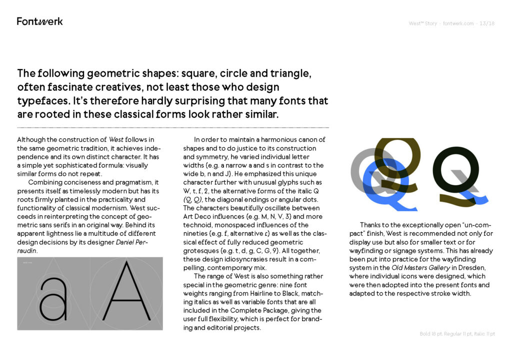
Eine Liste der unterstützten Sprachen und eine Übersicht über alle Glyphen sowie Stylistic Sets (Open Type Features) folgen. Den Abschluss macht ein Text über die Entwicklung der West, den Einfluss der geometrischen Tradition von Dreieck, Quadrat und Kreis und Wests Unabhängigkeit von eben dieser durch gezielte Designentscheidungen des Schriftgestalters Daniel Perraudin. Eine weitere Seite widmet sich dem Designer selbst, seinem Werdegang und seiner Expertise in typografischen Projekten.
Zusammenfassend besteht das Type Specimen von West also aus folgenden Teilen:
1 Deckblatt
2 Informationsblatt
3 Einzelwörter (Buchstabenkombinationen), ergänzt im Fotos
4 Übersicht über alle Schnitte und Stile
5 Kombination der Schnitte
6 Präsentation eines Editorial-Aufbaus
7 Sprachen
8 Übersicht aller Glyphen
9 Übersicht aller Stylistic Sets
10 Beschreibung der Schrift (Entwicklung und Charakter)
11 Kurztext zum Schriftgestalter
Fazit
Die Analyse der beiden Type Specimen war eine wichtige Recherchearbeit für die Entwicklung des Type Specimen meiner Schrift The Minimalist. Die beiden Unterlagen zeigen wie unterschiedlich Specimen ausfallen können, gerade auch in Gegenüberstellung einer reinen Display Schrift und einer universell einsetzbaren Grotesk. Trotz unterschiedlichem Stil und anderem inhaltlichen Aufbau, ähneln sich die Specimen hinsichtlich bestimmter Präsentationsweisen: Auf eine Übersicht der Glyphen und unterschiedlichen Schnitte/Stile, eine Beschreibung der Schrift und Gestaltungen mit einzelnen Worten oder Absätzen, um Stil und Rhythmus der Schrift zu zeigen, darf nicht verzichtet werden. Was im Falle von Dahlia überraschend, aber für mich hinsichtlich The Minimalist sehr bereichernd war, war die Deutlichkeit, in der das Specimen den Charakter der Schrift vermittelt hat. Der Schriftgestalter Jeremy Schneider hat Dahlia in ihrer Formensprache einen sehr besonderen Charakter verliehen, den er auch in ihrer Anwendung bei anderen Grafiker:innen sehen möchte. Dahlia bringt immer einen Hauch von exzentrischer Eleganz und Verspieltheit mit. Soll ein Design dies kommunizieren, ist Dahlia die Schrift der Wahl. Dies wird durch das Specimen sehr gut vermittelt – eine Lehre, die mir auch in der Gestaltung meines Type Specimen Books helfen wird.
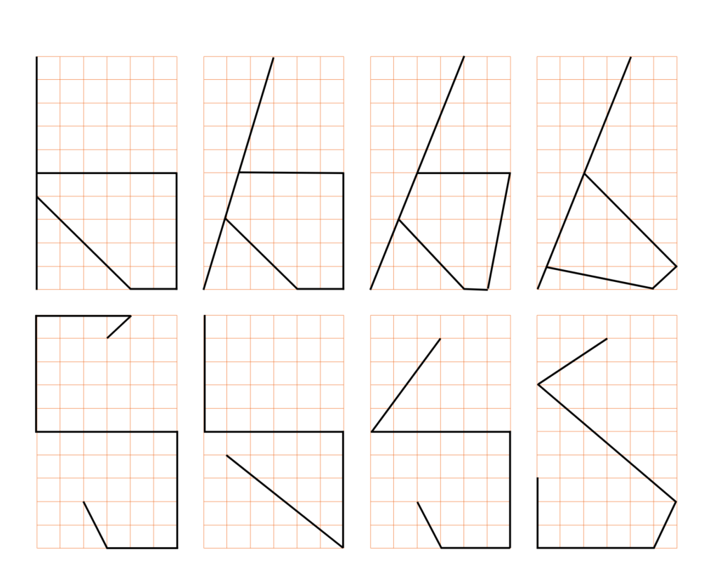
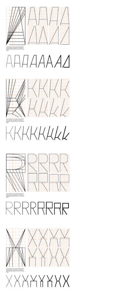
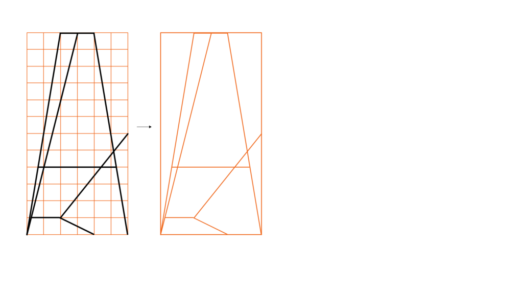
In my last post, I explored forms in the context of permutations. Now I want to explore how to actually create a typeface on the basis of different grids, moreover I want to show how different the output can be by using the same grid. I will generate unexpected graphical elements, all of which would be difficult to create without using this kind of analytical approach. Mainly I want to explore the different outcomes of this exercise and how the grid will lead me in different directions and how many different ways there actually be of design f.e. just one letter. So let’s start with an easy one, I created an orthogonal grid 1:2, in this case with a width of six units and to a height of 12 units.
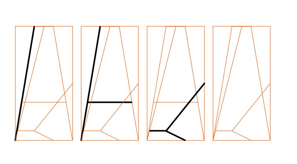
This process can go on for all 26 Latin capitals and generate a great variety of letter systems. Now I want to go one step further. Since grids do not always have to be square-based, they can literally be based on anything. So I want to give it a try and create a grid based on an already existing typeface and use this as the basis for creating graphics, icons, or patterns. First, I am going to take the two letters from which a created above and will put them into one matrix.
In creating a grid one already determine the character of the shapes that will be generated. So it would make a lot of difference if one would choose closed, rounded, open, linear, etc. In my example, I took letter forms which are linear, one open and one closed, so I can achieve a broader range of outcomes. After having developed the final grid I can now fill it in various ways, always on the base of the used typeface, its proportions and aesthetic will generate a set of homogenous graphical elements which can be integrated coherently into an existing design.
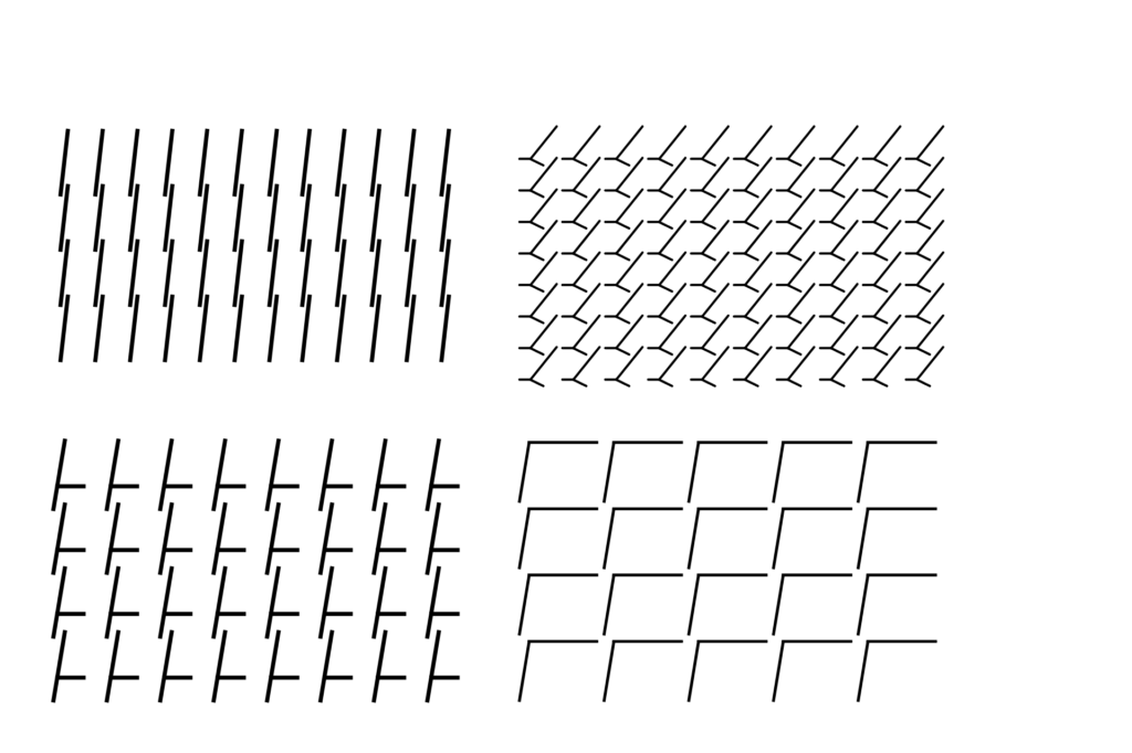
Now let’s create patterns out of the shapes we generated from our typographical grid.
So as we can see, there are infinite ways of using a grid & creating things out of a grid. It is also a great tool for creating flexible visual systems which are great for recognition & association of a design.
Designing a grid comes through deviations, we should allow our creativity free rein here. We should always feel free to combine the results of our grid analyses with additional permutations and should not subordinate our creative sense to any formulaic decree. The following article is filled with an exploration of analog and algorithmic creation of forms which in this post will be based on a form-based grid.
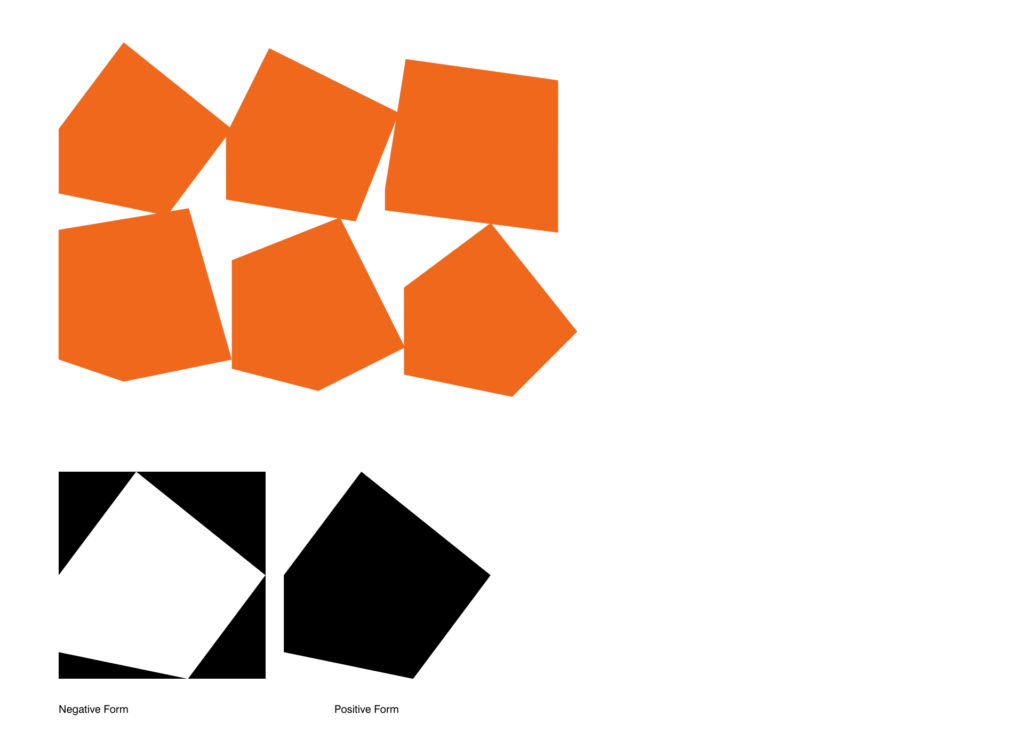
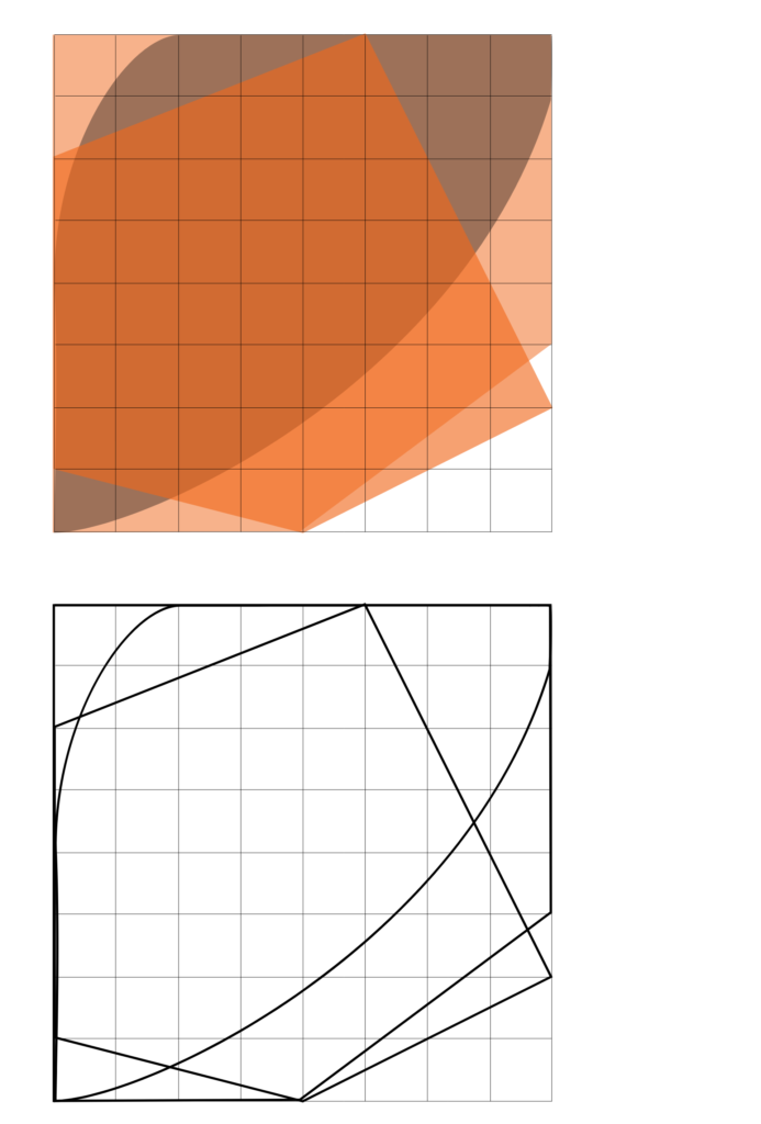
What does form-based actually mean? Well-form-based grids oft use geometric primitives as a base. In the first semester, I actually wrote about the famous designer Karl Gerstner, which took this component to generate the grid for the magazine of Capital. Following his approach, I will create geometrics from which I only require points, distances, and angles. I will use an 8×8 unit fundamental Grid, where I am going to analyze the possibilities offered by formal perpetuation with the help of 3 primitives: Triangle, Square, and Circle. I will then use mathematics functions such as addition, subtraction, intersection, and exclusion to generate random shapes.
All these shapes created in this way depart from the realm of symmetry and may at first appear cumbersome and labored. At a second glance, however, a certain aesthetic comes into focus, which, due to its clearly defined source, is nonetheless appealing.
For my first experiment, I want to transform the relationship between foreground and background to an extreme at which each turns into its opposite: Foreground becomes background and vice versa. We move each of the vertices in increments of two units in an anti-clockwise direction.
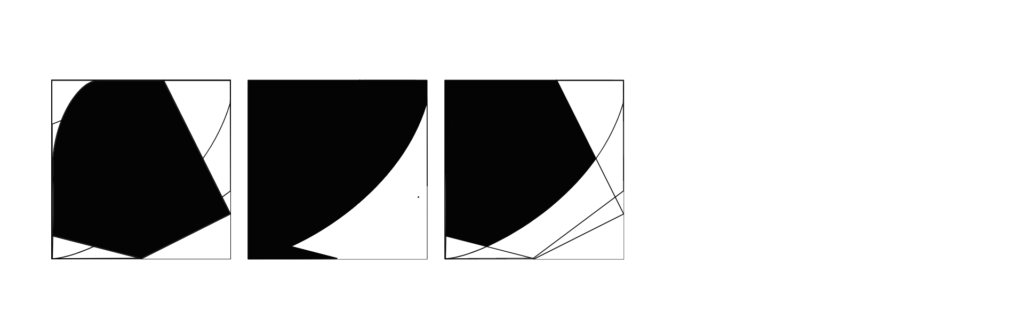
Now we are going to take the square and scan it horizontally across the grid, we push the bottom-right vertex upwards in increments of one unit. Flipping vertically, we push the same corner to the left in increments of one Unit.
The same can be experienced with a variety of different shapes.
Even though they are randomly put together they still please the eye.
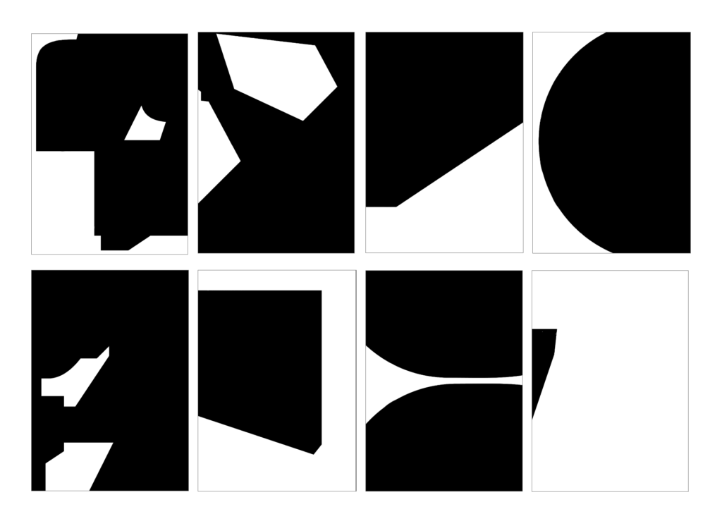
Now I want to explore different shapes in one matrix. The fact that all of them are created in the same grid makes it easy for us creating shapes which pleases the eye.
Now we can create more shapes from these shapes using different path tools.
Using a variety of shapes to create different compositions.
In einem Blogbeitrag aus dem letzten Semester hatte ich schon einmal das Thema der emotionalen Typographie aufgegriffen. In meinen letzten Recherchen komme ich auch immer wieder auf das Thema zurück und finde es sehr spannend Fonts und Schriften genauer zu untersuchen. Zu diesem Zweck bin ich auf einen Blogartikel gestoßen, der auch dieses Thema aufgreift (https://design.tutsplus.com/articles/the-psychology-of-fonts–cms-34943, 16. Mai 2020). Grace Fussell beschreibt daran dass uns unterschiedliche Fonts bezüglich der Emotionen beeinflussen können. Sie schreibt auch von “Font Psychology” und wie dadurch Logos und Brands angepasst werden können.
Einige ihrer Beispiele möchte ich für dieses Font Experiment aufgreifen. Sie schreibt unterschiedlichen Fonts bestimmte Stimmungen und Emotionen zu. Anhand eines einfachen Designs einer Karte habe ich das ausprobiert. Dazu habe ich einfach ein und dasselbe Design in unterschiedlichen Schriftarten gesetzt. Normalweise würde in den meistens Fällen wahrscheinlich eine Kombination vieler Schriftarten gewählt werden. Für diesen Zweck wollte ich aber ein ganzes Design mit einer Schriftart setzen.
Die von Fussell zugeschriebenen Assoziationen passen finde ich durchaus wirklich auf die unterschiedlichen Schriftarten. Jede einzelne Karte erhält dadurch eine unterschiedliche Wirkung. Im Prinzip ist das ja auch der Sinn hinter verschiedenen Schriftarten. Trotzdem ist es spannend den Unterschied einmal genauer hervorzuheben. Die unterschiedlichen Wirkungen und Einsatzmöglichkeiten von Fonts möchte ich in Zukunft auch auf jeden Fall weiter betrachten. Ob Schriftarten nun wirklich auch Emotionen hervorrufen ist schwierig zu sagen. Ich denke eher dass wie Fussell auch schreibt verschiedene Stimmungen erzeugt werden können, je nachdem welche Schriftart verwendet wird. Denn das passiert auch bei dem Design der Karte. Alle Beispiele haben eine andere Wirkung und lassen auf unterschiedliche Kontexte schließen.
Mit diesem Blogbeitrag möchte ich auch die Experimente für dieses Semester abschließen. Manche Experimente haben sehr gut funktioniert, andere eher weniger. Mir ist vor allem klar geworden, dass es nicht möglich sein wird, jedes Design emotional zu gestalten oder in jedes Element emotionale Wirkungen hineinzuinterpretieren. Für mich ist noch nicht ganz klar ob ich mit diesem Thema des emotionalen Designs auch nächstes Semester weitermachen werde. Auf jeden Fall möchte ich das Thema im Design immer bedenken.
With my left hand setup kind of working I decided to start with my right hand setup which, unfortunately, I have totally neglected so far. Short recap: the right hand setup is planned to consist of an IMU sensor that picks up the natural strumming patterns of the right hand and uses the movement parameters to modulate the guitar sound. First of all, what is an IMU sensor? According to Wikipedia, an inertial measurement unit (IMU) is an electronic device that measures and reports a body’s specific force, angular rate, and sometimes the orientation of the body, using a combination of accelerometers, gyroscopes, and sometimes magnetometers. As the definition suggests, it is quite a complex device and is really on another level coding-wise than the left hand setup featuring the time-of-flight sensor.
At the very beginning of the semester, my supervisor gave me one of his IMU sensors, namely a MPU-92/65. However, as I approached him last week concerning the IMU sensor business for my right hand setup, he recommended me using another kind of IMU sensor, the BNO055 from Bosch. Apparently, there are better/easier-to-use Arduino libraries for the BNO055, and it is capable of sensor fusion – something I will get into below. Luckily, he also had one of those and gave it to me for experimenting.
Additionally, my supervisor told me the basics of IMU sensors which I will relay to you now:
As already mentioned in the definition, an IMU sensor basically combines an accelerometer, a gyroscope and a magnetometer and they can be used alone or in combination to obtain information about the position and/or movement of an object. When used in conjuncture (=sensor fusion), one can determine the pitch, roll and yaw movements of said object which is what I think I need. Since I have to actually wear the sensor on my wrist while playing the guitar, I cannot yet say, what kind of information I need from the IMU sensor. Of course, the pitch, roll and yaw movements make sense, but I could also try acceleration values for example. My goal for now is to get sensors readings in general and in the next step, I will try to figure out what kind of readings work best for my cause.
I found an Arduino library that lets me calculate the orientation of the sensor giving me readings of the x, y and z axes. My supervisor also highlighted the need to calibrate the sensor each time otherwise the readings are inaccurate. Luckily, the library also has a function that reads me the calibration status of each of the sensors in the IMU (accelerometer, gyroscope, magnetometer) – 0 means not calibrated at all; 3 means the sensor is fully calibrated. I watched a YouTube video that explains how to calibrate each of the three sensors: to calibrate the gyro, the sensor just needs to sit still for like 1-2 seconds (easy!). To calibrate the magnetometer, one needs to tilt and move the sensor for a bit into all directions which also works quite well. Calibrating the accelerometer is the most complex of all three approaches. One must tilt the sensor in different angles and hold each position for about five seconds. It takes a little bit of time and experimenting, but it works.
With the calibration and the orientation readings going, I decided to test it by putting the sensor on my wrist – easier said than done! After some tinkering I came up with the very rough solution of using my (seldomly worn) wristwatch and sticking the IMU sensor onto it using double-sided tape. Now I should be able to strap the watch over my hand and start playing.