Interview with a cardiologist (C) 

In the course of my visit to Spain during the Easter holidays, I had the opportunity to have a short interview with one of the heads of the cardiology department of the Salamanca general hospital.

After listening to what the doctor told me, 3 things were clear to me:

  • The time spent on correcting minor technical errors or sharing information between specialists should be reduced to the maximum in order to be able to use it in dealing directly with patients.
  • Advances in technology are very effective, but we cannot forget that the main customers of health systems are the elderly people, and this is going to be the tendency at least in the near future.
  • Pedagogy is key in order to making patients stop seeing the hospital as a hostile environment. Time and tools are needed to provide this inclusion prior to treatment and, if possible, the availability of real people for those who do not feel so comfortable with virtual assistants.

Here is the full interview.

*This interview has been the first instance recorded in Spanish and afterward translated and transcripted to this document. 

_________________________________________________________________

Me: Hello! Thank you for taking some time for me, I know you have probably a very packed day. 

C: Yes, indeed. But no problem at all, thank you for coming. 

Me: My pleasure. Just a little information before we jump into the interview itself: This interview is for educational use. I want my master’s thesis to be related to healthcare, more specifically speaking I want to find out what are the design challenges healthcare is facing right now. Since healthcare is just a big umbrella that brings together many different disciplines, I have decided to delve into radiology. I think it is a field where many different types of software and hardware are used, and also there is an ongoing relationship with other specialists and patients if I am not mistaken. All of this makes the field very attractive for a designer, and that’s why I’m here. 

The information will be shared in a blog that students and teachers from my department can access as well as will be used to shape the final version of my master thesis. Only if you consent, I’ll use some of the comments made during this session as quotes within the master thesis, only then, by using the proper form of citation. And here ends the bureaucracy. 

C: hahaha! No problem, of course, you can use the information for your master thesis and I’ll be happy to be quoted within it. So go ahead! 

Me: Thank you so much. Let’s start then. 

Me: How long have you been working here? 

C: 15 years already! 

Me: That is time enough to gather many different experiences. Tell me a bit about your daily routine. How many patients do you see on a normal day? 

C: 15 to 30. Depending on the pathologies. Sometimes I meet on the same day with patients who are going through similar pathologies because it is easier for me to do a bit of pedagogy with them and also to easily access the repositories. There is a huge archive where all heart diseases are collected, and they are labeled in alphabetical order by the name of the pathology. Therefore, I spend less time looking for a specific record if I move around the same area all the time. But of course, I always give priority to urgent issues, and you never know when a new one is going to show up during your day. 

Me: Besides meeting your patients, do you have other important meetings that you have to attend in your day? 

C: Other cardiologists. Residents. Specialists from many different fields, like, for example, radiologists. We compare diagnoses, we talk about further steps within a patient’s treatment… Nurses, and sometimes administrative staff. 

Me: Between all of those meetings, do you have time to take a break every now ad then? 

C: Hmmm… I guess I do have breaks, but not really as many as I’d need. Sometimes I don’t have time to eat properly or I can’t take the time to clear my mind after giving bad news to a patient. Although we are used to dealing with bad scenarios and informing patients about them, in the end we are all human beings, so it is also a human need to have a space to digest that you “hurt” someone’s feelings before going on with your day. 

Me: I understand. The breaks are not only to have a physical rest but also to recompose yourself psychologically. 

Me: Is there something you think that will make you have more of that time you are seeking? 

C: Hay muchas veces que las reuniones se podrían hacer más rápido. Algunos trámites administrativos podrían hacerse más rápido. La transferencia de datos de médico a médico para un diagnóstico posterior debería ser más rápida. Incluso hay ocasiones en las que tenemos que repetir procedimientos por falta de instrucciones dadas al paciente, o alguna pérdida de información. Son cosas que no deberían estar pasando en un gran hospital como este, porque si hay algo que buscamos, en realidad, todos buscan, es tiempo. 

Me: Let’s go to the analysis of some of the devices and procedures that you daily use. 

Me: What kind of devices do you use more often? 

C: Cardiac ablation catheters, Cardiovascular angioplasty devices, Cardiac pacemakers, Implantable cardioverter defibrillators, Prosthetic (artificial) heart valves, Stents, Ventricular assist devices, “domestic” monitor devices, web and mobile applications or portals. 

Me: Can we focus on the last ones? As I understand, patients can get more involved in those. 

C: Definitely. 

Me: Within the use of “domestic devices or those that patients take home, is the data collected sufficient to provide a complete diagnosis? 

C: Yes and no. For many patients, it is enough because we only look for abnormalities. So we see them or we don’t. But answering your question, no. It is not enough to completely diagnose a pathology. If we find an abnormality through the monitor, we will have to perform further procedures to find the best way to proceed with that specific patient. And many of those procedures will need to be done inside the hospital. 

Me: How many times do you need to repeat monitoring procedures? Average per year. 

C: Around 15% of the whole amount of procedures.  

Me: What do you think is the main cause? 

C: Technical problems many times. But there are also times when patients don’t understand exactly what we need for them, so we have to explain again how to interact with the device, what they can do, what they can’t do, and redo the procedure. 

Me: Is there a specific demographic group where the repetitions occur more often? 

C: Elderly people. In reality, most cardiology patients are older people. Sometimes we have children or young people who have heart problems but… You know, we are in a very old society. And it is expected to be even greater in the coming years… Medicine has to see the elderly as its main client and adapt procedures to them. And that takes time. Exactly what we don’t have here. 

Me: These elderly people, is there something they complain about when they are required to wear this device on them? 

C: They feel insecure. They don’t see why they need this machine if I’m here. I’m the doctor, what a machine is going to the better than me? They have a lot of questions. Many don’t even understand the most basic things so… They feel uncomfortable, even though they have to wear the device for only one or two days. 

Me: Do you think these people feel involved when dealing with these devices? Do they feel like an active part of the procedure or a secondary actor? 

C: Honestly, I think they feel totally aside. They don’t know what is going on. They follow instructions. Everything is cold and aseptic. They don’t have a voice. But they do have a voice, but many times we don’t have the time to listen to them because we use all our available time discovering what is going on there.  

Me: What do you think could be done in order to improve patient engagement and involvement?  

C: Definitely avoid all of those technical errors that are grabbing our time for the face-to-face relationship with our patients and the pedagogy we could do with them. More time = more pedagogy = less repetition of procedures = more rate of success when finding the diseases in their early stages. 

Me: What do you think has been already done to improve this? 

C: Many of our applications and portals, as well as AIs, provide training to our patients previous to their procedures. We go back to the problem of getting the elderly people there. They rather speak with you than navigate an application looking for the information they need or listen to the instructions from a non-human character. This has been widely discussed among the medical staff, so the awareness is also a good point and I guess some steps will be done to address this. 

Me: Thank you so much for your time. I think I have all I need. Do you maybe want to talk about something that I didn’t ask you that you would like to share with me? 

C: I think I don’t have any further information I can share with you. I already talked too much! But if more questions come up to your mind, don’t hesitate in contacting me. Thank you for the interview! 

Experiment #1 – Feedback des Videographen

Obwohl sich der Endkunde bereits für den orchestralen Soundtrack entschieden hat*, war es mir dennoch wichtig die subjektiven Eindrücke des Videographen zu erfragen. Daher bat ich Ihn, sich die zwei unterschiedlich orchestrierten Soundtracks anzuhören und für ihn selbst zu analysieren, wieder in Kombination mit dem Bild.

Seine Auffassung der Unterschiede zwischen den 2 Ausführungen:

Die Orchestrale Version gefiele Ihm mehr, da sie die Bilder, die immerhin großteils Natur (Wälder, Bäume etc.) zeigen besser untermale.
Weiters fiel ihm seiner Meinung nach auf, dass die Synthesizer Version in Verbindung mit dem Video einen leichten Grusel Charakter annimmt, und der eigentliche Stil vom Video darunter leidet. 

Ebenfalls würde man die „Stille“ mit der orchestralen Version besser wahrnehmen können. Die leisen Elemente der Musik würden sich merkbarer „zurückhalten“ als die der selben Passagen von der Synthesizer Version.

Die letzte Aussage überraschte mich am meisten, da mir diese Eigenschaft nicht aktiv aufgefallen wäre und solch detailliertes Feedback eher selten unter Videographen vorkommt.

*Aus Deadline-technischen Zeitgründen konnte die Hybrid Version – die meines Erachtens nach ideal gewesen wäre – nicht mehr in das finale Produktvideo eingebaut werden, da der Kunde dieses schon vorzeitig benötigte.

Graphic Design is as much an art as it is a science.

I am going to kick off with a phrase from Viktor Baltus, he is a typography guru who gives very interesting talks and online classes, and in it’s last course he mentioned something, which describes my topic very well:

Everyone can look at a laid outspread and judge if it’s professionally done, it’s harder to quantify that professionalism. Why do some layouts work and others do not? And more importantly, how can you recreate that professionalism? – Viktor Baltus

This semester I want to focus on designing layouts, and how style changes are perceived by the audience,I will also include a lot of typography and compositions.

“A grid is only useful if it is derived from the material it is intended to handle.” – Derek Birdsall

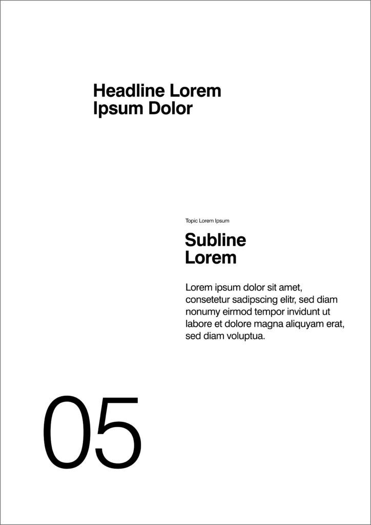
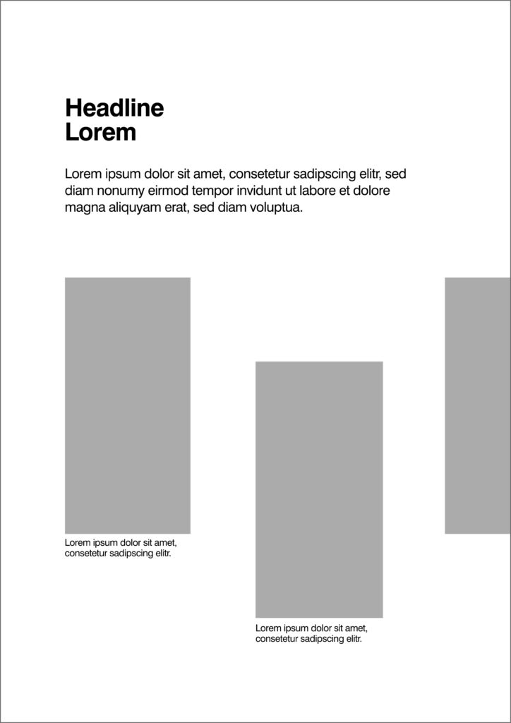
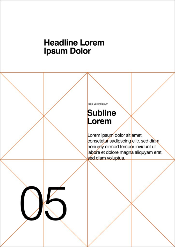
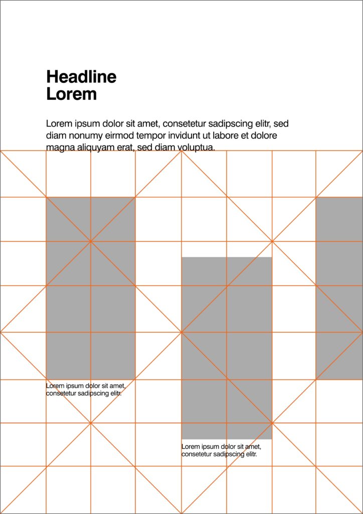
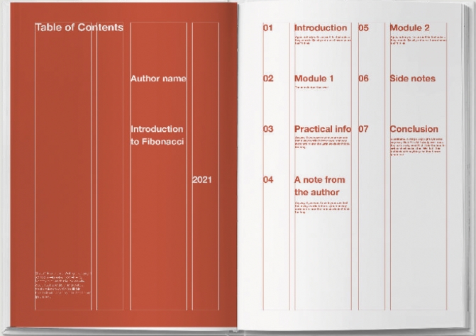
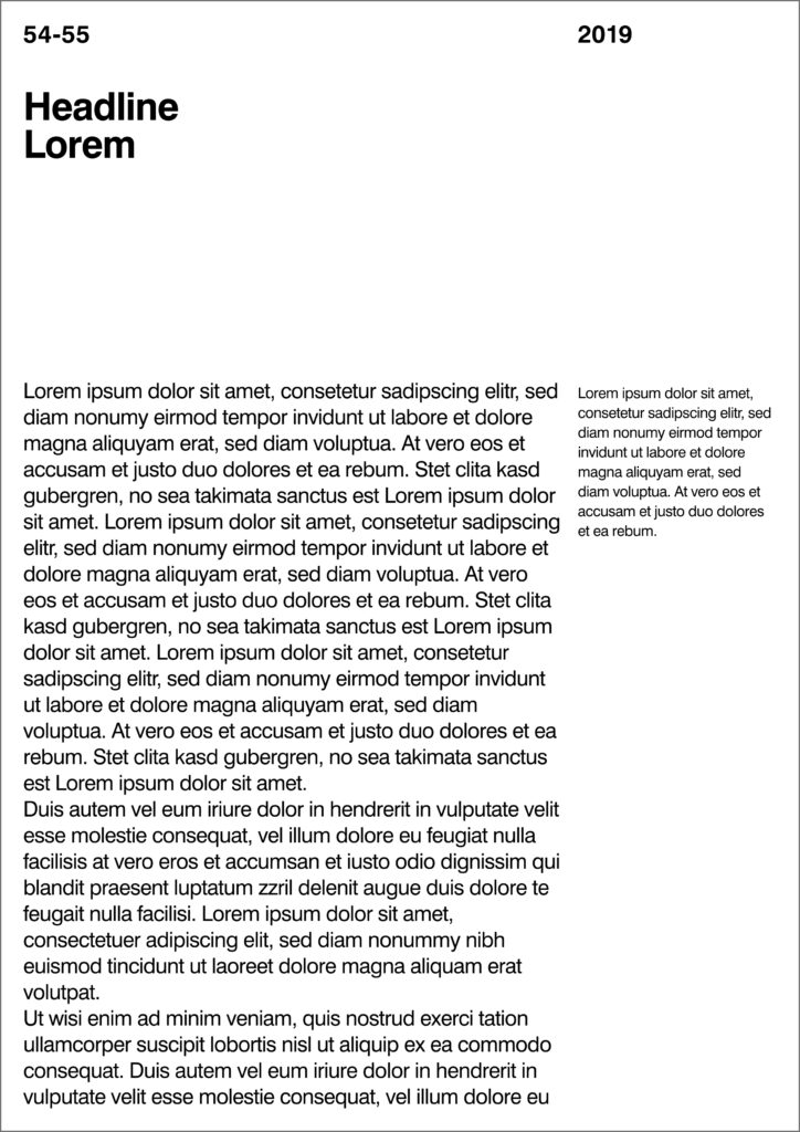
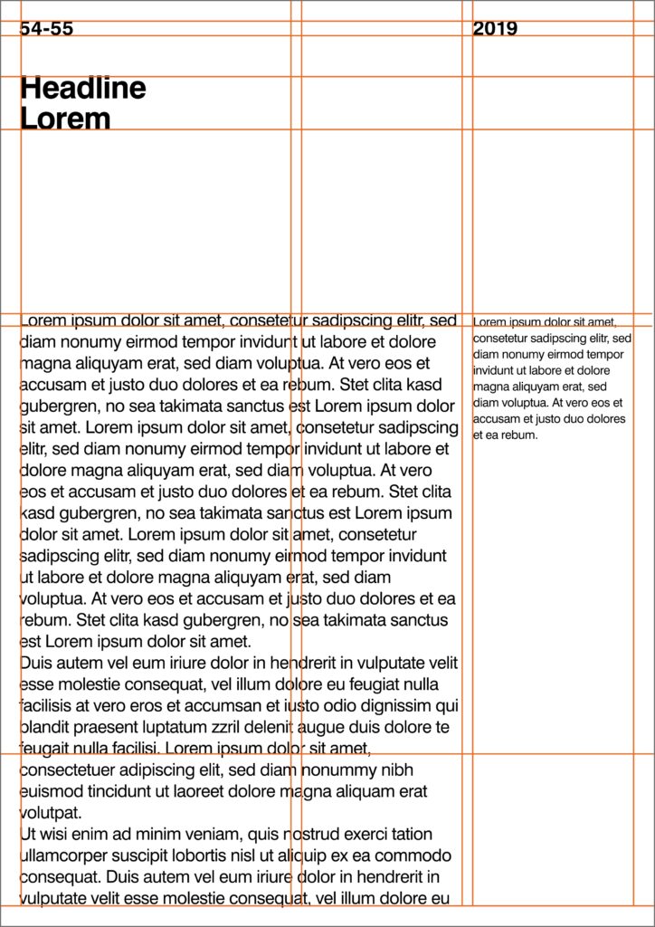
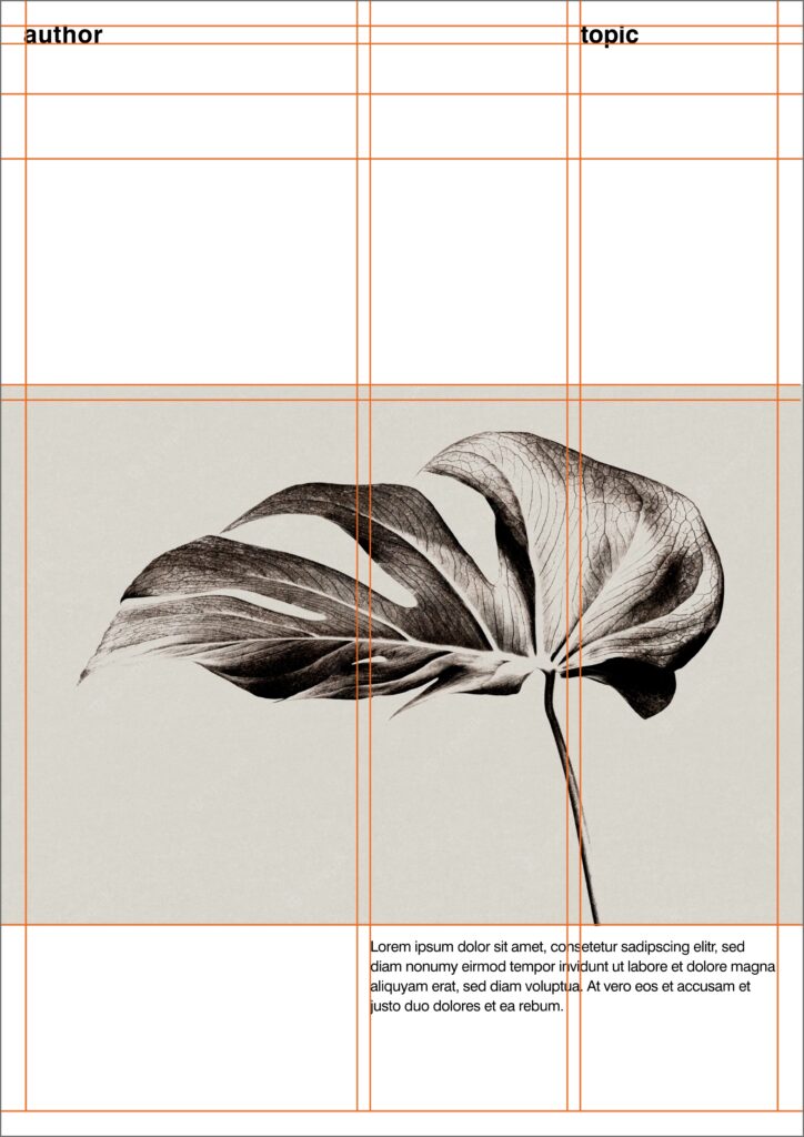
The secret to professional-looking designs lies in the arrangement of visual elements and how they are positioned in relation to each other. It’s a combination of layout and grids. The words layout and grid are related but are different things. The layout is the overall way of presenting your text and images and includes things like size and product. Grids are the backbone of a layout and are used to create the hierarchs of your text, images, and other visual elements. So in this post I played a lot with different grids and created random layouts out of it. Following I am going to list some of the most common grids which are used as a base to create layouts out of it.

Gutenberg Grid

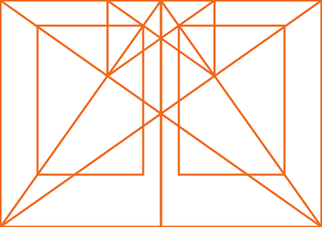
Golden Ratio

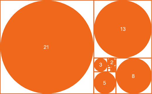
Fibonacci Sequence

Fibonacci Sequence as a Grid

Rabatment Composition

Not every design needs a perfect Golden ration of 1:1.61. A lesser known composition method can often replace this theory and is called Rabatment. Rabatment is a composition method that consist of overlapping squares in a horizontal or vertical rectangle, regardless of the dimensions.
When you overlap two Rabatment squares in a rectangle, they create another rectangle. We call this secondary Rabatment.

In layouting, this method can help you align columns and images for structured look. Following there will be shown how this grid can be applied.

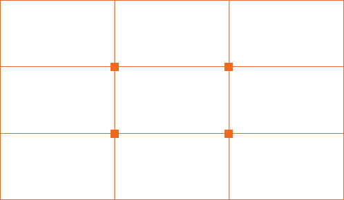
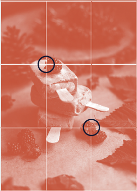
Rules of third
Rules of third can be used to align elements to either the lines or the cross sections for a better composition. Because we’re so familiar with perceiving the world this way, looking at a layout which is in line with the Rule of Third is often pleasing to the eye.

Gestalt Theory

Besides all the mentioned mathematical and optical composition theories there is an another theory: Gestalt, the psychological theory behind compositions.

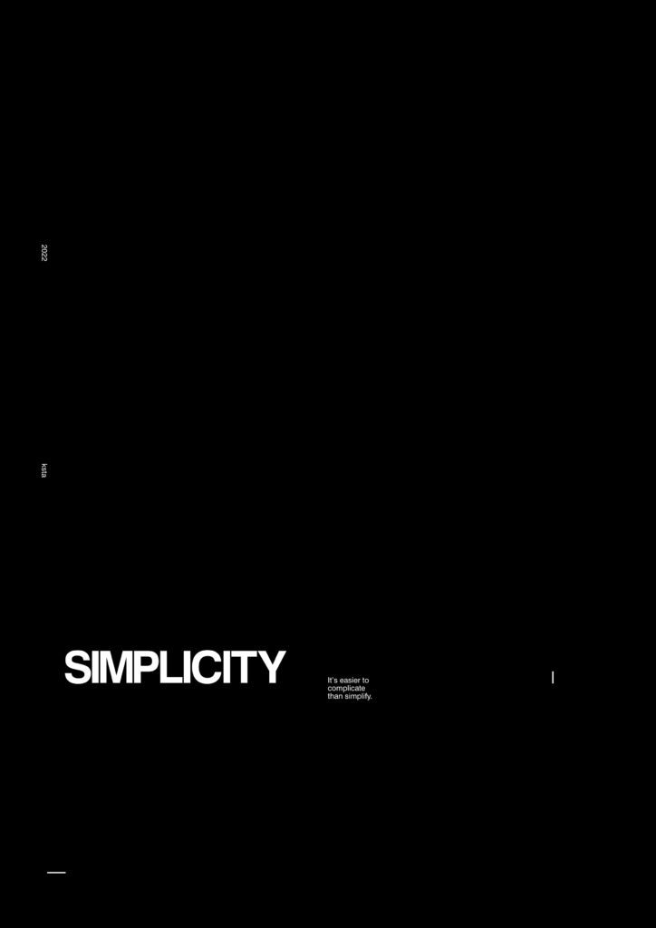
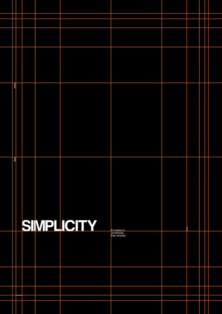
Simplicity

The theory of simplicity states that forms are easiest perceived in its simplest form. We see this clearly when looking at typography: Letters that are grouped together form words; letters that are separated on your artboard are more actively perceived as single shapes. A good layout design makes use of simplicity to balance the components on your artboard.

Figure Ground

The figure and ground theory will help you make your layout more dimensional. The so-called „figure“ is often perceived by the mind as the focused object white the „ground“ is automatically placed in the background. A figure doesn’t have to be an actual figure, it simply indicates the text, image, or another object that the observer should pay most attention to.
The ground frames this element so it stands out more. Keep in mind that convex elements are often perceived as figures while concave elements are often perceived as ground elements.

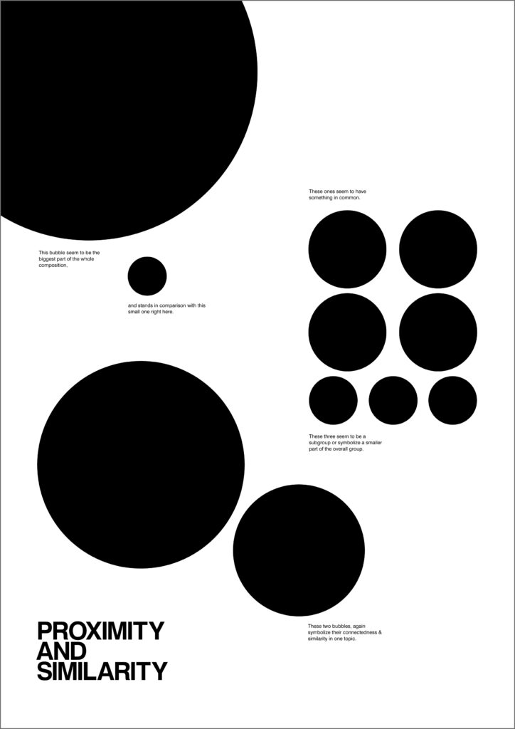
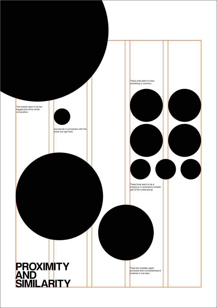
Proximity and similarity

Elements that stand in close proximity to each other are often perceived as being from the same group. This does not only apply to columns or images but also to elements that have a similar shape, color, direction, or font size. When designing a layout, for instance, a music program with lots of information about the music, times, and musicians, it will help the viewer better understand the structure if items about the same event or grouped together or when all times are displayed in a timeline.

Symmetry

Design elements that are symmetrical are perceived as part of the same group. We can see this in the layout of spreads, where the right page is mirrored copy of the left. This can also be applied to the layout of elements that have the same value in terms of importance.

Continuity

Design elements that are aligned with each other are. perceived as being from the same group. The example above has letters of the title missing, but because they are placed in line with the beginning of the word, we can extend the word easily in our mind. The sam theory can be applied to placing the columns on different fields of the modular grid, forming a structure the viewer can follow.

Connectedness

Connecting elements like lines, dots, and shapes are perceived as connected. A good example of this theory can be found in the layouts of infographics, flowcharts, or timelines, where arrows, lines, and dots help connect one topic to the next.

As seen, there are endless possibility to make layouts based on grids.

So I wanna end this post with a phrase from Massimo Viglenni:
„Styles come and go. Good design is a language, not a style“

Type Design #2: Die ersten Buchstaben

Wie im vorherigen Beitrag beschrieben, widmet sich dieses Type Design-Experiment der Gestaltung einer Schrift auf Basis eines bestehenden Schriftzugs, dessen Ursprung jedoch unbekannt ist. In diesem Beitrag möchte ich die Vorgehensweise der Gestaltung der ersten Buchstaben beleuchten. 

Gemeinsame Formen erkennen und nachzeichnen

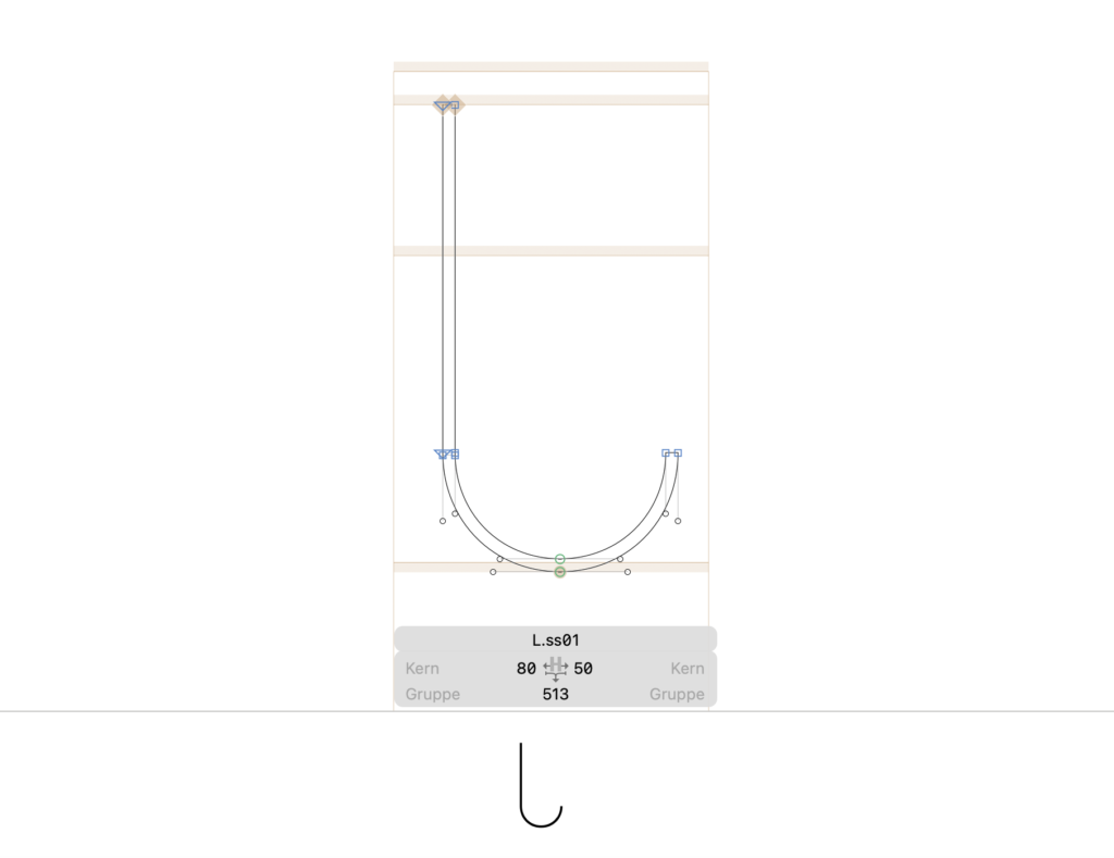
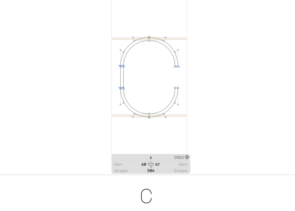
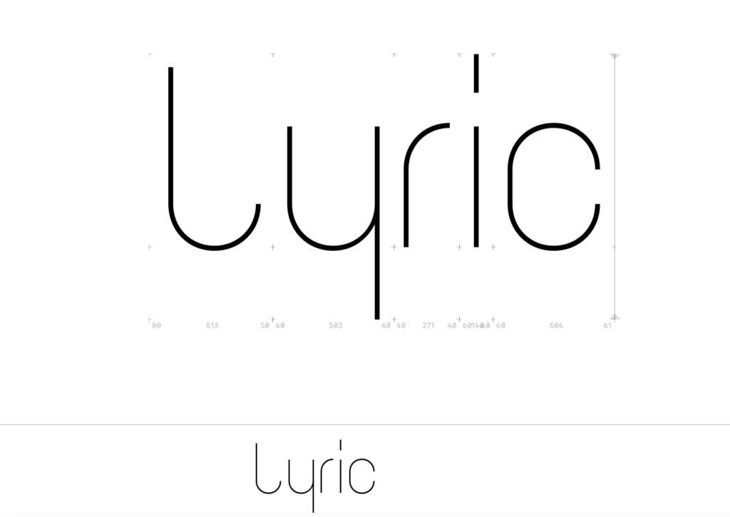
Zuerst habe ich das Bild auf einer Illustrator-Zeichenfläche platziert und die Formen nachgezogen (siehe Abb. 1). Da die Buchstaben aus einfachen Geraden und regelmäßigen Bögen bestehen, versuchte ich, alle Lettern des Wortes „lyric“ mit einem Rechteck bzw. Halbkreis nachzuzeichnen. Diese beiden Formen zog ich dann als Basis für alle weiteren Formen heran. Dass die Schrift eine Hairline werden sollte, ergab sich natürlich aus dem bestehenden Schriftzug. 

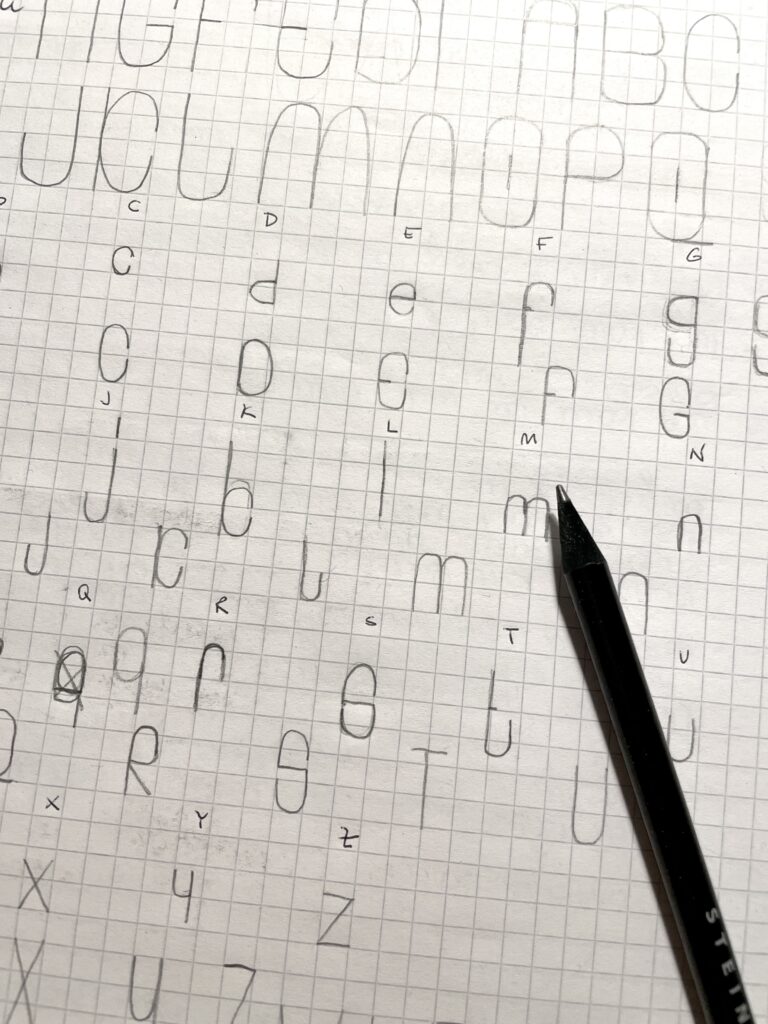
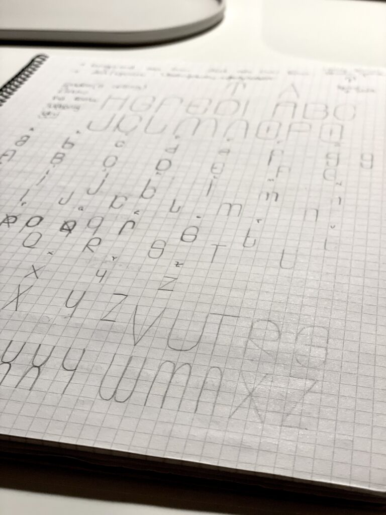
Um ein Gespür für die angedachte Formensprache zu entwickeln, wechselte ich die digitale Software gegen Bleistift und Papier und fing an, Buchstaben zu skizzieren – soweit wie möglich immer aus Geraden in 90°-Winkeln und Bögen bestehend (siehe Abb.2 und Abb. 3). Für den Großteil der Versalien sowie Gemeinen funktionierte dieser Ansatz überraschend gut, sodass bald viele Buchstaben des Alphabets ihre Form erhielten. Als schwierig entpuppten sich vor allem jene Buchstaben, die Diagonalen enthielten – X, Y, W, Z – sowie auch S und K, jeweils als Groß- und Kleinbuchstaben, da diese das grafische System sprengten und nach alternativen Formen verlangten, die mit den bereits bestehenden trotzdem harmonierten. Als die Skizzen für Versalien und Gemeine soweit standen, wechselte ich wieder an den Laptop, in die Type Design-Software Glyphs. 

Erste Buchstaben in Glyphs

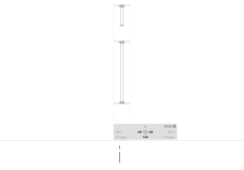
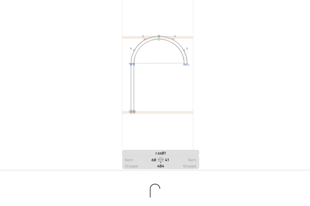
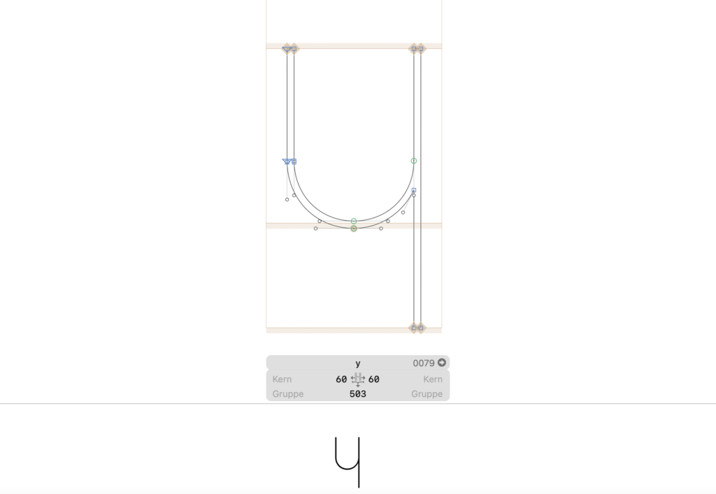
Da die Glyphen in Glyphs auf quadratischen Zeichenflächen von 1000px x 1000px angelegt werden, hatte ich auch die Zeichenflächen im Illustrator bereits in diesen Größen festgelegt. So musste ich die Formen, die ich zunächst im Illustrator gezeichnet hatte, in Glyphs nicht mehr skalieren. Die Klein- und Großbuchstaben waren in Glyphs bereits angelegt. So kopierte ich jeweils die Formen für l, y, r, i und c in die dafür vorgesehenen Felder. Ich startete mit dem l, bestehend aus einem Rechteck und einem Halbkreis. Ich schob die Formen dabei lediglich ineinander und wandelte sie nicht in eine durchgehende Form um. Dies ermöglichte mir die weitere flexible Verwendung der beiden Formen für alle anderen Buchstaben. Obwohl es sich in diesem Fall um eine Grotesk handelt, beschloss ich, die Oberlänge der Gemeinen höher zu setzen als die Höhe der Versalien – eigentlich etwas, das vor allem bei Serifenschriften der Fall ist. Bei Sans Serif-Schriften kann darauf verzichtet werden. Da meine Schrift aber einem sehr strikten grafischen System zugrunde liegt, wollte ich bewusst Akzente setzen, die für Lebendigkeit im Schriftbild sorgen. 

Schritt für Schritt zeichnete ich mit den Formen die weiteren Buchstaben des Wortes „lyric“ und legte bereits an dieser Stelle für alle Buchstaben ein Spacing fest, das in etwa passen konnte (siehe Abb.3 bis Abb. 8). Auch wenn es an dieser Stelle noch nicht möglich war, ein finales Spacing vorzunehmen, war es mir wichtig, bereits hier für einen Rhythmus zwischen den Buchstaben zu sorgen, der die Luftigkeit der entstehenden Hairline-Schrift spiegelte. Kontrollieren konnte ich dies durch das Text-Werkzeug in Glyphs, mit dem man sogleich die ersten gezeichneten Buchstaben tippen und gegebenenfalls auch im Vergleich zu den anderen Buchstaben Korrekturen an den Glyphen vornehmen kann. Welche genauen Werte für das Spacing notwendig sein würden, konnte ich jedoch erst auf Basis mehrerer Buchstaben feststellen. 

Weitere Schritte

Bis zum nächsten Beitrag möchte ich alle Versalien sowie Gemeinen, Umlaute und teilweise Interpunktionen gezeichnet haben und diese präsentieren. Im Zuge dessen werde ich auch das Spacing vornehmen – und je nach Bedarf das Kerning gewisser Buchstabenpaare. 

Sensor Test & Selection

At this stage of the project, I decided that it is time to determine which sensor will be used for the left, fretting hand setup. In order to find out which sensor in which position works the best, I directly compared the sensors one after the other in different positions and made notes what works and what does not. The good news is that we have a clear winner; the bad news is that there are still some issues remaining.

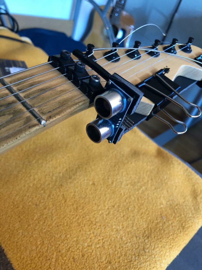
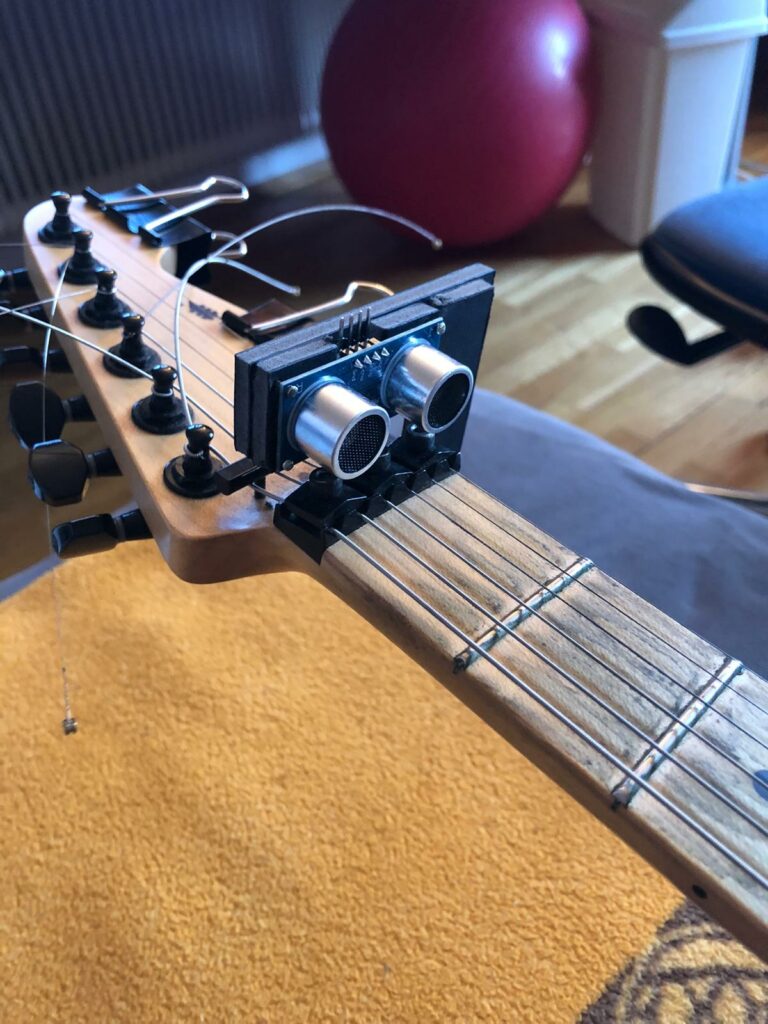
What kind of sensors are tested? I tested the HC-SR04 ultra-sonic sensor against the VL53L1X time-of-flight sensor. Both sensors were tested using two different rigs: Rig #1 is attached to the bottom of the neck and rig #2 is placed horizontally on top of the neck.

I started with the ultra-sonic sensor. Having worked with the time-of-flight sensor for a while now, I was surprised of how bad the results were. As I mentioned a couple of times (most notably in blog post #6), I always had problems with the ultra-sonic sensor as far as accurately pinpointing the fret location if a real hand is used as a reference. In conjuncture with rig #1, the ultra-sonic sensor gives very accurate distance and fret number readings if a flat surface is used as the object whose distance should be elicited. If this object is a hand, however, the readings become very inaccurate. Don’t quote me on this but I think the problem arises because the ultra-sonic sound spreads out a little bit as it travels through the air and, as a result, bounces off of multiple points of the fretting hand which in turn leads to fluctuating readings. Using rig #2, the ultra-sonic sensor did not work at all during the test. Here, the sound apparently bounces off of the frets instead of my hand. Depending on the angle of the sensor it just detects ranges between two to five frets.

Ultra-sonic sensor rig #1
Ultra-sonic sensor rig #2

These sobering results lead me to the time-of-flight sensor which, luckily, fared better than its ultra-sonic relative. No matter what rig, the distance and fret number readings are super exact until fret number eight, and I think with further coding, I can extend the range to the 10th fret at least. I think the issue at hand is that the library I am currently using calculates only integer values. However, since the fret ranges and their lower and upper limits are defined as decimal numbers, the integer numbers may become too inaccurate and unsuitable to calculate the fret numbers after the 7th fret. I have already asked for the advice of my supervisor regarding this matter. Another major concession is that the fret detection works best when playing barre chords. When playing a solo, I am confronted with the problem that the forefinger is always registered to be one fret before actual fret where solo is played. This unfortunately is the result of the usual hand and finger positioning when soloing. Since my goal is to extent the guitar’s range of sounds in a way that is not invasive, I must find a solution that does not require the player to alter his or her hand position…

ToF sensor rig #1
ToF sensor rig #2

Nevertheless, we have a clear winner: the time-of-flight sensor – especially in conjuncture with rig #2. It does not work optimally yet, but I will spend no more time with the ultra-sonic sensor and focus on the ToF. However, as far as learning the code is concerned, my time spent with the ultra-sonic sensor was not in vain. I learnt a lot and I could transfer a lot of code to the ToF.

Horrorfilme: Die Subgenres “Slasher” und “Splatter”.

Die sogenannten Slasherfilme (Slasher: zu Deutsch „jemand, der aufschlitzt (1)) gehören zu der brutaleren Sorte des Horrorfilmgenres: „Killer“. (2) 

Hierbei handelt es sich um einem Mörder, der in der Regel, junge Menschen zuerst unheimlich beobachtet und anschließend bei Gelegenheit mit einer Art Messerklinge (o. Ä.) barbarisch umbringt. Dies tut er nicht grundlos, sondern als Reaktion auf etwas, das ihm einmal geschehen ist. (3)

In überaus vielen Fällen ist er auf Frauen aus und wird auch von einer umgebracht. (4)

Dem Subgenre voran geht der Film „Psycho“ (1960) von Alfred Hitchcock und kann als ein Beispiel der ersten Slasherfilme genannt werden. Auch hier gibt es einen „Killer“, der sein Opfer ohne eine Schusswaffe umbringt. (5)

Weitere bekannte Filme in dieser Kategorie sind Werke der Filmreihen „Halloween“ (John Carpenter, 1978-2021 (6)), „Scream“ (Wes Craven, 1996-2022 (7)), „Saw“ (James Wan, David Hackl, Kevin Greutert, Peter Spierig, Darren Lynn Bousman, Michael Spierig, 2004-2021 (8)) und “Freitag der 13.“ (Ronny Yu, Tom McLoughlin, Marcus Nispel, Sean S. Cunningham, Joseph Zito, Adam Marcus, Rob Hedden, James Issac, John Carl Buechler, Danny Steinman, Steve Miner, 1980-2009 (9)) (10)


(1) Vgl. Langenscheid (o. D.): Slasher, www.langenscheidt.com, [online] https://de.langenscheidt.com/englisch-deutsch/slasher [abgerufen am 19.04.22].

(2) Vgl. horroronscreen.com (o.D.): Horror Genres & Sub-Genres, www.popcornhorror.com, [online] https://popcornhorror.com/genres/, [abgerufen am 19.04.22].

(3) Vgl. Nowell, Richard (2011): Blood Money, New York, USA: Continuum, S. 20

(4) Vgl. Clover, Carol (1987): Her Body, Himself: Gender in the Slasher Film in Representations, No. 20, Special Issue: Misogyny, Misandry, and Misanthropy, Kalifornien: University of California Press, S. 187

(5) Vgl.  Ebd., S. 192

(6) Vgl. Langham, Christopher (2021): „Halloween”-Reihenfolge: Die Timelines der Slasher-Filme www.kino.de, [online] https://www.kino.de/film/halloween-2018/news/halloween-reihenfolge-die-timelines-der-slasher-filme/, [abgerufen am 20.04.2022].

(7)  Vgl. Jacob, Constantin (2022): Reihenfolge der „Scream“-Filme: So schaut ihr das Horror-Franchise, www.kino.de, [online] https://www.kino.de/artikel/reihenfolge-der-scream-filme–469r65pqgm, [abgerufen am 20.04.2022].

(8) Vgl. Witt, Waldemar (2020): Die richtige Reihenfolge der „Saw“-Filme, www.kino.de, [online] https://www.kino.de/film/saw-2004/news/die-richtige-reihenfolge-der-saw-filme/, [abgerufen am 20.04.2022].

(9) Vgl. Wieseler, Max (2020): Der beste Freitag der 13.? Alle 12 Filme der Kult-Horror-Reihe im Ranking, www.moviepilot.de, [online] https://www.moviepilot.de/news/der-beste-freitag-der-13-alle-12-filme-der-slasher-horror-reihe-im-ranking-1128995, [abgerufen am 20.04.2022].

(10) o. A (o. D.): Die besten Slasherfilme, www.moviepilot.de, [online] https://www.moviepilot.de/filme/beste/genre-slasherfilm [abgerufen am 20.04.2022].

Anzumerken ist, dass es Vermischungen zwischen den Genres der Splatter- und Slasherfilme gibt, wie bei „Saw“ (2004). (11)

Das Subgenre Splatterfilme im Genre Horror befasst sich hauptsächlich mit blutigen und gewalttätigen Szenen: Hierbei werden brutale Verletzungen, wie das Ab- und Durchtrennen von Körperteilen bis hin zur (dadurch ausgelösten) Tötungen von Menschen, dargestellt. Da solche Szenen selbstverständlich nicht real gefilmt bzw. produziert werden können, werden bestimmte Kamera- und Filmschnitttechniken verwendet, um ein real-aussehendes Massaker darzustellen. (12)

Bekannte Filmbeispiele sind „From Dusk Till Dawn“ (Robert Rodriguez, 1996), „Tanz der Teufel“ (Sam Raimi, 1981, 1987) und „Evil Dead“ (Sam Raimi, Fede Alvarez, 2013). (13)

Zusammenfassend haben die Subgenres des Horrors „Slasherfilme“ und „Splatterfilme“ gemeinsam, dass es sich um blutiges und brutale Ermordungen, gar „Abschlachtung“ von Menschen handelt. Der Unterschied zwischen den beiden Kategorien liegt darin, dass Splatterfilme blutiger sind und Slasherfilme die „Jagd“ des Killers auf seine Opfer in den Vordergrund stellt. 


(11) Vgl. o. A. (o. D.): Die besten Splatterfilme, www.moviepilot.de, [online] https://www.moviepilot.de/news/der-beste-freitag-der-13-alle-12-filme-der-slasher-horror-reihe-im-ranking-1128995, [abgerufen am 20.04.2022].

(12) Vgl. o. A. (2002): Bodies that Splatter., f-Im.de, [online] http://www.f-lm.de/bodies-that-splatter/, [abgerufen am 15.04.2022].

(13) Vgl. o. A. (o. D.): Die besten Splatterfilme, www.moviepilot.de, [online] https://www.moviepilot.de/filme/beste/genre-splatterfilm [abgerufen am 20.04.2022].

Here comes the ToF sensor Part 2

Hello and welcome back! We were in the middle of deciding which sensor fits my project best – the VL53L1X or the VL53L0X?
They are pretty similar and both have enough range, however, there is one difference which made me favor the VL53L1X: the possibility to (de-)activate SPADs. The VL53L1X has a 16 x 16 spad array for detection. By default, all spads are enabled. This creates a conical field of view (FoV) covering 27°. By disabling a part of the pads, the cone can be narrowed to 15° at 4 x 4 activated spads and the direction (ROI = Region of Interest) can be specified. The VL53L0X does not offer these options. Considering my problems with detecting the appropriate finger to get the most accurate location of the fretting hand possible, I figured that the possibility to further restrict the region of interest would lead to more accurate results.

Consequently, I bought a VL53L1X on Amazon – it was quite expensive in comparison: I could have bought three VL53L0Xs for the price of one VL53L1X. I was used to having cheaper and more sensors at my disposal (I had five ultra-sonic sensors for example) and I have to admit this put some pressure on me working with the sensor because I had no second (or even) third chance in case I messed it up somehow.

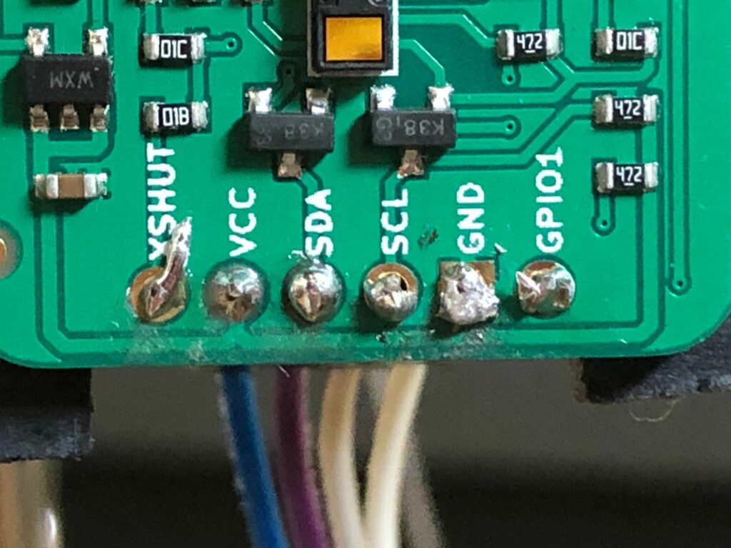
This pressure intensified when I saw that the sensor came without the necessary pins soldered on. I am SO bad at soldering. I once participated in a soldering course as a child where we had to build a radio from a kit, and I just couldn’t get it to work because of my horrible soldering. The short anecdote aside, I had no choice but to try it. The result is quite appalling (even my supervisor said so) but it sort of works. Here is a picture that illustrated my shortcomings:

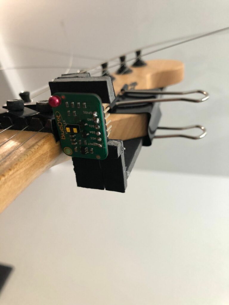
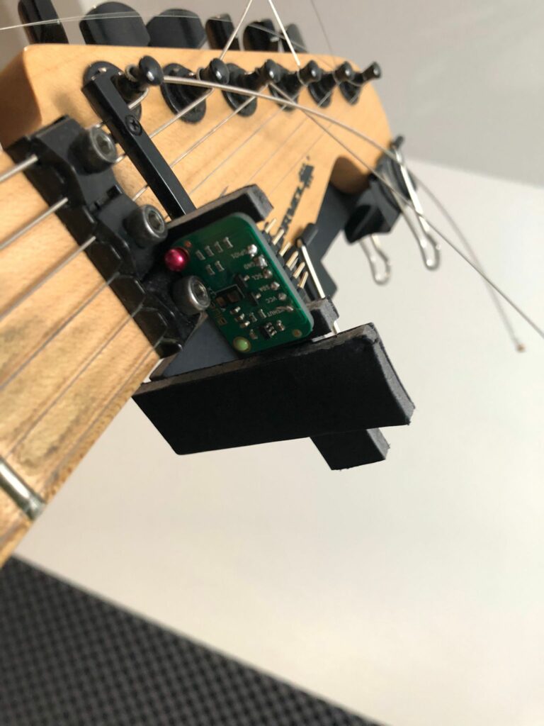
I now had to built rigs to attach it to my guitar. The design of the rigs is closely based on the rigs already built for the ultra-sonic sensors, using the same material and technique. I first build a rig that places the sensor on the underside of the neck. When trying out the VL53L1X sensor using rig #1, I noticed that when playing a solo my forefinger is placed a little bit before the actual fret it is fretting, and I figured that maybe I need to adjust the sensor in this regard. However, when playing a barre chord for example, the finger position is straight on the correct fret – this could evolve into a real problem.

I decided to build a second rig that places it horizontally on the neck itself in order to see if this position solves this problem. I will keep you updated on the results.

I tried rig #1 with quite good results but still have to try out rig #2. After dropping it for the third time, I also gave in to the pressure of working with one single expensive VL53L1X sensor and bought the three VL53L0X just in case. This project is getting quite expensive, and I wonder if there is a possibility to receive some funds from the KUG or FH…

Here comes the ToF sensor Part 1

The proceedings described in this blog post took place quite some time ago before other projects forced me to put my guitar project on the backburner. I also did not have time to put my advancements into writing – until now. Today is a nice sunny day so I decided to sit on my balcony and write this post which is long due anyway.

Short recap: In my last post I mentioned problems concerning the tackling of finger placing when playing the guitar since Fingers placement on the fretboard is:

  1. Different according to how the guitar is played. The hand and finger position differs for example when Barre chords are played compared to when single notes/a solo is played.
  2. Not like a flat surface (which is ideal for the ultrasonic sensor) but instead quite inconsistent and I think that sometime the sensor does not “know” which finger or other part of the hand is the relevant point from which to measure the distance from.

I had the growing concern that the ultra-sonic sensor is not the right tool to pinpoint the location of the fretting hand along the neck and after consulting with my project supervisor we decided to try our luck with a so-called time-of-flight (or ToF) sensor that measures distance using light not ultra-sonic sound. My supervisor recommended me several types but and I started comparing their specs.

But first of all, what are “time-of-flight” sensors? According to a trusty and very helpful blog called “Wolles Elektronikkiste”, these kinds of sensor work (as the name suggests) with the time-of-flight (ToF) principle. They emit light rays and measure the distance according to time passed until the reflected rays reach the sensor again. This makes them very similar to the ultra-sonic sensor, but they work optically. The rays I mentioned are in fact infrared (IR) rays emitted from a Vertical Cavity Surface-Emitting Laser (VCSEL) which features a wavelength of 940 nanometers (nm) – a wavelength outside the spectrum of visible light. Furthermore, the sensors use so-called Single Photon Avalanche Diodes (SPADs) (this detail will become more useful down the (blog) road).

On my quest to find the ideal ToF sensor, I looked more closely at the VL6180X, the VL53L0X and the very similar VL53L1X.

A quick search verified that the VL6180X is unsuitable for my project because of its limited range of 20 cm. As mentioned in one of my previous blog posts, I am working with a Charvel guitar whose scale length is 64,8 cm with the neck measuring approximately 40 cm so consequently, 20 cm of range is too short.

The next choice between the VL53L0X and the VL53L1X proved to be more difficult, and I have not reached a final decision yet. Again “Wolles Elektronikkiste” provided me with a useful blog comparing these two sensors. They have a lot in common as far as voltage range and pinouts are concerned and the communication is via I2C for both sensors. The article describes the range as the most obvious difference between the VL53L0X and VL53L1X with the first reaching two meters and the latter up to four meters. These two ranges are both more than enough for my applications, so I still had no obvious favorite.

I will insert a cliff hanger here to keep the suspense alive: Which sensor will I choose? Read my next blog to find it out!

Sources:

VL6180X – ToF proximity and ambient light sensor • Wolles Elektronikkiste (wolles-elektronikkiste.de)

VL53L0X and VL53L1X – ToF distance sensors • Wolles Elektronikkiste (wolles-elektronikkiste.de)

My Poster of the Future Journey

On Tuesday this week, one of the major projects of the semester came to an end: the poster of the future. Over the last two weeks this project kept me quite busy, and I had little time for something as complex as my guitar project and related blog posts. To make up for at least one blog post, I decided to dedicate this blog to my poster of the future project-journey.

It all started back in January, still in the first semester. We were tasked to come up with an idea concerning a “poster of the future”, thinking about how a poster could look like in the future and which themes it could possibly address. The finished results would then be presented in an upcoming exhibition in September. The project aimed to foster the interaction between the majors but at first, only the majors Sound Design and Communication Design were involved.

I teamed up with a colleague, who studies Communication Design and we thought about future problems or issues that may arise in the future. We did not want to go with obvious choices such as climate change or too much screen time (which would have been the easier and better (?) choices in retrospect). After some time (and partly inspired by me watching Blade Runner 2049), we came up with the topic of advanced, intelligent robots and how they will be treated in the future – will the be enslaved or used for work deemed unworthy for humans? In terms of poster and sound, we wanted to show a human hand that was a robot’s underneath, accompanied by sound that changed from analog to digital sounds and instruments.

With this idea, we started into the second semester where the whole project and its importance were blown up immensely. Suddenly, all majors were to take part and every student should not only do his or her own project but in addition had to partner up with another student and help him or her out.

Furthermore, the second semester also marked the beginning of my colleague and me erring from project presentation to project presentation, desperately trying to come up with a consistent concept that satisfied the demands of our two main lecturers. At first, we were pretty happy with the idea but the lecturer responsible for Communication Design changed from the first to second semester and our idea had to change as well.

We followed the suggestion of the COD lecturer to pursue the concept of eroticism and how it might be perceived in the future. We had several ideas that were rejected sooner or later because they did not fill the teachers’ expectations. Finally, we stumbled onto the term of erobotics, describing the possibility of intimate human-robot relationships in the future. We clung to that topic and (with the help of the SD lecturer) came up with the idea of three people telling their friends about their intimate experience with a robot. To ensure the authenticity of the narrations, we hired three to-be actors that I knew from a film project we did during the first semester. The actors proved to be quite costly, but they did a great job and at the end of the day I had three authentic tales to work with. In the meantime, my colleague had to let go of illustrations and was told by her lecturer to use photos instead. She photographed close-ups from machines, and I installed a mechanism that allowed for triggering the actors’ stories by touching the photos.

The last hurdle was to come up with a sound design concept underlining the actors’ recordings. I was already pretty happy with the recordings and with the messages they conveyed so I had a hard time coming up with additional sound design just for the sake of it. My lecturer suggested using abstract sounds. The thing is I cannot relate to abstract design – visual and auditory. I never stood before an abstract painting and was overwhelmed with emotions. However, I saw my fair share of realistic paintings all over Europe and was always in awe. Maybe it is because I do not understand it, but I just cannot relate to abstract art and am never impressed by it.

But here we go. I recorded some ASMR sounds that admittedly turned out pretty good. However, I tried to go for something realistic for one more time and modeled acoustic backgrounds that placed the three actors in three different but plausible environments where they would tell their stories in real life as well. However, I was then again remined that the abstract way is the right way, and I changed the whole thing again and came up with an abstract concept I could halfway relate to. By then, I was already hoping that our poster would not be chosen for the exhibition.

Not counting a one-hour-delay, the final presentation went quite well with the touch function working like a charm.

I am now glad that the project is over. Although it was a real struggle, I am reasonably happy with the results, and I think that we did our best. I do not see my future in sound installations and exhibitions so I will not be extraordinarily sad if our project does not get chosen. In retrospective, we should have decided on something more straightforward than erobotics and it would have saved us some nerves. Additionally, I have to say that I would have wished for more acceptance of our own ideas. Somewhere in the middle of the project I began thinking about what kind of sound design would please my lecturers instead of thinking what kind of sound design I would like our poster to have.

However, I also have to mention that I really enjoyed doing the sound design for another student’s project. It involved composing four songs of four different genres (jazz, rock, retro pop, classical) and this is where I feel truly comfortable.

Experiment 1: Generierte Ornamente

Formen werden bestimmten Bedeutungen zugeschrieben, die sich in etwaigen Kulturkreisen unterscheiden. Stickereien können dabei diese Kulturkreise beschreiben. Gerade in den slawischen Völkern, sind geometrische Formen tief verwurzelt und können in verschiedenen Abwandlungen anders interpretiert werden. Eine der größten Hürden in der Komposition von Ornamenten, ist die präzise Verarbeitung. Es reichen wenige Millimeter an Abweichung, um das gesamte Muster zu zerstören. Viele Jahre an Erfahrung und Übung sind nötig, um exakte Sticktechniken perfekt zu beherrschen. Durch die heutige Technologie, ist es uns möglich eine Annäherung zu dieser erstrebenswerten Perfektion zu gelangen, denn was die menschliche Hand nicht zu 100% schafft, ersetzt eine Maschine.

In diesem Experiment wurden in zwei verschiedenen Programmen getestet, in wie weit ein Ornament perfekt generiert werden kann. Das Ornament besteht aus einem Quadrat, dass mittig positioniert ist und aus vier halbierten Quadraten, die dieses umkreisen. Der Abstand zwischen dem mittigen Quadrat und seinen halbierten Quadraten, beträgt die Breite der Linien.

1. Adobe Illustrator

Als Communcation Designer, ist die Verwendung von Adobe Illustrator gang und gäbe. Tatsächlich besitzt das Programm einige Lücken was die präzise Ausführung des Ornaments betraf. Viele die Illustrator verwenden, kennen das Problem: das Programm, schafft es nicht genau zu zeichnen. Digital kann das Ornament zwar exakt aussehen, würde dieses aber gedruckt werden, kann das Programm nicht garantieren, dass es nicht zu leichten Abweichungen kommt. Wenn wir sehr nahe an das Ornament heranzoomen, kann eine Abweichung erkannt werden, die sich sehr schwer korrigieren lässt.

2. Processing

Abhilfe hier kann tatsächlich das Programm Processing schaffen. Durch Coding können mathematisch exakte Formen konstruiert werden. Dafür wurde ein Code generiert, der sich in allen möglichen Maßen abändern lässt. Lediglich die Werte im Code müssen ausgetauscht werden. Die Form bleibt jedoch bestehen.

size(800,800);
translate(width/2, height/2);
//rect(0,0, -75, 200); // hidden rectangle
noFill();
noStroke();

fill(255,0,0);
rect(0-75,0+75,150,-25);
rect(0-75,0+75,25,-150);
rect(0+75,0-75,-150,25);
rect(0+75,0-75,-25,150);

fill(255,0,0);

for (int i = 0; i <= 3; i++) {
rect(0-50, 0+200, -25, -100);
rect(0-50, 0+100, 125, 25);
rect(0+50, 0+100, 25, 100);
rotate(radians(90));
}

Welche Methode für das generieren von geometrischen Formen genutzt wird, ist besonders eine Entscheidung der eigenen Fähigkeiten und Präferenzen. Nicht jeder kann Codieren und das Erlernen davon, kann auf den ersten Blick sehr abschreckend wirken. Nichts desto trotz, ermöglicht Coding genaueres Arbeiten und kann so für bestimmte Projekte, für die es wirklich auch Sinn macht, genutzt werden.