Further automotive AR examples

| continuing my last blog entry on examples

In the past week I was searching for further examples of AR implementation in car’s user interafaces. Currently, after three weeks of research in this topic I have the impression that the industry is mainly focusing on visual augmentation as a help for the driver. Here are some further examples that offer some new aspects and features.

GMC Sierra HD trailer camera

The 2020 GMC Sierra HD pickup truck featured a novel implementation of AR technology. The truck was designed to tow heavy duty trailers and has in sum 15 cameras to help the driver navigate the really large truck. One camera can be mounted at the back end of the trailer looking at the road behind. This image can then be displayed added to the built-in rear camera view of the truck, letting the trailer almost disappear. [3]

I personally find the solution to be a nice gimmick but would actually question its practical benefit. The view for sure doesn’t help manoeuvring with the attached trailer.
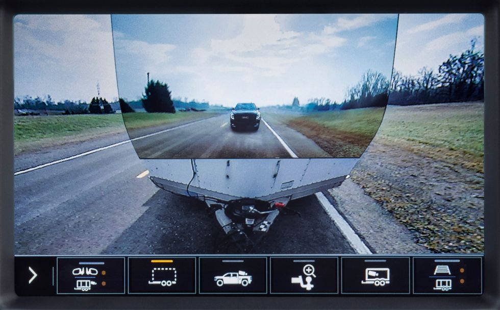
GMC trailer camera [3]

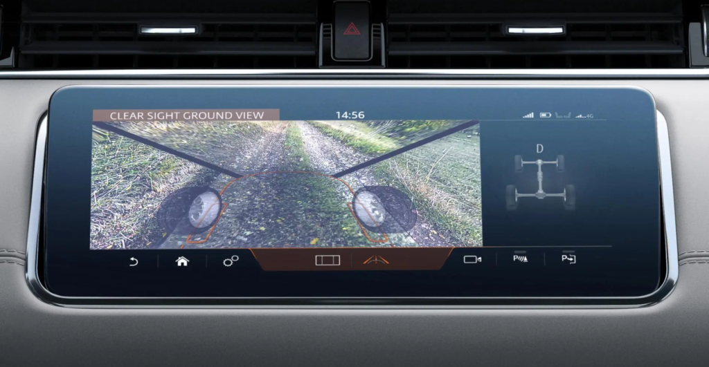
Land Rover Clearsight ground view

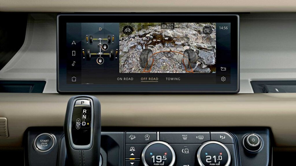
Looking at special utility solutions, LandRover also implemented a camera augmentation in the Evoque and Defender models – on the main screen. The system works with cameras on the side mirrors and on the front grille and help the driver to see a 180° ground view in front of the car and between the front wheels, below the normal vision field. As LandRover targets off-road enthusiasts, this feature could be welcomed for showing any dangerous obstacles on rough terrains, or simply when climbing steep hills. A similar system is also implemented in the higher-class Bentley Bentaiga SUV. [7]
Besides this “transparent bonnet” system, the company Jaguar-LandRover was also conducting research also on a “transparent pillar” solution. That should help drivers in a more urban environment to see their surroundings in 360°, including objects hidden by the roof’s pillars with the help of cameras and AR. The research was done in 2014 and I couldn’t find any further outcome of the idea. Additionally they have also shown a unique way of AR navigation help: a ghost car projected in front of the driver that has to be followed along the route. [8] [9]
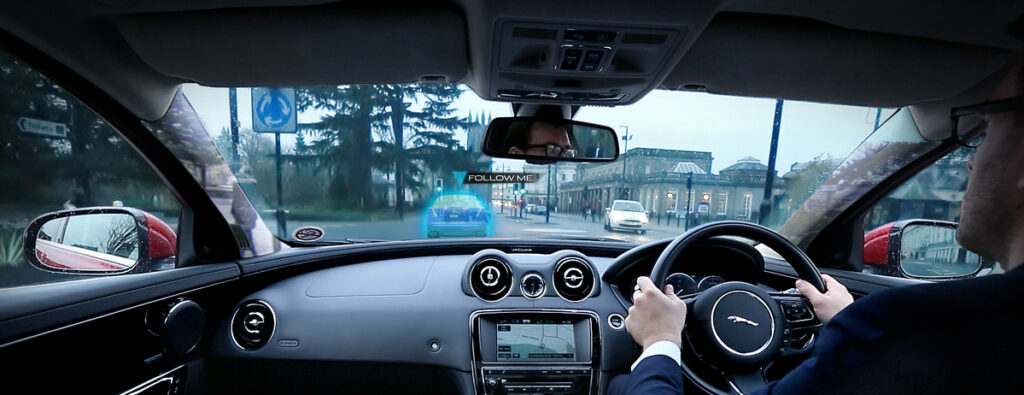
Jaguar transparent pillar and ghost car concept [8]

Panasonic’s state-of-the-art AR HUD

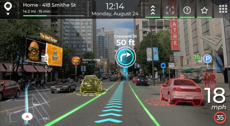
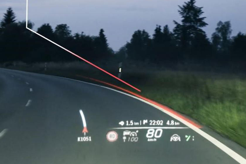
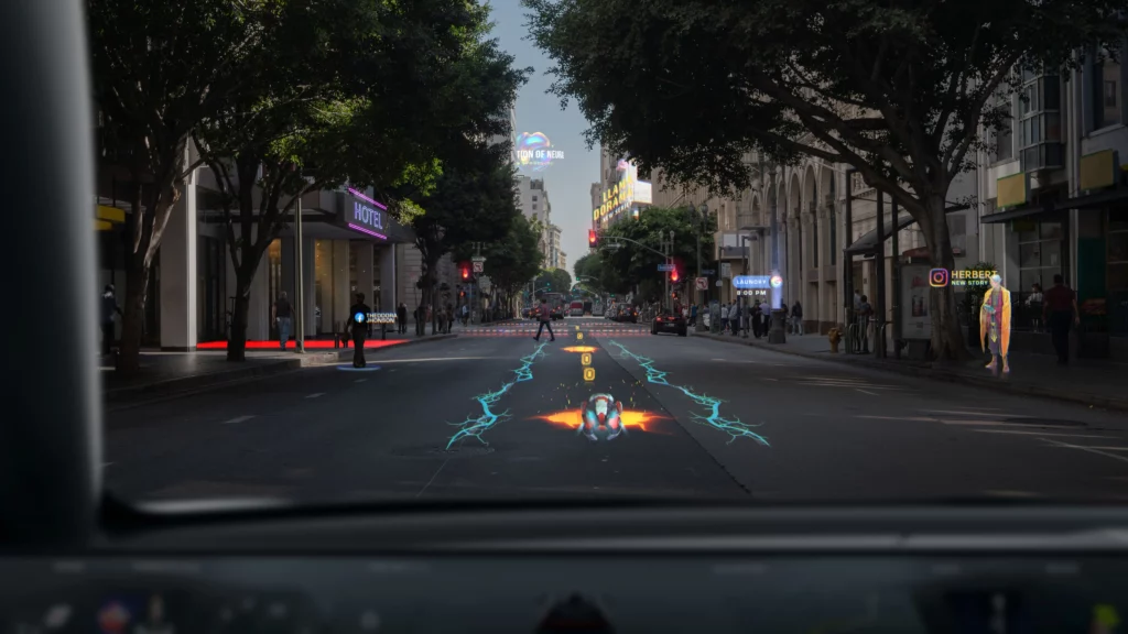
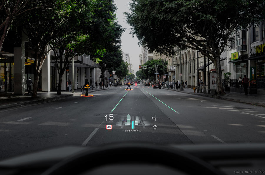
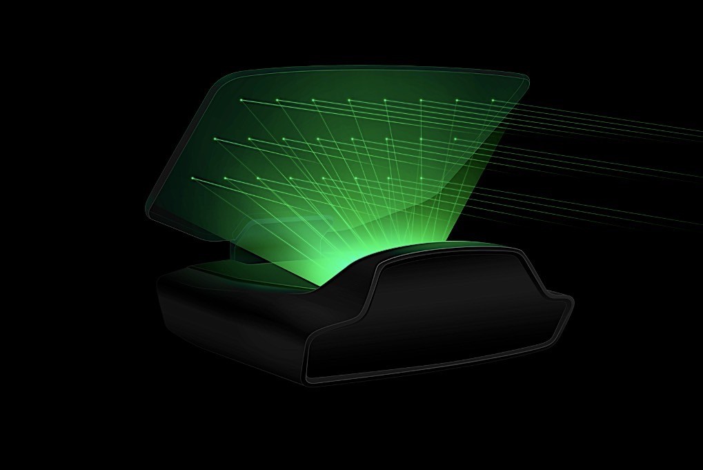
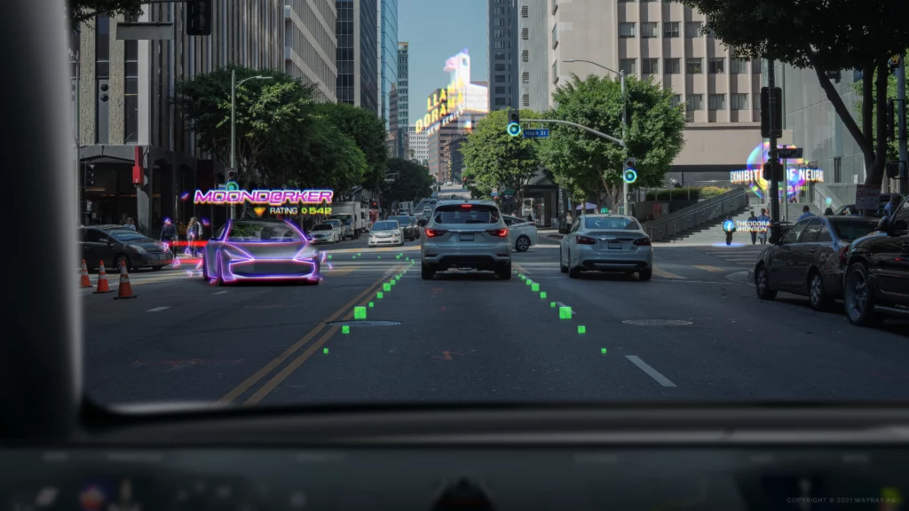
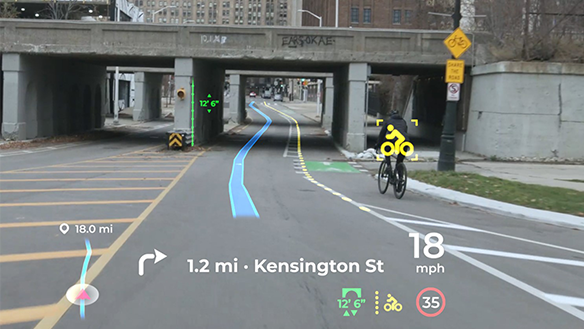
Panasonic Automotive is an other supplier (like Continental, etc.) who is developing onboard systems for automotive OEMs, like an AR Head Up Display with high-end features. Their product was shown on the latest CES 2021 exhibition and is claimed to get implemented in a series production car of an unknown brand in 2024. The system stands out from the other existing HUDs in following features:

  • AI software for 3D navigation graphics, supporting smooth responses to sudden changes ahead of the car. It also uses information from all the onboard ADAS systems (e.g. a 180° forward facing radar with 90 m range) and generates updates in less then 0,3 seconds. (the spatial-AI, AR navigation platform is a patent by Phiar)
  • Eye tracking technology to ensure that the driver always sees the projected information on the right place at any head movement.
  • Vibration control: image stabilization for bumpy roads.
  • Advanced optics, 4K resolution with laser and holography technology (by Envisics).

[5] [6]
To cover all relevant sensory fields in a car interior interface, next week I want to focus on the topic of haptics and tactile feedback solutions on the market.

Sources

[1] YouTube video from Roadshow: Car Tech 101: The best ways AR is being installed in cars | Cooley On Cars. Retrieved on 11.12.2021.
https://www.youtube.com/watch?v=PHhvCRexjWQ

[2] YouTube video from Roadshow: 2020 GMC Sierra HD: Heavy-duty hauler debuts “Transparent Trailer” tech. Retrieved on 11.12.2021.
https://www.youtube.com/watch?v=U0gZ9HaCWsA

[3] Online article by Road And Track: The 2020 GMC Sierra HD Can Make Your Trailer “Invisible”. Retrieved on 12.12.2021.
https://www.roadandtrack.com/new-cars/future-cars/a26009122/2020-gmc-sierra-heavy-duty-invisible-trailer/

[4] YouTube video by About Cars: Panasonic’s Innovative Augmented-Reality HUD Could Be in Cars by 2024. Retrieved on 12.12.2021.
https://www.youtube.com/watch?v=cLgMnSTSxog

[5] Online article by Panasonic: Panasonic Automotive Brings Expansive, Artificial Intelligence-Enhanced Situational Awareness to the Driver Experience with Augmented Reality Head-Up Display. Retrieved on 12.12.2021.
https://na.panasonic.com/us/news/panasonic-automotive-brings-expansive-artificial-intelligence-enhanced-situational-awareness-driver

[6] Online article by Auganix.org: Panasonic collaborates with Phiar to bring real-world AI-driven Augmented Reality navigation to its automotive solutions. Retrieved on 12.12.2021.
https://www.auganix.org/panasonic-collaborates-with-phiar-to-bring-real-world-ai-driven-augmented-reality-navigation-to-its-automotive-solutions/

[7] Online article by Car Magazine: Does it work? Land Rover’s ClearSight handy X-ray vision tech. Retrieved on 12.12.2021.
https://www.carmagazine.co.uk/car-news/tech/land-rover-clearsight/

[8] Online article by Autocar: Jaguar Land Rover previews transparent pillar technology. Retrieved on 12.12.2021.
https://www.autocar.co.uk/car-news/new-cars/jaguar-land-rover-previews-transparent-pillar-technology

[9] Online article by Jaguar: Jaguar Land Rover Develops Transparent Pillar And ‘Follow-Me’ Ghost Car Navigation Research. Retrieved on 12.12.2021.
https://media.jaguarlandrover.com/news/2014/12/jaguar-land-rover-develops-transparent-pillar-and-follow-me-ghost-car-navigation

Productivity tool: MS teams

Since my studies at FH JOANNEUM University of applied sciences, I have had to use a tool imposed by the University to communicate by video conference with our professors and organize meetings between students on the progress of projects. Since the university imposed the use of this tool, I have been able to explore the many possibilities that the application could offer through its pedagogical use (writing comments, responding to information, delivering documents, etc.). The university has imposed the use of this tool on students and teachers since the covid-19 epidemic to continue the courses in a synchronous or asynchronous. Since the event, the tool is used to its full potential to ensure the continuity of online courses. Before I started using the software, I was a bit reluctant to have to download it to use it daily, because I did not know all the possibilities that this tool could offer. It took me some time to master them after short use. Some of the tasks I performed while using it took a long time to be accomplished, and I repeated the mistakes in a redundant way that sometimes I gave up. After a short week of immersion in this software, it was almost impossible for me to forget the steps to perform the tasks. The tasks to be performed seemed more and more obvious to me, whether for collaboration or document sharing. This allows me to conduct a small usability study of this software.

Microsoft Teams is a collaborative workspace that acts as a central hub for workplace conversations, collaborative teamwork, video chats, and document sharing, to enhance user productivity through a multitude of possibilities.

Since the covid-19 pandemic, there have been 75 million daily active users through this software. It was a boon for academic institutions to continue classes efficiently. Microsoft reported 2.7 billion meeting minutes recording on 31 March 2020. And most of the active time is spent on calls and video conferencing.

persona snapshot

Target group

In a general sense, the software is accessible to everyone. But Microsoft has positioned itself to provide a solution for academic and professional institutions due to the pandemic by bringing new features. The most particular targets for universities are students and teachers who have a regular grip on IT tools, especially students who are, for the most part, born of the Z generation. They are, therefore, digital natives who have a better understanding of the uses and are more likely to adapt to a digital transition.

Sources:

[Data Safety #1] Do you like ‘cookies’?

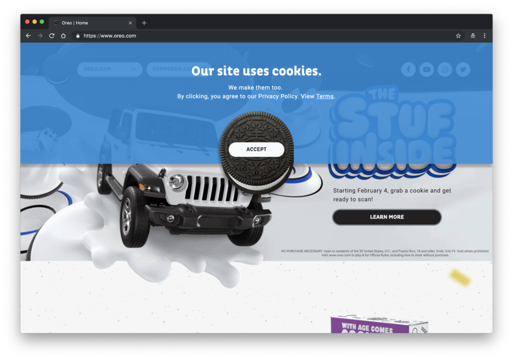
Perhaps when you have read the title, it has come to your mind a picture of those sweets made of butter, milk and flour; and even perhaps you have imagined them with chocolate chips. However, the question was about the new ‘cookies’ of the web pages, maybe this image sounds to you:

Oreo Cookies

In case you didn’t know, cookies refer to the pieces of data that the website collects from users. Before 2018 it was optional to ask users for permission to collect such data, but upon approval of the General Data Protection Regulation (GDPR) by the European Commission it is mandatory that users give their consent both for the websites to collect their data and for what they can use them.

This gives UX/UI designers the obligation to know the rights of users with respect to data protection and to communicate them in the best possible way. It is a new role and very important, since it is very complicated to establish a design that balances the right to information and a clear, direct and efficient communication. Because if it’s not usable, it’s also not safe.

Questions about accepting the privacy policy are necessary and also a tool to empower the user, however, most users are annoyed. This is due to many issues, which we must research about, but above all it is because of the constant appearance of tabs and windows that pop every time they enter a new website, interrupting them for their original purpose. This leads many times to the user accepting the terms and conditions without even knowing what they are doing. Avoiding this situation is in our hands as designers, and it is also our duty.

Data Protector

The purpose of these small pills is to provide the necessary tools and information to designers (and, of course, interested people) on this new issue. I have divided the deliveries into the following topics:

  1. User’s rights.
  2. Brief summary of interviews.
  3. Dark Patterns. Practical Examples.
  4. White Hats. Practical Examples
  5. Role of UX/UI designers.
  6. Research’s conclussions.

Follow the deliveries if you want to know more. For now, i leave this video to warm up.

See you!

How to deceptive design pattern

This week I’ve been looking at what makes good design and what rulebooks can be consulted. Conversely, I thought about whether these could be used as a guide for creating deceptive design patterns* by following the respective opposite. Therefore I reviewed rules, principles and heuristics from design legends and usability experts like Ben Shneiderman, Don Norman, Dieter Rams and Jakob Nielsen. And this would probably work pretty well.

Rule 1: Aim for inconsistency

Strive for consistency (Ben Shneiderman)
Consistency (Don Norman)
Consistency and standards (Jakob Nielsen)

If an interface is not coherent the user will have a hard time to operate and navigate. Therefore it is more likely that he makes a mistake by selecting options he did not intend to. Example are to switch „Yes“ and „No“ buttons or introduce new functionalities to established triggers.

Rule 2: Do not provide any feedback

Offer informative feedback (Ben Shneiderman)
Feedback (Don Norman)
Visibility of system status (Jakob Nielsen)

By not giving back information about the last action or current system status, users will not recognize mistakes made. As a result they will carry on with the process until it is too late to reverse it. For example, warnings should be refrained from issuing as additioal costs are added.

Rule 3: Make reversal of action as hard as possible

Permit easy reversal of actions (Ben Shneiderman)
User control and freedom (Jakob Nielsen)

By making it impossible to go back one step without reloading the entire page and loose all previous actions, users might be persuaded to stick with their minor mistakes. Additionally reversing a completed process, like a subscription, should be fairly difficult for example by only providing analog cancellation. 

Rule 4: Make interface utmost unclear

Good design makes a product understandable (Dieter Rams)
Help and documentation (Jakob Nielsen)

If the user is not completely sure how to reach his goal and there is more than one possibility how it could work out, he would just have to guess. Therefore he might complete unintended actions. A common tool for this strategy is implementing trick questions.

Resumé

To sum it up it is the opposite of Dieter Rams famous principle: „Good design is honest“.

If these rules were actually applied to the entire interface, users would probably give up before they could be manipulated. Nevertheless, some similarities and contrasts to deceptive design patterns* can be found here. Thus, it would be a possibility to establish so-called “light patterns”.

Even if this blog entry contains less scientific facts, it was an exciting change of perspective for me. Next time I am going back to psychology and dive in deeper.

Sources:
Norman, Donald A., and Basic Books Verlag. The Design of Everyday Things. Revised and Expanded ed. 2013. Print.
Nielsen, J. (1994a): Enhancing the explanatory power of usability heuristics. Proc. ACM CHI’94 Conf. (Boston, MA, April 24-28), 152-158.
Dieter Rams: The power of good design. In: https://www.vitsoe.com/us/about/good-design
Shneiderman, B., Plaisant, C., Cohen, M., Jacobs, S., and Elmqvist, N., Designing the User Interface: Strategies for Effective Human-Computer Interaction: Sixth Edition, Pearson (May 2016)

* formerly called “dark pattern”

Everything you need to know about new urbanism

New urbanism is a term describing how cities should create better futures for all of us. It’s about place-making and fixing or creating compact new towns and villages for people to thrive in.


Principles of new urbanism are

“walkability” – as the 5,10,15 principle from Le Corbusier.

Connectivity – meaning how infrastructure should disperse traffic and ease mobility.

Mixed-use and Diversity – of both building, people and culture.

Mixed housing – providing a range of houses in size, price and proximity.

Quality Architecture and Urban Design – to emphasize aesthetics, a sense of space, and sites within community.

Traditional neighborhood structure – with public spaces at center, invisible city centers and boarders, and transect planning.

Increased density – higher concentration of people, services and resources.

Smart transportation – to connect cities and neighborhoods

Sustainability – to have a minimal environmental impact, with more local production, respect for ecology and value of natural systems.

Quality of life – as a sum of all the principles to create a high quality of life with places that enrich and inspire the human spirit.


The most important benefits of new urbanism is a healthier lifestyle with less stress, with more opportunities to get to know others in the neighborhood. More freedom and independence to children and elderly because of proximity and ease of mobility. Also diversity of business will help people get jobs easier.

Other important aspects are the increased level of community involvement as a result of people taking part in the community and knowing other residents. Also faster approvals will occur in communities that have adopted smart growth principles resulting in cost/time savings. Mixed-use properties for sharing of spaces throughout the day and night. Less spent per capita on infrastructure and utilities. Less crime and less spent on policing due to presence of more people day and night. Less resistance from community, and greater civic involvement of population leading to better governance.

For the next chapter I will discover what place interaction design have taken in the domain of city development. I will research how meaningful interaction between people to facilitate wellbeing. To search for more specific meaning I will later decide between the different levels of development, being: a single building, groups of buildings, the urban block, the neighborhood, towns, cities and regions.

http://www.newurbanism.org/ ­­

Who dreams big nowadays?

The hottest newest coolest projects of utopian city planning is a city called Telos. The project is partly funded and ran on initiative by billionaire Marc Lore, famously known as the Lebron James of E-commerce. The city will be built in the desert from the ground up, as a resurrection of the idea of cities built from blank slates. The world Telos, meaning a higher meaning in Greek stems from the cities vision to be the most open, most fair, and most inclusive city in the world.

Telos as a vision will be reached partly through a economic concept coined equitism, describing how citizens have a stake in the city. All citizens will partly own the city they live in, meaning they will have a stake in the city. When the city does better, the residents do better and visa-verse. The city is setting out to be a form of inclusive growth to combat the increasing inequality that’s taking place in the US. An extension of this idea is to track the taxes of inhabitant. As a result, all inhabitants will be aware of exactly where their money is going.

Some of the downfalls of previous utopian projects have been the lack of human perspective, as I wrote in my previous post “Utopian Retrospect”. Marc Lore however tends to change that perspective into developing a city not only for the people, but with the people.

“Cities that have been built to date from scratch are more like real estate projects, they don’t start with people at the center.”

Marc Lore, said in a promotional video

Another emerging project that is settling to stretch the boundaries of city design is the so-called Woven city placed at the foot of mount Fuji. The city is powered by Toyota to be a space of testing innovative technologies in cities, such as autonomous vehicles, AI-health tracking and big-data surveillance for inhabitants wellbeing.

the Woven City will explore ways to stimulate human interaction in the urban space. After all, human connectivity is the kind of connectivity that triggers wellbeing and happiness, productivity and innovation.”

Bjarke Ingels, in an interview about the Woven City

Both projects are examples of new urbanism approaches, which I will cover in the next chapter of my blogs

https://www.mckinsey.com/featured-insights/urbanization/urban-world-cities-and-the-rise-of-the-consuming-class

https://nypost.com/2021/10/19/marc-lores-woke-city-will-screen-settlers-for-diversity/

https://edition.cnn.com/style/article/telosa-marc-lore-blake-ingels-new-city/index.html

https://edition.cnn.com/style/article/ces-toyota-big-smart-city/index.html

When do we make decisions?

To get people to make better active decisions, we first have to look at when those decisions are made. I spoke to several people when trying to figure this out and it seems like it all comes back to feelings, which is not that weird when you think about it. However, it means that for everyday decisions, for most people, we can rule out trying to appeal mostly to reason. When it comes to the small but crucial decisions that make up a life we don’t make pro-con charts, we go by our gut feeling. For more important decisions there is also another complicated thing we do, we ask for advice, but we’ll get back to that later. If you go for a run, it’s most likely because you feel like going for a run or it’s part of some plan or system that you feel like following. If you grab that tub of ice-cream in the store it’s because you want ice-cream. Sometimes we also make decisions that are not beneficial to us in the long term because it feels good right now. Like sleeping in, eating unhealthy, laying on the couch for a day or procrastinating. Our urge for satisfaction is stronger than our motivation or willpower to do what we ‘ought’ to be doing. Some ways of influencing this pattern might be to make things that are rewarding in the long term more rewarding in the short term or simply to strengthen your willpower. It seems like the urge to make a decision, good or bad, builds up over time and is finally triggered by something. The more buildup the smaller the trigger can be. Like your unconscious telling you ‘Hey, pay attention to this!’. Maybe it is also possible to make this feeling of urgency build up faster or to trigger it when it is convenient to you.

Automotive AR examples

| looking at some state of the art examples of in-car AR systems on the market

MBUX – the newest infotainment system of Mercedes-Benz

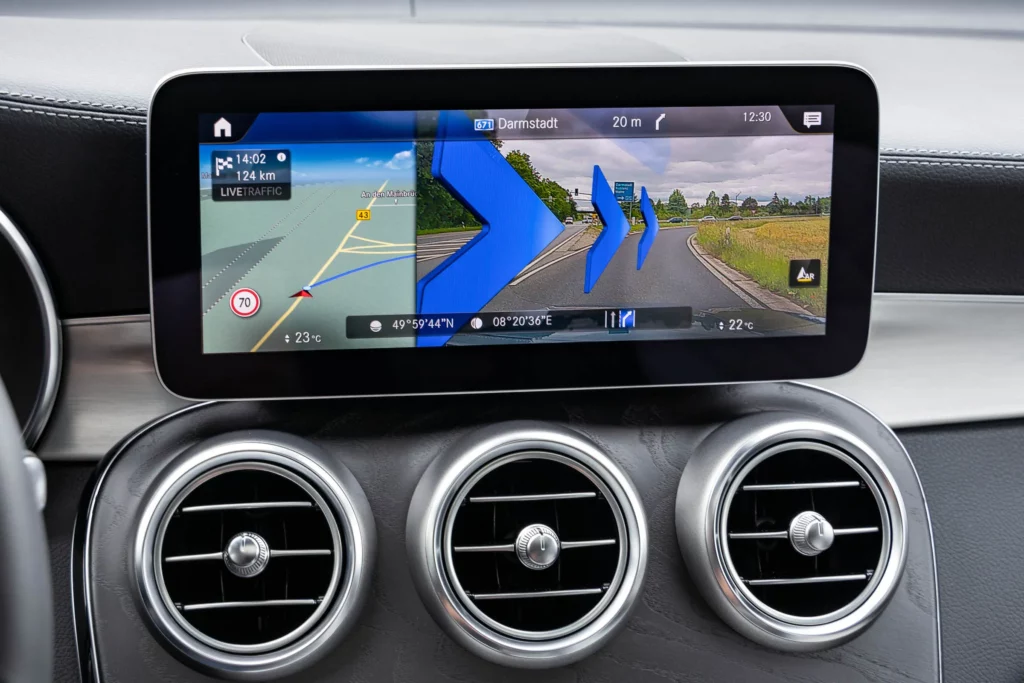
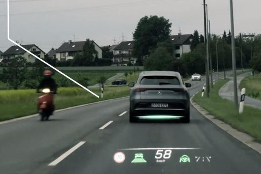
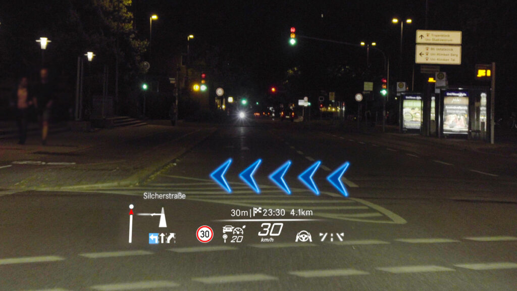
2018 was the year when Mercedes Benz introduced their newest infotainment system called MBUX. This uses the front camera (originally used for parking) to create a live stream of the road ahead, combined with graphics of navigation hints or finding adresses. Since then it was continuosly improved and the latest version was revealed in 2021 in the S/EQS-Class models, featuring an AR navigation display and a HUD with distance assist, lane keeping assist and dinamic arrows showing directions.

Video demostrations of the 2021 MBUX system:
https://www.youtube.com/watch?v=hnRbi5UcJnw
https://www.youtube.com/watch?v=DCgy3askMcM

Audi AR HUD

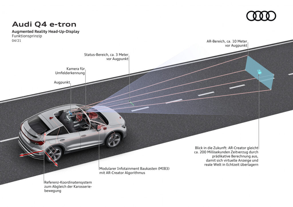
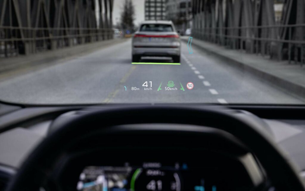
Audi announced their augmented reality HUDs as an optional feature for the newest high-end electric SUV, the Q4 e-tron for 2021. The visual information shown in front of the driver are similar to the MBUX’s content. Audi explicitly defines two areas: the status field (in a visual distance of ca. 3 m) and the AR field (in a visual distance of ca. 10 m), which seems to be bigger than in the German competitor’s solution.

Demo video of the Q4 e-tron HUD:
https://www.youtube.com/watch?v=Ea6o-_smVk8

Hyundai and WayRay

Looking at HUDs further, Hyundai/Genesis was the first brand to implement laser-holographic AR head-up displays in their G80 model, presented by the young AR developer company WayRay in 2019. It is said to have tremendous benefits compared to past HUDs (using reflected LCD screens) in terms of precision and visibility for the driver.

The Swiss startup WayRay claims to be the only company to have implemented holography to HUDs. Their holographic optical elements (HOEs) in their displays should provide unprecedented 3D images while remaining transparent and capable of being bent to windshields. The company presents its uniqueness in the field by covering “deep-tech” holography hardware development (e.g. blue-laser beams) as well as software development, all realised in-house.

They have already received large fundings by Hyundai and Porsche, have presented a 180° AR cockpit experience and offer different add-on solutions for vehicles, boats and airplanes. Their newest project is a shared car concept (“Holograktor”), designed for the “Metaverse” with a complete gaming / working / learning possibility while traveling autonomously. In their cooperation with Pininfarina on a concept car, they proposed solutions of the “True AR” displays also for side windows, providing new ways of passenger infotainment and entertainment experiences.

A report from the FIA Formula E on WayRay’s developments also predicts the use of HUD systems for race cars in the future. The pilots behind the wheels could get visualized ideal racing lines, brake points or a ghost car to chase on the race track.

Hyundai’s In-Car Noise Cancelling

Besides HUDs, Hyundai is pushing the development of AR solutions in cars in other aspects as well. Like in our headphones, noise cancelling also found its way into the car interiors, bringing more comfort to the passengers. According to Hyundai, the earlier systems were only capable of masking steady engine noises, but their newest solution (“Road Noise Active Noise Control”) in the upcoming Genesis GV80 will be capable of deleting different tire noises at different speeds. It uses multiple microphones placed directly into the wheel wells, accelerometers, amplifiers and a digital signal processor. As a result of the complex calculations for each individual wheel, the in-car noise should be reduced by half (3 dB).

Engine sound enhancements

Writing about noises of the car, we also have to take a short look at the opposite effects to noise cancelling – the engine sound enhancement devices. Due to the downsizing of the engine displacements, the roars coming from the combustion got also reduced. To keep the emotions connected to sporty engine sounds though, manufacturers are using additional devices to create compensating sound effects.

These can be pipes from the intake manifold connected to the dashboard walls, in some cases with an extra flap to control the sound throughput only for the sporty driving situations (Toyota, Ford, Porsche).

BMW was known to use engine sound amplification through a synthesised reproduction of the actual engine noise played simply on the car’s speakers.

The Volkswagen Group made it a bit more complicated by adding a special speaker device (“Soundaktor”) below the windshield to produce deep, buzzing tones resembling larger engine sounds. In some models there are also speakers built into the exhaust pipes to alter the natural noises coming from the engine, to make them more emotional or masculin.

Soundmodule for the Mercedes G350d

3D ADAS system of Arkamys

Beeping noises in a car are existent since many years, with the intention to help drivers. But beeping on itself is not always enough to give an understandable signal about what is happening or dangerous around the driver. The company Arkamys presented an intuitive alerting concept for Advanced Driver Assistance Systems – parking, lane keeping, blind spot and other assistants – by placing many different speakers inside the cabin and generating a 3D sound experience. With this it is possible to signalize the direction where a possible danger can exist, making the recognition and processing of the information easier and more intuitive for the driver.

Electric cars

Electric cars are further good examples where in-car noise generators are used to give the driver and passengers the known feeling of vehicle driving dynamics. Porsche is a perfect example where specific sounds are developed for representing the brand’s identity within the driver experience. They call the system “Porsche Electric Sport Sound” that enhances some natural noises of the drivetrain but also reduces disturbing ones, while implementing sounds to compy with the legal regulations for electric vehicle alerting sounds.

Thinking further about sound augmentation in cars, probably the already most spread system is the parking assistant, giving beeping sound feedback on the remaining distance to obstacles around the car. The design of these systems could probably fill a chapter on its own, but as it is already an everday tool, I won’t go further into detail on it.

The above listed examples are not even close to a complete list of use cases. Therefor I want to further research the current technologies. The next step will then be to look into the reasons for these systems, why they were developed and what practical needs, feelings and experiences are the underlying causes.

Sources

Online article on Wired: With In-Car AR, Drivers Get a New View of the Road Ahead. Retrieved on 05.12.2021
https://www.wired.com/story/in-car-ar-drivers-get-new-view-road-ahead/

Article on Wired: Hyundai’s Luxury SUV Mixes Mics and Math for a Silent Ride. Retrieved on 05.12.2021
https://www.wired.com/story/hyundai-genesis-gv80-suv-noise-cancelling/

Online Article on FIA Formula E: How AR and VR are revolutionising the car industry. Retrieved on 05.12.2021
https://www.fiaformulae.com/en/news/2020/june/ar-vr

WayRay – offical website. Retrieved on 05.12.2021
https://wayray.com/#who-we-are
https://wayray.com/press-area/#media_coverage

Online article on WayRay by CNET and Autocar. Retrieved on 05.12.2021
https://www.hyundai.news/eu/articles/press-releases/hyundai-wayray-unveil-next-generation-visual-technology-at-ces-2019.html

YouTube video by Roadshow: CES 2019: WayRay’s holographic AR windshield is real, hitting the road soon. Retrieved on 05.12.2021
https://www.youtube.com/watch?v=HFIgjQI2E6Y

AutoCar article on the Pininfarina concept car. Retrieved on 05.12.2021
https://www.autocar.co.uk/car-news/new-cars/pininfarina-concept-car-showcased-holographic-ar-display

Online article by AutoZeitung: Mercedes entwickelt MBUX weiter. Retreived on 05.12.2021
https://www.autozeitung.de/mercedes-infotainment-192628.html

Mercedes-Benz MBUX System – online articles and images, retrieved on 05.12.2021
https://www.wired.com/story/in-car-ar-drivers-get-new-view-road-ahead/
https://www.extremetech.com/extreme/314758-2021-mercedes-s-class-2-hud-sizes-level-3-autonomy-4d-sound-5-lcds
https://carbuzz.com/news/new-mercedes-s-class-shows-off-amazing-augmented-reality-display

Audi AR HUD system: online article and Youtube video on Slashgear. Retreived on 05.12.2021
https://www.slashgear.com/the-audi-q4-e-trons-augmented-reality-head-up-display-is-dashboard-genius-09662735/
https://www.audi-technology-portal.de/de/elektrik-elektronik/fahrerassistenzsysteme/audi-q4-e-tron-ar-hud-de/

Online article on GeekDad: Augmented Reality for Your Ears. Retrieved on 01.02.2022
https://geekdad.com/2016/02/arkamys/

Image of Mercedes G350d soundmodule. Retrieved on 01.02.2022
https://www.tuningblog.eu/kategorien/tuning-wiki/soundgenerator-nachruesten-232502/

CarThrottle article on sound enhancers. Retrieved on 05.12.2021
https://www.carthrottle.com/post/5-ways-that-manufacturers-enhance-the-sound-of-their-cars/

The Porsche Sound – online article, retrieved on 05.12.2021
https://newsroom.porsche.com/de/produkte/taycan/sound-18542.html

IoT devices for medical applications

Data is driving change in most industries in the past years. Enterprises gathering significant data from users can tailor their experience better to them.

Major tech players have entered the field of Health in recent years. Fitness promotion, health indicators monitoring, and emergency contact are some of the key features that companies like Apple, Samsung, Meta, Fitbit, or Garmin have in their offerings through tracking wearables in form of smartwatches with GPS, Barometer, Gyromenters and an array of medical-grade sensors, like Apple’s FDA Approved ECG sensor in the Apple Watch.

This ability to gather data from the user in a non-invasive and continuous way is great news for health services around the world. Some of the main Health indicators, like blood pressure, oxygen levels, and glucose levels that previously required a visit to the doctor now can be done in real-time and telematic, reducing pressure on a strained health system and reducing cost in an ever-increasing expense for governments around Europe.

Telehealth or remote doctor’s consultations are another great option for non-urgent questions that don’t require a physical appointment anymore and help prevent overcrowded hospitals.

A sensible way to collect data can help health administrators track a population’s overall health and implement policy to help their citizens lead a healthier life because prevention is always a better solution than treatment. An easier and most continuous way of following up with patients via Telehealth is also a better way to ensure that people are on track with their treatment in a more efficient manner.

Literature:

https://blog.kiversal.com/que-es-la-iomt/

https://builtin.com/internet-things/iot-in-healthcare

https://www.businessinsider.com/iot-healthcare

Types of deceptive design patterns

In todays blogpost I want to get a bit more specific and list types of deceptive design patterns* with some extraordinary bad examples for those technique. I am going to use the 12 defined types of deceptive design patterns* from Harry Brignull. 

Bait and Switch

This pattern works with previous experience and common user interactions. The user wants to complete an action, but something different, undesired or even the exact opposite thing happens. The most famous example for bait and switch is the Microsoft update pop-up to Windows 10. Normally clicking the „x“-button in the upper right corner means closing the window without completing any action. In this case they switched the meaning to „Yes, let’s do this update“. Another common strategy is to simply switch „Yes“ and „No“ Buttons for additional add-ons in an e-commerce process.

Source: https://www.darkpatterns.org/types-of-dark-pattern/bait-and-switch

Disguised Ad

In this case ads are hidden and they seem like they are actually part of the interface. Since they look like content or any kind of navigation, users are clicking them assuming it is a genuine interaction of the website. Prime example here are download buttons linking to different websites.

Forced Continuity

This pattern tricks users into continuing any kind of paid membership by charging them after a free trial without a warning or making it really hard to cancel on automatic renewed subscriptions.

Friend Spam

Users grant access to numbers or emails in their phone or connect their social media accounts in order to „find friends“ within this environment, but the product actually spams all contacts pretending to be the user himself. 

Hidden Costs

A design that intentionally hides costs and makes product or service seem cheaper by adding additional costs or fees later on. As the user is already in the checkout process, it is more likely that he continues anyway even after realizing the price change. Usually those hidden fees are delivery costs or service fees.

Misdirection

This pattern is also known as aesthetic manipulation. Focusing the user’s attention on an interaction to distract them from something else. There are many different approaches on how to use this dark patterns as it does not have a simple context like many other types.

Price Comparison Prevention

Showing the price of products or service in a way that makes it difficult for the user to compare two items. One way of achieving this is work with different units and not showing price per weight. Another one is to show prices of products only on each subpage and never next to each other so the user has to remember the price and go back and forth to actually compare them.

Privacy Zuckering

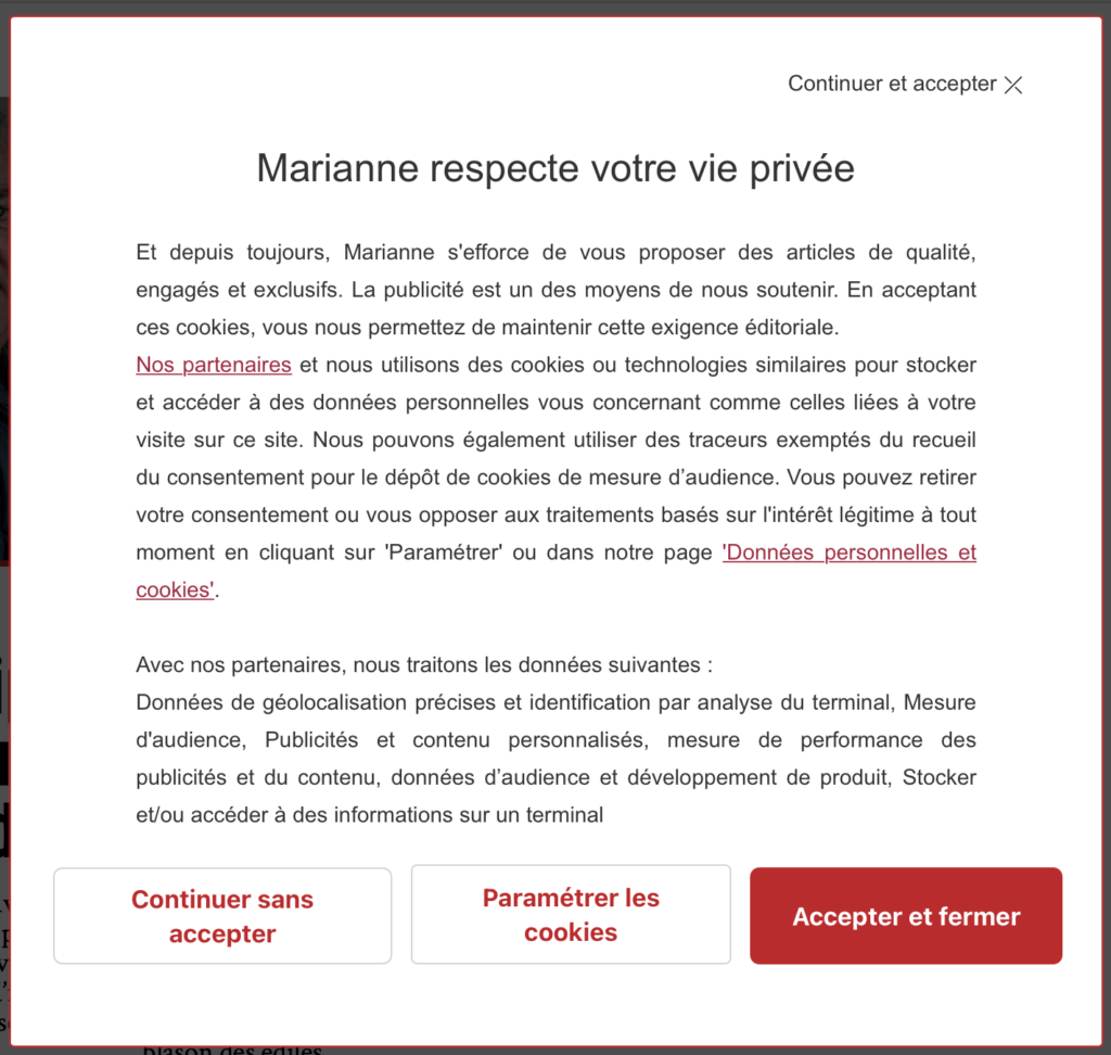
Maybe the most famous of all deceptive design patterns*: tricking users into agreeing to share all their personal information. Most users are aware that cookie-concent-managers make it difficult to opt out on purpose. Additionally this one is regulated by law. 

“X”-Button is not simply closing the pop-up, but accepting all cookies. Screenshot: https://www.darkpatterns.org/types-of-dark-pattern/bait-and-switch

Roach Motel

The model describes that users easily get into a situation, but find it difficult to get out of it. This mostly happens when a user signs up for something quickly, but then is having a hard time to cancel the membership (e.g. with a phone call during business hours).

Users can not cancel by filling out a form, but have to interact with an employee. Screenshot: https://help.nytimes.com/hc/en-us/articles/360003499613-Cancel-your-subscription

Sneak into basket

Sneaking products into the users basket, that they did not add themselves. Sometimes this pattern is justified with making suggestions to enhance the user experience, but actually it is just tricking them into buying something by mistake.

Trick Questions

Using unnatural language, like double negatives, to confuse the user and manipulate their actions. Especially often this pattern is used in forms to get users to subscribe to the newsletter.

That’s it for today 🙂 

Source: Harry Brignull: Types of Dark Patterns. In: https://www.darkpatterns.org/types-of-dark-pattern

* formerly called “dark pattern”