Automotive AR examples

| looking at some state of the art examples of in-car AR systems on the market

MBUX – the newest infotainment system of Mercedes-Benz

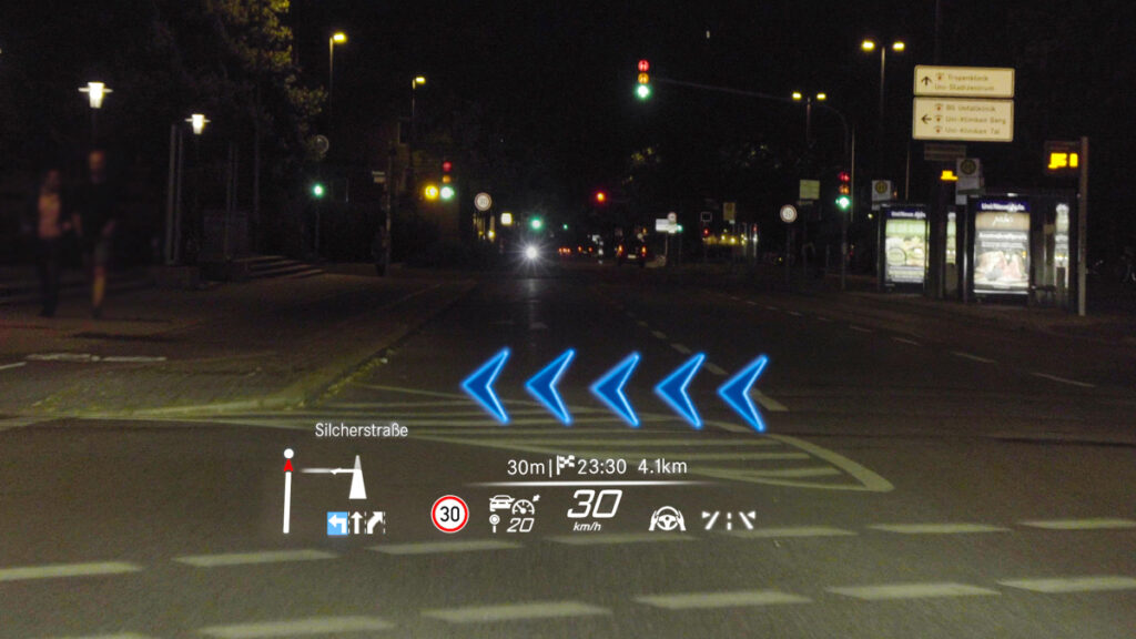
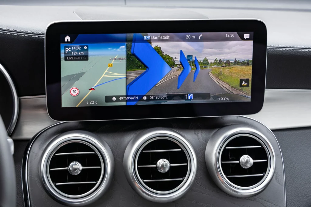
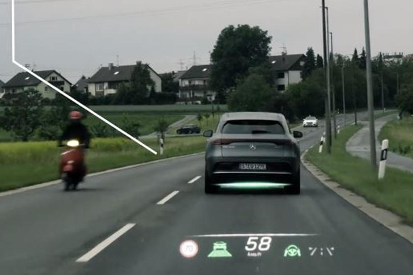
2018 was the year when Mercedes Benz introduced their newest infotainment system called MBUX. This uses the front camera (originally used for parking) to create a live stream of the road ahead, combined with graphics of navigation hints or finding adresses. Since then it was continuosly improved and the latest version was revealed in 2021 in the S/EQS-Class models, featuring an AR navigation display and a HUD with distance assist, lane keeping assist and dinamic arrows showing directions.

Video demostrations of the 2021 MBUX system:
https://www.youtube.com/watch?v=hnRbi5UcJnw
https://www.youtube.com/watch?v=DCgy3askMcM
Audi AR HUD

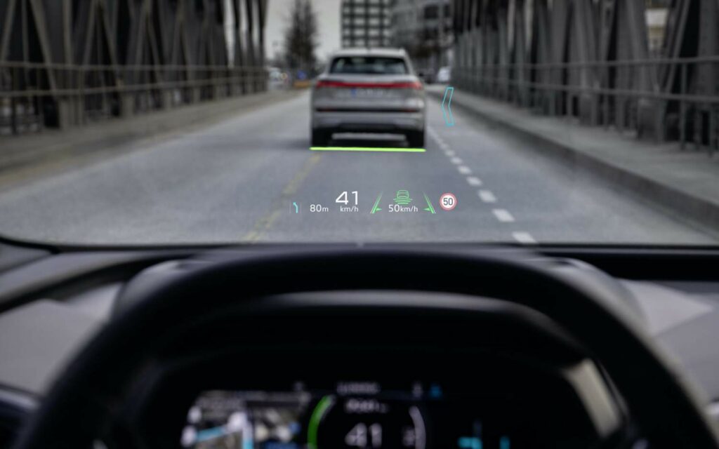
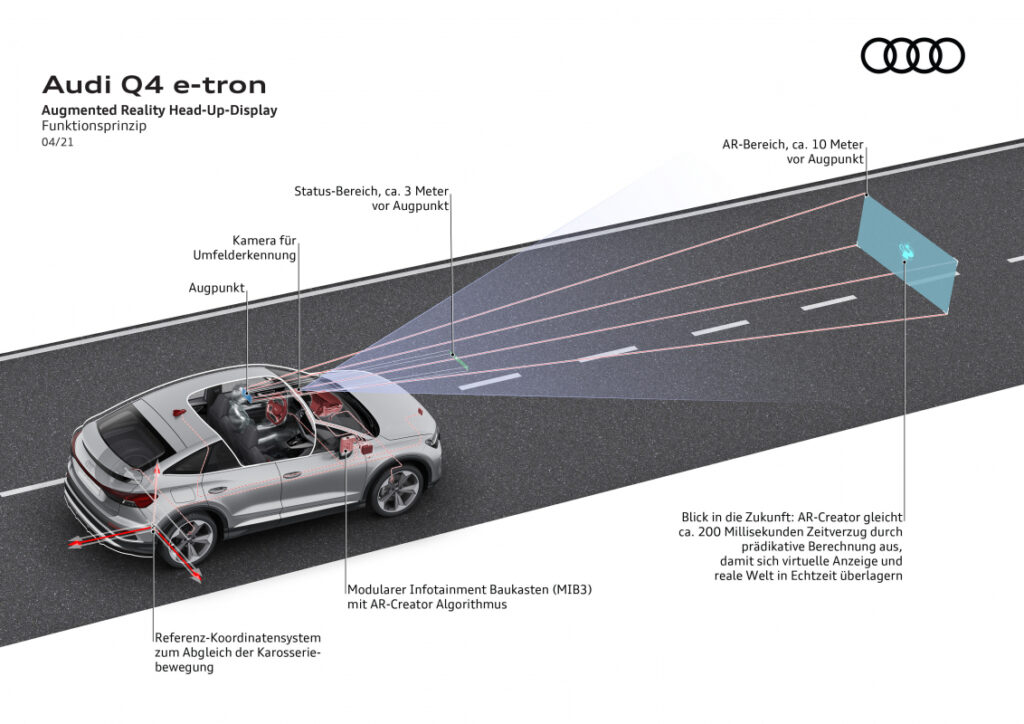
Audi announced their augmented reality HUDs as an optional feature for the newest high-end electric SUV, the Q4 e-tron for 2021. The visual information shown in front of the driver are similar to the MBUX’s content. Audi explicitly defines two areas: the status field (in a visual distance of ca. 3 m) and the AR field (in a visual distance of ca. 10 m), which seems to be bigger than in the German competitor’s solution.

Demo video of the Q4 e-tron HUD:
https://www.youtube.com/watch?v=Ea6o-_smVk8
Hyundai and WayRay

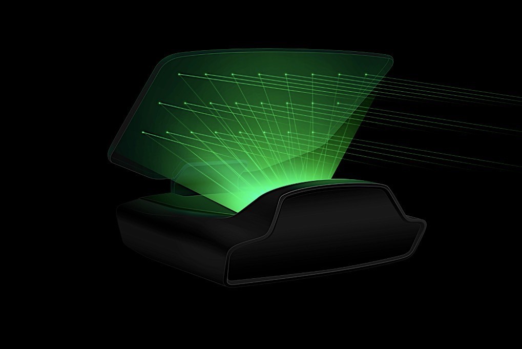
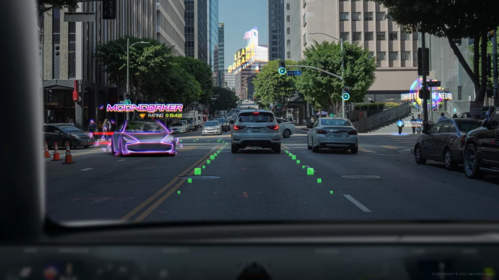
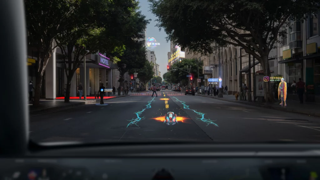
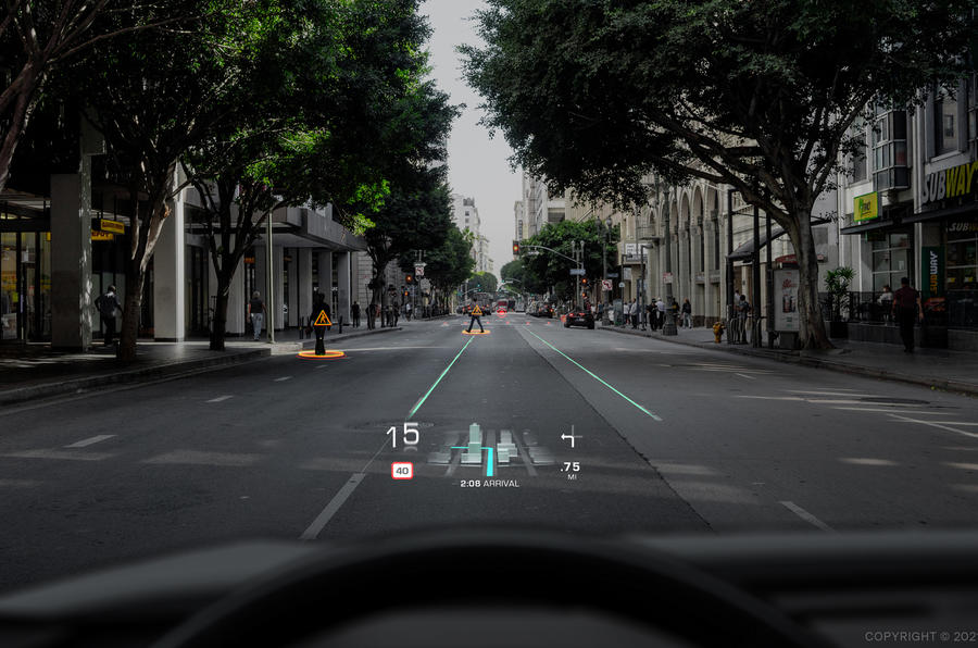
Looking at HUDs further, Hyundai/Genesis was the first brand to implement laser-holographic AR head-up displays in their G80 model, presented by the young AR developer company WayRay in 2019. It is said to have tremendous benefits compared to past HUDs (using reflected LCD screens) in terms of precision and visibility for the driver.

The Swiss startup WayRay claims to be the only company to have implemented holography to HUDs. Their holographic optical elements (HOEs) in their displays should provide unprecedented 3D images while remaining transparent and capable of being bent to windshields. The company presents its uniqueness in the field by covering “deep-tech” holography hardware development (e.g. blue-laser beams) as well as software development, all realised in-house.

They have already received large fundings by Hyundai and Porsche, have presented a 180° AR cockpit experience and offer different add-on solutions for vehicles, boats and airplanes. Their newest project is a shared car concept (“Holograktor”), designed for the “Metaverse” with a complete gaming / working / learning possibility while traveling autonomously. In their cooperation with Pininfarina on a concept car, they proposed solutions of the “True AR” displays also for side windows, providing new ways of passenger infotainment and entertainment experiences.

A report from the FIA Formula E on WayRay’s developments also predicts the use of HUD systems for race cars in the future. The pilots behind the wheels could get visualized ideal racing lines, brake points or a ghost car to chase on the race track.
Hyundai’s In-Car Noise Cancelling

Besides HUDs, Hyundai is pushing the development of AR solutions in cars in other aspects as well. Like in our headphones, noise cancelling also found its way into the car interiors, bringing more comfort to the passengers. According to Hyundai, the earlier systems were only capable of masking steady engine noises, but their newest solution (“Road Noise Active Noise Control”) in the upcoming Genesis GV80 will be capable of deleting different tire noises at different speeds. It uses multiple microphones placed directly into the wheel wells, accelerometers, amplifiers and a digital signal processor. As a result of the complex calculations for each individual wheel, the in-car noise should be reduced by half (3 dB).

Engine sound enhancements

Writing about noises of the car, we also have to take a short look at the opposite effects to noise cancelling – the engine sound enhancement devices. Due to the downsizing of the engine displacements, the roars coming from the combustion got also reduced. To keep the emotions connected to sporty engine sounds though, manufacturers are using additional devices to create compensating sound effects.

These can be pipes from the intake manifold connected to the dashboard walls, in some cases with an extra flap to control the sound throughput only for the sporty driving situations (Toyota, Ford, Porsche).

BMW was known to use engine sound amplification through a synthesised reproduction of the actual engine noise played simply on the car’s speakers.

The Volkswagen Group made it a bit more complicated by adding a special speaker device (“Soundaktor”) below the windshield to produce deep, buzzing tones resembling larger engine sounds. In some models there are also speakers built into the exhaust pipes to alter the natural noises coming from the engine, to make them more emotional or masculin.

Soundmodule for the Mercedes G350d

3D ADAS system of Arkamys

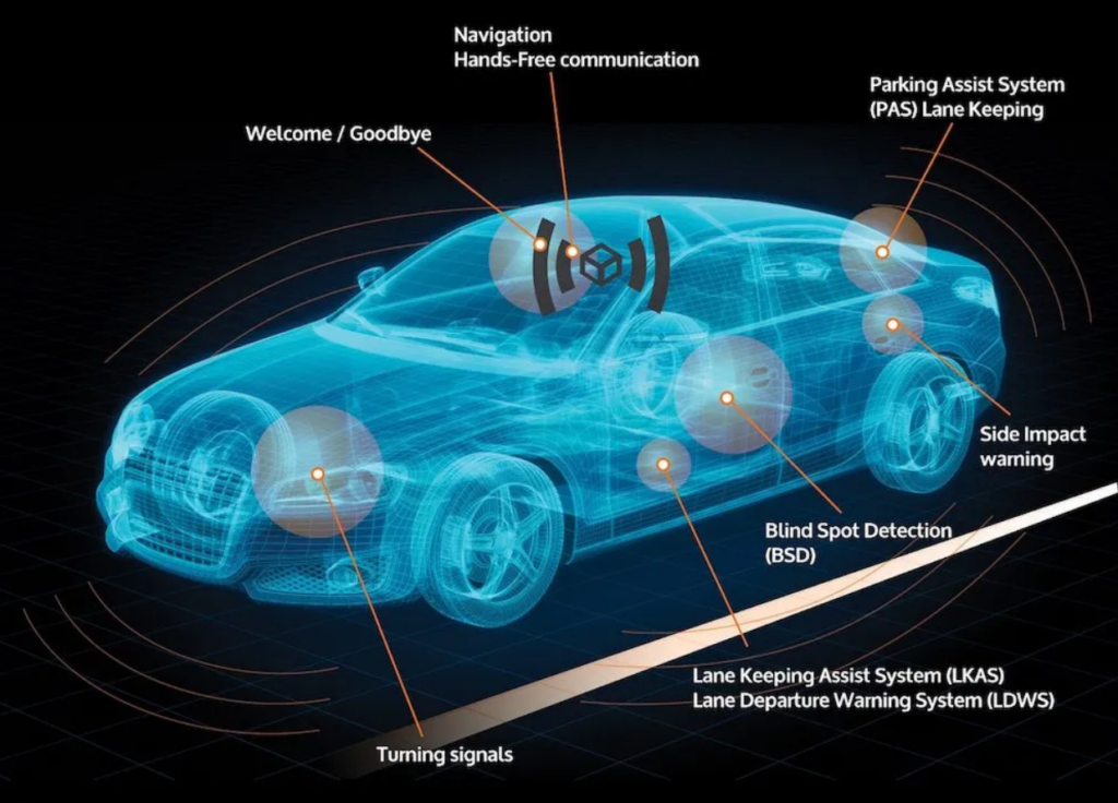
Beeping noises in a car are existent since many years, with the intention to help drivers. But beeping on itself is not always enough to give an understandable signal about what is happening or dangerous around the driver. The company Arkamys presented an intuitive alerting concept for Advanced Driver Assistance Systems – parking, lane keeping, blind spot and other assistants – by placing many different speakers inside the cabin and generating a 3D sound experience. With this it is possible to signalize the direction where a possible danger can exist, making the recognition and processing of the information easier and more intuitive for the driver.
Electric cars

Electric cars are further good examples where in-car noise generators are used to give the driver and passengers the known feeling of vehicle driving dynamics. Porsche is a perfect example where specific sounds are developed for representing the brand’s identity within the driver experience. They call the system “Porsche Electric Sport Sound” that enhances some natural noises of the drivetrain but also reduces disturbing ones, while implementing sounds to compy with the legal regulations for electric vehicle alerting sounds.

Thinking further about sound augmentation in cars, probably the already most spread system is the parking assistant, giving beeping sound feedback on the remaining distance to obstacles around the car. The design of these systems could probably fill a chapter on its own, but as it is already an everday tool, I won’t go further into detail on it.

The above listed examples are not even close to a complete list of use cases. Therefor I want to further research the current technologies. The next step will then be to look into the reasons for these systems, why they were developed and what practical needs, feelings and experiences are the underlying causes.

Sources

Online article on Wired: With In-Car AR, Drivers Get a New View of the Road Ahead. Retrieved on 05.12.2021
https://www.wired.com/story/in-car-ar-drivers-get-new-view-road-ahead/

Article on Wired: Hyundai’s Luxury SUV Mixes Mics and Math for a Silent Ride. Retrieved on 05.12.2021
https://www.wired.com/story/hyundai-genesis-gv80-suv-noise-cancelling/

Online Article on FIA Formula E: How AR and VR are revolutionising the car industry. Retrieved on 05.12.2021
https://www.fiaformulae.com/en/news/2020/june/ar-vr

WayRay – offical website. Retrieved on 05.12.2021
https://wayray.com/#who-we-are
https://wayray.com/press-area/#media_coverage

Online article on WayRay by CNET and Autocar. Retrieved on 05.12.2021
https://www.hyundai.news/eu/articles/press-releases/hyundai-wayray-unveil-next-generation-visual-technology-at-ces-2019.html

YouTube video by Roadshow: CES 2019: WayRay’s holographic AR windshield is real, hitting the road soon. Retrieved on 05.12.2021
https://www.youtube.com/watch?v=HFIgjQI2E6Y

AutoCar article on the Pininfarina concept car. Retrieved on 05.12.2021
https://www.autocar.co.uk/car-news/new-cars/pininfarina-concept-car-showcased-holographic-ar-display

Online article by AutoZeitung: Mercedes entwickelt MBUX weiter. Retreived on 05.12.2021
https://www.autozeitung.de/mercedes-infotainment-192628.html

Mercedes-Benz MBUX System – online articles and images, retrieved on 05.12.2021
https://www.wired.com/story/in-car-ar-drivers-get-new-view-road-ahead/
https://www.extremetech.com/extreme/314758-2021-mercedes-s-class-2-hud-sizes-level-3-autonomy-4d-sound-5-lcds
https://carbuzz.com/news/new-mercedes-s-class-shows-off-amazing-augmented-reality-display

Audi AR HUD system: online article and Youtube video on Slashgear. Retreived on 05.12.2021
https://www.slashgear.com/the-audi-q4-e-trons-augmented-reality-head-up-display-is-dashboard-genius-09662735/
https://www.audi-technology-portal.de/de/elektrik-elektronik/fahrerassistenzsysteme/audi-q4-e-tron-ar-hud-de/

Online article on GeekDad: Augmented Reality for Your Ears. Retrieved on 01.02.2022
https://geekdad.com/2016/02/arkamys/

Image of Mercedes G350d soundmodule. Retrieved on 01.02.2022
https://www.tuningblog.eu/kategorien/tuning-wiki/soundgenerator-nachruesten-232502/

CarThrottle article on sound enhancers. Retrieved on 05.12.2021
https://www.carthrottle.com/post/5-ways-that-manufacturers-enhance-the-sound-of-their-cars/

The Porsche Sound – online article, retrieved on 05.12.2021
https://newsroom.porsche.com/de/produkte/taycan/sound-18542.html

IoT devices for medical applications

Data is driving change in most industries in the past years. Enterprises gathering significant data from users can tailor their experience better to them.

Major tech players have entered the field of Health in recent years. Fitness promotion, health indicators monitoring, and emergency contact are some of the key features that companies like Apple, Samsung, Meta, Fitbit, or Garmin have in their offerings through tracking wearables in form of smartwatches with GPS, Barometer, Gyromenters and an array of medical-grade sensors, like Apple’s FDA Approved ECG sensor in the Apple Watch.

This ability to gather data from the user in a non-invasive and continuous way is great news for health services around the world. Some of the main Health indicators, like blood pressure, oxygen levels, and glucose levels that previously required a visit to the doctor now can be done in real-time and telematic, reducing pressure on a strained health system and reducing cost in an ever-increasing expense for governments around Europe.

Telehealth or remote doctor’s consultations are another great option for non-urgent questions that don’t require a physical appointment anymore and help prevent overcrowded hospitals.

A sensible way to collect data can help health administrators track a population’s overall health and implement policy to help their citizens lead a healthier life because prevention is always a better solution than treatment. An easier and most continuous way of following up with patients via Telehealth is also a better way to ensure that people are on track with their treatment in a more efficient manner.

Literature:

https://blog.kiversal.com/que-es-la-iomt/

https://builtin.com/internet-things/iot-in-healthcare

https://www.businessinsider.com/iot-healthcare

Types of deceptive design patterns

In todays blogpost I want to get a bit more specific and list types of deceptive design patterns* with some extraordinary bad examples for those technique. I am going to use the 12 defined types of deceptive design patterns* from Harry Brignull. 

Bait and Switch

This pattern works with previous experience and common user interactions. The user wants to complete an action, but something different, undesired or even the exact opposite thing happens. The most famous example for bait and switch is the Microsoft update pop-up to Windows 10. Normally clicking the „x“-button in the upper right corner means closing the window without completing any action. In this case they switched the meaning to „Yes, let’s do this update“. Another common strategy is to simply switch „Yes“ and „No“ Buttons for additional add-ons in an e-commerce process.

Source: https://www.darkpatterns.org/types-of-dark-pattern/bait-and-switch

Disguised Ad

In this case ads are hidden and they seem like they are actually part of the interface. Since they look like content or any kind of navigation, users are clicking them assuming it is a genuine interaction of the website. Prime example here are download buttons linking to different websites.

Forced Continuity

This pattern tricks users into continuing any kind of paid membership by charging them after a free trial without a warning or making it really hard to cancel on automatic renewed subscriptions.

Friend Spam

Users grant access to numbers or emails in their phone or connect their social media accounts in order to „find friends“ within this environment, but the product actually spams all contacts pretending to be the user himself. 

Hidden Costs

A design that intentionally hides costs and makes product or service seem cheaper by adding additional costs or fees later on. As the user is already in the checkout process, it is more likely that he continues anyway even after realizing the price change. Usually those hidden fees are delivery costs or service fees.

Misdirection

This pattern is also known as aesthetic manipulation. Focusing the user’s attention on an interaction to distract them from something else. There are many different approaches on how to use this dark patterns as it does not have a simple context like many other types.

Price Comparison Prevention

Showing the price of products or service in a way that makes it difficult for the user to compare two items. One way of achieving this is work with different units and not showing price per weight. Another one is to show prices of products only on each subpage and never next to each other so the user has to remember the price and go back and forth to actually compare them.

Privacy Zuckering

Maybe the most famous of all deceptive design patterns*: tricking users into agreeing to share all their personal information. Most users are aware that cookie-concent-managers make it difficult to opt out on purpose. Additionally this one is regulated by law. 

“X”-Button is not simply closing the pop-up, but accepting all cookies. Screenshot: https://www.darkpatterns.org/types-of-dark-pattern/bait-and-switch

Roach Motel

The model describes that users easily get into a situation, but find it difficult to get out of it. This mostly happens when a user signs up for something quickly, but then is having a hard time to cancel the membership (e.g. with a phone call during business hours).

Users can not cancel by filling out a form, but have to interact with an employee. Screenshot: https://help.nytimes.com/hc/en-us/articles/360003499613-Cancel-your-subscription

Sneak into basket

Sneaking products into the users basket, that they did not add themselves. Sometimes this pattern is justified with making suggestions to enhance the user experience, but actually it is just tricking them into buying something by mistake.

Trick Questions

Using unnatural language, like double negatives, to confuse the user and manipulate their actions. Especially often this pattern is used in forms to get users to subscribe to the newsletter.

That’s it for today 🙂 

Source: Harry Brignull: Types of Dark Patterns. In: https://www.darkpatterns.org/types-of-dark-pattern

* formerly called “dark pattern”

The Found-Footage-Aesthetic: A Closer Look

Für meinen zweiten Blogeintrag würde ich mich gerne auf die ästhetischen Merkmale von Found-Footage-Filmen konzentrieren und anhand mehrere Filmanalysen diese kurz zusammenfassen. Dabei fokussiere ich mich weniger auf die Narrative der Filme selbst – ausgenommen, wenn diese durch spezielle Stilmittel zum Ausdruck gebracht wurden – sondern vielmehr auf die visuelle Beschaffenheit des “gefundenen” Materials.

Es liegt natürlich nahe, mit dem Film zu beginnen, der das Genre popularisiert und einen regelrechten Trend hervorgerufen hat, nachdem er im Internet Wellen schlug. Das Studio hatte bewusst Verwirrung in Bezug auf die Echtheit der Aufnahmen gestiftet und die gesamte Aufmachung des Filmes präsentiert sich als Zusammenschnitt des gefundenen Videomaterials vermisster Personen.

The Blair Witch Project (1999)

Sehr kompakt zusammengefasst handelt der Film von drei Filmstudenten, die verschwinden, nachdem sie in einen Wald in Maryland gereist sind, um dort einen Dokumentarfilm über die lokale Blair Witch-Legende zu drehen. Sie hinterlassen nur ihr Filmmaterial, das durch ihre Videokamera und eine 16-mm-Filmkamera entstanden ist. Als Zuschauer betrachten wir nun die gefundenen Aufnahmen.

Immersion und unmittelbares Dabeisein

Im Folgenden werde ich kurz Zusammenfassen, was mir bei der Analyse des Filmes Blair Witch Project aufgefallen ist und welche Stilmittel meiner Meinung nach das Found-Footage auszeichnen.

Bildausschnitt und Bildkomposition
Das Seitenverhältnis von 1,33: 1, fällt als erstes als Besonderheit auf und hebt sich bereits hiermit von moderneren Kino Formaten ab. Aufgenommen wurde das Filmmaterial mit einer älteren 16mm Kamera, die die Filmstudenten für ihren Dokumentarfilm wählten.
Was die generelle Bildkomposition auszeichnet ist zudem, dass abseits der Interviewaufnahmen, die die Filmstudenten von den befragten Dorfbewohnern erstellten, die Ausschnitte teilweise extrem verwackelt, verschwommen oder nur sehr schwer erkennbar sind. Teilweise bleiben für längere Zeit lediglich verschwommene Formen in ungewöhnlichen Blickwinkeln zu sehen, bevor der Fokus langsam schärfer wird und sich die Abbildungen konkretisieren. Längere Sequenzen sind völlig schwarz oder bestehen nur aus einem Rauschen, welches hin und wieder von einem kurzen Blick auf die unmittelbaren Geschehnisse durchbrochen werden.
Einige Momente lang wird auf die Kamera scheinbar auch komplett vergessen, sie wird grob zur Seite geworfen oder kurz auf den Boden abgelegt, ohne dass wir als Zuschauer genau erkennen, was gerade passiert.
All diese Besonderheiten weisen zum einen auf die Existenz der Kamera innerhalb der Narrative des Filmes hin, verdeutlichen, dass wir als Zuschauer das rohe Material zu sehen bekommen und wirft uns gemeinsam mit den Filmenden mitten ins Geschehen.

Why the 'Blair Witch Project' is an awful movie – The Other Press

Sensor und Kamera
Gerade in Szenen, welche in der Nacht gedreht wurden, fällt der hohe ISO Wert und ein extremes Rauschen der Kamera auf. Einige Sensorstörungen oder Glitches beim hektischen Hinlegen der Kamera verstärken das Gefühl, dass die Person, die wir begleiten völlig darauf vergisst, dass sie das Gerät mitführt. Uns wird als Zuschauer klar, dass die unmittelbare Bedrohung eindeutig Priorität hat. In diesen Sequenzen spielt das Sounddesign eine wesentliche Rolle und das meiste Geschehen spielt sich eher in unseren Köpfen als im Video ab.

Verschmutzung und Linse
Da die Schauspielstudenten, deren Aufnahmen wir sehen, an einem gewissen Punkt bereits mehrere Tage im Wald herumirren, legen sich zunehmend Verschmutzungen auf der Linse und dem Objektiv der Kamera ab. Gewisse Lichtsituationen erzeugen so verstärkte Linseneffekte und Artefakte.

Blair Witch Project, The (1999) - tbwp1999-1099 - high quality Horror  Movies screencaps gallery

Differenzierung der Kameras
Das Material der zwei verwendeten Kameras wurde scheinbar zusammengefügt und interessant ist, dass eine Kamera mit der gefilmt wurde, nur in schwarz-weiß aufnimmt, was es dann im Laufe des Filmes möglich macht, zu erkennen, aus welcher Sicht wir gerade am Geschehen teilhaben, bzw. welche Person die Kamera hält. Dies kann ebenfalls als Erzählungswerkzeug verwendet werden, um Zuschauern gewisse visuelle Ques zu geben, wo und wann man sich innerhalb der Geschichte befindet.

The Blair Witch Project (1999) - Photo Gallery - IMDb

Taschenlampe und Nachtsicht
Gerade Szenen in der Nacht, bei denen die einzige Lichtquelle der Kegel der Taschenlampe oder das Licht der Kamera ist und die harten Schatten, die das Dickicht des Waldes wie eine Gefahr aussehen lassen, erzeugen eine extrem angespannte Stimmung. Eine der verwendeten Filmkameras im Speziellen erzeugt einen sehr hohen Kontrast des Bildes und jeder Schatten wirkt bedrohlich.

Verwackeln des Bildes und Motion Blur
Etwas, das natürlich für große Dynamik in den Aufnahmen sorgt, ist das Verwackeln der Kamera bei jeder Bewegung der Protagonisten. Gerade, wenn diese vor etwas davonlaufen oder sich hektisch Bewegen, verleiht dies den Filmaufnahmen eine stark immersive Wirkung und die Dramatik der Situation wird verdeutlicht, da keineswegs mehr an das Ergebnis der mitfilmenden Kamera geachtet wird.
Es ist interessant, dass wir während des gesamten Filmes die Hexe selbst nie zu Gesicht bekommen. Der Horror des Filmes entsteht größtenteils dadurch, dass wir die Angst und Panik der Protagonisten miterleben, während jedoch die wirkliche Bedrohung zu keinem Zeitpunkt im Film klar zu sehen ist.

Die Existenz der Kamera innerhalb der Narrative
Auch wenn dies ein Aspekt ist, der vielleicht für meine Zwecke weniger relevant ist, möchte ich kurz auf die Rolle eingehen, die das Aufnahmemedium im Film spielt. Die Kamera ist immer wieder Grund für Auseinandersetzungen und Streitereien. Als Zuschauer werden wir konstant daran erinnert, dass die Kamera präsent ist. – Natürlich wäre der Film wenig spannend oder kurz, hätten die Protagonisten beschlossen, das Filmen abzubrechen. Daher spielt auch die Tatsache, dass die Studentin, die einen Großteil der Aufnahmen durchführte sehr versessen darauf ist, nicht mit leeren Händen zurückzukehren.

Literaturliste

  • Cowie, R., Hale, G. (Produzenten) & Myrick, D., Sánchez E. (Directoren). (1999). The Blair Witch Project [Film]. United States: Artisan Entertainment.
  • Norbert Groeben, Margrit Schreier, Christine Navarra: Das Verschwinden der Grenze zwischen Realität und Fiktion. Eine inhaltsanalytische Untersuchung zur Rezeption des Kinofilms „The Blair Witch Project“. In: Achim Baum (Hrsg.): Fakten und Fiktionen. Über den Umgang mit Medienwirklichkeiten. UVK, Konstanz 2002, S. 271–282.
  • Jane Roscoe: The Blair Witch Project. Mock-documentary Goes Mainstream. In: Jump Cut. Nr. 43, 2000, S. 3–8.: http://www.ejumpcut.org/archive/onlinessays/JC43folder/BlairWitch.html
  • imdb: The Blair Witch Project (1999): https://www.imdb.com/title/tt0185937/mediaindex?ref_=tt_ov_mi_sm
  • Christoph Elles, Dominic Grzbielok: Das Phänomen der Fälschung in den Medien. Fiktion und Wirklichkeit. VDM Müller, Saarbrücken 2007, (Kapitel Das Phänomen Blair Witch Project.) S. 16–81.

Reference works for Extended Guitar Performance #3

During my research on Google Scholar, I came upon the following journal article called “The Electric Guitar: An Augmented Instrument and a Tool for Musical Composition”. I found the content of this article highly inspiring since it deals with the history of sonic augmentation of the electric guitar and is thus also highly relevant for my project (which, of course, also seeks to extend the range of sound possibilities of an electric guitar).

According to Lähdeoja, Navarret, Quintans and Sedes, the electric guitar can be considered a highly augmented instrument in itself since it is basically an acoustic guitar whose sonic possibilities were and still are extended by electromechanical and digital means. Obviously, at the beginning of the electric guitar stands the acoustic guitar since – as far as the basic physical qualities are concerned – an electric guitar is very much based upon an acoustic: (physical) features such as metallic strings, a glued or screwed neck, strengthened with a truss rod, tone woods (maple or mahogany necks with a maple, rosewood or ebony fingerboard) as well as metallic frets and a chromatic scale were all transferred from the acoustic onto the electric guitar. However, with the invention of the solid body a new era began, introducing a major extension of sonic capabilities through electric technologies of amplification. With an electric guitar, the actual sound source of the acoustic guitar becomes part of an electro-acoustic chain that additionally comprises a range of analog and/or digital modules that are necessary for producing sound, thus giving the electric guitar a modular property. Of course, the electrification of the guitar sparked a whole new way of thinking and creating sounds, leading to the development of new playing techniques.

While “the electrification of the guitar is probably the most important modification the instrument has undergone in the twentieth century”, the instrument and its sound possibilities continued to be intensely advanced in the following decades, with the developments driven by guitarists, instrument makers and the requirements of different musical styles. The afore mentioned modularity of the electric guitar that includes the selection of tone woods, pick-ups, amplifiers, effect chains, etc. provides the guitarist/musician with a lot of freedom as far as customizability is concerned. However, it is the case with every instrument that along with the increase of sonic possibilities and corresponding control interfaces, playing the instrument gets more and more complex as well, potentially overburdening the musician’s (physical) capabilities. In order to avoid the latter, most control interfaces for electric guitar have been conceived with simplicity in mind, featuring relatively simple controls and traditionally being conveniently placed within the guitarist’s reach (e.g. an effect pedal that is (dis)activated by stepping on it). While serving its purpose of not overburdening the player, Lähdeoja, Navarret, Quintans and Sedes observe that this approach limits the possibilities for dynamic, real-time interaction with controls which leads to a status they describe as the “sonic stasis common in electric guitar playing: the player chooses a specific sound for a musical part with “on/off” effect switches, playing with the same timbre until the next “monolithic” modification”.

I think this latter notion is very interesting because it justifies my quest to identify ways of extending the sonic range of an electric guitar using only the natural movements of the player as an input source for effects. While the article states that there is currently research being done on this topic, I think that I can still add to the current research with my project and its outcomes.

Source:

Lähdeoja O., Navarret B., Quintans S., Sedes A. (2010). The Electric Guitar: An Augmented Instrument and a Tool for Musical Composition. Journal of Interdisciplinary Music Studies, 4(2), 37-54. 10.4407/jims.2010.11.003

Idea Update

Good News: Conducting thorough research, concerning extended guitar sound possibilities, during the month of November allowed me to further specify my project idea “Extended Guitar Performance”. By firstly discerning what has already been done in this area of musical research, I identified several commercials products (see the MIDI rings in Blog #6) as well as custom-made products (e.g. Blog #9 + Blog #10) that all deal with movement and/or gesture-controlled extension of guitar sounds. However, I also found that the bulk of these “gadgets” require the guitar player to move his body and hands in certain ways to specifically trigger the sensors built within the gadget. Consequently, the guitarist often needs to interrupt his natural playing movements in order to wave is hand for example. I saw this for myself when I tried to keep playing guitar in the usual way while incorporating special hand movements to trigger hypothetical sensors (having not built anything yet) – it proved to be almost impossible to maintain a typical rock groove for instance much less playing lead.

That is why I thought that it would be even better if one could extend a guitar’s sonic possibilities while at the same time not compromising the usual way people play guitar. Based on this notion, I decided to try finding a non-evasive way, restricting my idea to only using natural movements of a guitarist to trigger sensors in order to extend guitar sound possibilities.

Consequently, some changes to my previous idea will be made:

I will abandon the idea of attaching (accelerometer) sensors to the guitar body to pick up its movements because moving in a certain way again is not part of the natural movements of a guitarist.

Instead, I will focus on the “Solo Mode” effect, described in Blog #8, and effects based on the same concept since this kind of system allows the guitar player to move up and down the neck with effects adapting automatically to the fret position. During this week’s consultation session, I brought this idea before my supervisor, and he recommended looking into ultrasonic or infrared sensors to locate/pinpoint the left hand along the neck. This will, of course, be done. Furthermore, my supervisor also saw the possibility of using this system beyond switching from rhythm to lead sound. Additionally, one could define certain areas/positions on the fretboard that each give a slightly different sound, allowing the guitarist to change is sound according to fret position.

I will also further pursue the idea of placing an IMU type of sensor on the pick to pick up the natural strumming and picking movements of the guitarist. Here, it would have been practical to resort to one of the MIDI rings which are, however, quite expensive. At the moment, a custom setup is hence favoured.

Naturally, I will also continue to analyse a guitarist’s natural body and hand movements in order to come up with additional ways to harness them as an input source for guitar effects.

Lastly, upon the recommendation of my supervisor, I will not yet fully discard the possibility of using MIDI pick-ups. During my research I stumbled upon the Fishman Triple Play, a hexaphonic pick-up, capable of picking up the pitch of each string separately and converting it to MIDI data. Albeit coming with a huge price tag (300€ on Thomann), the pick-up constitutes another possibility of adding to a guitar’s sound potential without compromising the player’s usual movements. This will be given further thought.

Sources:

https://www.thomann.de/at/fishman_triple_play.htm

Storytelling with Augmented Reality | Part 1

Augmented Reality opens new possibilities of storytelling. With Augmented Reality, you are not just watching a story been told. You are immersed in the experience and become part of the story.

“We witness stories our entire lives. All the storytelling mediums we know and love are ones where an author recounts a tale and we bare witness to that tale. What gets me so excited about these immersive mediums is it feels like we’re crossing the threshold from stories we witnessed to stories we live as our own.”
– CEO of the VR tech and entertainment company, Within

You experience the story as a character of it, you can interact with other characters and they interact with you and you have the ability to influence the story. You walk away with the memory of your own story and not of just media you have consumed.

Three main components of Augmented Reality Stories

In most of AR scenes, you need to focus of the three main aspects.

1. Assets

Assets are all the elements of a AR story, like 3D or 2D models, audio files or videos. They help you tell your story. 3D models, especially when they are combined with audio, can create an immersive experience by taking the user into the world of the story. 2D aspects can also be an important part, for example by providing information via text.

Something you need to also keep in mind is on which device the user will be experiencing your AR story. Not every user is using the latest device, so you need to pay attention on the size of your assets.

2. Interactions

While creating an AR story, you have to consider, how you want the user to be able to interact with the story. These could be through really simple interactions, like the user can for example rotate assets, take a closer look at some of them or look at the scene from a distance. Or more complex ones, for example interacting with characters, speak to them and in order to that influence the story.

3. Environment

Augmented Reality takes place in the real world. So you need to consider where it takes place and how it does influence the role of the user. Does it take place in a room, like the surface of a table, where the user is in the middle of the story, or does the story take place outside, where the assets are far away and the user gets the role of an observer.

Example: Between Worlds by Skip Brittenham

A great example of storytelling with Augmented Reality is Skip Brittenhams book “Between worlds”. Through the use of the Augmented Reality technologies, the fantasy world becomes alive in interactive 3D.

Wie viel Gendersensibilität steckt im Employer Branding?

Nachdem sich der letzte Blogartikel verstärkt mit Begrifflichkeiten der Gender Studies auseinandergesetzt hat, soll sich dieser nun zunächst auf das Employer Branding als solches konzentrieren, um in einem zweiten Schritt zu untersuchen, inwiefern die Berücksichtigung von Gender in der Literatur und Praxis hier bereits eine Rolle spielt. Später soll dann konkret dargestellt werden, inwiefern bei der Erstellung von Stellenanzeigen bereits Wert auf Gendersensibilität gelegt wird. Hier soll ebenfalls auf den aktuellen Forschungsstand zu der Thematik eingegangen werden.

Employer Branding und Gendersensibilität kommen von Innen

Unter Employer Branding wird der Prozess verstanden, in dem ein Unternehmen sich als Arbeitgeber*in eine einzigartige Marke bzw. eine individuelle Identität schafft, welche sie, im besten Fall positiv, von konkurrierenden Unternehmen abgrenzt. 

Als Teil eines Unternehmens siedelt es sich sowohl in Kommunikationsabteilungen an als auch in den Human Resources. Besonders von Bedeutung innerhalb des EBs ist die Erarbeitung sogenannter Employer Value Propositions (EVP), also das Nutzenversprechen von Arbeitgeber*innen an ihre Mitarbeitenden. 

Essenziell ist laut Literatur dabei, dass die EVPs von innen heraus erarbeitet werden. Mitarbeitende funktionieren dabei als wichtigste Stakeholder*innen, sie müssen spüren, dass Versprechen und Erwartungen eingehalten werden. So kann ein negatives Word-of-Mouth verhindert werden. Darüber hinaus muss akzeptiert werden, dass es sich beim Employer Branding, beziehungsweise bei der Erstellung und Umsetzung von EVPs nicht um einen abschließbaren Prozess handelt. Nur langfristig gedachte und dauerhaft umgesetzte Arbeit kann zu den beabsichtigten nachhaltigen Ergebnissen führen. Das gleiche gilt für gelebte Chancengleichheit der verschiedenen Geschlechter innerhalb von Unternehmen. 

Insgesamt muss allerdings gesagt werden, dass der Forschungsstand zum Faktor Gender innerhalb des Employer Brandings eher gering ist. Was sich aus der Literatur herauslesen lässt, ist folgendes: Gender Awareness in einem Unternehmen bedeutet kulturellen Wandel, ein höheres Innovationslevel sowie eine größere und diversere Menge von Erfahrungen, Kompetenzen und Wissen. Ein Unternehmen welches Gender Equality umsetzt und nicht nur kommuniziert wird ebenfalls mit einer geringeren Wahrscheinlichkeit seine Mitarbeitenden enttäuschen. Dafür muss gemeinsam evaluiert, Genderstereotype sichtbar gemacht und hinterfragt werden. Das Hinzufügen einer Gender-Perspektive auf eine nachhaltige Value Proposition kann nicht nur Sensibilität verursachen, sondern gleichzeitig dafür sorgen, die eigene Attraktivität als Arbeitgeber*in für diversere potenzielle Arbeitnehmer*innen zu steigern. 

Sprachliche Gendersensibilität in Stellenanzeigen

Wie wird das Thema Gender von Unternehmen in der Praxis des Employer Brandings bereits umgesetzt? Konkret soll es hier um gendersensibel gestaltete Stellenanzeigen gehen. Da sich die Forschung allerdings beinahe ausschließlich mit der sprachlichen Ebene dieser auseinandersetzt, werden im folgenden Untersuchungen von Formulierungen wiedergegeben, die mögliche schriftliche Diskriminierungen analysieren. 

Im Jahr 2006 wurde im Deutschen Bundestag das Allgemeine Gleichbehandlungsgesetz (AGG) beschlossen. Dieses besagt, dass Stellenanzeigen grundlegend merkmalsneutral formuliert werden müssen. In Österreich gelten ähnliche Vorgaben. 

Die Antidiskriminierungsstelle des Bundes (Deutschland) hat im Jahr 2018 eine „Studie zur Auswertung von Stellenanzeigen im Hinblick auf Diskriminierung, Ausschlussmechanismen und positive Maßnahmen“ veröffentlicht. In der Darstellung bisheriger Forschungsarbeiten wird unter anderem auf Studien von Jobware (2014) und der TU München (2014) eingegangen, die beide zu dem Ergebnis kamen, dass Männer Stellenanzeigen anders lesen als Frauen und dass dies einen Einfluss auf deren Bewerbungsverhalten hat.

Besonders interessant ist, dass Stellenanzeigen nicht nur als eher männlich wahrgenommen, wenn der Job Titel im generischen Maskulinum dargestellt wird, sondern auch wenn bestimmte Formulierungen, wie durchsetzungsstark, unabhängig, dominant oder offensiv in ihnen vorkommen. Andersherum gibt es auch Formulierungen, die als eher weiblich gelesen werden, wie kontaktfreudig, kooperationsfähig, engagiert oder kommunikativ. Frauen werden von agentischen Worten (die stereotyp als männlich assoziiert werden) eher abgeschreckt, sich auf bestimmte Stellen zu bewerben und von kommunalen Worten (die als weiblich verstanden werden) eher dazu motiviert. Männlich assoziierte Begriffe kommen dabei vor allem in Stellenanzeigen für männerdominierte Berufe vor. Einige Studien zeigen auch, dass Frauen Stellenanzeigen, die genderneutral formuliert sind, als besonders attraktiv wahrnehmen, weil sie entsprechende Arbeitgeber*innen dann als eher fair beurteilen. 

Innerhalb der bereits erwähnten, von der Antidiskriminierungsstelle durchgeführten Studie wurden insgesamt 5.667 Stellenanzeigen untersucht und mittels einer Inhaltsanalyse von Bild und Text in drei Kategorien unterteilt: Stellenanzeigen, die gegen das AGG verstoßen, die keine Diskriminierung enthalten und die zwar nicht gegen das Gesetz verstoßen, dafür aber Diskriminierungsrisiken bzw. Ausschlüsse im Bezug auf ein oder mehrere durch das AGG geschützte Merkmale enthalten. 

Zentrale Ergebnisse der Studie:

97,8 % der Stellenanzeigen verstoßen nicht gegen das AGG, 2,2 % enthalten Verstöße und jede fünfte Anzeige (21,2 %) enthält ein Diskriminierungsrisiko. Dieses besteht in den allermeisten Fällen deswegen, weil sie nicht geschlechtsneutral sind (80 %) sind. Außerdem besteht ein Zusammenhang zwischen einer Diskriminierung bzw. eines Diskriminierungsrisikos und bestimmten Berufsgruppen, die die Stellenanzeigen ansprechen. Diskriminiert wird am häufigsten in frauendominierten Berufen. Ein Diskriminierungsrisiko besteht hingegen besonders in männlich dominierten Berufen wie Manager*in oder Wirtschaftsprüfer*in. Die meisten Stellenanzeigen sind zudem im generischen Maskulinum verfasst und tragen einen Zusatz wie (m/w/d). Gendergaps oder Gendersternchen werden nur bei 0,2 % der Stellenanzeigen genutzt. Fotos werden häufig genutzt, tragen aber gleichzeitig ein Diskriminierungsrisiko, weil häufig, den Geschlechtsanteilen der Berufe entsprechend, nur Männer (28 %) oder Frauen (19 %) abgebildet werden. 

Kritisieren lässt sich an der Studie, dass die Analyse nur innerhalb des gesellschaftlich konstruierten binären Geschlechtssystems erfolgte. Es wurde beispielsweise nicht darauf eingegangen, inwiefern sich trans Personen von Formulierungen in Stellenanzeigen diskriminiert fühlen. Außerdem wurden, bezogen auf visuelle Wirkungen, lediglich Bilder analysiert, nicht aber andere Designelemente. Eine Untersuchung in diesem Bereich wäre interessant. 

Was diese allerdings gezeigt haben, ist dass eine gezielte Ansprache von unterrepräsentierten Gruppen in den Stellenanzeigen nur äußerst selten gefunden werden konnte. Nur in 8 % der Stellenanzeigen werden diese spezifisch angesprochen, wenn sie in Unternehmen unterrepräsentiert sind. Für Gruppen wie diese dürfen bei der Formulierung von Stellenanzeigen Ausnahmen vom AGG gemacht werden. Solche könnten dann zum Beispiel sein: 

Da aus pädagogischen Gründen die Kinderbetreuung in unserer Kindertageseinrichtung sowohl von weiblichen als auch von männlichen Erziehern erfolgen soll, in unserer Einrichtung bisher aber keine männlichen Erzieher beschäftigt sind, fordern wir Männer besonders auf, sich zu bewerben.

Bezogen auf meine weiterführende Arbeit, wirft dies die Frage auf, inwiefern eine gezielte Ansprache bestimmter Geschlechter mithilfe von visuellen Codes eventuell ebenfalls dadurch legitimiert werden könnte, dem Mittel zum Zweck, wie z.B. der Rekrutierung von mehr Frauen in handwerklichen Berufen dienen zu können. Hier lässt sich allerdings der Zweifel einwerfen, es könnte sich bei visuellen Gestaltungscodes, im Gegensatz zur Sprache, um Konstrukte handeln, die fast immer auf gesellschaftlichen Zuschreibungen von Charaktereigenschaften von oder des Geschmacks eines bestimmten Geschlechtes handeln. Dies gilt es im Folgenden genauer zu erörtern und mittels von (Best Practice) Beispielen zu analysieren.


Literatur

Antidiskriminierungsstelle des Bundes (2018). Diskriminierung in Stellenanzeigen. Studie zur Auswertung von Stellenanzeigen auf Diskriminierung, Ausschlussmechanismen und positive Maßnahmen. Verfügbar unter: https://www.antidiskriminierungsstelle.de/SharedDocs/downloads/DE/publikationen/Expertisen/diskriminierung_in_stellenanzeigen.pdf?__blob=publicationFile&v=3

Heider-Winter C. (2014). Vielfalt gestalten – Unterschiede würdigen: Gender, Diversity und Inklusion als Dimensionen im Employer Branding. In: Employer Branding in der Sozialwirtschaft. Springer Gabler, Wiesbaden. Verfügbar unter: https://doi.org/10.1007/978-3-658-01196-3_4

Hentschel, T. & Horvath, L. K. (2015). Passende Talente ansprechen – Rekrutierung und Gestaltung von Stellenanzeigen. In: C. Peus, S. Braun, T. Hentschel & D. Frey (Hrsg.): Personalauswahl in der Wissen- schaft – Evidenzbasierte Methoden und Impulse für die Praxis. Heidelberg: Springer, S. 65–82.

Jobware (2014). Eye-Tracking-Studie. Leseverhalten bei Online-Stellenanzeigen. Verfügbar unter: http://www.healthcare-personal.de/hcpm/bilder/pdf/Eye-Tracking-Studie.pdf.

Lundquist, H. (2015). Gender Aware Employer Branding: How to Become Authentic, Unique and Attractive. In: Canadian Center of Science and Education (Hrsg.): International Journal of Business and Management. Vol 10., No. 11. Verfügbar unter: https://www.researchgate.net/publication/283699019_Gender_Aware_Employer_Branding_How_to_Become_Authentic_Unique_and_Attractive

Peus, C., Braun, S., Hentschel, T. & Frey, D. (2015): Personalauswahl in der Wissenschaft – Evidenzbasierte Methoden und Impulse für die Praxis. Heidelberg: Springer.

Listening to nature

Today’s blogpost is about : listening to nature. But first of all, what means listening ?

Listening is the active process of receiving and responding to spoken (and sometimes unspoken) messages.

Listening is not just hearing what the other party in the conversation has to say. “Listening means taking a vigorous, human interest in what is being told us,” said poet Alice Duer Miller. “You can listen like a blank wall or like a splendid auditorium where every sound comes back fuller and richer.”

So listening to nature can be litterally finding a way to hear it, or inventing more abstracted ways to pay attention to it.

Hearing nature

Some applications are making us closer to nature by teaching us names. Maybe you have it in your own pocket ! Pl@ntNet1 gives us plants names if you scan it, BirdNET2 the bird names with their sound… This is not revolutionnary, but at least, putting names on plants or animals we see is a good start to feel closer to them, as knowing other humans name might creates a closer relationships.

Nowadays, we have way to listen to nature… for real ! With the little help of electronic devices you can transform plant’s elecricity into sound or music3. How does it work ? First, you have to connect some alligator cables to the leaves, roots or stalk of plant. Then, a MIDI device is capting the electrical signal going through the plant, emphasize it and then translate it into music.

Some artists embraced this process and are making concerts with humans and plants, for example, Jean Thoby4. Personnally, I find this kind of music very relaxing and in my head, it is really associated to nature. I couldn’t imagine other sounds coming from it.

France Bleu

What is also really interesting in this concept is that the sounds depends on every plant and it’s environment. The kind of plant, it’s size, the weather, the wind, the surrounding, all those factors can have an influence on the electrical signal of the plant. This way, humans and plants can interact. The art performance Beyond Perception mesures electrical signals from humans and plants while playing music together to see how thay affect each other5. And the results are quite surprising : impossible to know if you are looking to the plant’s signal or human ! We seem to react the same way to music.

Beyond perception, Maria Castellanos, Alberto Valverde

Giving nature a voice

Now we know we can hear nature like sounds or music. But what about giving it a real voice ? How can we do so ?

For now, I found nothing that was giving nature a voice like humans, but an abstract way to do so is with the creation of a juridical status for a nature entity. In Ecuador, the river Rio Vilcabamba has now a juridical status since 20116. This means that the river can sue every entity that harms it and has power to defend itself.

The Rio Vilcabamba

Listening to nature

We can also use technology associated to nature to understand more in depth the natural changes that can affect humans. A sort of animal internet.

The Kivi Kuaka expedition7 is a french project studying birds behavior to predict natural disasters. Scientists are putting some little GPS chips on the back of birds and then follow their signals. This way, instead of using high tech devices, nature could also gives us informations via birds.

Kivi Kuaka expedition

One way to get closer to nature would be maybe to learn again how to read the signs it gives us. Signs of sickness, signs about the events to come, the weather, the seasons.

Sources :

  1. Application Pl@ntNet
  2. Application BirdNET
  3. Pavle Marinkovic, Plants making music…what’s that all about?, 2020
  4. Jean Thoby, Musique des plantes
  5. Maria Castellanos, Alberto Valverde, Beyond perception, 2020
  6. Joshua C. Gellers, Earth system law and the legal status of non-humans in the Anthropocene, 2021
  7. Kivi Kuaka expedition

Unisex, gender-neutral, ungendered? – Practices in design

Previously we had defined for ourselves what is meant by unisex, however oftentimes when using the expression other terms like “ungendered” and “gender-neutral” pop up. Is there a difference and if any, what differentiates them?

Unisex controversy: is unisex actually unisex?

When researching more into differences between unisex and gender-neutral you come across many articles questioning the integrity of unisex clothing. It is stated that often brands use the term to sound diverse but to only describe clothing that already exists for the different genders like t-shirts and jeans. Moreover, when fashion companies design new unisex clothing lines the fits are often tailored to females, to make more masculine and boxy shapes available for women but often not vice versa. Critics say that these fashion collections also do not include women with more curvy bodies but rather fit the more androgynous looking bodies anyway. Some sources state that exactly this is the difference between unisex and gender-neutral: unisex clothing describes fashion that uses boxy and oversized, masculine fashion to fit both men and slender women, whereas gender-neutral clothing incorporates interchanging fashion for both genders and all body types. The difference to the term ungendered lies in the two genders: gender neutral refers to both and ungendered to none. 

Unisex design world: an example of an experiment analysing gender patterns

When talking about unisex fashion design, it is interesting to analyse other design industries that have adapted unisex strategies to attract both genders. Packaging design being the most common, I want to analyse other industries and focus on where a unisex branding strategy and design was adapted. While researching I found an interesting article about gender and its influence on preferences in design for “digital health wearables” or in other words: smartwatches, by Esfahani and Sareh from the “International Journal on Interactive Design and Manufacturing” from 2021.

A study about gender patterns and the differences between the product design of smartwatches

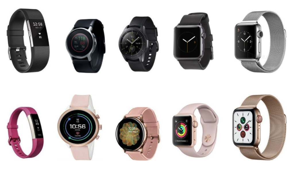
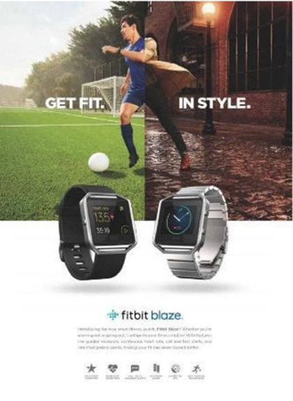
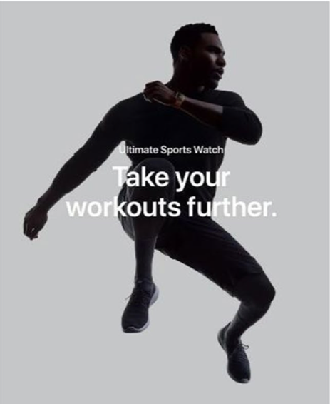
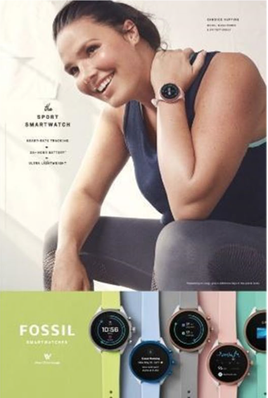
The study conducted within the article included a participatory design session with two groups, one with 3 men and one with 3 women. They were first shown watches from different companies from FitBit, Fossil, Samsung and Apple and advertisements from these companies. The images are shown below.

Top: smartwatches targeted towards men, Bottom: smartwatches targeted towards women, From left to right: Fitbit, Fossil, Samsung and Apple

From left to right: Fitbit, Apple and Fossil

The most interesting findings are listed below:

Theme 1: Gendered aesthetics

  • All females interested in products targeted towards females
    • Associated specific colours with specific genders
    • Associated all gender-neutral products to be more masculine
      • Especially Apple Watch: masculine, although advertised as gender-neutral 
      •  Due to specific features: large square screens & wide straps in silver to be linked to males
    • In general: attitudes more open to the rules and norms of gender patterns
  • All males identified product language targeted towards males
    • Through stereotypical colours such as ‘pink for girls’ and ‘blue for boys’
    • Classify particular colours as female or male and intentionally assign gender values to products
    • Dark colours: stereotypical colour for men –> comparison to cosmetic products targeted towards men –> prefer products attached with masculinity
    • Avoid products not meant for males
  • Both genders identified gendered colours: dark colours for males & bright colours for females
    • References from gender imperatives and fears of the norms of appropriate gender stereotypes  –> influences of advertising
  • All participants agreed that smartwatches looked more masculine

Theme 2: Masculinity

  • All male participants identified following attributes for male targeted advertisements:
    • minimal information, not long to read, more rigid, infographics to portray info –> less time to read 
      • observations from their gender identity & societal norms
      • attributes influenced and derived from the society and its expectations (e.g. pressure from peers & parents to behave within traditional gender roles)
    • often fear of being perceived as homosexual: main motives for young males to act within the stereotypes
My analysis of the results of the study

This study shows precisely what I conveyed above: unisex is a hard design concept to implement within the norms of society as especially for males any attributes that are in any way associated with females are seen as “homosexual” and not fitting within their gender identity. This fragile masculinity that relies on vehemently staying within these roles drives brands to counterfeit this by designing gender-neutral or unisex products more towards male design preferences within gender norms. As a result, females view these as targeted more towards men. This reflects the trends within fashion industry as well, where unisex fashion is often only masculine clothing, like oversized fashion targeted also towards females. 

A hypothesis I have formed is that gender neutral clothing in general perhaps has a different target group than the other categories of unisex products, as men that want to wear skirts and more feminine cuts are more secure in their masculinity and do not rely on staying within gender norms. This could also be due to the fact of being genderfluid or -queer or even agender. Therefore, it might be interesting to analyse which target group is interested in gender neutral fashion in general and to analyse other fashion companies and how they advertise to their target group.


Literature

DiffSense. n.d. The difference between Gender-neutral and Ungendered. Accessed November 29, 2021. https://diffsense.com/diff/gender-neutral/ungendered.

Esfahani, Bahar Khayamian, and Pooya Sareh. 2021. “Insights into the role of gender in aesthetic design: a participatory study on the design of digital health wearables.” International Journal on Interactive Design and Manufacturing 173-185.

Morgan, Ashley. 2019. “Why the Terms Unisex and Gender Neutral are not Fit for Purpose in Contemporary Clothing and Fashion Design.” Journal of Textile Science & Fashion Technology. 

Not.Jethro. 2020. Unisex vs Gender Neutral Fashion — What’s the difference? August 14. Accessed November 29, 2021. https://medium.com/@jethronepomuceno/unisex-vs-gender-neutral-fashion-whats-the-difference-a44512d9136e.

Reilly, Andrew, and Ben Barry. 2020. Crossing Gender Boundaries: Fashion to Create, Disrupt and Transcend. Bristol: intellect.