As the glossary in my last blog entry shows very well, there are already existing concepts which cover topics that I planned to bring in the context of UX and its establishment during my research. So, in upcoming blog entries, I’ll take a closer look at the following terms: Universal Design, Inclusive Design, Accessibility, Green UX, UX Metrics and everything I’ll come across within this research that turns out to be central for my research topic.
This Blog entry will cover universal design, its 7 principles and its (socio-) ecological impact.
“The power of the Web is in its universality. Access by everyone regardless of disability is an essential aspect.“
— Tim Berners-Lee
Universal Design has its origins in architecture and it is seen variously as a design approach, a process, a paradigm, or as a design attitude leading to a design strategy. This strategy overall aims to create environments that can be used by everyone to the greatest extent possible. Universal design is based on the idea that a design which meets the needs of excluded groups, such as the elderly, children or persons with disabilities, will also improve the product experience of a broad range of social groups.
While universal design is often mentioned along with related concepts like accessibility and inclusive design, it can be distinguished by its goal of creating a single design solution that can serve as large a diversity of users as possible.
Universal design is not only a theoretical concept, there is a guidance within 7 principles, how a designer can achieve universality in design.
7 Principles of Universal Design
The 7 Principles of Universal Design were developed in 1997 by a working group of architects, product designers, engineers, and environmental designers led by the late Ronald Mace at North Carolina State University. According to the Center for Universal Design at NCSU, the principles “can be applied to evaluate existing designs, guide the design process, and educate both designers and consumers about the characteristics of more usable products and environments.”
Principle 1: Equitable Use
The design is useful and marketable to people with diverse abilities.
Principle 2: Flexibility in Use
The design accommodates a wide range of individual preferences and abilities.
Principle 3: Simple and Intuitive Use
Use of the design is easy to understand, regardless of the user’s experience, knowledge, language skills, or current concentration level.
Principle 4: Perceptible Information
The design communicates necessary information effectively to the user, regardless of ambient conditions or the user’s sensory abilities.
Principle 5: Tolerance for Error
The design minimizes hazards and the adverse consequences of accidental or unintended actions.
Principle 6: Low Physical Effort
The design can be used efficiently, comfortably and with a minimum of fatigue.
Principle 7: Size and Space for Approach and Use
Appropriate size and space is provided for approach, reach, manipulation, and use regardless of user’s body size, posture, or mobility.
“Experiences that hit all levels put users in a state of flow, or total immersion into their task. This is called deep pleasure.”
— Mimi Yu
Moreover, the research gave me some examples where universal design implies added value for ecology and socio-ecology. In the article „Designing for the future? Integrating energy efficiency and universal design in Belgian passive houses“ by Ermal Kapedani it was said that energy efficiency (EE) and universal design (UD) are two important fields addressing parts of the environmental and social pillars of sustainability.
Another article examined whether universal design combined with a socioecological approach improves measured accessibility compared to existing fitness facilities. It was shown that universal design coupled with a social ecological approach improves accessibility in fitness facilities and results in a reasonable payback time. It led to higher scores than comparison facilities and excess revenue exceeded the extra cost of accessibility enhancements. Therefore, Universal Design combined with a socio-ecological approach leads to successful results.
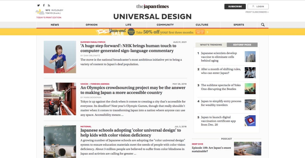
Japan
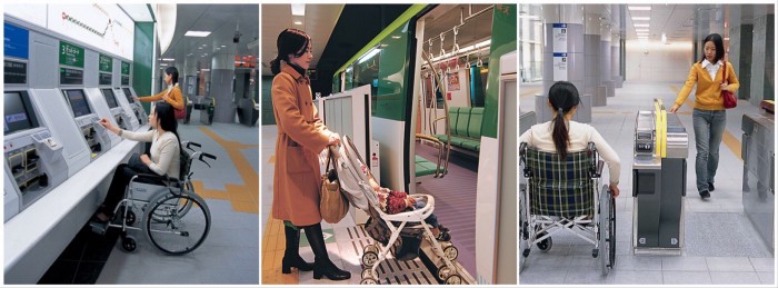
Japan is well known for a very well implemented universal design approach and acts as a model country in regards to providing accessibility. Japan has built efficiency into the experience, removing friction and guiding you through a range of services from renting an apartment to taking out the rubbish. Train stations are one of the best examples of universal design and equitable use, allowing a wide range of people to access the station.
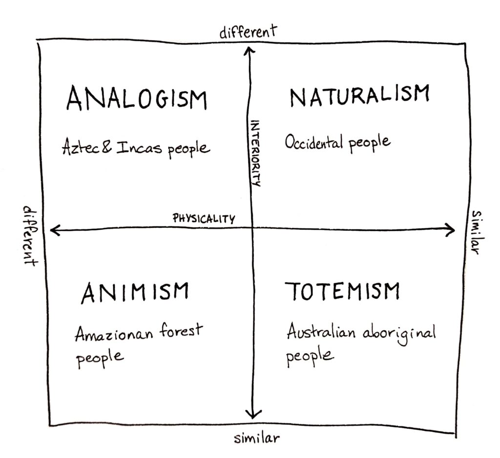
Ontology is a anthropological/philosophical discipline that refers to the subject of existence. It’s about how we perceive the world, we classify it, we act in it.
Philippe Descola is a French anthropologist that has dedicated his research to nature ontologies across cultures. His idea is that the concept of “nature” doesn’t exists and is just a social production centered on human point of view. The belief of the existence of nature is to say that some entities exists thanks to something that is not human willingness. Very typical of occidental cosmologies, naturalism makes us thinks that nothing happens without a cause. That way, naturalism is so implemented in our ways of thinking that it determines our points of view and our view on others and world.
But naturalism is not the only way to perceive nature. In the book Par-delà nature et culture1 (Beyond nature and culture), Descola identifies four different ontologies: totemism, animism, analogism, and naturalism. He classifies them considering the continuity of two parameters :
interiority : do objects have intentions, a purpose, like me ?
physicality : do those objects share the same physical properties as me ?
Totemism believes in a similarity of the physicality and of the interiority. It gathered humans and non-humans into categories depending on certain physical or psychological attributes. For example the Australian aboriginal people all have a totem. You are not called by your name, but by the totem like Mr Kangaroo, Mrs Ignam and so on. A totem can also represent a clan, a generation. It means you share some attributes with this totem and then you are connected by physicality and interiority.
Animism see a discontinuity of the physicality but a continuity of the interiority. In other words, what can make a difference between humans and non-humans is just the skin. Going beyond the physical differences, animals and plants have the same soul and purposes as humans. You can interact with the same as you do with other people. For example, some aboriginal people of the Amazonian Forest discuss every morning the dreams they had in the night. In those dreams, plants and animals are taking a human appearance and speak human language to deliver messages.
Analogism says that physicality is different, either interiority. Here, the world is divided in a myriad of different individualities, all physically different (not the same kind of life) and in their interiority too (not the same purposes). It is the way of thinking of Aztec and Incas people, or of the Chinese civilization. The world is composed of an infinity of hierarchic relationships between every living beings. It is often related to the polytheists religions that give different attributes to gods.
Naturalism is the way all occidental have been raised. Here, we put a bareer between us humans and whatever else we consider as nature. Despite that we have the same physicality, we don’t have the same interiority. We share the same physiological properties, but we have completely different purposes in life. Because this way of thinking is so widespread in our culture, it’s nearly impossible for us to understand other ways of thinking and to have the feeling that we are part of the nature. Besides, the word “nature” can only be found in occidental languages, you don’t have it the Japanese or Chinese civilizations.
Naturalism led to the separation of nature and culture and is the direct source of all our actions concerning nature. For centuries we’ve been told that it was different from us. Is it even possible nowadays to think out of the naturalist prism ?
Sources :
Descola Philippe, Par-delà nature et culture, 2005
_On December 10th THE GAME AWARDS for the year 2021 took place in LA, where great games get acknowledged and, stating the obvious, awards. Also is this an event for game developtent companies to present their new projects to the whole world.
_Since 2020 there is an award in place for “Best Innovation in Accessibility”, which recognizes debvelopers that are pushing the medium forward by adding features, technologies and content to help games to be played by an even greater audience. Last year, this award was given to NAUGHTY DOG STUDIOS for their immense dedication to publish the most accessible game n a long time: THE LAST OF US PART II. This year, THE GAME AWARDS made the extra effort to make their show more accessible, including an audio-descriptive stream, an ASL (American Sign Language) stream and closed captions. Even on site one could see ASL interpreters standing in front of the stage, bringing ASL to the audience. The award itself was presented by Morgan Baker (Accessibility specialist and designer; also judge in this category) and Jacksepticeye (webvideo producer).
Games are for everyone.
They stated that it’s about honoring people, who work as hard as possible to share their work with as many people as possible by discovering new and creative methods to encourage inclusion. This year’s nominees were:
Far Cry 6 (UBISOFT)
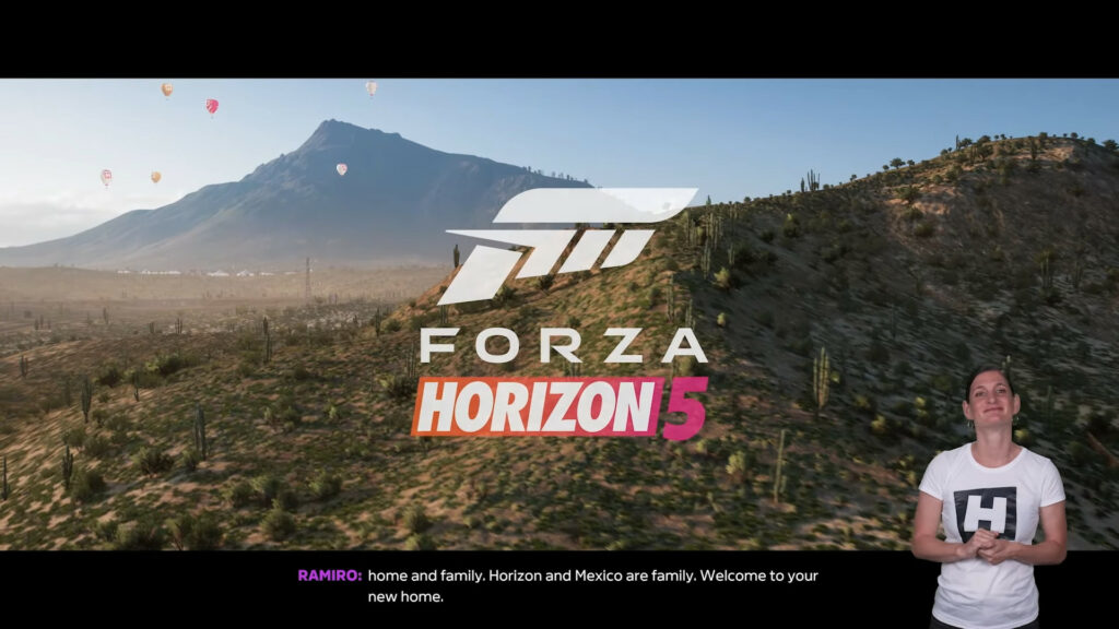
Forza Horizon 5 (PLAYGROUND GAMES)
MARVEL’s Guardians of the Galaxy (SQUARE ENIX)
Ratchet & Clank: Rift Apart (SONY)
The Vale: Shadow of the Crown (FALLING SQUIRREL)
_Quick Summaries on what each nominee accomplished with accessibility options in their games:
Far Cry 6. This shooter is a quite unexpected newcomer in accessibility, with a wide variety of color customizations for different aspects of the game, like enemy laser pointers, to see where they are going to fire. Also closed captions, a colorblind mode, and texts to speech options.
Forza Horizon 5. The option to enable a in game sign language interpreter was added to this new racing game, besides of many other accessibility customizations.
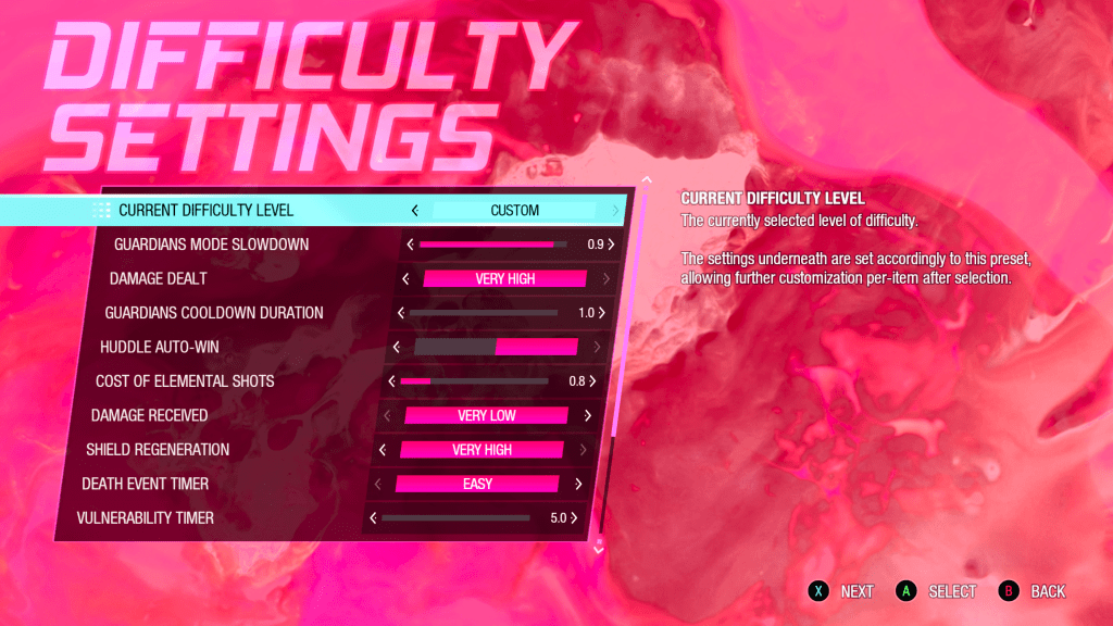
MARVEL’s Guardians of the Galaxy. Various settings to alter gameplay and certain aspects of it, like changing received damage, ammunition costs, timers, and cooldowns.
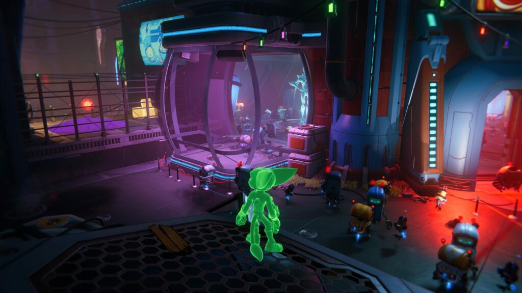
Ratchet & Clank: Rift Apart. Options to customize the visual appearance of the game, like depth of field, screen shake, colors, high contrast outlines and more.
The Vale: Shadow of the Crown. A very interesting nominee; a game solely and entirely told through audio and almost no graphics with a focus on narrative and storytelling – perfectly designed to be accessible for blind and low-vision players.
_The winner for best Innovation in Accessibility this year was Forza Horizon 5 (also Best Audio Design & Best Sports/Racing Game) made by PLAYGROUND GAMES. They stated, that their team were so committed to accessibility, so they made it to one of their core pillars of game design in this project. According to them, there is a billion players with some sort of disability which makes gaming a challenge for them – they are happy to be creators who can add options and features which open the ‘magic’ of video games to more and more players.
To win the @TheGameAwards award for Innovation in Accessibility for #ForzaHorizon5 is incredibly meaningful to us, and we hope to continue the important work of making Forza for everyone!
_Immediately after watching this award category and its winner I pondered, what are the exact benefits of ASL as opposed to subtitles? Apparently, ASL – provided by a skilled interpreter – makes it easier for sign language users to keep track of the conversation, who is currently speaking; by taking on the certain aspects of the speaking character. This is achieved through the fact that ASL works completely differently as language, with a different grammar, syntax, and stylistic nuances. Also, subtitles rarely indicate music, sound effects or the atmosphere of the situation. In conclusion, ASL in conjunction with subtitles can greatly enhance the experience of games for people with hearing disabilities.
Hello again. The first blog entry was meant to be like a kick-off entry/overview for the process of research within this project. It consists of information, assumptions, opinions and perceptions. To answer the questions I asked myself i have to close some knowledge gaps before. It will be important during my research to recheck these assumptions and to find a best solution approach within my topic.
Before I follow up on the content and questions from the first entry, I would like to clarify and define terminologies I will work with. Therefore this blog entry is used as a small glossary for UX related terms I came across within my research already and which I will update continuously in course of my further research. Additionally the glossary should help me in my research to follow a clear direction and to avoid misconceptions.
There we go:
A
++ A/B Testing
A/B testing is the comparison of two designs against each other to determine which performs better.
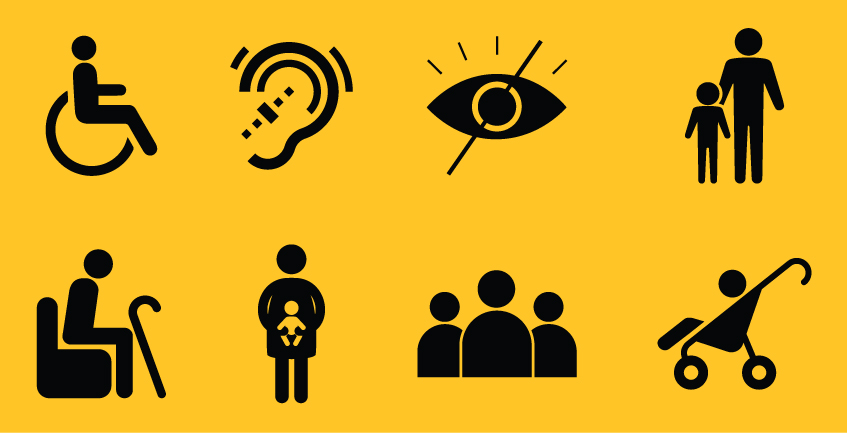
++ Accessibility
The practice of designing experiences for people who experience disabilities. Those with difficulty with any of the five senses of sight, hearing, smell, touch or taste may be benefitted by using products and services that have been designed with accessibility in mind.
++ Agile UX
Agile UX adds UX design and research methods to the agile methodology. The most important driver for Agile UX is the close cooperation between developers, UX designers and UX researchers during the entire process of product development. Ideally, every sprint entails a design and/or research goal. By planning, testing, optimizing and re-testing elements throughout the project, the UX team is able to roll out a final product that has already been validated by their target users.
B
C
++Corporate Identity (CI)
The corporate identity concept can be seen as a strategic concept for positioning the identity of a company and defining a clear uniform self-image, both within the company and in the corporate environment. By developing a clear “we-awareness”, the corporate identity concept is intended to establish a corporate culture internally as a network of lived behavioral patterns and norms. Decisions are made on the basis of a uniform corporate image or identity and corporate mission statement. This enables a significantly higher compatibility and synergy of corporate activities and releases considerable motivation potential through identification with the company and its policies.
++ Cognitive Biases
Cognitive biases are errors in reasoning, memory or other cognitive processes that result from holding onto existing beliefs regardless of contrary information. There are more than 100 documented cognitive biases, commonly categorized in four categories: biases that arise from too much information, not enough meaning, the need to act quickly, and the limits of memory. Cognitive biases are particularly important to be aware of while conducting research, as a way of arriving at truer findings instead of relying on personal preferences. Example: Designer Bob loves minimalist design, and exhibits confirmation bias when he decides to approach his new UI project with an ultra-minimalist approach.
++ Customer Experience (CX)
CX refers to all the different interactions a user has with a brand through its different channels and products, and how a user feels about them. It has a profound impact on brand trust.
++ Customer Journey Map
User journey maps depict an entire process that a hypothetical user can go through. From the information process, to the booking process, to the purchasing process. This mapping goes far beyond a single product or service. It also considers everything that lies outside of individual touchpoints (such as a website).
Customer journey maps visualize how users would achieve their goals and complete tasks. Ideally, research should show the pain points and customer needs within this map. Journey maps are often presented as timelines to demonstrate interaction points covering the beginning, middle and end of an experience.
D
++ Design Thinking
Design thinking is a non-linear, iterative process that teams use to understand users, challenge assumptions, redefine problems and create innovative solutions to prototype and test. Involving five phases—Empathize, Define, Ideate, Prototype and Test—it is most useful to tackle problems that are ill-defined or unknown.
++ Discursive Design
Discursive Design is about exploring how design can be used for good-, prompting self-reflection, igniting the imagination, and affecting positive social change. Discursive design (derived from “discourse”) targets the intellect, prompting self-reflection and igniting the imagination and expands the boundaries of how we can use design; how objects are, in effect, good(s) for thinking.
E
F
G
H
I
++ Inclusive Design
The British Standards Institute (2005) defines inclusive design as: ‘The design of mainstream products and/or services that are accessible to, and usable by, as many people as reasonably possible … without the need for special adaptation or specialized design. Inclusive design does not suggest that it is always possible (or appropriate) to design one product to address the needs of the entire population. Instead, inclusive design guides an appropriate design response to diversity in the population through: Developing a family of products and derivatives to provide the best possible coverage of the population. Ensuring that each individual product has clear and distinct target users. Reducing the level of ability required to use each product, in order to improve the user experience for a broad range of customers, in a variety of situations.
J
K
++ (UX) KPIs
In business administration, the term “key performance indicators” is generally used to refer to the success, performance or capacity utilization of a company, its individual organizational units or a machine. UX KPIs are key performance indicators that can be used to manage and coordinate UX in companies. They are intended to help integrate UX into the company and increase the UX maturity level.
L
M
++ Mental Model
A user’s mental model is a conceptualization or internal explanation each user has built about how a particular system works. As Norman says (1990), it is a natural human response to an unfamiliar situation to begin building an explanatory model a piece at a time. We look for cause-and-effect relationships and form theories to explain what we observe and why, which then helps guide our behavior and actions in task performance.
According to Norman, each user’s mental model refers to a product of many different inputs. Two core variables are “knowledge in the head” and “knowledge in the world”. Knowledge in the head comes from mental models of other systems, user expertise, and past experience. Knowledge in the world comes from other users, the work context, common cultural conventions, documentation, and the conceptual design of the system itself.
N
O
P
++ Persona
A persona is a fictional representations of a user group you’re designing for. Personas help stakeholders understand who you have in mind when you make design decisions, and act as a reminder to teams that “You are not your user.” Contrary to popular belief, personas are not to be taken as one actual person, but rather as a mix representing a group of users with similar behaviors and mental models. Personas are often created early in the design process so the designer knows who it is designed for.
Q
R
++Return On Investment
A measure for evaluating business performance. In traditional finance, ROI is the most common “profitability ratio” most often calculated by dividing net profit by total assets. The general idea of ROI helps product teams evaluate whether certain efforts are worth pursuing.
S
T
U
++ User-Centered Design
An approach for designing a product or service (user interface design), in which the end user is in the center of the process.
++ Universal Design
Universal Design is the design and composition of an environment so that it can be accessed, understood and used to the greatest extent possible by all people regardless of their age, size, ability or disability. An environment (or any building, product, or service in that environment) should be designed to meet the needs of all people who wish to use it. This is not a special requirement, for the benefit of only a minority of the population. It is a fundamental condition of good design. If an environment is accessible, usable, convenient and a pleasure to use, everyone benefits. By considering diverse needs and abilities of all throughout the design process, universal design creates products, services and environments that meet peoples’ needs. There are 7 principles universal design follows.
++ Usability
Usability is a measure of how well a specific user in a specific context can use a product/design to achieve a defined goal effectively, efficiently and satisfactorily. Designers usually measure a design’s usability throughout the development process—from wireframes to the final deliverable—to ensure maximum usability.
++ Usability Testing
Usability testing is the act of evaluating products or services by testing them with users. During usability tests, researchers observe participants who attempt to complete tasks. The goal is to identify usability problems, collect qualitative and quantitative data and determine participants’ reactions to an experience.
++ User Interface (UI)
UI is the medium through which users interact with an experience, product or device. Your mobile screen, the automated checkout kiosks at grocery stories, the keyboard on your laptop and the way Alexa responds to your voice are all examples of user interfaces.
++User Journey
The path(s) that users take to complete tasks or achieve their goals. From the perspective of analytics software like Google Analytics, journey maps visualize “a person’s experience during one session of using a website or application, consisting of the series of actions performed to achieve a particular goal.”
++ UX Analytics
UX Analytics are important for knowing how User Experiences are going. There are different tools to obtain analytics metrics. While companies used to run focus groups, client interviews and in-lab studies, today the right testing software enables organizations to conduct user research online to scale and quantify results continuously.
++ UX Design (UXD)
UXD is the practice of affecting the user experience through a user-centered design process, with a focus on usability and making user interfaces easy to understand. User experience design is a broad field containing many subfields like information architecture, research, UI design and more. Contrary to popular belief, user experiences designers cannot design all the possibilities of an end-user’s experience (too subjective and vast), but these professionals can apply a design process to help users complete the most important actions.
++ User Experience
User Experience (UX) is everything that happens to a user while interacting with a product, service or general experience. This includes the person’s emotions, attitudes, reactions and behavior during the experience. As a design field, UXBeginner defines user experience at three levels: Level 1 (broadest): the general experience anyone can have with a product or service. Level 2 (as philosophy): Placing the user – and their experience – as the priority and origin of truth for product design. Level 3 (as a way of doing things): UX leverages design thinking, processes, tools and techniques (wireframes, sitemaps) in order to create and affect the user’s experience.
V
W
X
Y
Z
Sources: https://www.interaction-design.org/literature/topics https://www.sciencedirect.com/topics/computer-science/user-mental-model https://careerfoundry.com/en/blog/ux-design/ux-design-glossary/ https://uxmastery.com/resources/glossary/ https://www.uxbeginner.com/glossary/ https://djangostars.com/blog/ui-ux-terms-everyone-should-know/ https://medium.com/@workatplay/the-persona-is-past-its-prime-meet-the-mental-model-a41ac415906d Interface Design : Usability, User Experience und Accessibility im Web gestalten http://www.inclusivedesigntoolkit.com/whatis/whatis.html https://wirtschaftslexikon.gabler.de/definition/key-performance-indicator-kpi-52670
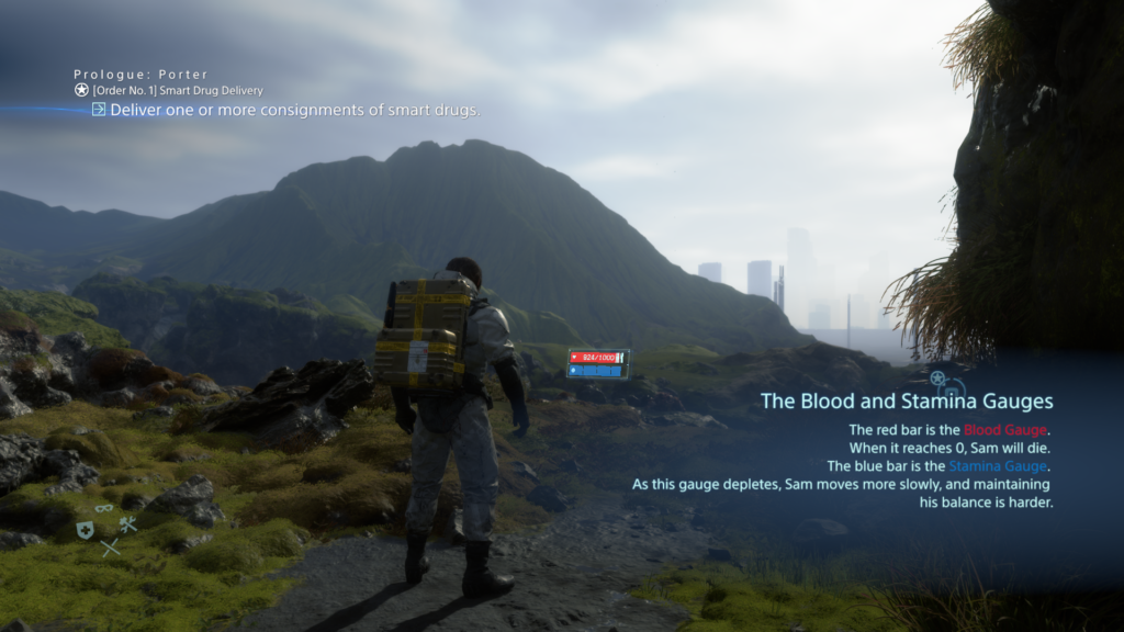
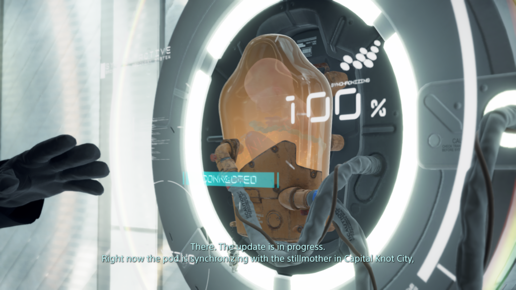
_Hands-on experience with DEATH STRANDING by SONY and Kojima Productions. This game is a beautifully crafted dark apocalyptic sci-fi game with an enigmatic story, a masterpiece in convoluted narrative, futuristic designs and rather complex systems and even more complex UIs.
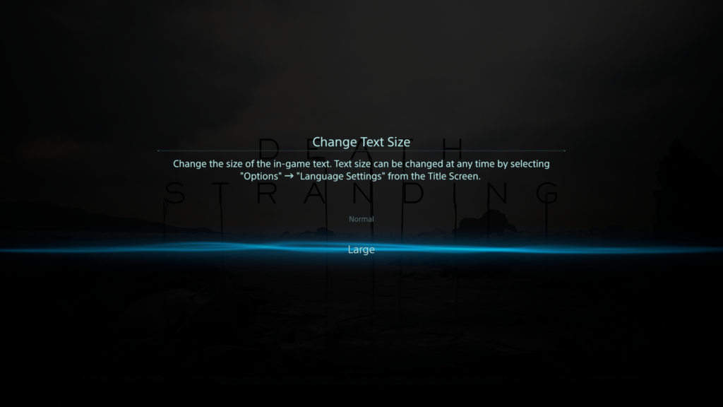
_Last year I played the ‘base version’ – the PS4 edition – quite a lot and found my way around the complex systems after a while. I learned how the different features work and how to use them properly; and even how to exploit them as much as possible to make my life easier with this game. But there were many things which annoyed me, like non scalable text size which made me often scooch even closer on the couch to my rather big screen, only to read some menu texts. So even for me, it wasn’t satisfying from the beginning and now, almost more than a year later, the “Directors Cut” for PS5 got released – rumor has it, this version is now more accessible. So, I tried the new version of the game after a yearlong break on a PS5 and immediately notices many improvements, mainly quality-of-life improvements. Now the question came up, how good were those improvements really? For a start, I researched some accessibility reviews on DEATH STRANDING and gathered their findings.
_The 1st review was made by Steve Saylor, a blind gamer – his general thoughts and opinions on the accessibility of this game were very intriguing. The crazy and wild story did really impress him, yet did he feel held back by the limitations of accessibility. He tested the PS5 version, where they implanted a “large text” option to enlarge the text size in the whole UI – whereas text in the base PS4 version initially was considered rather small. But even with this new option, often it seems hard to tell where large text was applied, and small text remains. Paired with that, the game has a lot of Button prompts, menus, button maps and texts which take up a lot of the screen, making it rather crowded. To identify everything correctly, one is required to lean back and forth to the screen – which is tiresome.
Staying with visual barriers, subtitles exist through the whole game; yet they do not have any high contrast or background to them – no further settings except on/off. But weirdly enough, in some situations – like any open menu – where there is dialogue experienced, the subtitles get a nice black gradient as background, but only there. Besides that, hearing impaired people might also find difficulties: there is no menu narration, but there are audio feedback/cues, that play on selecting inputs. The two main accessibility barriers he identified were for people with motor or cognitive disabilities. Starting with the latter; in the game there are a lot of different subsystems, which require you to memorize complex input patterns and often it’s hard to determine, what the most important information on the screen is right now – or what is just eye candy. There are subtle visual cues to those vital elements, but often you are left with a ‘lost’ feeling in all these menus.
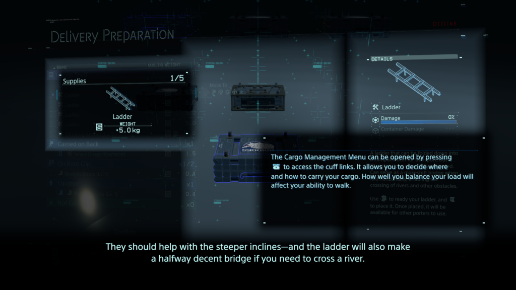
The lack of any in-game remapping of controls (PS5 version) comes to play at one of the core aspects of the game: while you deliver your items/cargo you will cross different types of terrain (water, rocks, mud, snow…) and for that you to balance your cargo. This is done by ‘ready yourself’ – pressing down left & right shoulder trigger – to prevent yourself from toppling over. The need to push them down constantly to stay upright might be a barrier for some people with motor disabilities. The adaptive triggers of the Dualsense controller do feel nice, but even without any dexterity problems it can get annoying and exhausting, because you will press the shoulder triggers a lot – fortunately you can disable the adaptive feedback. Later in the game you do get access to vehicles, which will help you with that, but it will take some time and exhaustion to get to that point. But that being said, these helping game features possess a durability system and do have to be maintained to work properly.
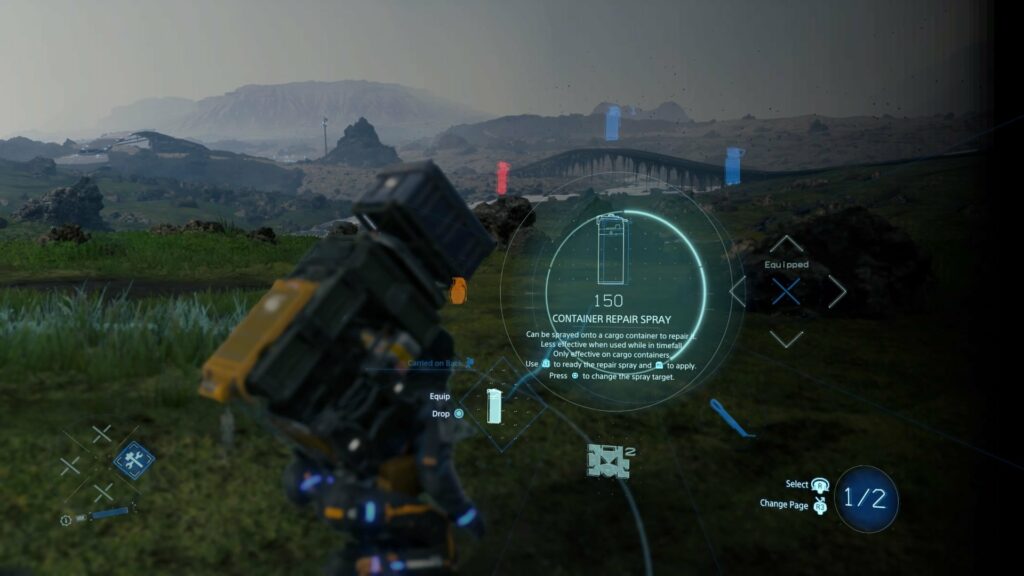
Buttons in DEATH STRANDING do have many different functions, depending on what subsystem you’re in. A good example would be the item “Repairspray”, which is used to repair worn out cargo containers. To use this item, you will have to:
Press the D-Pad right and hold it, that opens the item wheel
Select with your right analog stick the item
If it’s not on the first page of items, press the right analog stick to switch pages (often referred as R3)
Let go of the D-Pad, item is now equipped
Press left shoulder trigger (L2) to ready it (it now points forward)
Press square to point it backwards to your cargo mounted on your backpack
Press right shoulder trigger (R2) to activate it (until it runs out of gas)
Now you either but it back with D-Pad right or you hold D-Pad right, access the item again in the item wheel and press circle to drop it
Everything has such complex interactions und requires multiple button presses, even in combat and other stressful situations. His final words were that the “Directors Cut” does have some neat little improvements, but it remains just an upgraded & polished version with minor changes to the PS4 edition. It could be, that for many people the advances made are still too little.
_The 2nd review is by Michael Matlock who also came to mainly the same conclusions. Multiple button presses at once are difficult, and even remapping them within the PS5 integrated system options (which is possible nonetheless) is tiresome and exhausting. An interesting aspect which joined the barriers for people with motor disabilities was the camera: the right stick must be adjusted constantly to look around and an automatic camera would help a great deal; this would center/adjust the camera always behind the player character. It was mentioned that the difficulty setting “Very easy” was overhauled that everyone could beat the game, where penalties for dropping cargo are very small and combat is fairly simple – this would have to be tested, I might add.
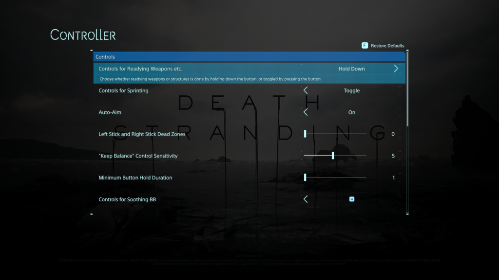
Concerning accessibility options, the aim-assist is by default activated (changeable) and there is an option for “Keep balance”-sensitivity, which controls who difficult the balancing part is for the player. Also, there is now a “Hold Button”-option, resulting in overriding any quickly repeated button presses (quick time events) to just holding the button down. The analog sticks have adjustable dead zones, and some motion-based inputs can be remapped to ‘normal’ button presses. The HUD can be adjusted with selecting & deselecting shown icons to reduce visual clutter; and the brightness can be easily adjusted. Another interesting barrier, everything has subtitles – expect the frequent appearing music pieces. Yet not hearing them will not stop you from advancing further in the game, but sadly do they add a lot to the atmosphere of the game.
A big burden is lifted through the rather smart game design – the online component. As one might never meet another player in his own game world, yet these other online players might alter your own game world by leaving objects and structures to help you traverse the world easier – this feature often helps a great deal getting through the game. For example, at one moment you might struggle crossing a river and when you return later someone left you a bridge in the meantime. Final judgement of this review was partially accessible and again, a lot of helpful accessibility options, but still room for a lot of improvements – yet it has gotten substantially better considering earlier Kojima titles.
_3rd review of the game was done by Courtney Craven at CAN I PLAY THAT?: again, iterating many of the given problems. Interesting enough, the ability to plot routes, which will then be visible in the game world as dotted lines was praised as helpful tool while being deservedly difficult to operate (speaking again of multiple button presses). Also, the “very easy”-difficulty could eliminate combat completely, but I doubt stripping away this aspect completely does the game any good, but maybe there could be a workaround by maybe leaving the combat situation in the game yet removing the possibility for a “game over”.
The statement was made, that if you struggle with holding down the triggers, you will not really be able to play DEATH STRANDING – which, given the number of times you will have to press it, is most likely true. Regarding the font sizes, it was mentioned that even the “large text”-option looks like rather ‘normal’ text size. I agree on that; the ‘large’ text was just right for me, yet somebody might need it even bigger – and that’s just not supported. Final words in that review that this game is one of the most barrier-ridden games in a long time but not a complete accessibility failure – although many people might not be able to enjoy this game.
_My own small notes on this game are that I was rather surprised by the given accessibility options, because Japanese productions often suffer from a poor approach to accessibility – maybe it was SONY helping hand – but it was nice to see that there were some ideas, thoughts and time spent on making the game more easily enjoyable for a broader audience. What I still struggle with, which is funny no one mentioned it in my research; the sheer amount and variety of complex, new and unknown icons often leave me pondering, what they want to tell me – although this is for another time.
Der Enaktive Realismus beschreibt den Zusammenhang bei einer interaktiven Oberfläche, einem Spiel beispielsweise, zwischen der in echt ausgeführte Bewegung und der Reaktion der dargestellten Inhalte im Spiel beispielsweise. Das Handeln wirkt sich in einer realistischen Weise auf die Oberfläche aus. Ein gutes Beispiel wäre, wenn man in einem Dialog durch eine bestimmte Handlung das virtuelle Gegenüber verärgert.
Dieses sogenannte Mapping, zwischen realen Bewegungen und der Auswirkung spielt eine große Rolle, inwieweit die Interaktion im Betrachter einer aufs echte Leben übertragbare Reaktion auswirkt.
Der externe Realismus, nach Lin, bezieht sich auf die Übertragbarkeit des Gesehenen auf die reale Welt. Darunter fallen Punkte, inwieweit kann man sich in einen Charakter hineinversetzen, bis hin zu einer realistischen Darstellung von Effekten, wie Feuer, Rauch, Explosionen, Partikel, Wasser und noch vieles mehr. Je echter dabei der Detailheitsgrad ausgeprägt ist, umso “realistischer” ist auch die Darstellung. Die Glaubwürdigkeit steigt. Je mehr man diese Übertragbarkeit ausprägt, umso stärken sind die Reaktionen der Betrachter. Im Research von Lin kann beispielsweise oft herausgelesen werden, dass die Immersion und Identifikation stark erhöht werden. Die Relevanz für das reale Leben steigt daher zugleich, sodass die Reaktionen auf die dargestellten Inhalte mehr von echten Reaktionen ähneln. Lin schreibt auch von einer erhöhten Aggression bei dem Spielen von Ego-Shootern beispielsweise, kann aber in weiterer Folge durch weitere Research darauf schließen, dass es immer noch eine Barriere zwischen dem Dargestellten und dem Realen ist, da die Reaktionen ausschließlich auf das Spiel fokussieren und nicht auf die reale Welt.
Eine Schwierigkeit, die sich nun aber immer häufiger darstellt, ist, dass in den heuten Filmen und Spielen nicht mehr nur wirklich existierende Inhalte dargestellt werden, den Drachen Beispielsweise gibt es ja nicht. Trotzdem wird ein Modell erstellt, das so echt, wie nur möglich aussieht. Eine “richtige” Referenz dazu existiert natürlich nicht, daher leidet natürlich auch die Übertragbarkeit in das echte Leben darunter. Inwieweit die Übertragbarkeit und die dadurch entstehende Freude über dem Stauen über surreales steht, ist natürlich noch fraglich – in erster Linie handelt es sich aber um ein Paradox, das man nicht mehr mit “Realismus” alleine lösen kann.
Seniors are easily overwhelmed with too much fast information. They are from another time and brains don’t learn faster with age, it is the opposite. In order to help with too much to learn, limiting functions, reactions and options to the most comfortable and useful once is key here.
Seniors are not interested in memes, podcasts, online shopping, digital files or navigation. They learned the minimal old way to find their way, but with the globalization they still wan’t to keep contact with their family and be able to see them in Video-calls and more. A phone is a smart device to do so, but it comes with too many features for seniors.
A block-app that allows to freeze features and put the important abilities on the main Home screen could be the solution.
If a Senior is better with more features or maybe is interested in, let’s say, sports, streaming or E-Mails, than this can just be added to the Home-Screen and not frozen. Also interest helps the brain to learn better, so grandparents that are interested in a specific more advanced feature are capable of learning it because passion drives them.
That means the app target group is actually the younger relatives and not the grandparents, but the outcome is indirectly targeted to seniors. The app is customizable by relatives or phone-services at shops.
Cropped shot of a group of colleagues using their smart phones in synchronicity
Phones and other devices are packed with functions and options, so many, we do not even use. Why are we not overwhelmed with it and why do we keep using and learning more and more functions? Well, I have no clear answer to it, but observing this topic and my main topic together, I see a difference. A difference in why older people need less functions, or options taken from them to be able to use the devices, and why the new generations implement their devices so well.
First, it’s the aspect “growing up”. Growing up with implemented systems and habits is easy and builds a general understanding of the system and new changes in the system. This is missing for the older generation as the invention of phones and computers was targeted to a younger audience making the gap even larger. So many years passed thinking older people won’t need it, no one teaching them, no one inventing a version for seniors…. Many years fell into this ignoring gap.
The second aspect is “the circle around”. If you have work, friends, entertainment and school around you, that basically forces you to use multiple functions of your devices, you learn to implement it into your life and work even faster with it. It really does make your life easier with more functions.
The third aspect that I see is “reachability”. A phone is small, thin and always in your pocket, making it very accessible. So much even that we unconsciously learned a habit-movement like reaching always for our phone, checking if it is still there, or any notifications or even the time without really reading the time. We even forgot the “Watch” movement, although it is coming back with the Smart-watches. The fourth aspect is “repetition, memory and signals”. Having many sources of notifications that use the same device like friends, family, work or school makes us always ready for signals like ringtones, vibrations and so one. So we are aware of them and react to them so we constantly reach to our phone which gets us to “repetition”. As we learn all the smart touches and movements, those implement into our memory. We swipe, we zoom, we learn all those commands.
Older people are not in those circles, do not react or hear those signals and so they do not learn those smart touches and movements, therefore it never implements into their life as the “automaticality” or “automotoricality” never reaches a point where it is not hard to work with anymore. So it is very important to work on their needs to make devices simpler for them without cutting them from families that are in those smart-device-circles. This will be in the next post.
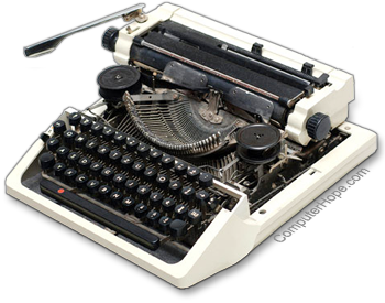
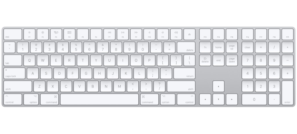
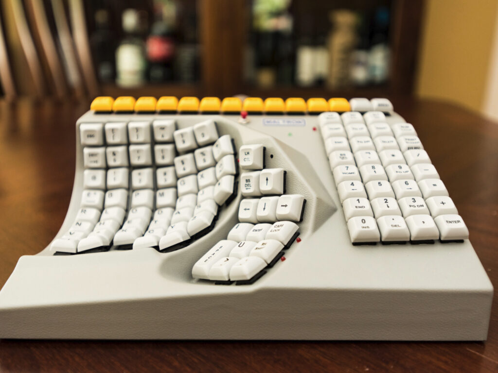
Some things were invented as a tool, very simple, but never got updated. Why? Because the simplicity and the habit of using it worked and got implemented well into a daily life. For example Keyboards, Instruments or glasses. Some things stay the same to honor a tradition or a culture, like said before, instruments. But others worked in their simple usability.
The first Keyboard had the same Look and arrangement of letters like nowadays. Of course the technique behind it updated to electronic devices.
It is not like no one tried to change them in their functionality and usability with hopes to make them even better or easier, but these inventions did not implement because first of all, it was an intervention in the learned usability of the products before and second of all, they tried to put more functions on it. People didn´t like that. Simplicity is key.
Do you know those “Call now” commercials, where they try to sell you a kitchen product that can do all the things? How many people who fell for it actually use it? At the end they think it is easier to just use a knife and cut vegetables before trying to unpack the gadget and clean every unreachable blade or whole afterwards. Putting too much into something makes it too complicated, especially when it is unpractical in size, storage or rechability. Other inventions that always stayed the same for it’s simplicity: Glasses, books, cutlery, pencils, money, etc.
This post opens up a question: “But why are Computers and mobile devices working for us even though they are packed with functions, even more than we ever use?” – I will try to find the answer to that in my next post.