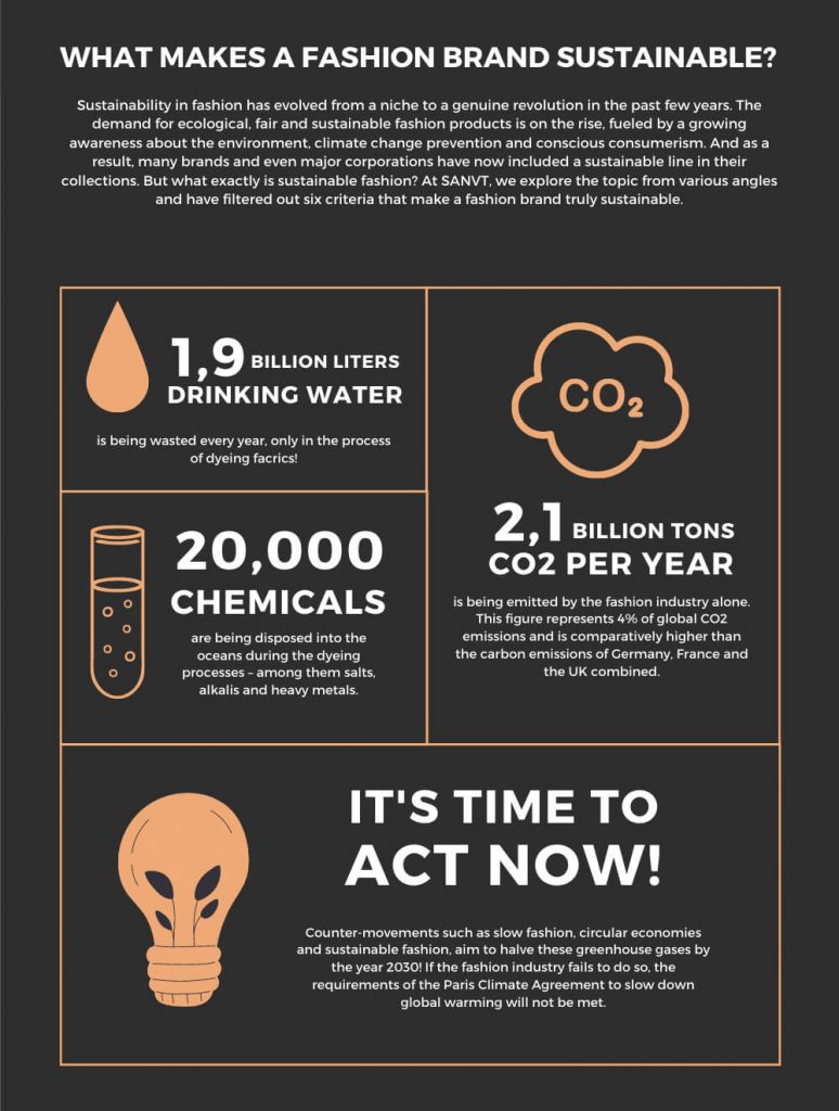
Let’s face it, the fashion industry is one of the dirtiest we have on this planet. It wastes water, it pollutes the air and oceans and is responsible for 2,1 billion tons of CO2 per year.
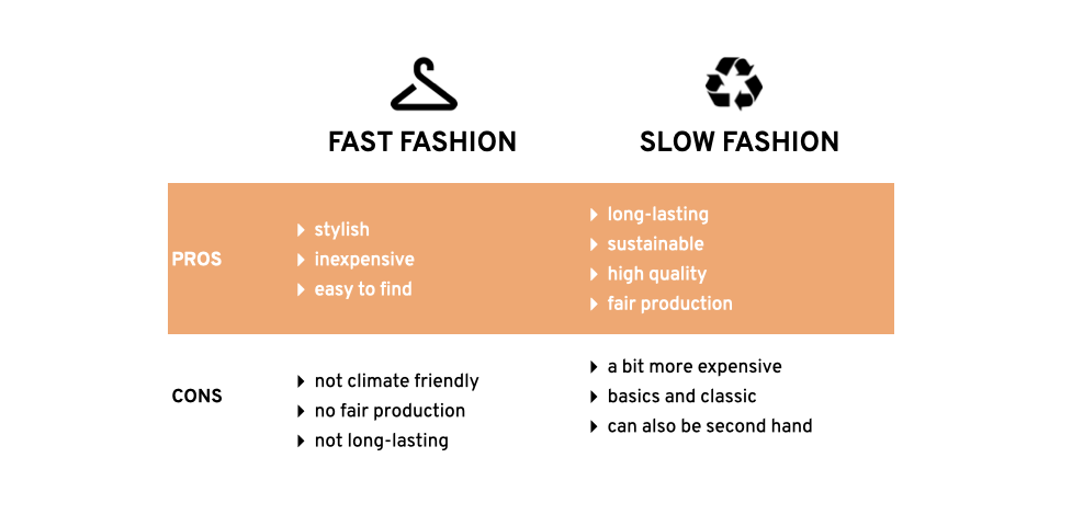
Luckily, producing clothes more responsibly isn’t just a trend anymore but became a strong movement over the last few years. Due to growing awareness, the demand for fair and ecological garments as well as the market expanded to a great amount. A term that often occurs in that context is SLOW FASHION.
But what exactly does slow fashion mean?
“Made from high quality, sustainable materials. Often in smaller (local) stores rather than huge chain enterprises. Locally sourced, produced and sold garments. Few, specific styles per collection, which are released twice or maximum three times per year.” The following graphic compares slow fashion with fast fashion.
Besides from the slow fashion aspects, there are 6 criteria that sum up what makes a fashion brand sustainable.
In order to understand how retailer help their customers to find the right garment in the right size, this blog post compares different approaches of UI/UX of online shops.
A big part of e-commerce returns happens when products don’t match their online description. Online shoppers return clothes that don’t align with their needs, that’s why e-commerce brands use size guides. With size guides, brands want to reduce return rates and improve the customer’s shopping experience. However, there are several approaches that support online store visitors to find the right fit. I tried out various e-commerce size guides and put together an overview of them in the following.
Best practice examples
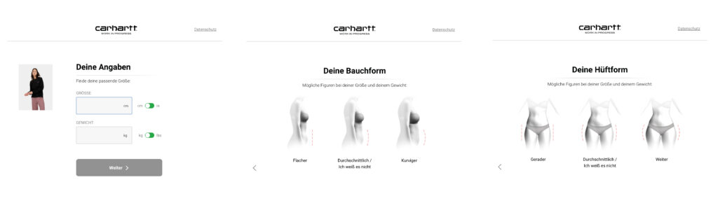
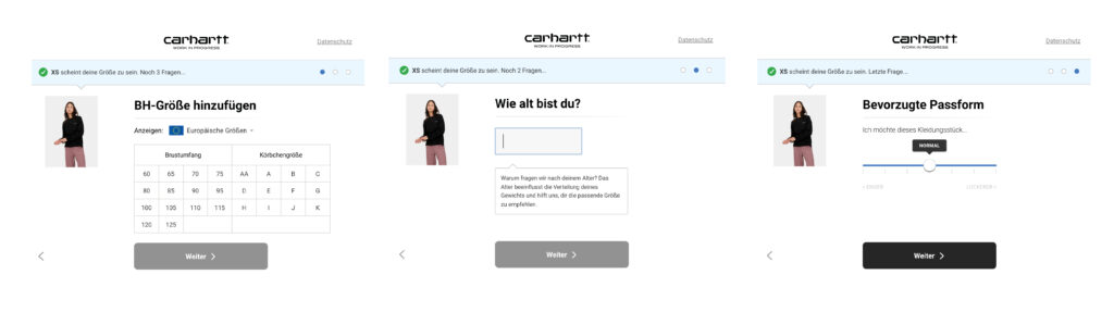
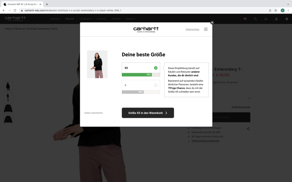
As a first example, I would like to share Carhartt’s online size guide. In 6 steps, the online store helps visitors to find their size. See steps below.
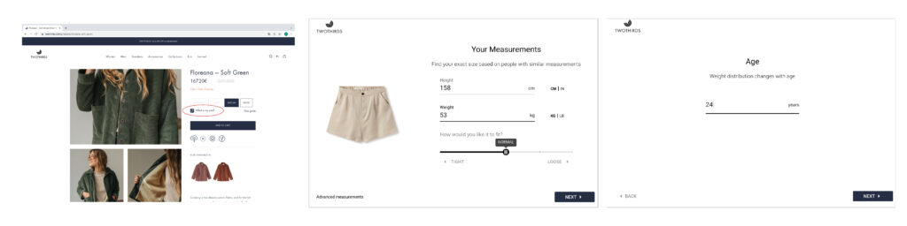
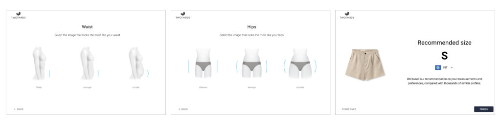
A similar size guide was found on the TWOTHIRDS website.
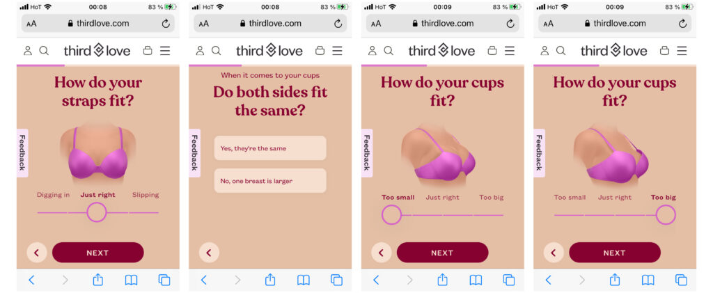
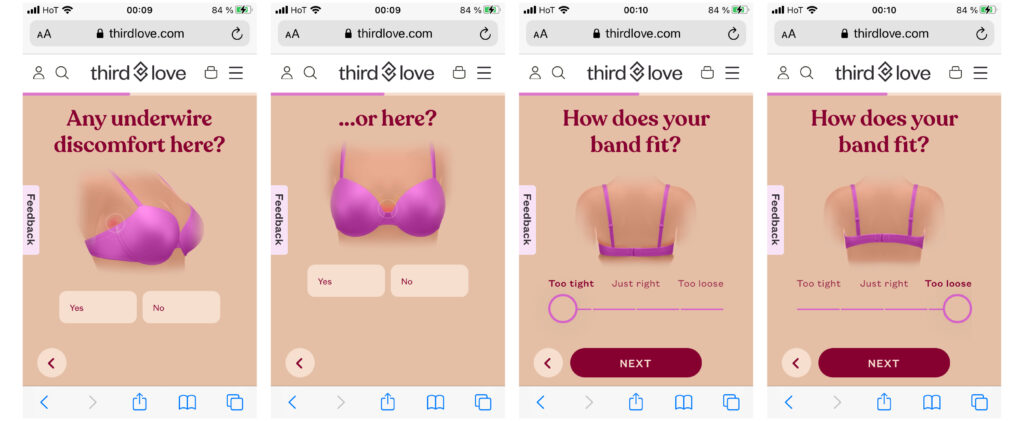
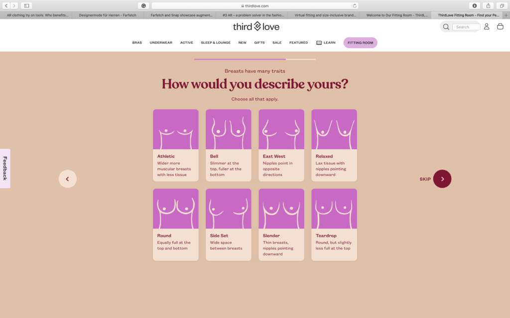
The next best practice is more extensive than the ones before. ThirdLove is an American lingerie company that invites website visitors to take an interactive quiz about their bra fit.
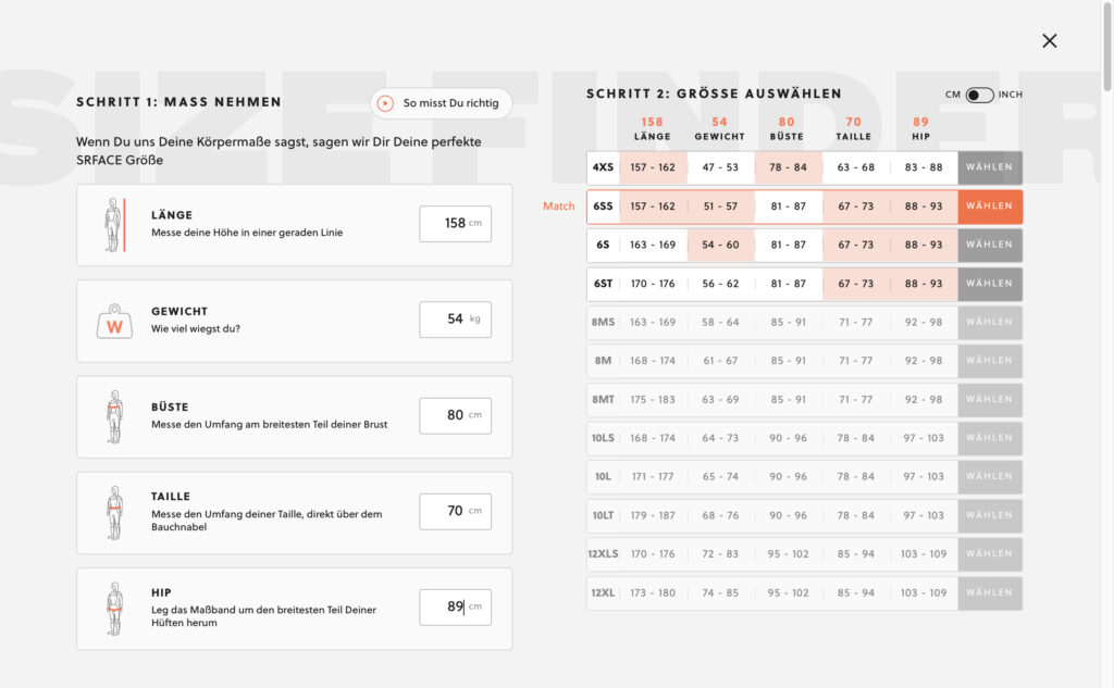
SRFACE offers a sizing guide for their wetsuits based on measurements.
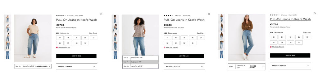
The jeans retailer Madewell follows a simple but effective method of size guiding by showing customers on product on different models/bodytypes.
What information about a consumer is important for size guiding and how can it be categorized?
The categories in guide sizing for women online that emerged from the examples discussed are:
• body measurements (height, weight) • body type (bust, taille, hip) • age • usual sizes (e.g. bra size) • preferred fit (loose, tight)
What are proven methods to deliver more accurate size guidance in online stores?
Additionally, the following dots should be included in fashion e-commerce websites to improve size guides.
• Include fit finder quiz (interactive online fit/size quiz) • Interactive size guide • Display product videos • Show product on multiple models/different body types • Measurement conversion charts • Feature customer reviews to validate size guide
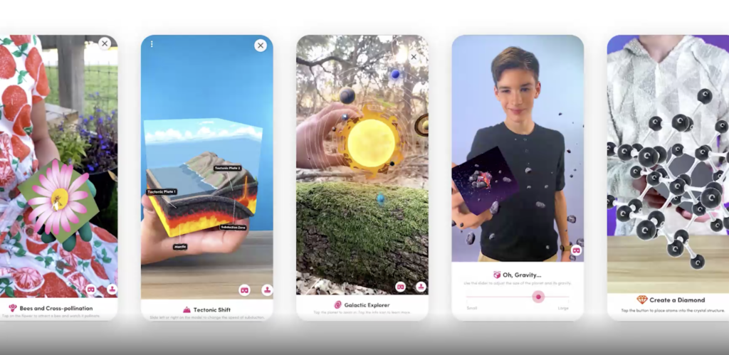
This blog entry will be a growing collection of questions that educators, designers and practitioners in general need to consider when designing/developing educational AR products.
Questions, questions and more questions
Who is the target group? What’s their educational level?
What is the learning environment? —> Classroom? Distance learning? Workplace? Indoors? Outdoors? …
What contents are to be conveyed?
Which part of the content to learn should be enhanced by AR?
What goal(s) should be achieved by using AR technology?
In what proportion will real and augmented content be combined?
How is the content prepared didactically?
Which AR device(s) will be used?
Which AR technology fits best? —> Trigger-based, View-based?
What are the advantages of AR in the learning context compared to traditional approaches? —> Which added value has AR in this case?
How can multiple senses be addressed?
How can cognitive overload be avoided?
How can teachers easily and quickly add/adapt content?
Hello again! In the following blog entry I will be writing about the advantages and limitations of using AR technology in the educational sector, which many studies already have been conducted to establish.
Advantages & Benefits
Many studies indicate that the use of AR in the educational field brings many benefits. According to a meta-review by Garzón, Pavón and Baldiris (2019), which analyzed 61 scientific publications, a total of 100% mentioned some kind of advantage when using AR systems in education. The following factors are the main advantages mentioned in their paper:
Learning gain: When using AR systems, students can improve their academic performance or even obtain better scores than students using traditional approaches. This improvement was reported not only by data, but also for different teachers and the students themselves
Motivation: The use of AR can increase the motivation of students as well as their level of fun while learning, compared to other pedagogical tools
Sensory engagement: When AR activates multiple senses, knowledge retention can improve.
Abstract concepts: AR can ideal to explain unobservable phenomena (i.e. the movement of the sun)
Autonomy: AR technology can not only help retain knowledge, but also gives students the possibility of retaining it for longer periods of time compared to other pedagogical methodologies
Memory retention: The combination of real and virtual worlds can increase the autonomy of students taking into account their natural abilities and motivation for using technological devices
Collaboration: AR can create possibilities for collaborative learning around virtual content which can facilitate learning, since it allows learners to interact with their partners, as well as with the educational content
Accessibility (not further described in the study)
Creativity(not further described in the study)
In a blog (not scientific!) by Sinha (2021) I found some more advantages of AR in education, that were not listed in the aforementioned study:
Easy access to learning materials anytime, anywhere: AR could replace textbooks, physical forms, posters, and printed brochures. This mode of mobile learning could also reduce the cost of learning materials and make it easy for everyone to access
Safer practice:In cases like practicing a heart surgery or operating a space shuttle can be done with AR without putting other people in danger or risking millions of dollars in damage if something goes wrong
Disadvantages & Limitations
According to the aforementioned meta review by Garzón, Pavón and Baldiris (2019) 15% of the reviewed publications reported some disadvantages or problems when using AR in educational settings. The following factors are the main disadvantages mentioned in their paper:
Complexity: Complexity can be an issure especially when designing for children. AR being a novel technology, which involves multiple senses, can become a very complex tool especially for those who do not have technological abilities
Technical difficulties:Technical problems like latency of wireless networks or limited bandwidth can become a problem as well as lack of teachers’ experience with tech
Multitasking: AR applications can demand too much attention, which can be a distraction factor. This can cause students to ignore instructions or important stages of the experience
Resistance from teachers: Some teachers may prefer having total control over content, despite recognizing the benefits of using AR applications
In a blog (not scientific!) by Omelchenko (2021) and another blog by Aleksandrova (2021) I found some more advantages of AR in education, that were not listed in the aforementioned study:
Need of proper hardware: The use of AR requires at least a mobile device like a smartphone or tablet (which has to be up-to-date in order to install AR apps), which not all students may have
Content portability issues:An AR app needs to work equally well on all platforms and devices
Conclusion
Many studies indicate that AR has the potential to make learning processes faster, more fun and more effective. But some also point out that there are also several problems that can occur when AR is used in educational setting. Some studies also state that the context in which this technology is more effective than other educational media is still not clear and needs further research (Hantono, Nugroho & Santosa, 2018). Some future work could focus on support for teachers in adding and updating content as well as the comparison of AR to traditional teaching methods based on empirical data. It would also be important to do further research on special needs of specific user groups and accessibility features (Garzón, Pavón & Baldiris, 2019).
Garzón, J., Pavón, J., & Baldiris, S. (2019). Systematic review and meta-analysis of augmented reality in educational settings. Virtual Reality, 23, 447-459.
Hantono, B., Nugroho, L.E., & Santosa, P.I. (2018). Meta-Review of Augmented Reality in Education. 2018 10th International Conference on Information Technology and Electrical Engineering (ICITEE), 312-315.
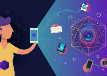
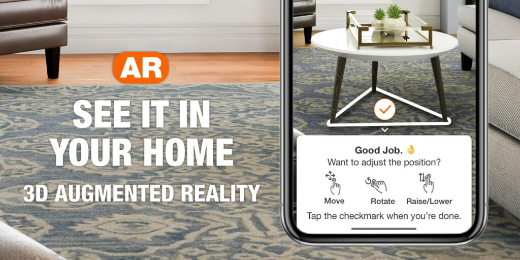
The fourth in the league of blog entries on the topic of UX in the fashion industry offers some examples of companies that are using augmented reality for their e-commerce businesses. This part of my research is dedicated to find out how companies include the technology and what goals they are pursuing with it.
According to IBM’s 2020 U.S. Retail Index report, the pandemic accelerated the shift to digital shopping by roughly five years. According to a Neilsen global survey from 2019, consumers listed Augmented and Virtual Reality as the top technologies they’re seeking to assist them in their daily lives. In fact, just over half said they were willing to use this technology to assess products. AR has proven that it can add enormous value for consumers in the shopping journey. Therefore, some brands are already re-imagining retail to provide a better shopping experience for their users.
Taking a look at existing products
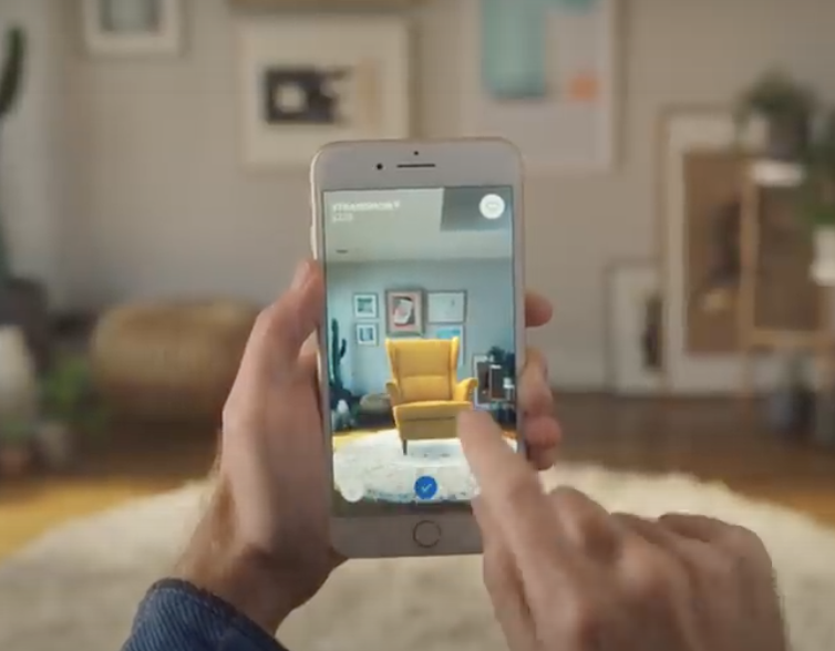
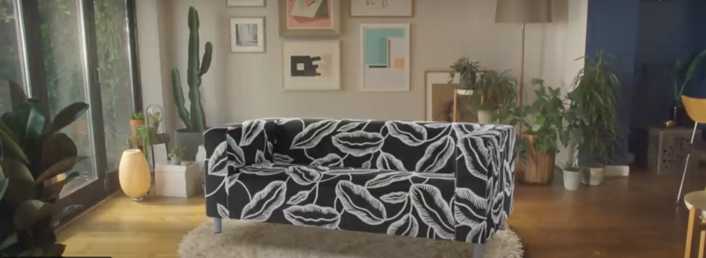
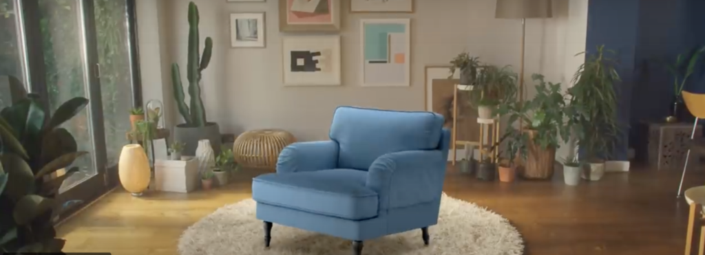
A virtual “try-before-you-buy” experience is already implemented by IKEA, offering a free App called IKEA Place. The app lets users virtually place furnishing in their space.
The home improvement retailer Home Depot added augmented reality capabilities to its app and mobile web before the pandemic. The feature helps lift engagement and conversion as consumers spend more time shopping on their phones.
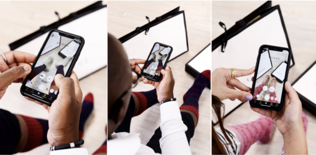
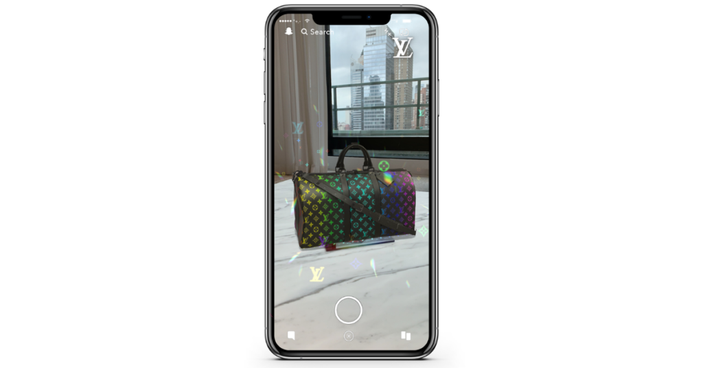
For consumers to virtually try on luxury fashion, AR became an essential tool for brands such as Louis Vuitton and Gucci. Among some innovative AR collaborations, Gucci launched a virtual shoe ‘try-on’ called Lenses through the Snapchat platform.
Gucci’s virtual shoe try-onWith AR, Louis Vuitton allows users to play around with their luxury products
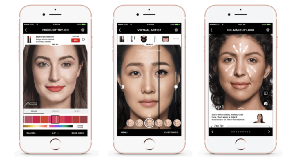
Physical stores reopening again, requires a high level of hygiene and safety. In response beauty retailer Sephora offers customers to test out makeup products with AR. Another beauty retailer, Ulta, uses the app GLAMlab to increase customers engagement to find the right shade of foundation.
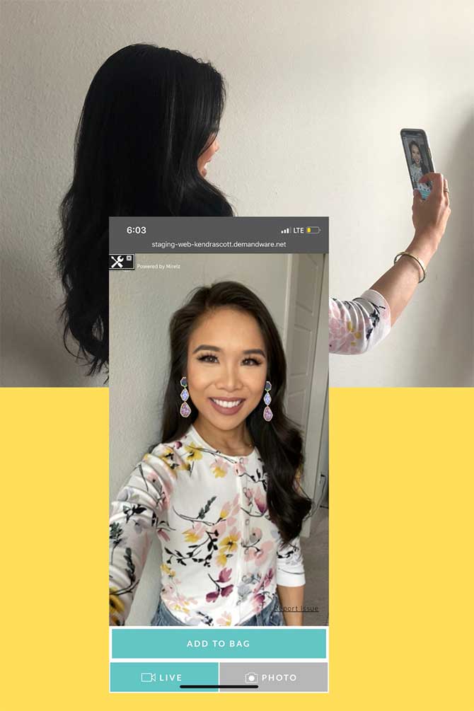
The jewellery brand Kendra Scott introduced an AR tool enabling customers to virtually try-on different earring styles from the comfort of their homes.
All AR examples have the same aim: to help consumers to find the right product by offering them a preview of the product. Ar in retail seems to work and boost conversion for products such as furniture, home appliances, accessories, jewellery, shoes and makeup. Nevertheless, I couldn’t find running AR applications that are used for trying on clothes virtually and helping customers to find the right fit and size. Since body types differ enormously, clothes look different on everybody and pose a great challenge for implementing AR in the online shopping experience for garments.
In order to make this topic more tangible, I will take a look at the approaches of size guiding of clothes in online shops. The next blog entry will show best practice examples of size guiding online.
Hello again! For this blog entry I had a look at several educational AR apps (there are a loooot of them) in order to get a picture of when AR has added value for educational purposes and when it doesn’t. So I picked out a few examples and categorized them in good and bad ones and summed up why I did (not) like them. It’s also to mention that I only looked at digital apps that use visual augmentation. But first I want to give a short overview on the wide range of educational fields and educational levels existing AR products on the market cover (this list provided by Garzón, Pavón and Baldiris [2019] might not be complete):
Education levels: Early childhood education, Primary education, Lower secondary education, Upper secondary education, Post-secondary non-tertiary education, Short-cycle tertiary education, Bachelor’s or equivalent level, Non-schoolers (work related trainings) – It’s to mention that educational AR products for Master’s or equivalent level and Doctoral or equivalent level might exist, but weren’t conducted in the study
The good
Augmented Creativity
Augmented Creativity includes a total of six prototypes that can be used with mobile devides: Coloring Book, Music Arrangement, Physical-Interaction Game, City-Wide Gaming, Authoring Interactive Narratives and Robot Programming – I had a look at the first two of them.
The Coloring Book is an application available that brings colored drawings to life: It comes with several templates that can be printed out and colored. When the drawing is scanned with the app on a smartphone or tablet (iOS and Android), it detects and tracks the drawing and displays an augmented, animated 3D version of the character, which is textured according to the child’s coloring (See Fig. 1).
Advantages the authors mention:
Creative Goal: Fosters imagination, allows character individualization, helps to express feelings about character
Educational Goal: Improves coloring skills, 3D perception, and challenges imagination
Potential Impact: User-painted characters and levels, scripting virtual worlds through coloring
Why I like it:
The augmentation doesn’t intervene the act of drawing and coloring by hand (which I think is an important way of creative expression in early ages), but adds additional value by digitalizing it afterwards
Stimulates several senses
Works really well and looks super cute (smooth animations; exact coloring; live updates)
Fig. 1: Augmented Creativity – Coloring Book
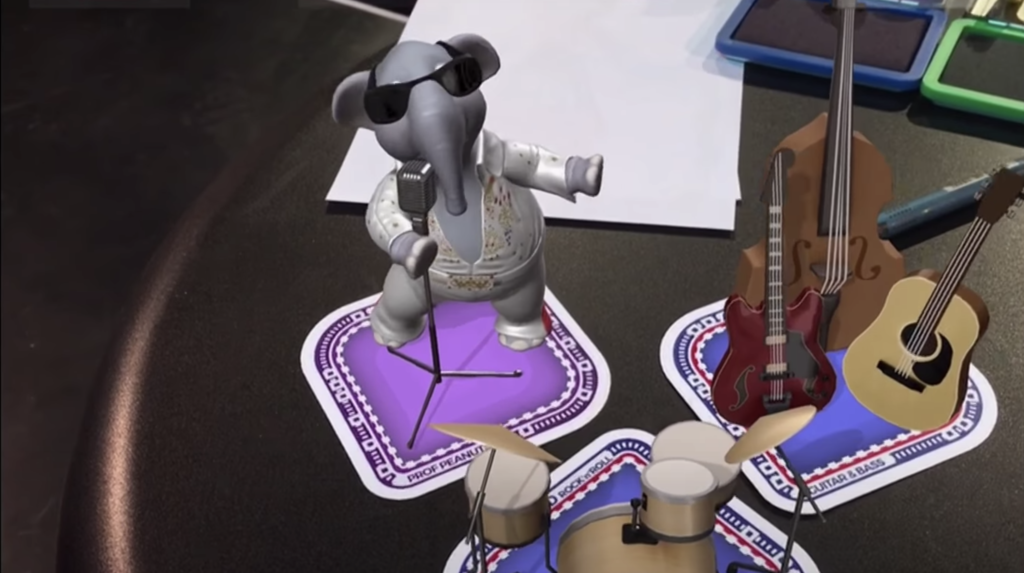
The Music Arrangement is a set of flashcards where each card represents a musical element like instruments and music styles. The user can then choose instruments and styles independently and rearrange the song as imagined. By placing a card on a physical board, the app detects the marker on it and displays an augmented version of the instrument and plays the corresponding audio, as depicted in Fig. 2. AR even allows the user to change the position and the volume of the instruments while the song is playing, allowing them to direct the virtual band.
Advantages the authors mention:
Creative Goal: Experiment with different instruments and styles to rearrange a song
Educational Goal: Teaches concepts of arrangements, styles, and the disposition of the band components
Potential Impact: Collaborative music arrangement experience, learn about the disposition of an orchestra
Why I like it:
Combines physical and digital interaction
It stimulates several senses
Works really well and looks super nice
Fig. 2: Augmented Creativity – Music Arrangement
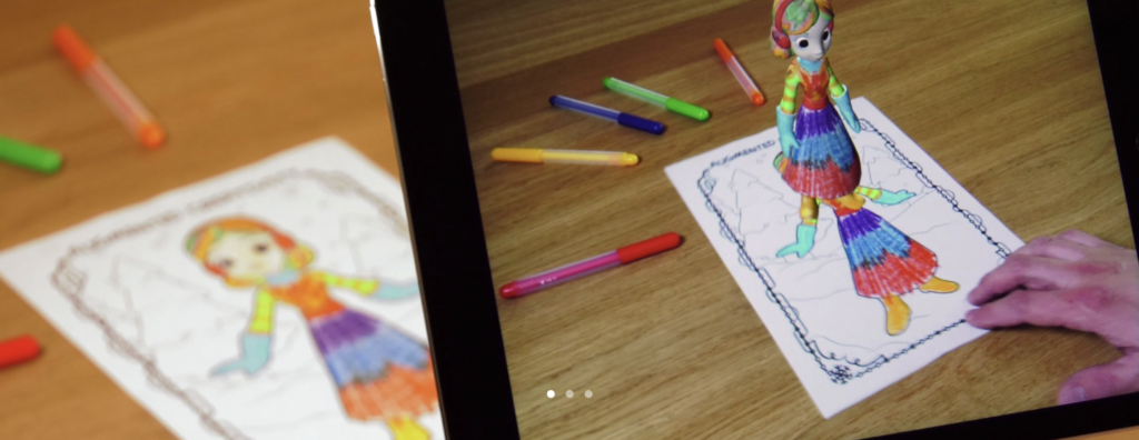
Quiver Education
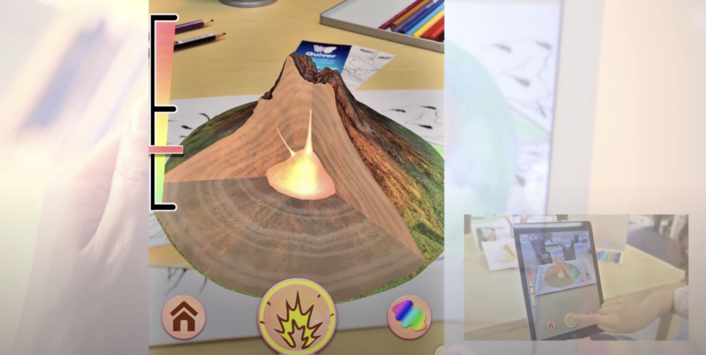
Quiver Education is similar to the Coloring Book mentioned above, but with a greater focus on educational content: The user can choose from a range of coloring packs, print them and color them by hand. When the coloring is scanned with the app on a smartphone or tablet (iOS and Android), a colored, animated 3D model is displayed and additional information and interaction options are provided (see Fig. 3). The content is designed around topics as diverse as biology, geometry, the solar system and more.
Why I like it:
The augmentation doesn’t intervene the process of coloring by hand
Stimulates several senses
A wide range of topics
~ I’m still a little sceptical if it’s necessary to color a scene first in order to learn about it (i.e. a volcano)
Fig. 3: Quiver
Merge EDU
Merge EDU engages students in STEM fields with 3D objects and simulations they can touch, hold and interact with. The special thing about Merge is that the user has to hold a special cube in their hands where the augmentation is placed on, so the user feels like actually holding the object in their hands and can then interact with it (See Fig. 4). Merge is available for iOS and Android and can be used with mobile devices – It also offers glasses where a user can put their phone in to have their hands free to interact with the cube.
Advantages the authors mention:
3D tactile learning
Flexibility: Can be used at home and at school
Curriculum aligned
Multisensory Instruction
Spatial Development
Accelerate Understanding
Focused Engagement
Why I like it:
The potential of the cube: It could potentially replace physical teaching aids
Big library of topics to explore
Users can upload and share their own creations
Fig. 4: Merge EDU
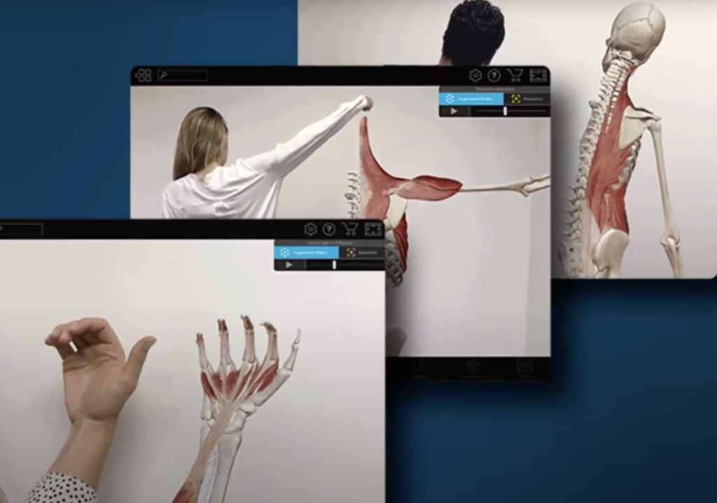
Human Anatomy Atlas
With the Human Anatomy Atlas medical students can turn any room into an anatomy lab: They can view and dissect a virtual model of a human organ or complete human body by scanning a printed picture (see Fig. 5) or simply placing a model on a flat surface (see Fig. 6). It’s also possible to study human muscles in motion by scanning a person as shown in Fig. 7.
Why I like it:
Students can study from anywhere and don’t have to go to an actual lab
Doing a dissection virtually might be helpdul to prepare for doing a dissection in real life (As far as I know from several people who are currently studying medicine, preparation for dissections is mostly done with the help of books, pictures, videos and physical models, but not with interactive digital models)
Fig. 5: Human Anatomy Atlas – Image marker
Fig. 6: Human Anatomy Atlas – Placing an object in space
Fig. 7: Human Anatomy Atlas – Live tracking of muscles
The bad
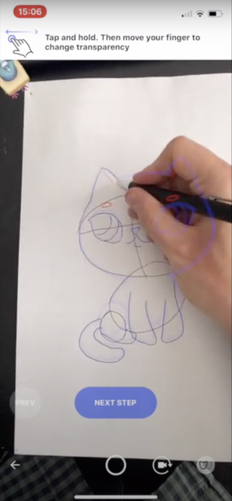
Sketch AR
With Sketch AR users can learn how to draw by using their smartphone camera: They can choose a sketch from a library and display it on a sheet of paper in front of them. The user can then follow the virtual lines on the paper step-by-step (See Fig. 8). The app also offers more features like minigames and AI portraits, but I only had a look at the AR feature. In general the app is designed really well and is also personalizable, but all in all I did not see the added value that AR has in this case.
Why I don’t like it:
Drawing might be difficult when looking at the paper though a small screen
While drawing I personally like to fixate the paper with one hand, which is not possible, because you have to hold your mobile device
I don’t see the advantes of AR compared to common image tracing (by printing it out and using it as a template)
An app that does pretty much the same is “Tracing Projector”, where I also don’t see the added value.
Fig. 8: SketchAR
On a general note
There are a lot of apps on the market – especially in children’s education – that try to replace a physical game with a digital one (i.e. playing with dominos), which is in my opinion not what AR should be used for. AR is supposed to enhance the user’s physical world and not replace it. I believe that it’s important to experience the world with as many senses as possible – especially in early ages – and haptic experiences should not be limited to holding and controlling a smartphone. Furthermore there are a lot of apps where the user can just randomly place 3D objects in the real world, but can’t do anything with them, which might be fun and playful though, but doesn’t have many educational values in my opinion.
Garzón, J., Pavón, J., & Baldiris, S. (2019). Systematic review and meta-analysis of augmented reality in educational settings. Virtual Reality, 23, 447-459.
Zünd, F., Ryffel, M., Magnenat, S., Marra, A., Nitti, M., Kapadia, M., Noris, G., Mitchell, K., Gross, M.H., & Sumner, R.W. (2015). Augmented creativity: bridging the real and virtual worlds to enhance creative play. SIGGRAPH Asia 2015 Mobile Graphics and Interactive Applications.
Projects have continued to be added to the database over the last few days in order to gather sufficient information to help us verify the reality of the points analysed in previous posts. The database can be found online in the link: http://ambiby.com/project_online/projectDB/index.php
For this reason, several projects have been added (13 so far), but I would like to add even more to the database. Even so, and taking into account the long list of references pending to be analysed, the data collected are similar to those previously studied. With this, the important points that are usually repeated in any interactive exhibition for children are checked.
It has to be said that, due to the current situation with COVID, the analysis has been a bit hard. Not being able to visit certain places either because of the pandemic or lack of time, there are details that are missed. The aim was to collect information from visual materials, which limited the number of projects to be analysed.
Now, a short analysis of the different sections of data found from the analysed projects is discussed.
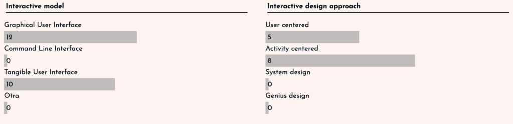
Interaction data
In terms of interaction, we find that the vast majority of exhibits mix GUI and TUI models, making them much more attractive to children. In addition, the spaces are usually activity-centred or user-centred. This depends on whether the project aims to teach or influence the user, or is focused on simply discovering or hanging out.
User experience for kids
Focusing on the userexperience for children, and using the questions and data studied in posts II and III, we have found very similar answers to those studied in those posts. In some cases the answers were obvious, but in others, they have varied from point to point.
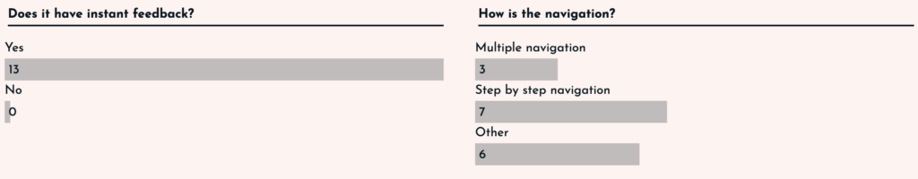
All the interfaces analysed had instant feedback to the user, whether it was a GUI or a TUI, as the user was always aware of what changes were being made.
In the case of navigation, the responses were more varied. Both navigation through the digital interface and navigation through the physical space were taken into account. For this reason, there are some projects that have more than one type of navigation. Even so, navigation by steps has been the most common, as the aim is to organise the information by steps so that it is told in the form of a story and is easier to understand.
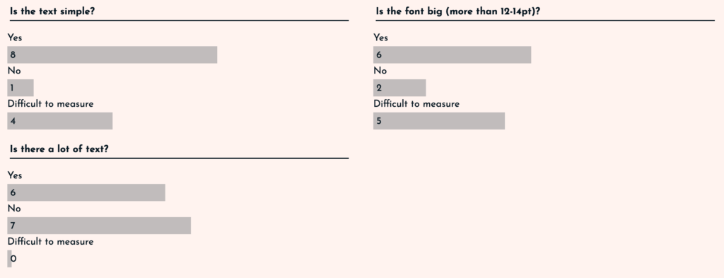
In terms of text, three parameters were taken into account: simplicity, size and quantity. In the case of simplicity and size, it was complicated in some cases to analyse it, as there were very few visual references. Even so, it has been shown that the texts are usually simple (adapted to the children’s vocabulary) and the text sizes are usually larger than usual. Surprisingly, the amount of text has been more adjusted, in some cases there was a lot of text (6 projects), and in others the text was scarce (7 projects).
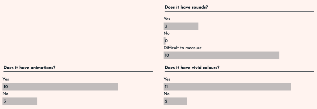
If we think about the visual and auditory inputs, we find three points to analyse: sounds, animations and vivid colours. The case of sound has been complicated, because with the visual material it was difficult to observe this point. On the other hand, animations were present in 10 of the 13 projects, so it can be determined that the use of animations is common. Finally, the use of colours was clearly vivid. In almost all of the exhibits (11 out of 13), bright colours are used to create a good atmosphere. The only ones using more muted colours are those related to nature, as they are more earthy colours.
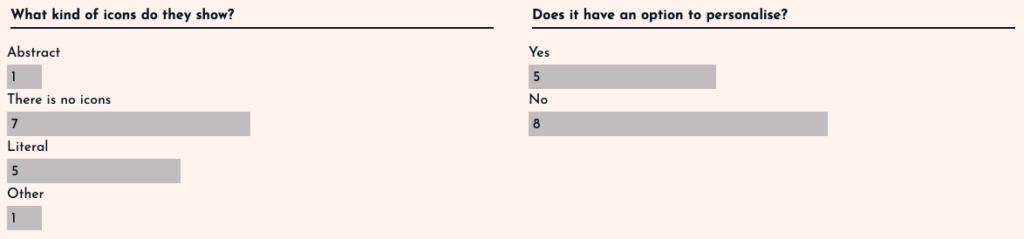
Finally in this section, two points should be taken into account: the icons and the option to customise. In the case of the icons, it was studied that in order to address children, care must be taken, as understanding them can be complicated. This is why it has been observed that in 7 projects there were no icons, and in those that did have them, the vast majority (5 of the 13) were literal, i.e. they resemble reality and leave no room for doubt. The case of personalisation was surprising. In only 5 of the projects is this option available.
The 125 Universal Principles of Design
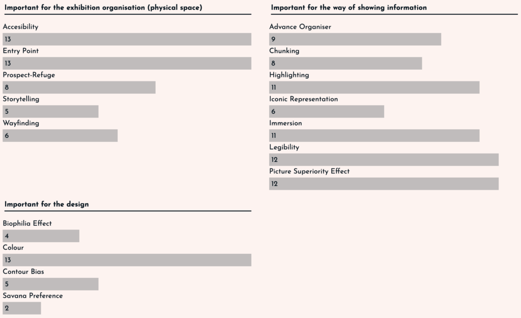
The vast majority of the principles explained in posts V and VI are used in the projects, even so, there are big differences between them. In order to better understand the contents, the principles have been divided into three types: related to the physical space, related to the way content is displayed and related to the design.
In the important principles for the organisation of the physical space, it is clear that accessibility and the entry point to the exhibition are clear. All projects rely on these as it is necessary to adapt the interface to children. For this, it is not only a question of simplifying the text, but also of adjusting the sizes and heights of the stations to those of the youngest children.
In those related to the way information is displayed, legibility and the use of images over text are key, as well as the importance of highlighting information in texts and immersion. It should also be noted that the vast majority (8-9 out of 13) use methods such as chunking or advance organiser to divide information into islands and make it easier to remember. Finally, the use of icons is again taken into account, and how this is reduced to only 6 of the 13 projects.
In terms of design, the results were low. It is true that the importance of colour is maintained in the 13 projects analysed, but the points related to the environment (biophilia effect and savannah preference) are not very much taken into account, as the spaces are looking for a sense of immersion and leave aside the use of nature so as not to distract the user. Finally, the use of more rounded and unaggressive designs has only been observed in 5 of the 13 projects, which seems surprising.
With this we conclude that although there are points that seem to be well determined, there are others such as the amount of text, the option of personalisation or the analysis of the design (contour bias) that need more referents to determine a result. But even so, it is understood that interfaces for children follow a series of principles that tend to be repeated in the vast majority.
The results have certainly been interesting, but more time is needed to add projects. In any case, the intention is to use this website as a base and add all the references in order to keep an updated database of projects that can help me in the future.
Good afternoon! I guess it was time for this series of two posts in which I finally show examples of what a good design and a bad design of the cookie window is. In this first post I have tried to select some cases that seem to me evidently malpractice, since they guide the user towards a specific option, biasing their choice when selecting their privacy policy.
These types of design are known as Dark Patterns, I will not go into further detail with them because my classmate Ana Mitterhauser is doing her research specifically about them. So, we go directly to show some of these applied to our specific topic:
Misdirection/Aesthetic Manipulation
This is the most common, it is a type of manipulation in which the design put the visual focus in the button “Accept all”, forgetting the rest of the options given. This can be done either by the use of color, size, font…
Examples:
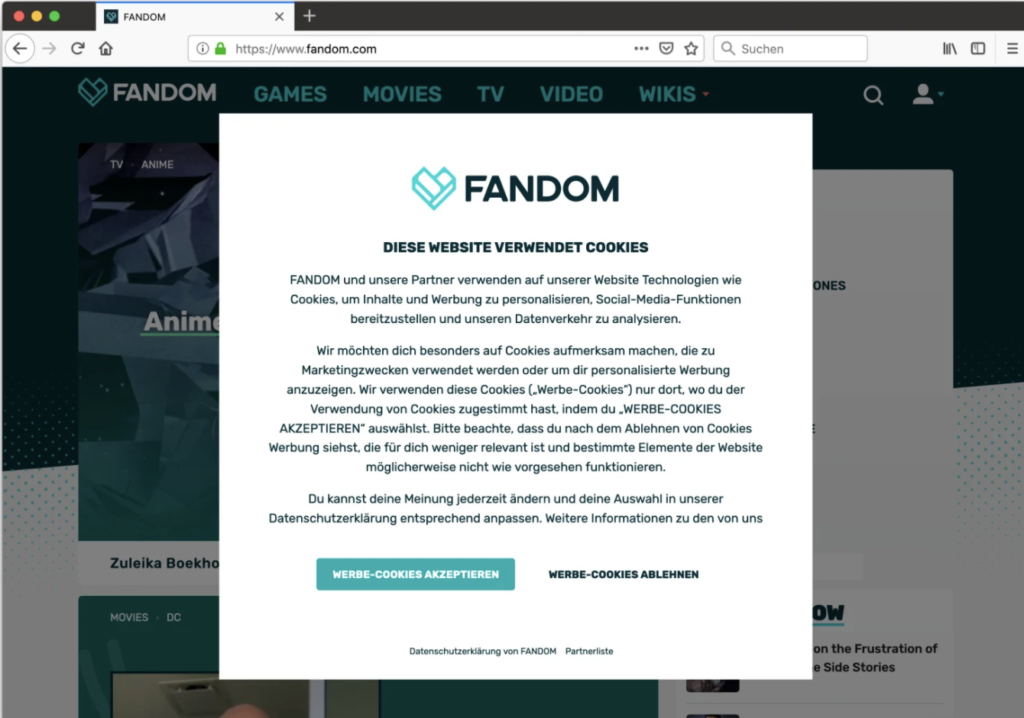
Fandom: In this case the “OK” option is more prominent and guides the user’s eyes. In addition, shading the rest of the page inclines the user to that option since they believe that if they do not accept they will not be able to access the content.
The guardian: As in the previous case, the background darkens and blurs slanting the user. In this case the option of not accepting cookies differs more clearly with a different font (in lower case), without color highlight and placed in a corner of the page while the other option is in the center.
Privacy Zuckering
Perhaps the best known, it is directly the design that takes care of deceiving users to share all their personal data. Despite being regulated by law in this type of patterns there is no clear output for the user to not accept or modify the data policy.
Example:
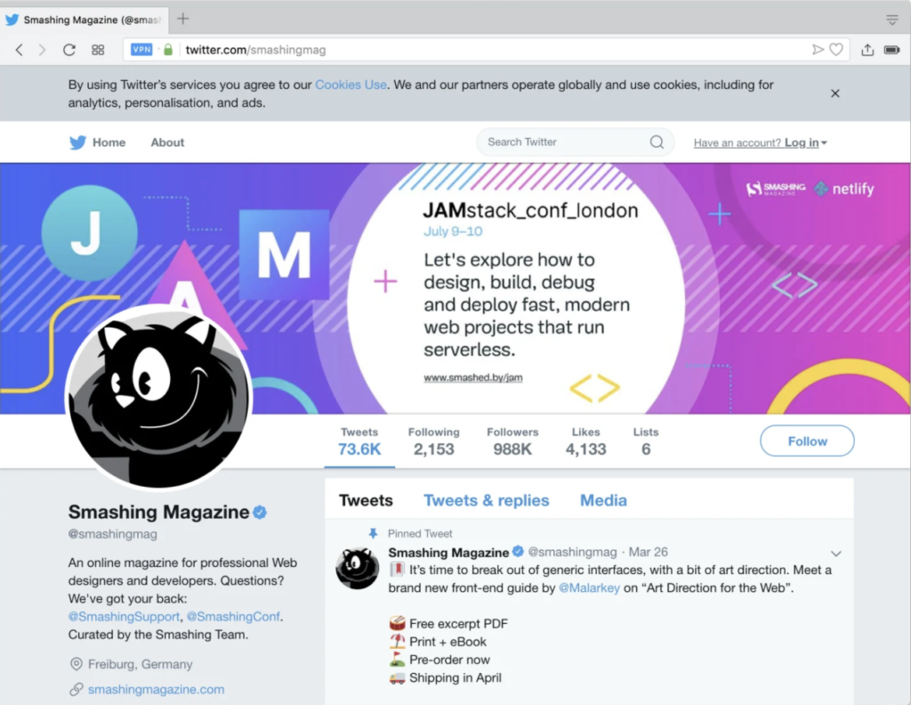
Twitter: Informs you that cookies are used, but there is no option to adjust preferences, nor to give your explicit consent. Closing the cookie window on the top right button will be interpreted by the website as having accepted your policy.
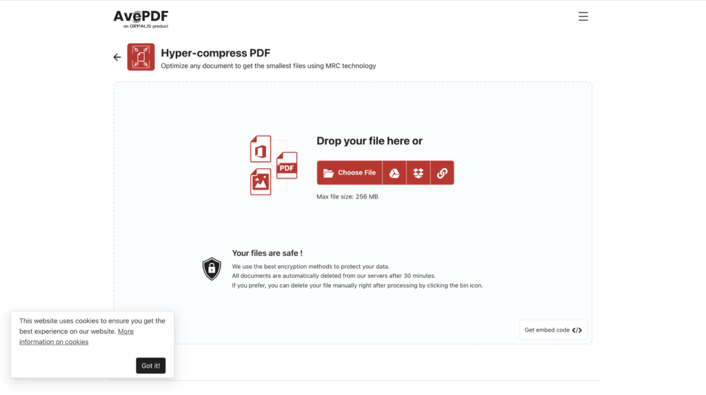
AvePDF: informs you that the website uses cookies, however, does not give the option to accept or reject but directly from “okey”. The user is not informed that there is another alternative, believes that the only way to avoid giving their data is not to use the web.
Laberynth
Even in spite of all the examples above, once you pass the “first phase” in case you have chosen the options relating to setting cookies or reviewing the privacy policy another page will open in which you will be shown your options. Sometimes they have a more intuitive design and other times it’s a complete maze from which you don’t know how to get out or what you’re doing.
Example:
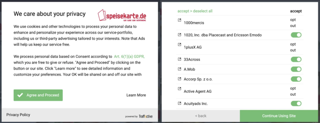
Speisekarte: In this case it is not only an initial aesthetic manipulation, but if the user clicks “Learn more” hundreds of different selection options appear in which he has to cycle one by one. It doesn’t sound a very interesting plan. Furthermore, the “reject all” button is virtually invisible for the user to continue with their initial decision.
NHS: In this other example, in case the user wants to customize their privacy policy, they are presented with a list of options that are already selected as “on”, in addition to not presenting a “reject all” button to make the implementation of the user’s decision more efficient.
Conclusions:
Once you have the habit of rejecting cookies by default, you are more receptive to finding many cases of questionable practices on the internet that do not seem to make life easier for the user but for the business behind the page. In fact, they succeed, and for many users, trading privacy is an acceptable cost for all the wonderful benefits that all those giants provide for nothing. However, not everything is negative, we can do something to change it and improve people’s lives, not only with regulations that protect the user but with UX/UI designers who design with the user in mind and create a relationship of security and trust between the brand and the user. We have in our hand the possibility of generating a more ethical and transparent design. In the next post I will give you examples and tips of how to do it.
That’s all for today, have you found any of these examples in your day to day? I’m sure now that you know you won’t be able to stop seeing them!
Der letzte Blogeintrag widmete sich dem neuen Thema: Fotografie als visuelle Sprache im Grafik Design. Nun wird ein Blick auf die geschichtliche Entwicklung geworfen, um zu verstehen, weshalb Fotografie zum Massenmedium wurde. Der zweite Teil widmet sich der gesellschaftlichen Verbreitung des Fotografierens sowie den Unterschieden zwischen Amateur- und Profifotografie.
Zuerst wird nun erklärt, welche Merkmale Fotografien auszeichnen. Es ist schwer und kaum möglich eine generelle Definition dafür zu finden. Doch kaum eine andere Person wird in diesem Zusammenhang häufiger genannt als Roland Barthes. In seinem bekannten Foto-Essay „Die helle Kammer“ beschreibt er Fotografie als „Emanation des vergangen Wirklichen“1. Zuvor definierte er Fotografie „als mechanisches Analogon des Wirklichen“.2 Der indexikalische Charakter zeigt, dass das abgebildete Objekt vor der Kamera gewesen sei und tatsächlich existiert habe.3 Auch wenn uns heute und auch schon vor ein paar Jahrzehnten bewusst gewesen war, dass Fotos manipuliert werden können, nimmt man an, dass sie etwas Vergangenes – etwas „Echtes“ – visuell darstellen. Auch bestimmte Bildausschnitte, die den Fokus auf etwas lenken, oder redaktionelle Veränderungen können die Representation der Wirklichkeit verändern. All das ist uns bewusst und bekannt, jedoch hindert es den Gedanken nicht, dass Fotografie die Wirklichkeit zeigt.
Doch wie kam es dazu, dass Fotografien manipuliert und verändert werden können? Hierfür ist ein Blick auf die geschichtliche Entwicklung notwendig. Das Jahr 1839 prägte die Erfindung der Fotografie, da zwei Ereignisse stattfanden, die den Weg für die Fotografie ebneten. Louis J. M. Daguerre stellte in Paris ein modernes Bildaufzeichnungsverfahren – die Daguerreotypie – vor. In Deutschland wurde im selben Jahr auch der Begriff der „Photographie“ geprägt. Die erste erfolgreich aufgenommene und erhaltene Fotografie wurde von Joseph Nicéphore Niépce mit Hilfe einer Camera obscura 1826 hergestellt. Hierbei fällt Licht durch eine winzige Öffnung in einen dunklen Hohlkörper und erzeugt seitenverkehrt und auf dem Kopf stehend den Außenraum auf der Projektionsfläche. Diese Fläche bestand aus Zinn und wurde durch eine Schicht aus Asphaltmischung heller oder dunkler ausgehärtet. So konnte das erste Foto der Welt entstehen.
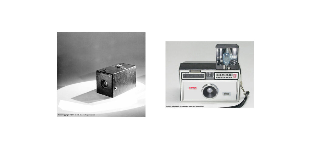
William Henry Fox Talbot entwickelte das Negativ-Positiv-Verfahren und so stand der technischen Fortschritten in den folgenden Jahrzehnten nichts mehr im Weg.4 Die Möglichkeit, vom selben Bild mehrere Abzüge machen zu können, war die Grundlage für die gesellschaftliche Verbreitung der Fotografie. Die amerikanische Firma Kodak stellte im Jahr 1888 die tragbare Kamera „Kodak Nr. 1“ vor. Der belichtete Film konnte an die Firma geschickt werden, die daraus Abzüge erstellte. Der Fotoservice gilt als Grundstein für die gesellschaftliche Verbreitung der Fotografie.
You press the Button. We Do the Rest.
Slogan der Firma Kodak, 1888 5
In den folgenden Jahrzehnten wurden die reproduktionstechnischen Voraussetzungen weiter optimiert. 1924 stellte die Firma Leica eine handliche Kleinbildkamera vor, gefolgt von Ermanox, Rolleiflex und Hasselblad. Ab den 1960er Jahren wurden von Pentax, Nikon und Canon weitere Modelle eingeführt. Kodak festigte dessen Marktanteil mit der Einführung der „Kodak Instamatic“, bei der Filme als Kassetten sehr leicht eingesetzt und gewechselt werden konnten. In 20 Jahren wurden mehr als 150 Mio. Kameras gekauft – ein absoluter Verkaufsschlager. Ein weiterer Meilenstein ist der erste digitale Bildsensor, der 1969 entwickelt wurde.
Was die digitale Revolution bewirkte, ist offensichtlich. Doch erst um die Jahrtausendwende erlebte die Massenproduktion an Digitalkameras und Spiegelreflexkameras einen Aufschwung. Die digitalen Medien heute vereinfachen die Erstellung und Verbreitung der Fotos, nahezu jede Person trägt eine kleine Kamera am Smartphone in der Hosentasche. Mittlerweile sind oft auf den ersten Blick kaum Unterschiede zwischen Fotos der neuesten Generation der Smartphones zu Fotos von professionellen Kameras zu erkennen. Die technischen Möglichkeiten der Smartphones werden immer besser. Doch was sich immer noch vom professionellen Fotograf*in zu*r Hobbyfotograf*innen und Knipser*innen unterscheidet, ist die Kompetenz. Amateur*innen nutzen oft die automatischen Einstellungen und sind mit Schnappsüssen, auch wenn leicht überbelichtet oder verwackelt, zufrieden. Dagegen spielen Profifotograf*innen gekonnt mit der Perspektive, Blickwinkel, den Einstellungen wie ISO-Wert, Blende und Belichtungszeit. Sie beherrschen ihr technisches Produkt bis ins kleinste Detail und schöpfen sie zum Zwecke der Bildgestaltung voll aus.6 Aus der unvorstellbaren Anzahl an Fotos, die täglich geknipst und im Internet veröffentlicht werden, ist es sehr schwer, sich von der breiten Masse abzuheben. Amateure entwickeln immer höhere Ansprüche, doch Originalität und Ästhetik zeichnen besondere Fotos aus.
Zusammenfassend lässt sich festhalten, dass die Fotografie, wie wir sie heute kennen, einen langen Entwicklungsprozess durchgemachte. Jedoch haben bedeutende Meilensteine – wie die Erfindung der Reproduzierbarkeit und Vervielfältigung sowie die des technischen Bildsensors – die Entwicklung vorangebracht. In der Geschichte der Fotografie entstanden neben Alltags- und Profifotografie auch Kunstformen und Bildtheorien, die im nächsten Blogeintrag betrachtet werden.
Quellen:
1 Barthes, Roland: Die helle Kammer. Bemerkungen zur Fotografie. Suhrkamp Verlag, Frankfurt a. M., 1989, S. 98 2 Barthes, Roland, Fotografie als Botschaft. 1961. In: Der entgegenkommende und der stumpfe Sinn, Barthes, Roland (Hrsg.): Frankfurt a. M., 1990, S. 14. 3 Ebd. 4 Raddatz, Christoph: Bildmanipulation aus der Perspektive des 21. Jahrhunderts, Vertrauensverlust durch mediale Täuschungen der Rezipienten. Bachelorarbeit, Fachbereich Medien, Hochschule Mittweida, 2009, S. 9 f. 5 “125 Jahre Kodak Moments”, https://www.kodakmoments.eu/de/kodak-historie/ – Zugriff am 24.01.2022 6 Eberle, Thomas S.: Fotografie und Gesellschaft. Thematische Rahmung. In: Fotografie und Gesellschaft. Phänomenologische und wissenssoziologische Perspektiven. Eberle, Thomas S. (Hrsg.), transcript Verlag, Bielefeld, 2021, S. 15
I create a survey for the IDK students about the experience of teams according to my last research about a usability review of MS Team. For this survey, I wrote qualitative questions to answer. First I asked them if they had ever used MS Teams at work or university, and to tell me about their difficulties and apprehensions. Then, I asked them about the different categories of tasks they perform within this software. And finally, I asked them a series of questions about the usability of this software, if it respects the usability criteria of Jacob Nielsen (effectiveness, efficiency, safety, learnability, memorability, satisfaction).
Partcipants
I made sure that the participants were part of my target audience that I had defined just before the survey. So I created it for IDK students. And these participants were between 23 and 24 years old following the Interaction Design, Media Design, and Information Design programs
Before using MS Teams
They have never used MS Teams before the FH Joanneum. This has led to some problems such as problems joining a team, uploading assignments to the platform, or even getting the wrong menus.
While using MS Teams
What kind of tasks are you mostly achieving?
What are the most useful tasks from the list (or not) perform?
Participating to lectures (5X), uploading assignement (2X), screen sharing (2X), easy to collaborate, creating meeting through the call, creating a meeting through the Calendar, download/upload folder.
What are the les useful tasks from the list (or not) perform?
linking application(3X), Creating a meeting through calendar, commenting during lecture, participate to online evaluation, upload folders.
What are the easiest tasks from the list (or not) you perform?
participate to lectures(3X), submitting assignement(2X), Sharing screen(2X), starting a meeting, adding people inside the lecture, writing a comment during a lecture.
What are the most difficult tasks from the list (or not) you perform?
Creating a meeting through the call(2X), Creating a meeting, Sharing screen, writing a message to a specific person, download recent folder.
It appears that the majority of students use the software to participate in classes, upload files and submit assignments. During online classes or other meetings, participants share their screens a lot and have the possibility to write comments. When it comes to the possibility of linking applications within MS Teams, their responses were nil.
Do you use other platforms beside of MS Teams ? Which one ?
So I imagined that if they had the ability to link applications, which ones would be more useful. So I asked them what kind of applications they use next to MS Teams?
After using MS Teams
Is the software perform the tasks you wants to achieve ? and why ?
Mostly yes, The users can perform easily the most basics task like attending a lecture.
Did you get some latency to learn the system and to achieve tasks ?
For some, they got a bit time to learn the system. They had several weeks to get the hang on it.
Did you encountered some problems or errors by navigating inside the system ?
Sometimes the system is a bit confusing (finding the right team for exemple) the user put some efforts to perform one specific task. And some of the errors are due to disfunction of the software.
Can the features make the tasks achievable without time and any effort ?
The answers are a bit middle, they somewhat spend time to realize tasks. Even they memorize the system, time and effort will persist.
Once the system learned, did you memorized how can you perform most of the tasks ?
Yes. After several weeks, they memorize how to perform tasks.
Are you satisfied by using this software ? ( Once using it, also about the visual design..)
They are all satisfied of the software, It is practical to follow course and interact with other people. The fact is that they are some design issues which leads to confusion. Fortunately, they can learn and memorize, but still resides with time and effort. about the design, once like the custom-able part, while the other doesn’t like it very much.
Conclusion
The results of this survey showed that MS Teams is practical and useful for attending online lecture or delivering assignments. All of the participants answered that they didn’t experienced this software, most of them took their time to accomplish task on it. Also, the problem of this software will still residing on time spent and the effort to perform one specific task. After all, the system is still learnable, the users can memorize the tasks they had experienced for a while to perform them. They all said satisfied about this software, it is able to perform tasks and to categorize an amount of information inside. Among the alternative solutions for online course continuity, it would seem that MS Teams meets the essential needs of academics.