Evaluation of Master Thesis

Technology as bridge between health professionals and patients.

Author: Julia Neunteufel
University: Paris Lodron Universität Slazburg

_______________________________________________________________________________________

Level of design

The design is a bit basic and poor. It looks like a very technological and scientific thesis but the author didn’t take the opportunity to play with design options. Once said that the overall structure of the content is very clear and clean, which makes the thesis perfectly readable and manageable.

Degree of innovation

The thesis seems to dig very deep into innovative procedures related to a human-centered approach to treating the topic of eHealth and mHealth. She mentions also design thinking processes that aren’t usually connected to the eHealth topics when approached by the scientific community. I think she really tries to link the coldest side of medical and technological topics and human psychology. Therefore I think this work might not be innovative when choosing the processes to go through but it is innovative in the way she connects human behaviour and emotions to a very well-known scientific topic.

Independence

The author uses many resources which help her by providing valuable information but she is the only one involved in the development of the master thesis. – Of course, supervised by her tutor. I think she makes a very good design process on her own, using different tools to reach her final goal.

Outline and structure

As I already mentioned in the design section, the master’s thesis is an extensive work structured in different parts in a clean and clear way. It is very easy to find specific parts or chapters thanks to its good organization in the index and she structures it in a very organic way according to the design process, helping the reader from the beginning to create a complete idea of what a research paper like this one entails.

Degree of communication

The author offers clear and fluent communication throughout the entire work. In some parts where the use of more technical words is required, she manages to make the content equally understandable and accessible to the reader, without avoiding the use of appropriate terminology.

In other sections, she uses a much more concise and shorter style, in a more schematic format, but which also helps to understand other types of material and always in an organic way. I think he knows how to adapt his writing style very well to the context he is developing at the time, and he manages to make this subject, which at times may not be very attractive, seem accessible and interesting to many types of audiences.

Scope of the work

The work focuses on how technology can serve as a link between patients and medical professionals. Under this title, she focuses on topics related to human behavior, technological tools commonly used in medical practices (focusing especially on cardiology), eHealth, and mHealth, as cutting-edge examples of technology designed already taking into account the human-centered approach.

Orthography and accuracy

She writes the work in English. As far as I’ve read, I haven’t found any major spelling mistakes. It is obvious that English it’s not her mother tongue because the vocabulary she uses tends to be simpler than other papers or works from authors whose mother tongue is English. It’s still very well written and there is also usage of specific terminology, giving the text a scientific accuracy about the topics she is dealing with.

Literature

She uses many references both from books and scientific papers on the various topics she deals with, as well as from web pages where statistics from previous medical and psychological studies over the years can be found, medical and psychology journals, and articles related to human-centered design and the development of the user experience in the medical field.
EVALUATION OF MASTER’S THESIS

Task 3 – Proseminar Master´s Thesis

Title                   Investigating Dark Pattern Blindness

Author               Matthias Sluijpers

University         Utrecht University (UU)

LEVEL OF DESIGN

The author of this master’s thesis kept the design rather minimalistic and probably used a standardized preset given by university. Simple headings, a single-column grid, and even margins define the layout. The only visible personalized design element is a very simple and low-impact graphic on the front page. However, a clear structure is given to the reader, which is of course crucial for a scientific paper.

DEGREE OF INNOVATION

The term “deceptive design pattern” (formerly “dark pattern”) is very young for a scientific topic and was first mentioned only in 2010. Nevertheless, the topic is very present and often dealt with in the context of ethics in digital design. Furthermore, there are already various studies about dark pattern-blindness, so it is nothing completely new. As stated by the author himself the question on useful countermeasures for deceptive design patterns would have been a step further and more innovative.

INDEPENDENCE

The work contains both a comprehensive search of the literature and a very detailed empirical method of data collection, analysis and interpretation. This suggests a neat and independent work. It can be said that the work stands on its own and does not require any swerving, additional research or deep prior knowledge on the part of the reader.

OUTLINE AND STRUCTURE

According to the table of contents, the thesis is divided into seven chapters, which in turn are broken down into up to three further sub-levels. The theoretical research, the objectives of the thesis, the method and the results are clearly delineated from each other. The literary and empirical parts complement each other well and result in a coherent overall concept.

DEGREE OF COMMUNICATION

In general I would say that the text is easy to read and understand. The author does not use a lot of technical jargon and most unknown terms are explained within the thesis. Tables, screenshots of the web applications shown and various infographics support the textual presentation of the results of the experiment. The appendix also contains the transcript of the experiment for review.

SCOPE OF THE WORK

The entire work comprises 230 pages, which makes it seem very time-consuming and precisely elaborated. In addition, the planning, execution and evaluation of the experiment is carried out in above-average detail. Even if, according to the author, some results did not turn out as desired and as a result the hoped-for comparisons could not be drawn, the work standard for a master’s thesis is definitely met.

ORTHOGRAPHY AND ACCURACY

Since English is not my native language, I found it a bit harder than usual to evaluate the orthography and accuracy of the text. All in all I would say that it is pretty well written and I could not find any obvious mistakes. The only thing I noticed is that the author often repeats the same words and phrases in sentences or paragraphs.

LITERATURE

It can be seen from the bibliography that the sources used cover a lush period from 1970 to 2022, and thus older and very recent works are consulted. The quotations are largely from conferences and articles and only very occasionally from experts’ books. Additionally a lot of internet sources are cited, however those are mostly from known authors in the field and trustful sources. Within the citations, the download links (e.g. Researchgate) of the full texts have been inserted, which looks a bit unprofessional.

Sluijpers, Matthias: Investigating Dark Pattern Blindness. Unpublished. Master’s Thesis. Utrecht University. Utrecht 2022

MIDI switch idea

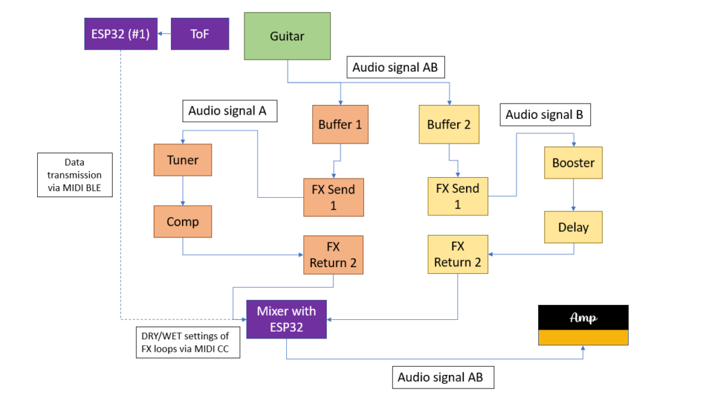
Another thought raised during the meeting was the extension of the project hypotheses. While I primarily focused on not interrupting the player’s natural hand movements, “non-invasive” could also refer to rig compatibility. The setups would therefore fulfill the working hypotheses even more if they could be used in conjuncture with a conventional guitar rig consisting of effect pedals and do not require an additional laptop or other “invasive” measures. Following this train of thought, I came up with a system that enables the guitarist to use his or her own amp and effect pedal chain in conjunction with at least the left hand setup.

As can be seen in the picture, the idea is to build a kind of MIDI-controlled signal splitter with a built-in mixer. After the splitter, the two audio signals are fed into two different FX loops. One loop would be the “dry” loop with effects that are usually ON; namely tuner, compressor, etc. The other FX loop would be the “wet” loop that contains effects that can be added to the dry signal such as reverb or delay. The ToF sensor and the ESP32 #1 send MIDI CC data to another ESP32 that is contained in the MIDI switch. According to the MIDI CC data received, this ESP32 then controls the DRY/WET ratio of the two FX loops.

Firstly, the described switch was simulated in Pure Data and, of course, worked as expected. However, as the switch involves processing audio signals with the ESP32 just acting as a MIDI CC receiver and controller, the main question was how to switch and split signals using hardware components only. With no prior experience of electrical components and their possibilities, substantial research was done regarding this field. Firstly, the basic functions of classic effect pedals had to be understood. The research yielded some results: it was concluded that in order to switch between to signal chains, a MOSFET or a relay had to be used. Both are electrical components that can act as a switch that can be controlled for example by the output voltage of a microcontroller pin. These suspicions were conveyed to my supervisor, who confirmed them.

Consequently, a relay was purchased at Neuhold. Being new to electrical components, including relays, the first challenge was to get the relay to act as a switch to turn on/off a LED controlled by an Arduino Leonardo. The Arduino Leonardo was chosen because its pins can output 5 Volts which are necessary for the relay to be activated. The pins of the ESP32 can only output 3.3 Volts which is not enough voltage to activate the relay. However, with the Arduino Leonardo, turning the LED on and off using the relay was successfully done. Subsequently, my supervisor provided me with a so-called Darlington transistor which can turn a 3.3 Volts input into a 5 Volts output. Thus, by using the Darlington transistor, the ESP32 with its 3.3 Volt output could now be used to activate the relay. Using two audio jacks, the relay could be successfully used to connect and disconnect a guitar signal played through the circuit.

Kritische Bewertung einer Masterarbeit

Aufgabe III Erstellung eines Blogeintrages

The master’s thesis I decided to write about bears the title “Timing-improved Guitar Loop Pedal based on Beat Tracking” and is written by Daniel Rudrich. It was submitted in 2017 at the Institute of Electronic Music and Acoustics (IEM) of the University of Music and Performing Arts Graz (KUG).

I chose the thesis because it documents the development of a tool for guitar which I am planning to do as well for my master’s thesis.

Level of design

Since I am a sound design student myself and no expert/professional (yet) I cannot make a general statement concerning the difficulty or ambition of the project. However, to me and my competences in this field, the project appears to be quite challenging and requires advanced in knowledge in sound and programming.

Degree of innovation

I am a guitarist myself and therefore can relate to the described problem concerning accurate looping. In my opinion, the “timing-improved guitar loop pedal” can be considered quite innovative since I do not know of an existing commercial product that already does the same thing.

Outline of structure

The thesis appears to be very well structured. In the beginning, a brief introduction to the topic at hand is given. Then the problem that the thesis wants to solve is described and, subsequently, the main objective of the thesis (developing an algorithm, which analyses the recorded phrase and supports the musician by aligning the start and stop cues such that the gap is reduced and not perceivable anymore) is stated. Afterwards the development of the mentioned algorithm is documented. Finally, the algorithm is tested through conducting listening tests followed by a conclusion.

Scope of the work

The thesis comprises 76 pages and is therefore quite extensive. To me, the theoretical and practical parts appear well balanced, taking up an equal amount of pages. The theoretical parts also act as a relevant basis for the practical research which was not the case with the master’s thesis I reviewed for the previous task.

Orthography and accuracy

Admittedly, the thesis was not read completely. However, the parts read for this analysis were free of any grammatical or formatting mistakes.

Literature

The bibliography contains 33 citations which is quite an amount for a project documentation. Furthermore, the citations appear to be solely journal articles or books which is also very positive.

Since I was not involved in the project, I cannot say anything regarding the criteria “independence” and “degree of communication”.

Conclusion

All in all, I think this master’s thesis represents a very positive example of “how to do it”. Featuring the development of a challenging practical workpiece and including some theory relevant to the topic, it fulfils the research objective it sets out to solve.

Meeting with Master’s thesis supervisor

This week I had a meeting with Katharina Groß-Vogt, one of our teachers at IEM concerning supervision of my Master’s thesis. Unfortunately, my current supervisor Marian Weger cannot serve as my supervisor, so I had to find someone else. As I know Kathi from our Sonification lectures and she is an expert in sonic interaction design, I thought that she will be very suitable. Luckily, she liked my project and agreed to supervise my Master’s thesis.

During our meeting, some interesting issues were raised that I had not thought of previously.

#1: The right hand setup currently works with an IMU sensor strapped to the back of the hand. A new idea would be to use another ToF sensor that is attached to the body of the guitar. If angled in the correct way, it could also measure the distance variations of the hand and, thus, achieve a similar effect as the IMU sensor. The advantage of this approach would be that the guitarist must not wear the sensor and can move his or her hand more freely. Additionally, the programming for the ToF sensor is a little bit more straightforward. This new sensor approach was tested. An attachment device was designed to fit the ToF sensor onto the guitar body. Then a code was made that measures the changes in distance if the strumming hand is moved. These changes in movement were then mapped to a Wah-Wah effect in Pure Data. The results are similar to what can be achieved with the IMU sensor. However, the hand must be in a specific position for the effect to work. Furthermore, the code must also be fine-tuned a little bit more. No final decision regarding the sensor of the right hand setup has yet been made, because, at the moment, the development efforts are focused on something else.

#2: In order to ensure usability of the system, it was suggested to involve expert guitarists in the development process sooner than previously planned. In so doing, a more user-centered design process could be achieved that already takes in the guitarists’ insights during the main development phase and not in the 4th semester when the products are already finished. This could prevent the unfortunate scenario in which the guitarists test the finished setups and suggest improvements, but there is no time left to implement the desired ameliorations before the master’s thesis submission deadline. Thus, the plan is to hold interviews with four to five expert guitarists that were shown the video demonstration and informed about the current state of the system. For these interviews, an interview guideline will be developed. The goals will be to:

  • Receive the current opinion of guitarists concerning the system
  • Find out more about their live setup and requirements concerning live gear
  • Gain new insights on how the products could be developed further and become more user-friendly

So far, a first draft of the questionnaire has been created. However, the questions must be reworked. Additionally, expert guitarists must be found. I know two to three guitarists that fit the category that may agree to be interviewed. The search for other guitarists will be conducted at the KUG’s jazz guitar institute.

Kritische Bewertung – Hochschularbeit zu Gamification

Jonas Ibel
Gamification – Einbindung von Spielelementen bei digitalen Medien

Die Arbeit wurde an der Hochschule für angewandte Wissenschaften Hamburg im Studiengang Medien- und Informationsdesign verfasst. Es geht konkret um Umsetzung und Zukunft von spielerischen Lernmethoden in der digitalen Umgebung.

Gestaltungshöhe

Die Arbeit ist zwar an sich übersichtlich aufgebaut, aber keineswegs kreativ gestaltet. Obwohl sie während eines Designstudiums gefertigt wurde, ist die Gestaltung eher wie an einer regulären Universität. Einheitlich, großer Zeilenabstand, Blocksatz. Wahrscheinlich gibt es an der Universität Richtlinien, wie die Arbeit auszusehen hat und wenig gestalterischen Spielraum. Am Deckblatt ist lediglich das Logo der Universität und der notwendige Text.

Innovationsgrad

Ich glaube, dass die Arbeit mit ihrem Ergebnis nicht besonders Innovativ ist. Das Thema wurde in dieser Form mit Sicherheit schon mehrere Male zumindest zu ähnlich bearbeitet. Es gibt auch kein neues gestalterisches Endprodukt, wie es an unserer Hochschule der Fall wäre. Die Leitfrage ist, ob und welche Zukunft Gamification hat. Nach der Auswertung von Expertenumfragen folgt das Fazit, dass Gamification in der Zukunft relevant bleibt, aber weniger „gehyped“ wird. Inwiefern diese Erkenntnis Innovativ ist, erschließt sich mir nicht ganz.

Selbstständigkeit

Ich denke dieser Punkt ist in Ordnung. Es sind offensichtlich eigens sehr viele Interviews beziehungsweise Umfragen mit Experten geführt worden. Auch Quellen und Literatur sind auf den ersten Blick gut gekennzeichnet und benannt.

Gliederung und  Struktur

Die Struktur kommt mir sehr schlüssig vor. Die Arbeit beginnt mir allgemeinen Informationen und der Ausgangslage und wird durchwegs konkreter. Es gibt anfangs eine Erklärung theoretischer Ansätzeund danach eine Analyse diverser Methoden und Expertenbefragungen. Gegen Ende gibt es einen kritischen Blick aufs Thema sowie Zukunftsaussichten und Prognosen.

Kommunikationsgrad

Die Arbeit ist leicht zu lesen und nachzuvollziehen. Es befinden sich aber nur wenige und eher schlechte Grafiken als Unterstützung zum Text über die diversen Theorien und Methoden in der Arbeit. Mir fehlt der Schritt-für-Schritt Prozess der Arbeit bzw. der Erkenntnisentwicklung ein bisschen.

Umfang der Arbeit

Die Arbeit umfasst die wichtigsten Anhaltspunkte des Themas samt Beschreibungen der wichtigsten Theorien und der wichtigsten Kritikpunkte.
Um aber als hochwertig zu gelten fehlen tiefergehende Schlüsse. Die Arbeit ist eher wie eine lange Beschreibung des aktuellen Wissens. Außerdem ist sie ein wenig kurz. Meiner Meinung nach könnte die Arbeit umfangreicher in jedem Unterpunkt und jedem Kapitel sein.

Orthographie sowie Sorgfalt und Genauigkeit

Ich fand die Arbeit sehr ungenau ausgearbeitet. Gleich zu Beginn purzeln die Beistrich- und Leerzeichenfehler nur so daher. Das wirkt sofort unprofessionell und als hätte der Autor keine Zeit zum Korrekturlesen gehabt.

Literatur

Quellenverweise sind immer im Fließtext, was den Lesefluss etwas stört. Die gewählte Literatur wirkt wissenschaftlich genug. Es kommen keine schwindligen Links oder bloße Wikipediaartikel vor. Es ist auch genug verschiedene Literatur eingebunden. Bei gewissen Themen wurden verschiedene Quellen mit unterschiedlichen Ansätzen verwendet, um diese kritisch gegenüberzustellen.

Kritische Bewertung einer Master- oder Diplomarbeit

Im Rahmen der Lehrveranstaltung “Proseminar Master’s Thesis” im 3. Semester des Studiengangs Communication, Media, Sound & Interaction Design, wurde die Aufgabe aufgegeben eine Master- oder Diplomarbeit kritisch anhand von verschiedenen Kriterien zu bewerten. Im Folgenden wurde dies behandelt.

Zu bewertende Diplomarbeit

Weiss, M. (2010) Schauraum Südtirol : ein Dach für eine Marke.
Link: https://repositum.tuwien.at/retrieve/26160

Gestaltungshöhe

  • Gute, konsistente Gestaltung durch die gesamte Diplomarbeit
  • Übersichtlich gestaltet, mit vielen Beispielen zur Veranschaulichung
  • Klare Einteilung der Kapitel
  • Endprodukt des “Raumdesigns” detailliert beschrieben und verdeutlicht, gleicht gut dem Corporate Design der Marke
  • Design des Endprodukts konsistent mit Design der Diplomarbeit

Innovationsgrad

  • Arbeit wurde 2010 verfasst
  • Konzept eher aus dem Architekturbereich, daher schwer zu beurteilen
  • Scheint innovativ zu sein, mit einem Showroom mit vielen Einsatzbereichen, wo man die Marke erleben kann

Selbstständigkeit

  • Autor nimmt fast nur Sekundärliteratur als Quellen, nur 1 Interview
  • Keine umfangreiche Datenerhebung –> geringe Selbstständigkeit
  • Frage ob Daten, die vorhanden sind genug sind für eine Diplomarbeit
  • Konzept wirkt trotzdem selbständig erarbeitet

Gliederung und Struktur

  • Gliederung für Außenstehenden nicht komplett nachvollziehbar
  • Einteilung in Thema, Geschichte, Hintergrund, Marke, Analyse und Entwurf –> Frage: gibt es einen Unterschied zwischen Geschichte & Hintergrund?
  • Keine klare Strukturierung in der Gliederung, Leser wird nicht schlauer worum es in der Arbeit genau geht
  • Struktur innerhalb der Seiten gut, Titel und Untertitel gut erkennbar, jedoch viele Bilder ohne Erklärungen

Kommunikationsgrad

  • Intention auf dem ersten Blick nicht ganz erkennbar
  • Inhalt innerhalb der Kapitel eher oberflächlich erklärt, da mehr Wert dem Konzeptsentwurf gegeben wurde –> Fokus darauf & an Theorie, eher weniger auf eine Analyse

Umfang der Arbeit

  • Inhalte eher oberflächlich angeschnitten, viel Theorie, mehr Konzeptentwurf
  • Konzept sehr umfangreich, viele Bilder & Darstellungen

Orthographie sowie Sorgfalt und Genauigkeit

  • auf 1. Blick keine Fehler erkannt
  • Abbildungen & Quellen als solches & auch richtig angegeben
  • Sprache verständlich & formell gehalten

Literatur

  • Sehr wenig Literatur: insgesamt 15 Quellen
  • Neben der Literatur, 12 Webseiten einfach als Liste gelistet –> nicht richtig
  • Nur ein Interview als Quelle & keine Aufzeichnung od. Transkript beigefügt
  • Keine Appendices mit mehr Infos

Kritische Bewertung einer Masterarbeit

Die Arbeit, welche von mir analysiert wird, ist die Master Thesis von Caitlyn Redden mit dem Titel „Typography for Non-Designers«, vom 12.10.2014 der Rochester Institute of Technology. Die Arbeit ist per se nicht im Kerngebiet meiner geplanten Arbeit, da sich meine Themenstellung nicht mit Nicht-Designern auseinandersetzen wird. Das Konzept der vorliegenden Arbeit hat als Zielsetzung die Vermittlung von typografischem Wissen an Laien und muss somit komplexe Inhalte auf wenige, essentielle Punkte fokussieren und auch einfache Weise kommunizieren und lehren, was für mich wiederum eine Relevanz für mein Thema ergibt.

Gestaltungshöhe

Der Grad der Qualität der Gestaltung wird von mir als mittelmäßig kategorisiert. Klar ersichtlich ist der Bezug zu wissenschaftlichen Papers, speziell was Struktur und inhaltliche Gliederung betrifft. Das Layout ist jedoch nicht im Standard Word Stil über volle Formatbreite bei 1,5 fachen Zeilenabstand gestaltet, sondern in ansprechender Schrift in asymmetrischen Raster gesetzt. Der Flattersatz lässt jedoch sehr zu Wünschen übrig. Eindeutig kann jedoch gesagt werden, dass kein Fokus auf eine gestalterische Aufgabe gesetzt wird, sondern der Versuch einer wissenschaftliche Arbeit angestrebt wird.


Innovationsgrad

Der Innovationsgrad lässt sich für mich durch zwei Sichtweisen analysieren. Die rein fachliche Komponente – das Aufarbeiten und Aufbereiten von typografischem Basiswissen – ist auch im Anbetracht einer als zeitgemäß zu bezeichnenden Darstellungsform (nämlich jener des animierten Videos) in keinster Weise als Innovativ zu bezeichnen. Die zweite Komponente – mit der bewussten Wahl der Zielgruppe als Nicht-Designer – bringt etwas mehr Relevanz in das Thema ein. In Summe muss der Innvoationsgrad aber auch an der Qualität der Produkte gemessen werden, welche sich zwar durch sehr komprimierte Form auszeichnen und somit der sehr geringen Aufmerksamkeitsspanne heutiger Medienkonsumation entspricht, aber damit auch sehr an der theoretischen Oberfläche des Themas bleiben.


Selbstständigkeit

Die Selbstständigkeit lässt sich durch eine sehr genaue Projektdokumentation als gegeben nachvollziehen, wobei vor allem der Teil des Scriptings; also das Recherchieren, strukturieren und komprimieren der zu kommunizierenden Inhalte; sehr im Verborgenen stattfindet – obwohl dieser Teil für mich in dieser Arbeit ein Wesentlicher ist. Vor allem auch ist hier die Quellenlage fraglich, es werden zwar Quellen genannt (die im Falle des Faches Typografie jedoch sehr sparsam gewählt sind), Zitate sind jedoch weder in indirekter, noch in direkter Form vorhanden. Angesichts der Tatsache, dass diese Arbeit offensichtlich den Fokus auf der wissenschaftlichen Form hat (siehe auch Abschnitt Gliederung und Struktur) ist dies für mich ein gravierender Mangel.


Gliederung und Struktur

Die Struktur ist jene einer detaillierten Werkbeschreibung, von Problemstellung über Research und Arbeitsprozess, Argumentation von Designentscheidungen und Beschreibung von technischen Herausforderungen bis hin zu den Tests des fertigen Produktes. Gerade dieser Ansatz und der umfangreiche Anhang mit den theoretischen Befragungen von Probanden lässt eben den Schluss einer sehr wissenschaftlich angesetzten Arbeit zu. Die Praxistauglichkeit ist für mich jedoch sehr fragwürdig, die Tests messen ein rein theoretisches Wiedergeben der Inhalte (die sehr komprimiert und kurz in den Videos vermittelt wurden, somit überschaubar in Sachen Komplexität für RezipientInnen), die praktische Anwendung (und somit auch der eigentlich der Problemstellung entsprechende Messgrad) bleibt ungetestet. Zwar wird im Proposal (in Anhang C angeführt) noch von einer qualitativen Testung (Gestaltung eines Flyers) gesprochen, dieser Test kommt jedoch in der Arbeit selbst nicht vor, es bleibt bei einer quantitativen Testung theoretischen Wissens.


Kommunikationsgrad

Vor allem die Storyboards und Designentscheidungen im Prozess sind gut bebildert. Das finale Produkt musste ich jedoch eigens recherchieren, es war in der Arbeit nicht dargestellt oder verlinkt.


Umfang der Arbeit

Der Kern der Arbeit ist mit ca 28 Seiten für mich gering eingeschätzt. Der Anhang mit den schriftlichen Tests nimmt nocheinmal so viel Platz ein. Im Arbeitspensum ist wohl aber die Organisation und Durchführung dieser Tests spürbar. Das Praktische Werk ist sicherlich im Arbeitsaufwand einer Masterarbeit würdig, wenngleich die Qualität des Ergebnisses bestenfalls mittelmäßig ist, selbst im Kontext des Animationsstandards von 2014.


Orthographie sowie Sorgfalt und Genauigkeit

Mir als Nicht-Native Speaker sind einige Fehler aufgefallen, somit gebe ich auch hier eine sehr mäßige Bewertung ab.


Literatur

Die Literatur ist zwar aus mir nicht ersichtlichen Gründen sogar mehrfach ausgewiesen, wie bereits erwähnt, wird aber vom Zitieren kein Gebrauch gemacht. Besonders aber ist der Umfang der Literatur sehr gering, gerade die theoretischen typografischen Grundlagen sind in großer Vielfalt als klassische und auch moderne Literatur findbar.

Quelle: Redden, Caitlyn, “Typography for Non-Designers” (2014). Thesis. Rochester Institute of Technology. Accessed from https://scholarworks.rit.edu/cgi/viewcontent.cgi?article=9888&context=theses, 23.11.2022

Emotionally durable design

Passend zu den bisher recherchierten Themengebieten habe ich eine Fernleihe ausgeliehen. Das Buch ‘Emotionaly durable design’ von Jonathan Chapman beschäftigt sich vorrangig mit zwei Fragen: Warum werfen wir Produkte weg, die noch funktionieren. Und wie können wir Produkte designen, die Menschen länger behalten wollen. Somit werden Muster untersucht, die sich mit dem Konsumverhalten beschäftigen. Beispielsweise wissen wir meistens, dass es bei Produkten lange dauern kann, damit die Materialien wieder abgebaut werden und trotzdem nutzen wir sie nicht lange. Schließlich werden Strategien und Tools für einen alternativen Umgang mit Produkten in der “throwaway society” besprochen. So kann Design geschaffen werden, das man gerne hat und lange bleibt.

Einige wichtige Erkenntnisse aus dem Buch möchte ich hier zusammenfassen, da das mein Masterarbeitsthema, rund um die Themen emotionales Design und langfristige positive Auswirkungen durch Design, gut aufgreift. Im Prinzip ist emotionales Design eine Möglichkeit, um Wegwerfprodukten entgegenzuwirken und Konsument:innen langfristig von Produkten zu überzeugen.

Chapman beschäftigt sich zunächst mit dem Thema rund um Sustainable Design. Menschen entscheiden sich immer häufiger bewusst für nachhaltige Produktoptionen. Darauf reagieren auch Brands, die dann bewusst, nachhaltigere Produkte auf den Markt bringen, dann so haben Konsument:innen ein positiveres Bild der Marke. Genauso wichtig wie die Nachhaltigkeit und Haltbarkeit von Produkten ist aber auch das Bedürfnis sich längerfristig mit Produkten zu beschäftigen und daran eine Freude zu haben. Wenn beide Faktoren übereinstimmen, kann das Wegwerfprodukten entgegenwirken, denn Konsument:innen werden Produkte dann gerne behalten wollen. Das Konzept soll schließlich eine tiefe, nachhaltige Verbindung zwischen Produkt und Mensch schaffen.

Ein wichtiger Faktor ist dabei die Empathie. Kurzfristige Empathie schaffen die meisten Produkte. Gerade beim Prozess des Auspackens, oder erstmaligen Benutzens, oder auch beim Kauf, können Empathie und positive Emotionen ausgelöst werden. Wie lange ein Produkt dann aber benutzt wird, wird über die längerfristige Empathie bestimmt. Gerade auch, weil Menschen immer mehr auch auf andere Ebenen von Produkten achten, die über die Usability hinausgehen, werden emotionale, ästhetische Faktoren und eine Verbindung zum Produkt immer wichtiger.

Erfahrungen ermöglichen das wahrnehmen von Emotionen. Damit hängen auch Erinnerungen zusammen, die Verbindungen zu Produkten stärken können, wenn diese positiv sind. Um das im Design zu nutzen, können bewusst Erinnerungen aktiviert werden und Assoziationen bei Konsument:innen geschafft werden. Dazu muss man verstehen, das jede Person einen eigenen Zugang zu Produkten hat und nicht jede Person offen für eine emotionale Bindung zu einem Produkt ist. Designer:innen können aber soweit unterstützen, indem sie das aktivieren von persönlichen Erfahrungen und Erinnerungen ermöglichen.

Um schließlich kurzfristiger Empathie entgegenzuwirken müssen Produkte dauerhaft einen emotionalen Mehrwert für Konsument:innen bieten. An diesem Punkt setzt schließlich das Design an.

Quellen:

Chapman, Jonathan: Emotionally durable design: objects, experiences and empathy. 2. Aufl. London: Routledge 2015

DiSalvo, C., Hanington, B. and Forlizzi, J., ‘An accessible framework of emotional experiences for new product conception’, in Mc Donagh, D., Hekkert, P., van Erp, J. and Gyi, D. (eds), Design and Emotion, Taylor & Francis, London, 2004, pp. 25 1-5; p. 253.

Design and Emotion Society, ‘Conference themes’, Design and Emotion 2004: www.designandemotion.org/de61.php (accessed 11 August 2004).

Schifferstein, H. N. J., Mugge, R. and Hekkert, P., ‘Designing consumer-product attachment’, in Mc Donagh, D., Hekkert, P., van Erp, J. and Gyi, D. (eds), Design and Emotion, Taylor & Francis, London, 2004, pp. 378-83; p. 378.

Emotional Design – Conclusions

Das dritte Semester von Design&Research steht und dem Thema “Produkt”. Da das Thema und auch das Produkt für mich noch etwas unklar sind, beginne ich das Semester mit einer Zusammenfassung der bisherigen Recherche und allen Ergebnissen und Experimenten, um mir selbst einen Überblick über die wichtigsten und für mich interessantesten Aspekte zu verschaffen.

Recherchierte Themen

Emotional …

  • Branding
  • Typography
  • UX Design
  • Wording
  • Storytelling
  • Packaging Design
  • Faben

Wichtigste Conclusions & interessante Aspekte

  • Emotionales Design hat zum Ziel bei Nutzer*innen positive emotionale Erfahrungen hervorzurufen und negative zu vermeiden. Mit gezieltem Design können so ganz spezifische Emotionen in den Vordergrund rücken
  • durch: Farben, Typo, Storytelling (Geschichten schaffen Emotionen und Verbindung), Packaging, Zielgruppenanpassung, Personalisierung (schafft Bindung), Bilder, Bewegung, User Experience & User Value, Brand Persönlichkeit, Gamification
  • Beim Packaging Design kommt die emotionale Ebene durch den Vorgang des Auspackens hinzu. Die Gestaltung der Verpackung spielt auf der viszeralen Ebene eine Rolle und kann entscheidend für einen Kauf sein. Sie schaffen Erwartungen.
  • Empathie im Design und das Integrieren der eigenen Persönlichkeit und Emotionen kann emotionales Design begünstigen. Das Design wird lebendiger und menschlicher.
  • Im Hintergrund stehen immer Bedürfnisse. Werden diese erfüllt, können positive Emotionen erreicht werden (was zum Kauf führen kann, Emotional Branding)
  • Auch mit Typografie können bestimmte Emotionen assoziiert werden. Gerade durch experimentelle Ansätze können durch Typografie und Grafikdesign Emotionen ausgedrückt werden.
  • Wichtig ist es neben der emotionalen Ebene, die funktionale Ebene nicht in den Hintergrund zu stellen.
  • Emotionen in Social Media: Bewegung und Natürlichkeit & Emotion in Bildern also Form der Übertragung für Emotionen
  • Auch das Wording kann durch Persönlichkeit, Humor etc. stark zur Emotionalität beitragen, genauso wie Musik, emotionale Thematiken, Authentizität, Stimmungen

Im nächsten Schritt wird es darum gehen, festzustellen ob ich das Thema weiter recherchieren möchte und zu meinem Masterarbeitsthema machen möchte (wenn ja, in welcher Form) oder ob ich mich einem neuen Thema zuwende. Ich kann mir sehr gut vorstellen, die Thematik um emotionales Design auf jeden Fall in meine Masterarbeit einzubauen.