_World UX Day 2021 & Accessibility in the Game Industry

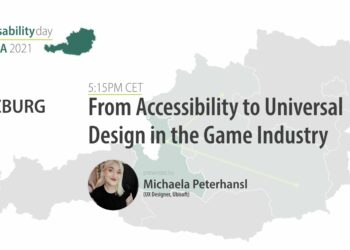
_On November 11th, the World Usability Day 2021 was also celebrated in Graz with a special online event, dedicated to this very special day. Informative talks, back-to-back were held and one of the speakers was Michaela – aka Ela – Peterhansl an UX Designer at Ubisoft Düsseldorf. Her topic: From Accessibility to Universal Design in the Game Industry.

Our own experience is not everyone else’s experience.

_Accessibility is Usability for all, which means according to Ela, products and services, features and even certain aspects of a product should be useable und enjoyable for everyone. But why is that important? There is a huge list of reasons, why this is such a crucial thing: equity and equality for people with disabilities, innovation & new standards, breaking the cycle of decreased quality of life and many more – only to name a few. But also, is it a legal question; since there are accessibility laws in place with very large fines for compliance failures and subsequent violations, and many more will be introduced. For example, the EU accessibility law is official since 2019 and will be applied by 2025.

_Extended list of examples fpr the importance of accessibility:

  • Equality and equity for people with disabilities
  • Break cycle of decreased quality of life
  • Accessible products/services are beneficial for everyone
  • Innovation and new standards
  • If a user’s experience is bad, a design is insufficient
  • Our interaction experience is going to require accessibility as we age
  • And many more…


Yet, despite of all the evidence for the importance of accessibility, there seems to be a huge gap in education. But there is no need to wait for this to catch up, one can make awareness and create demand now. For starters, to get into the mindset of accessibility: have an open mind, willingness to learn & unlearn, focus on empathy. But beware: empathy could easily lead to a slippery slope of pity and patronizing users. The biggest temptation to invest into accessibility might be that it’s a direct investment in our own future – our generation is highly tech-dependent, so there will be a high demand for accessible solutions in the future.

The most important key aspect was, that accessibility is a mindset – it doesn’t just ‘happen’. It needs to be brought back into thoughts and decision making at every step of the design process. The reason, why it isn’t already a standard, is because we tend to make unconscious decisions based on our own experience and bias.

The environment we created makes people feel disabled.

Also, the famous bubble – the social factor – plays a big role in our process of designing products. About society and people with disabilities, it’s important to note that the latter is often stereotyped, and many disabilities stay invisible and often go completely overlooked. How a disability looks is a very complex and very much individual question – many people might not even know that they have a disability. Two examples on the topic of inclusion/exclusion were brought up: Molly Burke – a blind influencer – feels in control and comfortable in her house; but as soon she steps out into the world, she loses all that control. This brings us to the question; how many talented people don’t get the opportunity to ever live up to their full potential, because the environment we made doesn’t allow them to do so? Another analogy made by the blind filmmaker, James Rath: just because someone can’t drive a car, it doesn’t mean you’re not allowed to look at cars, like them, go near them, be on the passenger seat or take a cab. The main essence from this is, it’s not about competing, it’s about facilitating fun. Video games have a positive impact on all players; hence they bring an increase of quality of life. For people with disabilities, it’s crucial to have a medium where they comfortable and accomplished with.

A short excursion about universal design, which means it should be usable by all people, with out any adaption or some special addendum. Accessibility though is often seen as something ‘extra’ – a feature to add in hindsight. This approach only leads to adding complexity to an existing non-accessible system. ‘Special’ solutions are further stigmatizing, and it is highly inefficient, ineffective & costly. But not only disabled people profit from accessible solutions – everyone does.

_Final Takeaways form this very informative event, it’s about the first steps in accessibility with lots of useful resources and important mindsets. Rather fitting start for our beginning into this journey – next stop: hands on experience.

_Literature & Resources

  1. https://worldusabilityday.at/
  2. https://youtu.be/sSPZ0Lq__pQ
  3. https://docs.microsoft.com/en-us/gaming/accessibility/guidelines
  4. https://igda-gasig.org/how/
  5. https://ablegamers.org/
  6. https://accessible.games/accessible-player-experiences/
  7. https://www.levelaccess.com/resources/simple-ways-make-video-games-accessible/
Storytelling with Augmented Reality | Part 2

In the last post, I gave an overview about the technical aspects of Augmented Reality Storytelling and the three main components of it. In this post, I want to focus more on the story. I want to give an insight into Interactive Storytelling, which can be used with Augmented Reality to create an immersive experience for the user.

Interactive Storytelling

Interactive Stories are stories that can and need to be influenced by the user. Throughout the story, the user needs to make decisions in order to continue. These decisions influence the further course of the story. The user is no longer a passive observer of a linear story, but can be an active part of it.

A interactive story is usually divided in different parts. At the end of a storyline, the user is asked to make a decision, based on different options, which are provided. After making the decision, the user is forwarded to another storyline.

The term is sometimes used synonymously for digital and transmedia storytelling (storytelling through the use of digital media), but this is not always the case. Interactive Storytelling can also be applied in, for example, books. At some point of the story, the reader has to make a decision and has several different choices to choose from. Depending on what decision he/she makes, he/she has to scroll to a certain page where the story continues.

Use of Interactive Storytelling

Interactive Storytelling often finds its usage in marketing. There are several campagnas, which make use of Interactive Storytelling to promote their products. But Interactive Storytelling can also be used to disseminate social and difficult to communicate topics. An example of that is a campaign from “Wiener Linien”, where they created an interactive campaign to educate about civil courage. Another example if from the “International Red Cross”, which made a spot to generate and show awareness of work in crisis areas.

Common Structures

There are several different options to structure an interactive story. These are some of the most common structures:

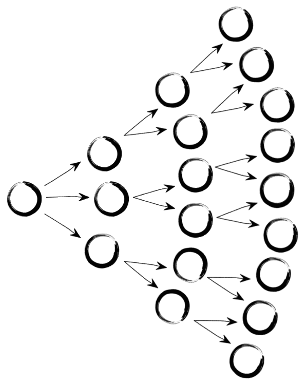
Branching Narrative

A relatively classic narrative structure in which viewers can make more and more far-reaching decisions about the course of action. The narrative branches into different endings depending on the choices you make. Depending on how many branches the narrative contains, this type of structure can get very complex very quickly.

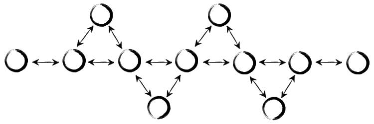
Fishbone Narrative

This is a traditional linear structure that allows viewers to explore the sub-stories of their story, but keep bringing them back to the main theme of their story. This structure still gives a lot of control over the route viewers take through your project.

Parallel Narrative

With this structure, on the one hand, viewers are offered choices in the story, and on the other hand, they are repeatedly returned to the main theme of the narrative for decisive moments.

Threaded Narrative

The perfect structure to tell a story from multiple angles. Topics can be linked to one another or remain completely separate. Rather, the story consists of a number of different themes that develop largely independently of one another.

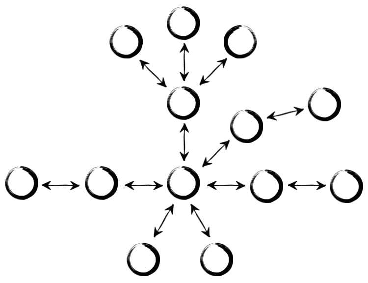
Concentric Narrative

In this structure, there are different storylines, which orbits around a shared central point The viewers are provided with different entry points, where they get to choose one. No matter which entry point the viewer choose, in the end they will always return to the core area.

References

#2 Virtual Fitting Room – let’s see behind the curtain

In my second blog entry, I dive deeper into topic of the technology behind virtual fitting rooms – Augmented Reality. My research should lay the groundwork for understanding how AR works and how it can be used in a fashion context.

And what exactly is Augmented Reality?

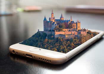
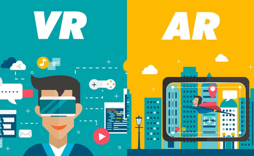
Augmented Reality (AR) is available on any camera-equipped device – mostly on smartphone and tablet – and on which the corresponding AR software is installed. AR adds digital content onto a device’s live camera feed, making the digital content seem to be part of the real world. Unlike Virtual Reality (VR), which replaces reality with a completely digital environment, AR enhances the real world by digital information overlay or virtual details, which means the real environment remains central to the user experience.

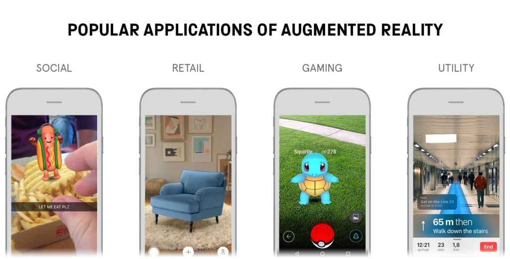
Widely known and used examples of AR are for instance Pokémon Go and Ikea App. The picture below shows a range of different applications and fields, taking advantage of AR.

But how does AR work?

When a user points the device’s camera at an object, the software recognizes it through computer vision technology, which analyzes the content of the camera feed. The device then downloads information about the recognized object from the cloud and presents the AR information as an object overlay in a 3D experience. The content displayed is part real and part virtual. Computer vision determines an object in terms of semantics (what) and 3D geometry (where). First recognizing an object, then understanding it’s 3D position and orientation. With geometry, it is possible for the rendering module to display the AR content at the right place and angle, which is essential for a realistic AR experience. AR is real-time 3D or in other words it is live, which means the process explained above has to occur every time a new frame comes from the camera (most smartphones today work at 30 fps). As a result, when moving a device, the size and orientation of the augmentation adjusts to the changed context automatically. 

Finally: AR & fashion?

Yes – one field of application for AR are virtual try-ons. However, the experience should go beyond the aspect of trying on clothes, and it has to be said that AR cannot yet completely replace a real try-on due to the lack of display quality. The key aspect in such experiences is the part real and part virtual aspect of AR (person = real and garment = virtual). 

According to Vogue Business, the “AR clothing try-on is nearly here” and it “is getting closer to reality, and the pace of acceleration is increasing”. Companies and start-ups are working on improving try-on capabilities with updates including 3D body mesh to define 3D shapes, cloth simulation and its behavior more precisely. Since there are many interesting possibilities for in-shop-experience and online-experience, investors and tech companies see a great potential in AR clothing. The value of the technology is extended beyond its entertainment aspect.

In my next blog entry, I will focus more on the benefits of AR clothing and how it could potentially solve current problems concerning the fashion industry with a focus on e-commerce.

References

https://hbr.org/2017/11/how-does-augmented-reality-work

https://www.blippar.com/blog/2018/08/21/what-is-augmented-reality-and-how-does-augmented-reality-work

https://medium.com/@shivsoni377/the-difference-between-augmented-reality-virtual-reality-and-mixed-reality-a028bdd81f9d

https://www.robotlab.com/blog/what-is-the-difference-between-ar-and-vr

https://www.voguebusiness.com/technology/why-ar-clothing-try-on-is-nearly-here

Information vs. Emotion

Wie sich Kunst und Design unterscheiden, unterscheidet sich auch Fotografie und Produltfotografie in gewisser Weise. Jeweils letzteres hat einen zusätzlichen Anspruch: Funktionalität.
Während der oder die Fotograf:in eine möglichst ansprechende Abbildung des jeweiligen Objektes haben möchte, beschäftigen sich Produktfotograf:innen mit dem Inhalt. Letztere legen Wert darauf, dass mit einem Foto alle möglichen Details zum Produkt kommuniziert werden, anstatt ein schönes Foto zu machen. Betrachterin oder Betrachter sollen anhand des Fotos bereits sofort erkennen:
Was ist das Material?
Wie fühlt sich die Oberfläche an?
Wie verhalten sich Nähte/Kanten/usw?
Wie sauber ist es verarbeitet?
Was kann ich damit alles machen?
ect.

Aber nicht nur oberflächliches wird kommuniziert. Wenn nun über das Produkt informiert wurde, muss als nächstes auch zum Kauf angeregt werden. Gesehen werden muss auch: Warum ist dieses Produkt besser als andere?
Was für Extras gibt es?
Welche Probleme nimmt es?
Warum brauche ich es?

Wettbewerb und Aufmerksamkeit
Besonders im Fall von Onlineshops: Der oder die Betrachter:in haben wenig Zeit — lange Texte werden nicht gelesen. Das Foto muss mit der Konkurrenz mithalten und das Alleinstehungsmerkmal des Produktes herausheben.

Information über das Objekt wird deutlich, Material
Eine erzeugte Atmosphäre regt zur Lust an

Schritte zum richtigen Ansatz beim Fotografieren von Produkten:

Ist es emotional oder technisch? Soll also die Funktion des Produktes aufgegriffen werden, oder soll das Produkt ein Feeling erwecken. Ein Foto eines Produktes kann eine eigene Geschichte erzählen, indem Licht, Farben und Komposition eines Setzings den Menschen in eine wünschenswerte Mood eintauchen lassen. Ein Gleichgewicht an Information und Emotion scheint sinnvoll. Die Gewichtung hängt aber von Medium/Plattform und Produkt ab.

Die Betrachter:innen verstehen: Was möchten sie sehen und was sollen sie sehen? Wie kommen die potentiellen Käufer:innen des Produkts bis zum Profukt/Foto? Der Weg ist das Ziel
Suchbegriffe auf Onlineshops zeigen an, welche Informationen das Bild als erstes vermittelt werden soll. Sucht eine Person nach “Besteck Camping Set” muss auch ein Foto vom Campingbesteck als Set als erstes angezeigt werden, um zu vermitteln “Ich bin genau das, was du suchst!”. In einem Katalog für Weihnachtsgeschenke sollte das Foto etwa klarmachen “Ich bereite Freude und hübsch verpackt bin ich auch!” und so weiter. Die Customer-Journey muss also berücksichtigt werden.

Was ist die Kommunikation der Marke/des Produkts auserhalb der Fotografie? Um ein konsistentes Auftreten zu schaffen, müssen auch Produktfotos zum restlichen Brandimage gehören. Inhaltlich wie auch gestalterisch.


Grimm, R.: https://youtu.be/4sYyOuc9RJo
Grimm, R.: https://youtu.be/LOs7Mp1TDNA
Al-Hakim, M: https://youtu.be/yMugtGmH-SE

Emotionen im Designprozess, Empathie & emotional Branding

Grafikdesign hängt eng mit dem Vermitteln von Emotionen zusammen, wie in den letzten Blogartikeln klar wurde. Dieser Zusammenhang, sowie die Wichtigkeit von Emotionen im Designprozess sind Thema dieses Blogartikels.

Indem Grafiken durch unterschiedlichste Gestaltungselemente verarbeitet werden und Informationen visualisiert werden, werden gleichzeitig auch Emotionen vermittelt. Diese Emotionalität im Design kann schließlich dazu beitragen, dass die Kommunikation der Informationen verbessert wird und die Betrachter*innen dem Design mehr Aufmerksamkeit schenken. Ästhetik ist dabei ein wichtiges Prinzip – denn im Zusammenhang mit Ästhetik können auch Emotionen ausgelöst werden. Durch Farben, Bilder oder das gesamte Design werden die Informationen übermittelt die im Designprozess bearbeitet wurden und diese können schließlich emotional aufgefasst werden (Tongxiang JS Appararel Accessories Co. Ltd., 2021).

Diese Art der Wahrnehmung ist sehr subjektiv und hängt von Erfahrungen, der Vorstellungskraft, dem Denken und Verstehen der jeweiligen Person ab (Tongxiang JS Appararel Accessories Co. Ltd., 2021). Dieses Thema der Subjektivität im Design wurde auch im letzten Artikel schon behandelt. Persönlich gefällt uns, was zu uns passt. Passt das Produkt oder das Design zu unserem Lebensstil oder einem erwünschten Lebensstil, unserer aktuellen Lage, passt es zu unseren Werten, so werden wir das Produkt am ehesten ansprechend finden (Heimann & Schütz, 2018). Somit muss die Wirkung eines Designs nicht immer gleich sein. Normalerweise sollten Betrachter*innen die emotionale Funktion eines Designs jedoch durch Empathie, Erfahrungen und die Vorstellungskraft wahrnehmen. So können auch individuelle Wahrnehmungen entstehen, die den eigenen ästhetischen Bedürfnissen nahe kommen (Tongxiang JS Appararel Accessories Co. Ltd., 2021)(Liang, 2021).

Emotionalität im Prozess des Designens

In einem Blogartikel, auf den ich bei der Recherche gestoßen bin, wird davon geschrieben, dass es auch ein möglicher Ansatz sein kann, die Emotionalität eines Designs gar nicht auf den ersten Blick sichtbar zu machen. So bleibt den Betrachter*innen die Möglichkeit, durch die eigene Wahrnehmung und interessengeleitet das Design zu betrachten und das Denken anzuregen. Ähnlich dazu wird in diesem Artikel auch die Empathie im Design behandelt. Designer*innen bringen ihre eigenen Emotionen in Designs ein – das kann auch bei Betrachterinnen Wirkung erzielen. Vor allem Personifizierung und das Integrieren von Persönlichkeit in ein Design, kann ein Design emotional werden lassen. Diese Methode kann natürlich nur dann angewendet werden, wenn diese zum Design und der Stimmung der Betrachter*innen passt (Tongxiang JS Appararel Accessories Co. Ltd., 2021).

Designer*innen sollten sich auch immer mit dem Standpunkt der Betrachter*innen beschäftigen und nicht nur mit dem eigenen, sodass Emotionen im Design hier im Einklang sind. Emotionales Design gibt auch Inhalt für den Prozess des Designens und kann in der Kommunikation eine wichtige Rolle spielen. So kann die emotionale Erfahrung der Betrachter*innen verbessert werden. Um das zu erreichen, müssen neben visuellen, ästhetischen Aspekten im Design auch die emotionalen Eigenschaften der Kommunikation betrachtet werden, sodass das Design lebendiger, ausdrucksstärker und menschlicher ist und diese Emotionen auch bei den Menschen ankommen (Liang, 2021). Zumindest nach der Betrachtung der funktionalen Ebene im Design, können Emotionen in den Vordergrund rücken (Yen, Lin & Lin, 2014).

Wahrnehmung und Einfluss des emotionalen Designs

Zunächst wird das Gesamtbild des Designs wahrgenommen und erst im Anschluss in seine Einzelteile zerlegt. Das bedeutet, das emotionales Design im gesamten Prozess bedacht werden muss, um Produkte zu schaffen, die näher an den Emotionen der Menschen sind, sodass diese auch übermittelt werden können. So können die Emotionen der Betrachter*innen oder Konsument*innen in den Vordergrund gestellt werden und visuelles Kommunikationsdesign kann die emotionalen und psychologischen Bedürfnisse der Betrachter*innen umfassend berücksichtigen. Treffen Produkte schließlich die Bedürfnisse möglicher Kund*innen hat dies auch eine Auswirkung darauf, ob das Produkt gekauft wird oder nicht, da bevorzugt Produkte ausgewählt werden sollten, die auch den eigenen Emotionen, Reaktionen und Bedürfnissen entsprechen (Liang, 2021).

Schafft es eine Marke schließlich eine starke Verbindung zu Kund*innen herzustellen kann man von emotional Branding sprechen. Diese emotionale Verbindung zu einer Marke zeichnet sich dadurch aus, dass diese längerfristig besteht und mit positiven Emotionen und Leidenschaft verbunden ist. Zu einer emotionalen Marke gehören schließlich nach Yen, Lin und Lin (2014) Ästhetik, Kreativität und auch Attraktivität. Diese wiederum beeinflussen die Leidenschaft, die positiven Emotionen und Verbindungen zu einer Marke. Das Thema des emotionalen Brandings wird aber in einem der folgenden Artikel näher behandelt werden (Yen, Lin & Lin, 2014).


Quellen

Heimann, M., Schütz, M. (2018). Wie Design wirkt: psychologische Prinzipien erfolgreicher Gestaltung. Rheinwerk.

Yen, H. Y., Lin, P. H., & Lin, R. (2014). Emotional product design and perceived brand emotion. International Journal of Advances in Psychology (IJAP)3(2), 59-66. https://cid.ntua.edu.tw/files/IJAP6556.pdf

Liang, S. (2021). Research on Emotional Factors and Emotional Experience of Information Graphic Design in Visual Communication Design. Academic Journal of Computing & Information Science4(2). file:///Users/lisapassenbrunner/Downloads/ddIcFe9Z1BlTIucU79yolNNcdv2e9gVl3956FEwr%20(1).pdf

Tongxiang JS Appararel Accessories Co. Ltd. (2021, 23. November). Graphic design skills, emotional resonance method. Verfügbar am 13. Dezember 2021 unter https://www.linkedin.com/pulse/graphic-design-skills-emotional-resonance-method-jsfashion

Die Geschichte der Food Photography

Abbildung 1 Food Photography in den 70er

Die Lebensmittelfotografie ist eine der schwierigsten und zugleich lohnendsten Formen der kommerziellen Fotografie. Man sagt, dass die Lebensmittelfotografie um 1832 begann, als ein französischer Erfinder für die Komposition eines Stilllebens mit einer Schüssel, einem Becher und einem Stück Brot ausgezeichnet wurde. Und in den 1930er Jahren produzierten Unternehmen wie Kraft Foods, Campbell’s, Bakers und Nabisco farbige Lebensmittelanzeigen mit Rezepten für Verbraucher in Zeitschriften. Während dieser frühen Phase der Printmedien in den späten 50er und frühen 60er Jahren veränderte die Lebensmittelfotografie die Art und Weise, wie Verbraucher Lebensmittel betrachten und wie sie in der Werbung im Lebensmittelgeschäft, in Restaurants und zu Hause wahrgenommen wurde..

In den späten 60er und frühen 70er Jahren hatte sich die Lebensmittelfotografie einen schlechten Ruf erworben, weil Berichte über Lebensmittelmanipulationen und Fälle auftauchten, in denen Lebensmittel gefälscht und manipuliert wurden, um sie besser aussehen zu lassen, als sie waren. Die Federal Trade Commission beobachtete genau, was die Unternehmen im Bereich der Lebensmittelwerbung taten. Die Wahrheit in der Werbung war zu dieser Zeit immer wichtiger geworden, weil Campbell’s Suppe seine Lebensmittel manipuliert hatte. Angeblich wurden in der Chicken ‘n’ Stars Suppe Murmeln verwendet, um die Zutaten zu ersetzen. Dadurch wurde die Illusion erweckt, dass die Sterne an der Oberfläche der Suppe zu sehen seien, während sie in Wirklichkeit auf den Boden der Schüssel sanken.

In den frühen 80er Jahren war schwarzes Plexiglas der angesagte Hintergrund. Die leuchtenden Farben der Lebensmittel vor dem schwarzen Plexiglas (siehe Abbildung 2 ) sprangen förmlich aus dem Papier.

Abbildung 2 Tacos mit schwarzen Plexiglas

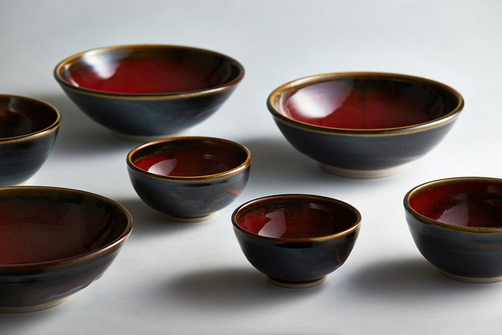
In den 90er Jahren wurde den Requisiten mehr Platz eingeräumt und nicht den Speisen. Auch wenn die Speisen auf dem Set kleiner waren, sorgte eine dunklere und dramatischere Beleuchtung für einen klassischen Look. In den 2000er Jahren wurde ein sauberer und weißer Look von der Trendsetterin Martha Stewart beeinflusst. Es wurden Leinentischdecken und alte Requisiten mit hellerer Beleuchtung verwendet. Im Jahr 2010 gab es eine Rückkehr zum Trend der geraden Kamerawinkel. Der derzeitige Trend ist nach wie vor, die Farben frischer Lebensmittel auf Weiß zu präsentieren. Die weißen Teller bringen eine Frische und einen sauberen Hintergrund für die zu präsentierenden Lebensmittel.

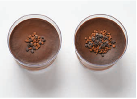
Global gesehen werden Lebensmittel in den verschiedenen Kulturen der Welt unterschiedlich dargestellt. International stehen kleinere Größen für Luxus und teuer. Quantität wird in der amerikanischen Esskultur mit Qualität assoziiert. Der amerikanische Verbraucher würde denken, dass die Beilage auf der rechten Seite des Desserts reichlicher ist als die auf der linken Seite, die spärlich und billig aussieht (siehe Abbildung 3). Hingegen ein Europäer das Dessert auf der linken Seite als teurer und appetitlicher empfinden würde.

Abbildung 3 Schokodessert

Food Photography in der Gegenwart

Heutzutage vermitteln die sorgfältige Zubereitung und das Styling der Speisen dem Betrachter den Eindruck, dass das Bild gerade vor dem Verzehr fotografiert wurde. Gute Food-Fotografie muss ein Gefühl von Frische und “Hausmannskost” vermitteln und gleichzeitig appetitlich aussehen. So bekommt der Betrachter Lust, die Rezepte selbst zuzubereiten oder sie sich liefern zu lassen. Auch wenn die meisten Food-Fotografien als Stillleben oder “Table Top”, wie es in der Branche heißt, aufgenommen werden, stellen sie das Essen von seiner besten Seite dar. Früher wurden Lebensmittelfotografien nur zu Werbezwecken in Zeitschriften, Kochbüchern und Auslagen von Geschäften gezeigt und eingesetzt. Heute ist die Lebensmittelfotografie überall zu finden. Neben den üblichen Orten, an denen Lebensmittel zu sehen waren, wie z. B. in Lebensmittelgeschäften und im Fernsehen, tauchen Lebensmittel jetzt auch an öffentlichen Orten auf, wie z. B. an Tankstellen, Bahnhöfen, auf dem Flughafen in mobilen Food Trucks und natürlich in den sozialen Medien. Die Lebensmittelfotografie ist heute wichtiger denn je, denn sie ist ein wichtiger Bestandteil unseres täglichen Lebens und wird rund um die Uhr gezeigt.

Quellen

J. Glyda, Food Photography Creating Appetizing Images, NewYork: Routledge, 2019.

Kids and Interaction (III): Analysis and database of interactive exhibitions aimed at children.

Following the discoveries made in the past search phase, it was time to analyse existing exhibits on the basis of the findings.

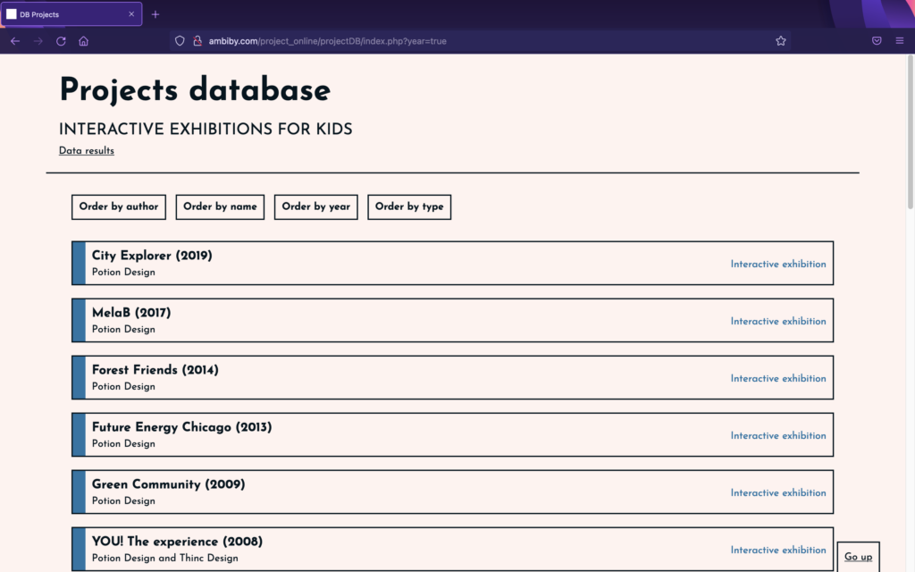
To facilitate this, work has been carried out over the past few days on the creation of a project database. This has been designed and programmed from scratch, and is not only a great help in keeping the information together, but also shows data taken from the analyses.

The idea is to collect information from different installations and to be able to read details related to usability (UX) aimed at children. For that purpose, certain questions have been determined to answer while analysing projects in order to obtain results that demonstrate, or not, whether the aspects explained in previously reviewed articles are applicable to interactive exhibitions for children.

The questions are:

  • Which interaction model is used (GUI, TUI, CLI, Other)?
  • What is the focus of the interaction (user-centered, activity-centered, system design or genius design)?
  • Does the installation provide instant feedback?
  • What type of navigation is there (multiple, step-by-step or other)?
  • Is the text simple and understandable?
  • Is the text size large?
  • How much text is there?
  • Does it have sounds?
  • Does it have animations?
  • Does it have bright, contrasting colours?
  • What kind of icons are displayed (abstract, literal, no icons, other)?
  • Is the experience customisable (user choice: characters…)?

With the database prepared and programmed, we started to analyse works in order to receive the data. For the moment it only has exhibitions by the Potion Design group, which in many cases directs its works to the very young. Even so, over the next few days we intend to add many more installations to be analysed, in order to have more realistic results.

Access to the database published online: http://ambiby.com/project_online/projectDB/index.php?year=true

The Emotional Space | #5 | Outlines

I already painted a metaphorical picture of how I imagine my currently merely conceptual installation from a visitors perspective in The Emotional Space | #4. This time, before diving into technical details, I will provide a more straight forward view of what I want The Emotional Space to look like and the necessities to make it work.

The Space

Essentially, I want to create an audio-visual installation, which requires its own room. As an entrance, I would rather have a thick curtain instead of a door, because a door, in my opinion, seems a lot less inviting to visitors, especially if sound can be heard on the other side of it. Entering the room should only be possible after putting on a wristband, which is handed out right in front of the room.

Further automotive AR examples

| continuing my last blog entry on examples

In the past week I was searching for further examples of AR implementation in car’s user interafaces. Currently, after three weeks of research in this topic I have the impression that the industry is mainly focusing on visual augmentation as a help for the driver. Here are some further examples that offer some new aspects and features.

GMC Sierra HD trailer camera

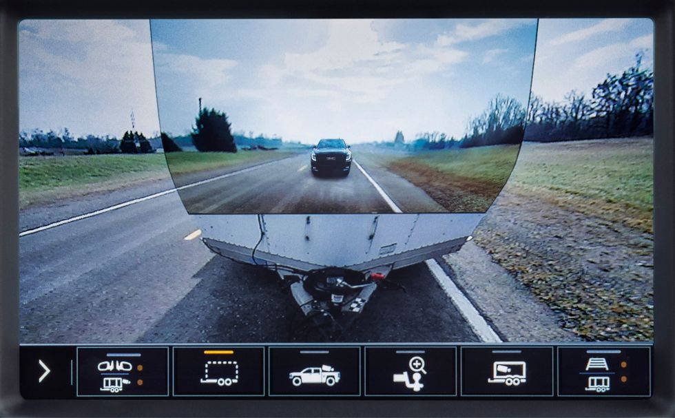
The 2020 GMC Sierra HD pickup truck featured a novel implementation of AR technology. The truck was designed to tow heavy duty trailers and has in sum 15 cameras to help the driver navigate the really large truck. One camera can be mounted at the back end of the trailer looking at the road behind. This image can then be displayed added to the built-in rear camera view of the truck, letting the trailer almost disappear. [3]

I personally find the solution to be a nice gimmick but would actually question its practical benefit. The view for sure doesn’t help manoeuvring with the attached trailer.

GMC trailer camera [3]

Land Rover Clearsight ground view

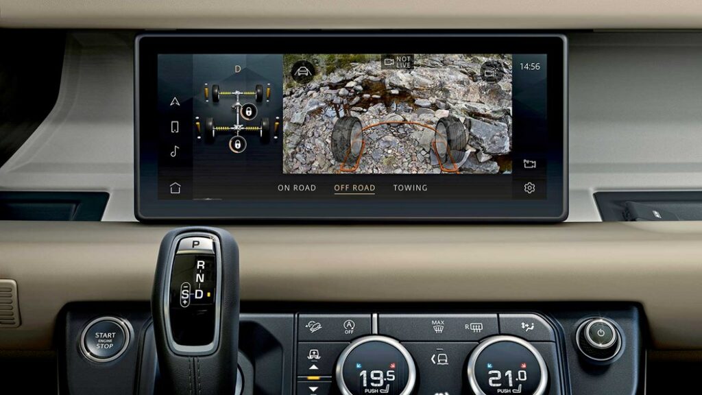
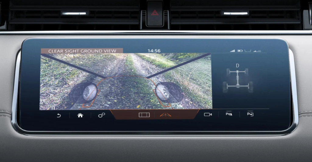
Looking at special utility solutions, LandRover also implemented a camera augmentation in the Evoque and Defender models – on the main screen. The system works with cameras on the side mirrors and on the front grille and help the driver to see a 180° ground view in front of the car and between the front wheels, below the normal vision field. As LandRover targets off-road enthusiasts, this feature could be welcomed for showing any dangerous obstacles on rough terrains, or simply when climbing steep hills. A similar system is also implemented in the higher-class Bentley Bentaiga SUV. [7]

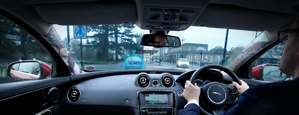
Besides this “transparent bonnet” system, the company Jaguar-LandRover was also conducting research also on a “transparent pillar” solution. That should help drivers in a more urban environment to see their surroundings in 360°, including objects hidden by the roof’s pillars with the help of cameras and AR. The research was done in 2014 and I couldn’t find any further outcome of the idea. Additionally they have also shown a unique way of AR navigation help: a ghost car projected in front of the driver that has to be followed along the route. [8] [9]

Jaguar transparent pillar and ghost car concept [8]

Panasonic’s state-of-the-art AR HUD

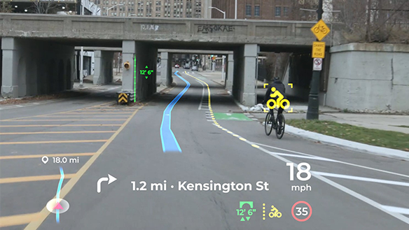
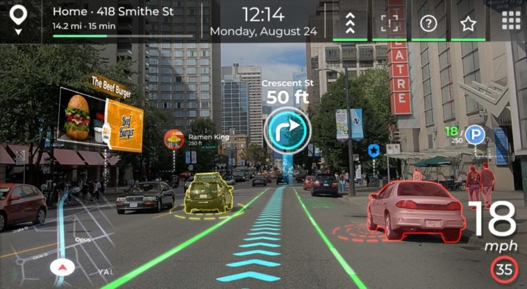
Panasonic Automotive is an other supplier (like Continental, etc.) who is developing onboard systems for automotive OEMs, like an AR Head Up Display with high-end features. Their product was shown on the latest CES 2021 exhibition and is claimed to get implemented in a series production car of an unknown brand in 2024. The system stands out from the other existing HUDs in following features:

  • AI software for 3D navigation graphics, supporting smooth responses to sudden changes ahead of the car. It also uses information from all the onboard ADAS systems (e.g. a 180° forward facing radar with 90 m range) and generates updates in less then 0,3 seconds. (the spatial-AI, AR navigation platform is a patent by Phiar)
  • Eye tracking technology to ensure that the driver always sees the projected information on the right place at any head movement.
  • Vibration control: image stabilization for bumpy roads.
  • Advanced optics, 4K resolution with laser and holography technology (by Envisics).

[5] [6]

To cover all relevant sensory fields in a car interior interface, next week I want to focus on the topic of haptics and tactile feedback solutions on the market.

Sources

[1] YouTube video from Roadshow: Car Tech 101: The best ways AR is being installed in cars | Cooley On Cars. Retrieved on 11.12.2021.
https://www.youtube.com/watch?v=PHhvCRexjWQ

[2] YouTube video from Roadshow: 2020 GMC Sierra HD: Heavy-duty hauler debuts “Transparent Trailer” tech. Retrieved on 11.12.2021.
https://www.youtube.com/watch?v=U0gZ9HaCWsA

[3] Online article by Road And Track: The 2020 GMC Sierra HD Can Make Your Trailer “Invisible”. Retrieved on 12.12.2021.
https://www.roadandtrack.com/new-cars/future-cars/a26009122/2020-gmc-sierra-heavy-duty-invisible-trailer/

[4] YouTube video by About Cars: Panasonic’s Innovative Augmented-Reality HUD Could Be in Cars by 2024. Retrieved on 12.12.2021.
https://www.youtube.com/watch?v=cLgMnSTSxog

[5] Online article by Panasonic: Panasonic Automotive Brings Expansive, Artificial Intelligence-Enhanced Situational Awareness to the Driver Experience with Augmented Reality Head-Up Display. Retrieved on 12.12.2021.
https://na.panasonic.com/us/news/panasonic-automotive-brings-expansive-artificial-intelligence-enhanced-situational-awareness-driver

[6] Online article by Auganix.org: Panasonic collaborates with Phiar to bring real-world AI-driven Augmented Reality navigation to its automotive solutions. Retrieved on 12.12.2021.
https://www.auganix.org/panasonic-collaborates-with-phiar-to-bring-real-world-ai-driven-augmented-reality-navigation-to-its-automotive-solutions/

[7] Online article by Car Magazine: Does it work? Land Rover’s ClearSight handy X-ray vision tech. Retrieved on 12.12.2021.
https://www.carmagazine.co.uk/car-news/tech/land-rover-clearsight/

[8] Online article by Autocar: Jaguar Land Rover previews transparent pillar technology. Retrieved on 12.12.2021.
https://www.autocar.co.uk/car-news/new-cars/jaguar-land-rover-previews-transparent-pillar-technology

[9] Online article by Jaguar: Jaguar Land Rover Develops Transparent Pillar And ‘Follow-Me’ Ghost Car Navigation Research. Retrieved on 12.12.2021.
https://media.jaguarlandrover.com/news/2014/12/jaguar-land-rover-develops-transparent-pillar-and-follow-me-ghost-car-navigation

NIME Research

Da ich großes Interesse an Sample-basierter Musik habe und auch selbst gerne alte Schallplatten aus dem Keller meines Vaters durch die MPC jage, habe ich mich nach einigen Enttäuschungen und Klo-Ideen dazu entschieden meine Projektarbeit dazu zu nutzen eine Art Sampler zu entwerfen, der im besten Fall irgendetwas kann, dass andere nicht können. Ebenfalls hat mich das Beschäftigen mit Pure Data dazu bewegt einen Sampler zu basteln und mich somit motiviert in diese Richtung zu steuern. Darum habe ich auch im NIME-Verzeichnis mit der Suchfunktion nach dem Wort „Sample“ gesucht und bin auf einen großartigen Beitrag gestoßen:

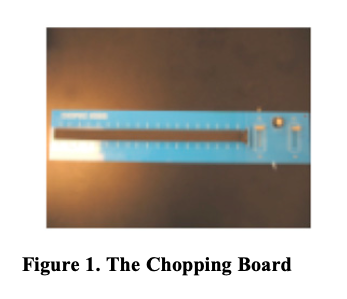
The Chopping Board

In der Einleitung schreibt der Hip-Hop Produzent und DJ, Jason Lee, über die Vorteile und Probleme des Samplens. Da ich die letzten Jahre ebenfalls Hip-Hop Beats baue und außerdem grade dabei bin meine erste EP zu releasen, kann ich sehr gut nachvollziehen, dass es durch zerschneiden eines Songs einfacher ist, ihn unkenntlich zu machen und somit rechtlichen Problemen zu entgehen.

Ebenfalls bin ich, wie Jason, der Meinung, dass ein Teil des Reizes des Samplings darin besteht, dass man den Produktionssound einer Aufnahmeära einfangen kann, die nicht mehr existiert, da Records mit analogem Equipment der 60er, 70er mehr „wärme“ bzw. „körnung“ besitzen.

Was ich sehr interessant finde ist die Theorie des „accidental sound“. Durch das Zerschneiden von mehreren Takten eines Tracks können zum Beispiel ein Schrei des Sängers oder andere Töne im Lied „zufällig“ platz im Rhythmus finden, um ihm einen gewissen Swing zu verpassen, was ich selbst schon des Öfteren feststellen durfte.

Auch, dass das Samplen oft eine eher programmierende als musikalische Aktivität darstellt darf ich immer wieder Erfahren, da es einiges an Vorarbeit benötigt bis es endlich zur neuen Komposition der Schnipsel kommt, da die Vorbereitung sehr zeitaufwendig und mühsam sein kann. Um dieser gegebenheit entgegenzuwirken hat Jason das Chopping Board entworfen.

im Grunde hat Jason mit seinem Chopping Board eine 18 Zoll lange physische Repräsentation eines Sampels entworfen und wollte damit erreichen, dass man das eingespielte Sampel wie ein Instrument bedienen kann. Es war nötig eine gewisse Fingerfertigkeit dafür zu entwickeln, da man sich die richtige Position einprägen musste und es ebenfalls eine Frage von Timing war wann das Sample getriggert wurde.

Betätigt wird das Chopping Board durch die Berührung des Touch-Pads. Es erlaubt dem Spielenden das Sample sofort abzuzielen und nicht erst vorbereiten zu müssen. Somit erschlaffte Jason ein Gerät das ähnlich wie ein traditionelles Instrument zu spielen war und mehr Platz für Improvisation und Experimente ließ. Mit den beiden Faden können Volume und Pitch eingestellt werden. Es war ebenfalls möglich zwischen „momentary“, wo das Sample nur so lange gespielt wird, solange das Pad gedrückt wurde und „sustain“ Playback-Mode, bei dem das Sample durch einmaliges Drücken bis ans Ende spielt zu switchen.

Ich finde die Idee spitzenmäßig, jedoch bin ich nicht sicher, ob dieses Instrument wirklich Verwendung gefunden hat. Jedenfalls habe ich in PD im Zuge meiner End-Abgabe bereits ein ähnliches Chopping board gebastelt und werde mit Sicherheit alle gesammelten Erfahrungen diesbezüglich in meine Projektarbeit einfließen lassen.