_Examining Accessibility reviews for DEATH STRANDING

_Hands-on experience with DEATH STRANDING by SONY and Kojima Productions. This game is a beautifully crafted dark apocalyptic sci-fi game with an enigmatic story, a masterpiece in convoluted narrative, futuristic designs and rather complex systems and even more complex UIs.


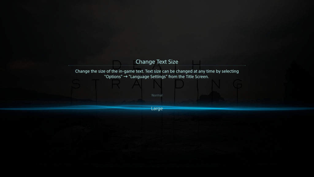
_Last year I played the ‘base version’ – the PS4 edition – quite a lot and found my way around the complex systems after a while. I learned how the different features work and how to use them properly; and even how to exploit them as much as possible to make my life easier with this game.  But there were many things which annoyed me, like non scalable text size which made me often scooch even closer on the couch to my rather big screen, only to read some menu texts. So even for me, it wasn’t satisfying from the beginning and now, almost more than a year later, the “Directors Cut” for PS5 got released – rumor has it, this version is now more accessible. So, I tried the new version of the game after a yearlong break on a PS5 and immediately notices many improvements, mainly quality-of-life improvements. Now the question came up, how good were those improvements really? For a start, I researched some accessibility reviews on DEATH STRANDING and gathered their findings.


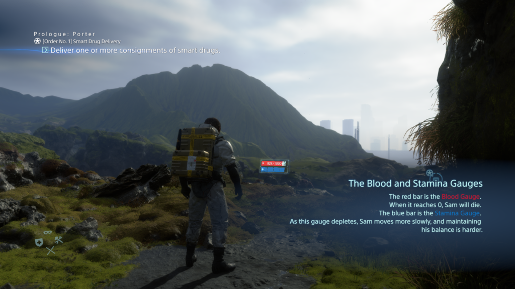
_The 1st review was made by Steve Saylor, a blind gamer – his general thoughts and opinions on the accessibility of this game were very intriguing. The crazy and wild story did really impress him, yet did he feel held back by the limitations of accessibility. He tested the PS5 version, where they implanted a “large text” option to enlarge the text size in the whole UI – whereas text in the base PS4 version initially was considered rather small. But even with this new option, often it seems hard to tell where large text was applied, and small text remains. Paired with that, the game has a lot of Button prompts, menus, button maps and texts which take up a lot of the screen, making it rather crowded. To identify everything correctly, one is required to lean back and forth to the screen – which is tiresome.


Staying with visual barriers, subtitles exist through the whole game; yet they do not have any high contrast or background to them – no further settings except on/off. But weirdly enough, in some situations – like any open menu – where there is dialogue experienced, the subtitles get a nice black gradient as background, but only there. Besides that, hearing impaired people might also find difficulties: there is no menu narration, but there are audio feedback/cues, that play on selecting inputs. The two main accessibility barriers he identified were for people with motor or cognitive disabilities. Starting with the latter; in the game there are a lot of different subsystems, which require you to memorize complex input patterns and often it’s hard to determine, what the most important information on the screen is right now – or what is just eye candy. There are subtle visual cues to those vital elements, but often you are left with a ‘lost’ feeling in all these menus.


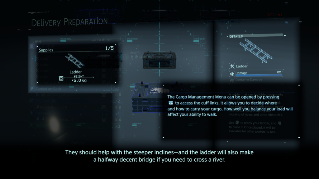
The lack of any in-game remapping of controls (PS5 version) comes to play at one of the core aspects of the game: while you deliver your items/cargo you will cross different types of terrain (water, rocks, mud, snow…) and for that you to balance your cargo. This is done by ‘ready yourself’ – pressing down left & right shoulder trigger – to prevent yourself from toppling over. The need to push them down constantly to stay upright might be a barrier for some people with motor disabilities. The adaptive triggers of the Dualsense controller do feel nice, but even without any dexterity problems it can get annoying and exhausting, because you will press the shoulder triggers a lot – fortunately you can disable the adaptive feedback. Later in the game you do get access to vehicles, which will help you with that, but it will take some time and exhaustion to get to that point. But that being said, these helping game features possess a durability system and do have to be maintained to work properly.

Buttons in DEATH STRANDING do have many different functions, depending on what subsystem you’re in. A good example would be the item “Repairspray”, which is used to repair worn out cargo containers.
To use this item, you will have to:

  • Press the D-Pad right and hold it, that opens the item wheel
  • Select with your right analog stick the item
  • If it’s not on the first page of items, press the right analog stick to switch pages (often referred as R3)
  • Let go of the D-Pad, item is now equipped
  • Press left shoulder trigger (L2) to ready it (it now points forward)
  • Press square to point it backwards to your cargo mounted on your backpack
  • Press right shoulder trigger (R2) to activate it (until it runs out of gas)
  • Now you either but it back with D-Pad right or you hold D-Pad right, access the item again in the item wheel and press circle to drop it


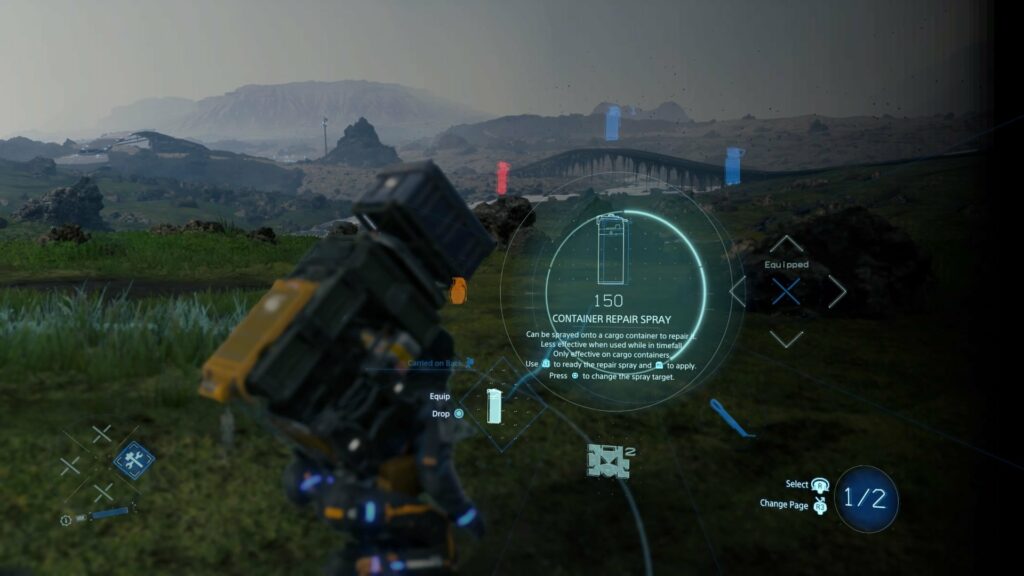
Everything has such complex interactions und requires multiple button presses, even in combat and other stressful situations. His final words were that the “Directors Cut” does have some neat little improvements, but it remains just an upgraded & polished version with minor changes to the PS4 edition. It could be, that for many people the advances made are still too little.


_The 2nd review is by Michael Matlock who also came to mainly the same conclusions. Multiple button presses at once are difficult, and even remapping them within the PS5 integrated system options (which is possible nonetheless) is tiresome and exhausting. An interesting aspect which joined the barriers for people with motor disabilities was the camera: the right stick must be adjusted constantly to look around and an automatic camera would help a great deal; this would center/adjust the camera always behind the player character. It was mentioned that the difficulty setting “Very easy” was overhauled that everyone could beat the game, where penalties for dropping cargo are very small and combat is fairly simple – this would have to be tested, I might add.

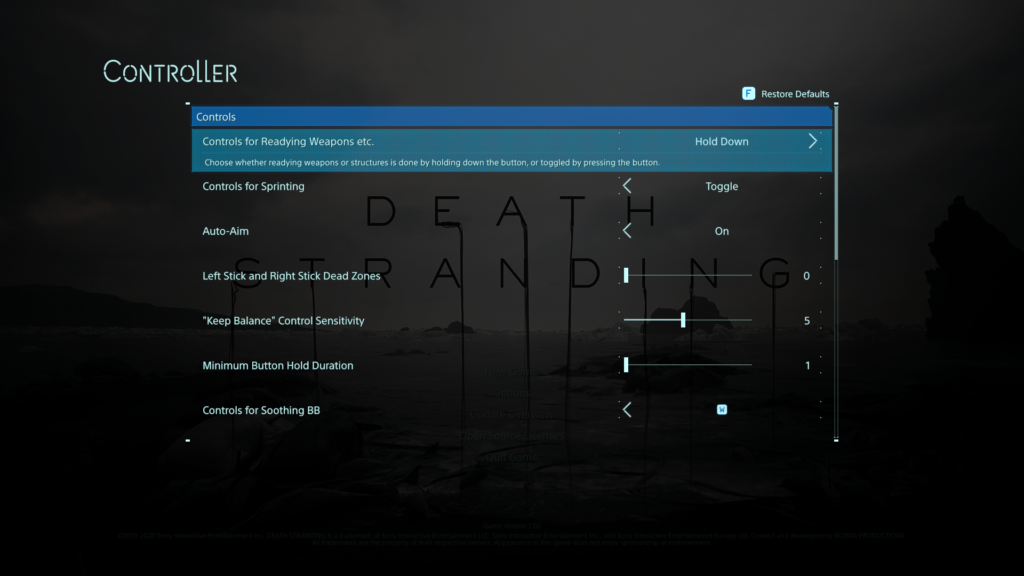
Concerning accessibility options, the aim-assist is by default activated (changeable) and there is an option for “Keep balance”-sensitivity, which controls who difficult the balancing part is for the player. Also, there is now a “Hold Button”-option, resulting in overriding any quickly repeated button presses (quick time events) to just holding the button down. The analog sticks have adjustable dead zones, and some motion-based inputs can be remapped to ‘normal’ button presses. The HUD can be adjusted with selecting & deselecting shown icons to reduce visual clutter; and the brightness can be easily adjusted. Another interesting barrier, everything has subtitles – expect the frequent appearing music pieces. Yet not hearing them will not stop you from advancing further in the game, but sadly do they add a lot to the atmosphere of the game.


A big burden is lifted through the rather smart game design – the online component. As one might never meet another player in his own game world, yet these other online players might alter your own game world by leaving objects and structures to help you traverse the world easier – this feature often helps a great deal getting through the game. For example, at one moment you might struggle crossing a river and when you return later someone left you a bridge in the meantime. Final judgement of this review was partially accessible and again, a lot of helpful accessibility options, but still room for a lot of improvements – yet it has gotten substantially better considering earlier Kojima titles.


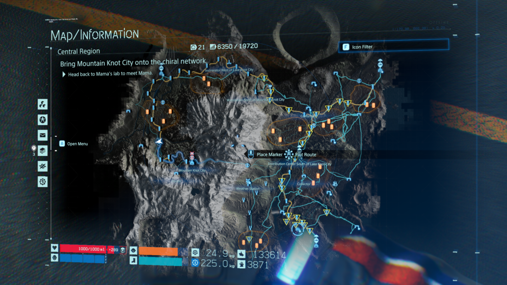
_3rd review of the game was done by Courtney Craven at CAN I PLAY THAT?: again, iterating many of the given problems. Interesting enough, the ability to plot routes, which will then be visible in the game world as dotted lines was praised as helpful tool while being deservedly difficult to operate (speaking again of multiple button presses). Also, the “very easy”-difficulty could eliminate combat completely, but I doubt stripping away this aspect completely does the game any good, but maybe there could be a workaround by maybe leaving the combat situation in the game yet removing the possibility for a “game over”.

The statement was made, that if you struggle with holding down the triggers, you will not really be able to play DEATH STRANDING – which, given the number of times you will have to press it, is most likely true. Regarding the font sizes, it was mentioned that even the “large text”-option looks like rather ‘normal’ text size. I agree on that; the ‘large’ text was just right for me, yet somebody might need it even bigger – and that’s just not supported. Final words in that review that this game is one of the most barrier-ridden games in a long time but not a complete accessibility failure – although many people might not be able to enjoy this game.


_For the 4th review I found a rather detailed and extensive piece by FAMILY VIDEO GAME DATABASE, which I will only feature as a link on their site, given the size of it: https://www.taminggaming.com/en-gb/accessibility/Death+Stranding


_My own small notes on this game are that I was rather surprised by the given accessibility options, because Japanese productions often suffer from a poor approach to accessibility – maybe it was SONY helping hand – but it was nice to see that there were some ideas, thoughts and time spent on making the game more easily enjoyable for a broader audience. What I still struggle with, which is funny no one mentioned it in my research; the sheer amount and variety of complex, new and unknown icons often leave me pondering, what they want to tell me – although this is for another time.


_Literature & Resources

  1. https://youtu.be/XqGN3YKnkDo
  2. https://dagersystem.com/disability-game-review-death-stranding/
  3. https://caniplaythat.com/2021/09/23/death-stranding-directors-cut-accessibility-review-can-i-play-that/
  4. https://www.taminggaming.com/en-gb/accessibility/Death+Stranding

Enaktiver Realismus

Der Enaktive Realismus beschreibt den Zusammenhang bei einer interaktiven Oberfläche, einem Spiel beispielsweise, zwischen der in echt ausgeführte Bewegung und der Reaktion der dargestellten Inhalte im Spiel beispielsweise. Das Handeln wirkt sich in einer realistischen Weise auf die Oberfläche aus. Ein gutes Beispiel wäre, wenn man in einem Dialog durch eine bestimmte Handlung das virtuelle Gegenüber verärgert.

Dieses sogenannte Mapping, zwischen realen Bewegungen und der Auswirkung spielt eine große Rolle, inwieweit die Interaktion im Betrachter einer aufs echte Leben übertragbare Reaktion auswirkt.

External Realism

Der externe Realismus, nach Lin, bezieht sich auf die Übertragbarkeit des Gesehenen auf die reale Welt. Darunter fallen Punkte, inwieweit kann man sich in einen Charakter hineinversetzen, bis hin zu einer realistischen Darstellung von Effekten, wie Feuer, Rauch, Explosionen, Partikel, Wasser und noch vieles mehr. Je echter dabei der Detailheitsgrad ausgeprägt ist, umso “realistischer” ist auch die Darstellung. Die Glaubwürdigkeit steigt. Je mehr man diese Übertragbarkeit ausprägt, umso stärken sind die Reaktionen der Betrachter. Im Research von Lin kann beispielsweise oft herausgelesen werden, dass die Immersion und Identifikation stark erhöht werden. Die Relevanz für das reale Leben steigt daher zugleich, sodass die Reaktionen auf die dargestellten Inhalte mehr von echten Reaktionen ähneln. Lin schreibt auch von einer erhöhten Aggression bei dem Spielen von Ego-Shootern beispielsweise, kann aber in weiterer Folge durch weitere Research darauf schließen, dass es immer noch eine Barriere zwischen dem Dargestellten und dem Realen ist, da die Reaktionen ausschließlich auf das Spiel fokussieren und nicht auf die reale Welt.

Eine Schwierigkeit, die sich nun aber immer häufiger darstellt, ist, dass in den heuten Filmen und Spielen nicht mehr nur wirklich existierende Inhalte dargestellt werden, den Drachen Beispielsweise gibt es ja nicht. Trotzdem wird ein Modell erstellt, das so echt, wie nur möglich aussieht. Eine “richtige” Referenz dazu existiert natürlich nicht, daher leidet natürlich auch die Übertragbarkeit in das echte Leben darunter. Inwieweit die Übertragbarkeit und die dadurch entstehende Freude über dem Stauen über surreales steht, ist natürlich noch fraglich – in erster Linie handelt es sich aber um ein Paradox, das man nicht mehr mit “Realismus” alleine lösen kann.

black flat screen tv turned on displaying 11

How to make phones usefull for older people?

Seniors are easily overwhelmed with too much fast information. They are from another time and brains don’t learn faster with age, it is the opposite. In order to help with too much to learn, limiting functions, reactions and options to the most comfortable and useful once is key here.

Seniors are not interested in memes, podcasts, online shopping, digital files or navigation. They learned the minimal old way to find their way, but with the globalization they still wan’t to keep contact with their family and be able to see them in Video-calls and more. A phone is a smart device to do so, but it comes with too many features for seniors.

A block-app that allows to freeze features and put the important abilities on the main Home screen could be the solution.

If a Senior is better with more features or maybe is interested in, let’s say, sports, streaming or E-Mails, than this can just be added to the Home-Screen and not frozen. Also interest helps the brain to learn better, so grandparents that are interested in a specific more advanced feature are capable of learning it because passion drives them.

That means the app target group is actually the younger relatives and not the grandparents, but the outcome is indirectly targeted to seniors. The app is customizable by relatives or phone-services at shops.

Why do complicated digital devices work for us?

Cropped shot of a group of colleagues using their smart phones in synchronicity

Phones and other devices are packed with functions and options, so many, we do not even use. Why are we not overwhelmed with it and why do we keep using and learning more and more functions?
Well, I have no clear answer to it, but observing this topic and my main topic together, I see a difference.
A difference in why older people need less functions, or options taken from them to be able to use the devices, and why the new generations implement their devices so well.

First, it’s the aspect “growing up”. Growing up with implemented systems and habits is easy and builds a general understanding of the system and new changes in the system. This is missing for the older generation as the invention of phones and computers was targeted to a younger audience making the gap even larger. So many years passed thinking older people won’t need it, no one teaching them, no one inventing a version for seniors…. Many years fell into this ignoring gap.


The second aspect is “the circle around”. If you have work, friends, entertainment and school around you, that basically forces you to use multiple functions of your devices, you learn to implement it into your life and work even faster with it. It really does make your life easier with more functions.

The third aspect that I see is “reachability”. A phone is small, thin and always in your pocket, making it very accessible. So much even that we unconsciously learned a habit-movement like reaching always for our phone, checking if it is still there, or any notifications or even the time without really reading the time. We even forgot the “Watch” movement, although it is coming back with the Smart-watches.
The fourth aspect is “repetition, memory and signals”. Having many sources of notifications that use the same device like friends, family, work or school makes us always ready for signals like ringtones, vibrations and so one. So we are aware of them and react to them so we constantly reach to our phone which gets us to “repetition”. As we learn all the smart touches and movements, those implement into our memory. We swipe, we zoom, we learn all those commands.

Older people are not in those circles, do not react or hear those signals and so they do not learn those smart touches and movements, therefore it never implements into their life as the “automaticality” or “automotoricality” never reaches a point where it is not hard to work with anymore.
So it is very important to work on their needs to make devices simpler for them without cutting them from families that are in those smart-device-circles. This will be in the next post.

Why did primitive Things stay that way?

Some things were invented as a tool, very simple, but never got updated. Why? Because the simplicity and the habit of using it worked and got implemented well into a daily life.
For example Keyboards, Instruments or glasses. Some things stay the same to honor a tradition or a culture, like said before, instruments. But others worked in their simple usability.

The first Keyboard had the same Look and arrangement of letters like nowadays. Of course the technique behind it updated to electronic devices.

It is not like no one tried to change them in their functionality and usability with hopes to make them even better or easier, but these inventions did not implement because first of all, it was an intervention in the learned usability of the products before and second of all, they tried to put more functions on it. People didn´t like that. Simplicity is key.

Do you know those “Call now” commercials, where they try to sell you a kitchen product that can do all the things? How many people who fell for it actually use it? At the end they think it is easier to just use a knife and cut vegetables before trying to unpack the gadget and clean every unreachable blade or whole afterwards. Putting too much into something makes it too complicated, especially when it is unpractical in size, storage or rechability.
Other inventions that always stayed the same for it’s simplicity:
Glasses, books, cutlery, pencils, money, etc.

This post opens up a question:
“But why are Computers and mobile devices working for us even though they are packed with functions, even more than we ever use?” – I will try to find the answer to that in my next post.

The Found-Footage-Aesthetic: A Closer Look #2

Nach der ersten genaueren Betrachtung des Filmes, der das Found-Footage Genre ins Leben gerufen hatte, war es für mich nur logisch als Kontrast eine Neuerscheinung des Genres zu analysieren.
2007 wurde Oren Pelis „Paranormal Activity“ zu einem der größten Independent-Horror-Hits aller Zeiten. Mit sehr beschränkten Budget gedreht, war der Film zum Teil wegen seiner Simplizität effektiv und erzählte die Geschichte des Spuks durch Kameras, die in einem ansonsten gewöhnlichen Vorstadthaus aufgestellt wurden.

Der aktuellste Teil der Serie “Paranormal Activity: Next of Kin” scheint sich sehr stark zu den vorhergehenden Filmen zu unterscheiden und reizt gewissermaßen die Grenzen aus, was die Found-Footage Kategorisierung betrifft.

Paranormal Activity: Next of Kin (2021)

Margot, eine Dokumentarfilmerin, reist gemeinsam mit ihren Filmkollegen und einem Vertreter der Amish zu einer abgelegenen Amish-Gemeinde in der Hoffnung, etwas über ihre lange verlorene Mutter und ihre Großfamilie zu erfahren. Nach einer Reihe seltsamer Vorkommnisse und Entdeckungen erkennt sie, dass diese Gemeinschaft möglicherweise nicht das ist, was sie zu sein scheint.

Im Folgenden werde ich kurz darauf eingehen, was mir bei der Analyse des Filmes aufgefallen ist, welche Stilmittel meiner Meinung nach den Found-Footage Style auszeichnet und auch an einige Gegenüberstellungen zu “Blair Witch Project” bieten.

Format und Bildkomposition
Zum Einen ist das Format, im Vergleich zu “Blair Witch Project”, sehr viel filmischer und somit auch eher an das herkömmliche Kinoformat angepasst. Die Aufnahmen scheinen qualitativ sehr hochwertig, professionell und auch kinematographisch durchdacht. Dies ist sogar innerhalb der Narrative erläutert, indem das Filmteam das professionelle Equipment und die sorgfältigen Vorbereitungen für die Dreharbeiten anspricht. Nichtsdestotrotz geht mit der “Eleganz” dieser Bilder einiges von dem verloren, das das Genre auszeichnet.

Review] 'Paranormal Activity: Next of Kin' Is the Franchise's Most Polished  Film But Lacks Effective Scares - Bloody Disgusting

Imperfektion vs. Kinematographie
Auffallend ist, dass sehr viel mehr Wert auf eine filmische Bildkomposition gelegt wird, als es bei “Blair Witch Project” der Fall war. Selbst wenn die Kamera auf den Boden fällt, kurz abgelegt wird oder bei hektischen Szenen herumgerissen wird, bleibt ein gewisser Grad an konventioneller Bildkomposition und Szenendarstellung erhalten. Teilweise wird dadurch jedoch das “Found-Footage-Feeling” ein wenig komprimiert. An manchen Stellen des Filmes wird das aus der Ego-Perspektive gefilmte Stilelement etwas gebrochen und wenn man genau aufpasst, müsste man sich fragen, wer nun eigentlich die Kamera hält.
In “Next of Kin” wird viel mehr Wert auf ein konventionelles Kino Erlebnis gesetzt, statt die “gefundenen Aufnahmen” als “echt” zu verkaufen. – Sehr im Kontrast zum bisher analysierten “Blair Witch Project”.

Präsentation des “Rohmaterials” und Editing
Das vom Filmteam aufgezeichnete Material scheint für uns Zuschauer bereits aufbereitet zu sein und nicht nur beinhaltet es Zeitlupenaufnahmen, Drohnenaufnahmen, GoPros und B-Rolls, es werden sogar Texteinblendungen, die Zeit und den Ort verkünden verwendet.
Hier ist anzumerken, dass diese Aspekte nichtsdestotrotz in gewisser Weise in die Narrative passen, da das Filmteam mit sehr professionellem Equipment ausgestattet ist. Als Zuschauer wird uns sogar gezeigt, dass das Team Zeitlupe, Drohnen und verschiedenste Filmtechniken vor Ort ausprobiert, welche dann letzten Endes im finalen Film landen und an einigen Stellen sogar “versehentlich” ausgelöst wurden. – Die Immersion bleibt zum Teil erhalten, obwohl mit technischen Gadgets gespielt wird. Jedoch merkt man schnell die Bemühungen deren Verwendung inhaltlich zu begründen.

Die Kamera innerhalb der Narrative
Es gibt weit weniger Kommentare zur Kamera. Während die Protagonisten um ihr Leben Kämpfen wird kaum eingebracht, dass zu jeder Zeit aus allen möglichen Blickwinkeln mitgefilmt wird. Man könnte sich als Zuschauer fragen, ob es in gewissen Momenten nicht besser wäre die Kamera vielleicht wegzupacken, um die Hände frei zu haben…
Begründen könnte man das Festhalten an der Kamera damit, dass sie auch als Lichtquelle dient und sich die Nachtsichtfunktion ebenfalls als sehr hilfreich erweist.
Als Zuschauer wird uns die gesamte Geschichte nahezu lückenfrei präsentiert. Sogar das Filmmaterial der Polizei am Ende des Filmes wird in das Found-Footage integriert: Auf der Brust von Polizisten angebrachte Kameras oder stationär über den Rücksitz von Streifenwagen gefilmt, erleben wir von Anfang bis Ende alle Geschehnisse mit. Es gibt wenige Ellipsen oder Zeitsprünge in der Geschichte.

Effektspielereien
Die Slow Motion, Nachtsicht und Drohnenaufnahmen wurden bereits kurz angesprochen. Nun zu den eigentlichen Stilmitteln, die für eine dramatische Horror Atmosphäre und Immersion in das Found-Footage von “Paranormal Activity: Next of Kin” sorgen. Ähnlich wie in “Blair Witch Project” liefert der Lichtkegel von Taschenlampe als einzige Lichtquelle oft eine interessante Lichtsituation.
Glitch Effekte, Sensorstörungen und Rauschen der Kameras treten weit seltener auf, werden jedoch auch in einigen Szenen verwendet, um die Hektik einiger dramatischer Situationen hervorzuheben.
Beim Weglaufen wird zwar von Seiten der Protagonisten ebenfalls teilweise keine Rücksicht mehr auf die Kamera genommen, dennoch sind Bild und Ton bei weitem gezielter auf das unmittelbare Geschehen ausgerichtet.
Auch der Autofokus der Kameras erzielt oft sehr interessante Bildsequenzen. Der Fokusshift ist oft sehr elegant gelöst und wirkt kontrolliert, obwohl die Kamera zu Boden fällt und eine so spezifische Ausrichtung auf das Geschehen eher unwahrscheinlich scheint.

Ist Paranormal Activity: Next of Kin auf Netflix, HBO Max, Hulu, Prime? –  Breaker.News

Fazit
“Paranormal Activity: Next of Kin” präsentiert sich meiner Meinung nach als ein für “herkömmliche” Kinobesucher aufbereiteter Horror Film, der nicht mehr ganz die Essenz des Found-Footage Styles, samt seiner Imperfektionen und unkontrollierten Bildsequenzen beinhaltet. Dennoch bieten die Bilder sehr viel interessante Referenz und kreativen Input für eine visuelle und praktische Umsetzung einer eigenen kleinen Horror-Narrative. Die Bildkompositionen sind sehr ansprechend und auch die Verwendung cinematischer Lichtsituationen bieten sich als Inspiration an.

Literaturliste

  • RogerEbert.com, Brian Tallerico: https://www.rogerebert.com/reviews/paranormal-activity-next-of-kin-movie-review-2021 (29. Oktober , 2021)
  • IMDb: https://www.imdb.com/title/tt10515988/ (2021)
  • Blum, J., Peli, O. (Produzenten) & Eubank, W. (Direktor). (2021). Paranormal Activity: Next of Kin [Film]. United States: Paramount Players, Blumhouse Productions, Solana Films, Room 101 Inc.
  • Victoria Rose Caister, gamerant.com: https://gamerant.com/critics-wrong-paranormal-activity-next-of-kin/ (3. November, 2021)

Twitch Integration in Games

There are lots of different Games that use Twitch as an interaction method between viewers and streamers. In this article there are 4 examples of this technique, sorted by complexity of integration.

Warhammer Vermintide 2

Gameplay: First-person coop shooter

Interaction: The twitch chat has certain operators to choose from with commands in the chat. They can ether give the player items that are helpful or spawn more and more enemies. Ether the make the gameplay easier or harder.

vermintide 2 gameplay screenshot

© GeneralMcBadass

Sources:

https://vermintide2.fandom.com/wiki/Twitch_Mode

https://www.youtube.com/watch?v=S-WiS3U4S2s

Dead Cells

Gameplay: 2D platformer, roguelike inspired by Metroidvania-style games.

Interaction: „Captain Chicken“ -> one viewer can decide when to heal the streamer and send messages in game, visible for all viewers. Furthermore, the rest of the chat can vote for specific upgrades for the streamers character.

© Jeff Grubbs Game Mess on YouTube

https://venturebeat.com/2018/08/07/dead-cells-twitch-integration-is-great/

https://play.google.com/store/apps/details?id=com.playdigious.deadcells.mobile&hl=en&gl=US

One Troll Army

Gameplay: Tower Defense, with a playable character controllable like a MOBA Game.

Interaction: Everybody in the chat can join the game as an enemy character trying to destroy the camp of the streamer and defeat them. They have commands on the stream.

© TinyBuildGames on YouTube

Sources:

https://www.youtube.com/watch?v=uu9M8WwneQo

https://store.steampowered.com/app/438680/One_Troll_Army/

Party Hard 2

Gameplay: Stealth 2D strategy game

Interaction: At the start of a round twitch viewers can create the environment in which the streamer has to navigate, they can place items, enemies etc. After a two minutes setup the player joins the room and try achieving certain challenges. There are also some special bonuses for the chat when the streamer dies due to them or are certainly helpful.

© tinyBuildGAMES on YouTube

Sources:

https://streamertactics.com/games-with-twitch-integration/#3_Viewergames_Arcade

https://www.partyhard.game/#:~:text=Party%20Hard%202%20is%20a,Games%20and%20produced%20by%20tinyBuild.

Von Setdesign zu Motion Graphics

Mein erster Blogpost handelte von allgemeinem Setdesign bei großen Fernseh-Events. Mittlerweile habe ich das Thema etwas eingegrenzt – und zwar liegt mein Fokus nun auf den vorproduzierten Elementen einer großen Live-TV-Show, wie zum Beispiel Intro, Trailer oder die Vorstellung der Künstler:innen. Bei dem sogenannten On Air Design kommen oft Motion Graphics gemeinsam mit Kamerabewegungen und 3D-Elementen zum Einsatz, die ich in den kommenden Blogposts näher betrachten möchte.

Um einen Überblick über den aktuellen State of the Art solcher Produktionen zu bekommen, stelle ich in diesem Post einige Best Practice Beispiele vor.

Dieses Video zeigt das Intro für die Grimme-Preis-Verleihung zwischen 2005 und 2016. Der Journalist, Autor und Regisseur Markus Thiele produzierte den Einspielfilm. Er zeigt dabei tausende kleine Monitore, die Ausschnitte der preisgekrönten Filme darstellen. Verwendete Programme waren bei diesem Intro Avid Mojo DX, After Effects, 3ds Max, Maya und Photoshop.

Der Eurovision Song Contest ist bekannt für seine aufwendigen Inszenierungen. Das wird auch am Intro von 2015 ersichtlich. Gezeigt wird eine rasante Kamerafahrt, die verschiedene Städte zeigt. Dabei bleibt der Hintergrund schwarz, nur die Sehenswürdigkeiten der Städte sind in diesen Farben erleuchtet:

Der untenstehende TV Spot wurde von der Wiener Design Agentur Media Apparat erstellt. Sie zeigt das Intro für ein Business Meeting von 2500 Pionieren im Bereich Start Up, Investment und Technologie. 

Diese Art von Motion Design ist sehr zeitintensiv, vor allem wenn jeder einzelne Frame selbst erstellt wird. Um ressourcenschonend zu arbeiten, greifen Agenturen oft auf Templates zu, die dann entsprechend angepasst werden. Ein Beispiel für ein solches Template ist das folgende von Envato Elements: 

https://elements.envato.com/de/the-stage-is-yours-VRS496Z

Simulation

Unglaubliche Bilder und Stories in Spielen und Filmen sind keine Seltenheit mehr. Die technische Entwicklung ermöglicht es, real wirkende Bilder zu erschaffen, dessen Unterscheidung zu einem Foto kaum mehr möglich ist. Die Computer rendern so viele Simulationen, von Licht und Schatten, Motion Blur, Lichtbrechung, Temperaturen und daraus entstehende Winde, die so gut wie echt wirken. Die Effekte brauchen auch keine Ewigkeit mehr zur Berechnung und können zum Teil sogar schon auf einem Laptop erstellt werden.

Nicht nur das Bild per se hat sicher verbessert, sondern auch die Darstellung von Emotion besipielsweise, durch detailliertere Gesichtsausdrücke, oder Microbewegungen, die zuvor gar nicht in diesen Welten existierten, und Geschichten, die durch den Realismus nun glaubwürdig und fesselnd wirken können.

Auch ein Buch kann realistisch sein, wenn Elemente in einer sinnvollen Reihenfolge passieren und detailgetreu verbal dargestellt werden. Die Spiele und Filmindustrie verfügt nun auch über die richtigen Tools, Details und Folgen von Kleinigkeiten darzustellen, die dem Betrachter das Gefühl einer fast Lebensechten Abbildung geben.

Lin spricht in ihrem Research von 2 Arten von Realismus, auf die sie sich bezieht. Einem “Externen Realismus”, der die Übertragbarkeit eines Inhalts zwischen der Realität und dem Dargestellten darstellt. Es geht quasi um eine Einstufung inwieweit eine Situation in das Echte übersetzt werden kann. Der Externe Realismus kann zum beispiel in einem guten Film wieder gefunden werden, bei dem man sich gut einen Charakter hineinversetzen kann. Die Unterscheidung zwischen echt und “könnte echt sein” ist daher immer noch präsent.

Sollte es nicht gelingen, einen Charakter oder einen Effekt exakt richtig zu reproduzieren, so scheitert die Vorstellbarkeit. Dazu gibt es einen Grafen von Mashiro Mori, welcher in seinem Research herausfinden konnte, dass es bei einer asymmetrie zwischen Echt und virtuell ein loch, gibt, dass er uncanny valley nennt. Je ähnlicher etwas dem Realen kommt, umso stärker wird alles, das nicht ganz perfekt passt. Diese Unterschiede sind so irritierend, dass sie zum Teil als äußerst abstoßend wahrgenommen werden können. Ein Mensch beispielsweise, der eine nicht passende Bewegung zu einem unerwarteten Zeitpunkt ausführt, mutiert zu einem Zombie, oder einem Roboter. Die Menschlichkeit geht gänzlich verloren. Dieses Phänomen stellt sich als große Hürde vor eine extrem realistische Darstellung. Auch wenn jeder Frame realistisch dargestellt werden kann, heißt das noch nicht, dass diese Inhalte als realistisch wahrgenommen werden.

Die zweite Form ist der “enaktive Realismus” der die Interaktion mit einem Interface und den darauf dargestellten Inhalten beschreibt. Es geht um die Beziehung zwischen dem wikrlich Bewegten – beispielsweise durch die Verwendung eines Controllers – und den Auswirkungen im Dargestellten. Beispielsweise, wenn man auf einem Controller die Pfeiltaste nach oben klickt und sich infolgedessen nach vorne bewegt. Auch komplexere Inhalte wie die Reaktion anderer Elemente auf reale Handlungen spielen eine große Rolle, inwieweit sich der Betrachter als Teil des Dargestellten fühlt.

Beide Arten des Realismus spielen eine große Rolle in der Generierung von Vorstellbarkeit, Engagement und der emotionalen Reaktionen. In Lins Research wird von einer erhöhten emotionalen Reaktion geschrieben, die bei Spielern ausgelöst werden kann..

Lin, Jih-Hsuan Tammy. (2015). The Contributions of Perceived Graphic and Enactive Realism to Enjoyment and Engagement in Active Video Games. International Journal of Technology and Human Interaction. 11. 1-16. 10.4018/ijthi.2015070101

https://www.researchgate.net/publication/272801269_The_Contributions_of_Perceived_Graphic_and_Enactive_Realism_to_Enjoyment_and_Engagement_in_Active_Video_Games