Vorkurs, Vorkurs, Vorkurs

Als Kernelement der Bauhauspädagogik wird oft bis heute der Vorkurs gesehen. Nicht zuletzt, weil dieser Grundgedanke in vielen Studienplänen bis lange nach der Zeit des Bauhauses – und teilweise sogar bis heute – seinen Bestand hatte und hat. Somit fällt ein wichtiger Blick auf den Begründer und ersten Leiter des Vorkurses; Johannes Itten. Er prägte mit seiner Lehrmethode die Anfangsjahre – und entsprach auch voll und ganz der teilweise sehr expressionistischen Anfangsstimmung des Bauhauses.

In der Bauhaus-Satzung von 1921 heißt es: „Jeder Bewerber wird vorerst nur für ein Halbjahr zur Probe aufgenommen. In diesem Probehalbjahr […] ist der obligatorische Vorunterricht zu besuchen, der in elementarem Formunterricht in Verbindung mit Materiestudien […] besteht. Die endgültige Aufnahme hängt vom Besuch dieses Unterrichts und von der Güte der in diesem Probehalbjahr entstandenen freien Arbeiten des Bewerbers ab.“ Der Vorkurs hatte also mehrere Aufgaben. Er sollte – neben der eben erwähnten Selektionsfunktion – die Aspiranten von allen gelernten künstlerischen Konventionen befreien und ihre Begabungen freilegen. Zugleich sollte er die weitere Spezialisierung und Berufswahl erleichtern, vor allem aber die Grundgesetze des bildnerischen Gestaltens lehren; Form und Farbe vermitteln und so die Gestaltungsprozesse objektivieren. In der frühen Bauhaus Phase – und speziell von Itten so konzipiert – war der Vorkurs aber großteils der kreativen Selbstentfaltung und der Suche nach der eigenen Ausdrucksform gewidmet. Dieser oft stark spirituell geprägte Aspekt (Itten war Anhänger eines buddhistisch-christlichen Kults) war es auch, der in der späteren Bauhaus-Phase – der verstärkten Zuwendung zu Technik und Industrie – zum Gropius-Itten Konflikt und letztlich zur Kündigung des letzteren führte. Das Grundgerüst, das Itten aber geschaffen hatte, blieb bestehen.

Von allem Anfang an war mein Unterricht auf kein besonders fixiertes äußeres Ziel eingestellt. Der Mensch selbst als ein aufzubauendes, entwicklungsfähiges Wesen schien mir Aufgabe meiner pädagogischen Bemühung. Sinnesentwicklung, Steigerung der Denkfähigkeit und des seelischen Erlebens, Lockerung und Durchbildung der körperlichen Organe und Funktionen sind die Mittel und Wege für den erzieherisch verantwortungsbewussten Lehrer. 

Johannes Itten

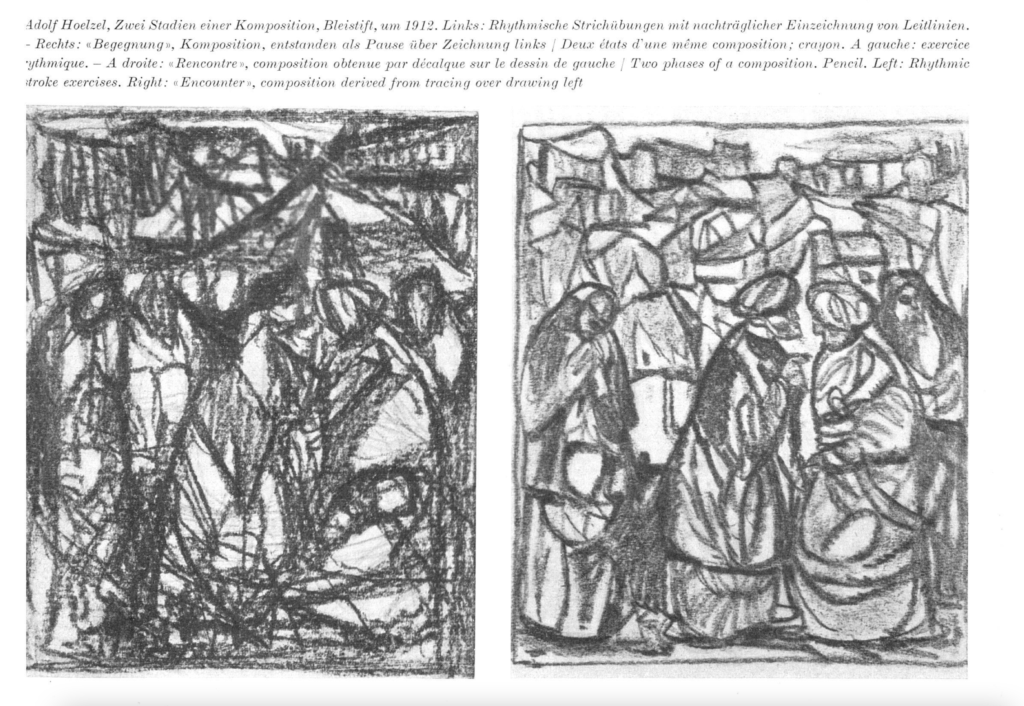
Itten schwankte in der Konzeption seines Unterrichts stark im Wechsel zwischen Rationalität und Spiritualität. Unter den vielen Einflüssen, die ihn zu seinen konkreten Ansätzen führten, zählen unter anderem die Kontrastübungen mit den Formelementen Quadrat, Kreis und Dreieck von Eugene Gilliard sowie die Vorträge und Übungen von Adolf Hölzel von der Stuttgarter Akademie zu Gemäldeanalysen und zur Kompositions-, Farb-, und Kontrastlehre. Ebenso von Hölzl inspiriert waren gymnastischen Übungen, mit denen er seinen Unterricht begann, deren Ziel es war, „dem Körper die Ausdrucksfähigkeit, die Erlebnisfähigkeit zu geben, sie in ihm zu erwecken. Zuerst muß er erleben.“ Das Ziel dieser Maßnahmen bestand darin, dass die Schüler sich lockern, entkrampfen und von den Zwängen der akademischen Lehre befreien und zudem Bewegung und Rhythmus als Urprinzip und als grundlegendes bildnerisches Organisationsprinzip physisch unmittelbar erfahren sollten. Dazu gehörte auch das „automatische Zeichnen“, also das Zeichnen in einem einzigen Linienzug, welches schon Hölz beim Aktzeichnen initiiert hatte.

Die Kompositionsstudien nach Hölzl beeinflussten Ittens Methoden nachhaltig

Regeln und Gesetze. Sie sind an und für sich gar nichts und nur dazu da, dem Schwachen eine Hilfe zu sein. Jedes Wort, jede Lehre ist ganz unnütz für die, die um das Eine wissen. Sie sind nur Tore, durch die der Suchende eintreten kann in des Reich des lebendigen, ewig unformbaren Geistes. Sie sind nur Nahrung für den Suchenden, solange er ihrer bedarf, aber nicht das zu Suchende.

Johannes Itten

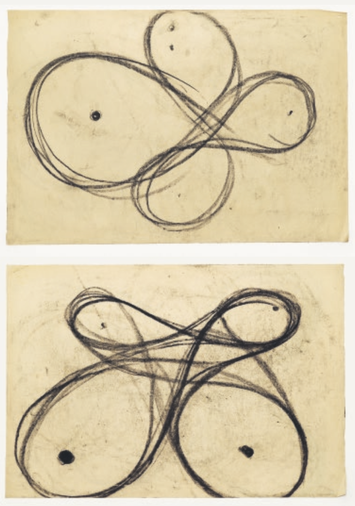
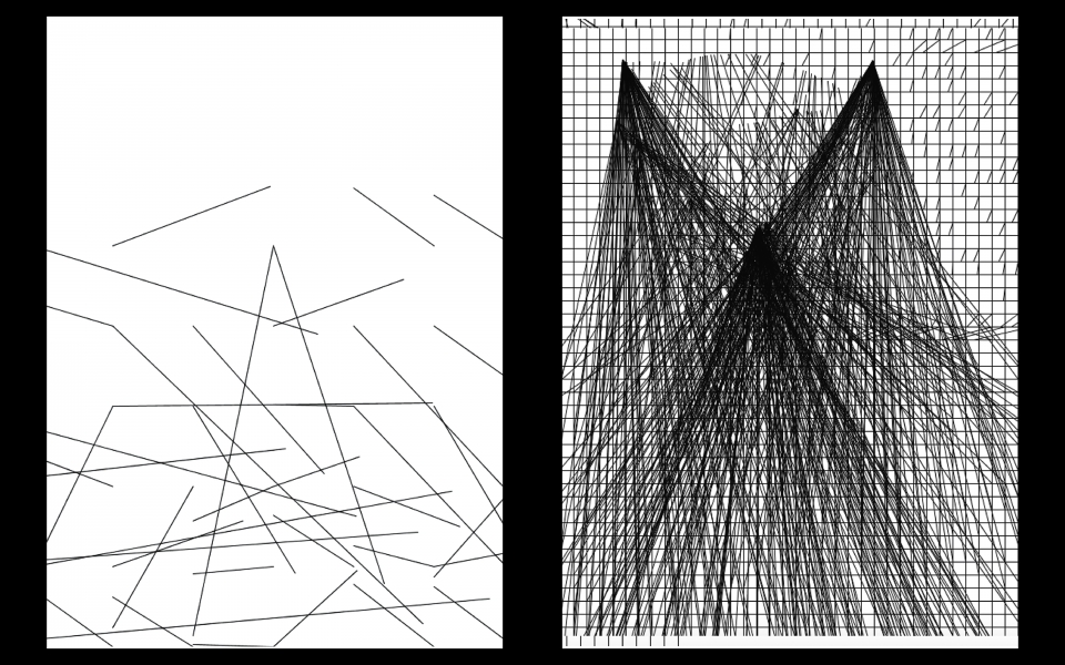
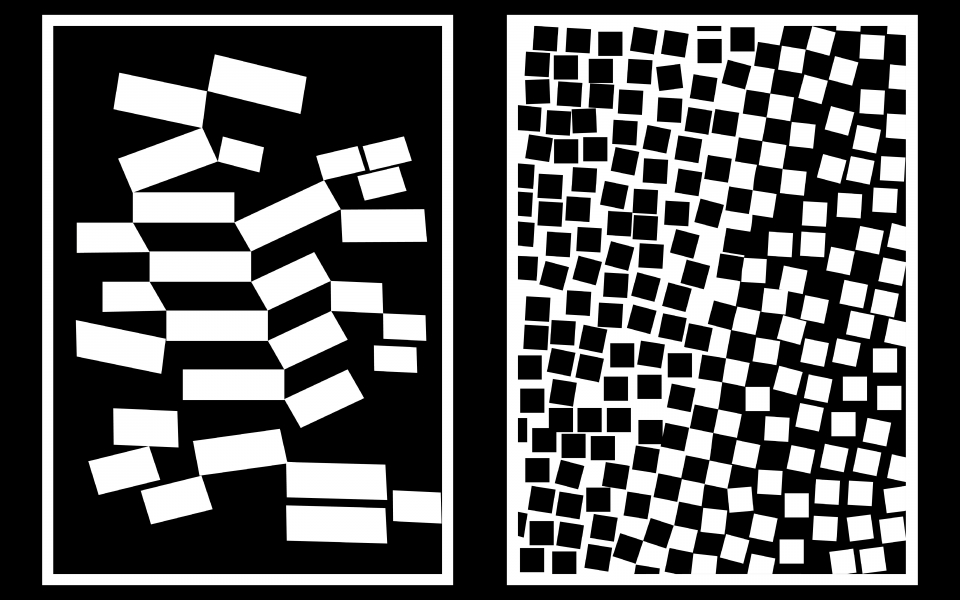
Ittens Unterricht begann in der Regel mit eben jenen gymnastischen Übungen zur Lockerung, gefolgt von Atemübungen zur „Harmonisierung des Körpers“. Darauf folgen rhythmische Formübungen; auch beidhändig; welche in Anleitung von Itten nachgezeichnet wurden – wiederum ging es um die körperliche Entspannung und das Finden des eigenen Rhythmus. Dem ganzheitlichen Konzept folgend Körper, Geist und Seele gleichzeitig zu schulen gab es eine Reihe von unterschiedlichen Improvisations- und Konstruktionsübungen bis hin zu dreidimensionalen Kompositionsversuchen. Die Wahrnehmung und Gestaltung von Kontrasten stand im Zentrum, bis in feinste Nuancen sollten Kontraste wie groß-klein, breit-schmal, dick-dünn, spitz-stumpf, horizontal-vertikal, durchsichtig-undurchsichtig uvm. erforscht werden. Speziell der Hell-Dunkel-Kontrast war Itten wichtig. Dieser wurde in Übungen, die aus „freiem Empfinden und Fantasieren heraus gelöst werden sollen“ gelehrt.

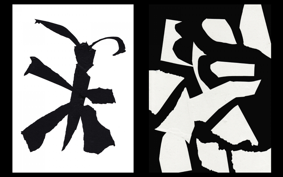
Studien zu Themen wie Tanz, Trauer, Fröhlichkeit, Kampf, Geburt, Tod, Frühling, Pest und anderen Themen werden mit Zeichenkohle gemacht. Um das Gefühl für Kontrast und Proportion zu Schulen wurden Übungen zu den geometrischen Grundformen und den damit nach Itten zuordenbaren Begriffen gemacht. Itten verband Quadrat mit Ruhe, Tod, Schwarz, Dunkel; das Dreieck mit Heftigkeit, Leben, Weiß, hell, gelb; sowie den Kreis mit Null oder unendlich, gleichmäßig, Bewegung, harmonisch, blau. Mit solchen Einordnungen entsprach er auch den damals aktuellen künstlerischen Ansätzen von Kandinsky, welche später selber am Bauhaus lehrte. Material und Texturstudien waren ebenfalls ein zentrales pädagogisches Werkzeug, mit verbundenen Augen mussten unterschiedliche Materialien erkannt werden um das Tastgefühl zu stärken. In weiterer Folge wurden Texturmontagen aus kontrastierenden Materialien angefertigt, die vor allem in dieser Frühphase des Bauhaus noch teilweise sehr expressionistisch wirken. Der Zeichenunterricht wurde mehreren Abstufungen gehalten: fotografisch genaue Naturstudie (zur Schulung von Auge, Hand und Gedächtnis) Zeichnungen aus dem Gedächtnis, Porträts in absoluter Finsternis. Die Naturstudien zielten darauf ab, Gesehenes oder Erinnertes exakt wiederzugeben, die Aktzeichnungen jedoch sollten jedoch wiederum im Zeichen von Rhythmus, Empfinden und Gefühl stehen.

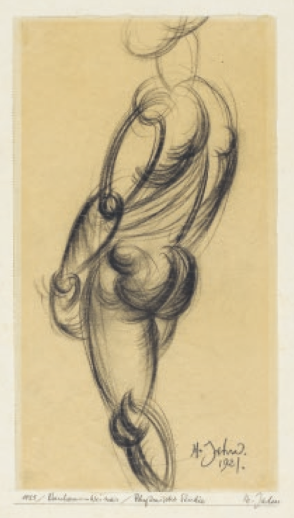
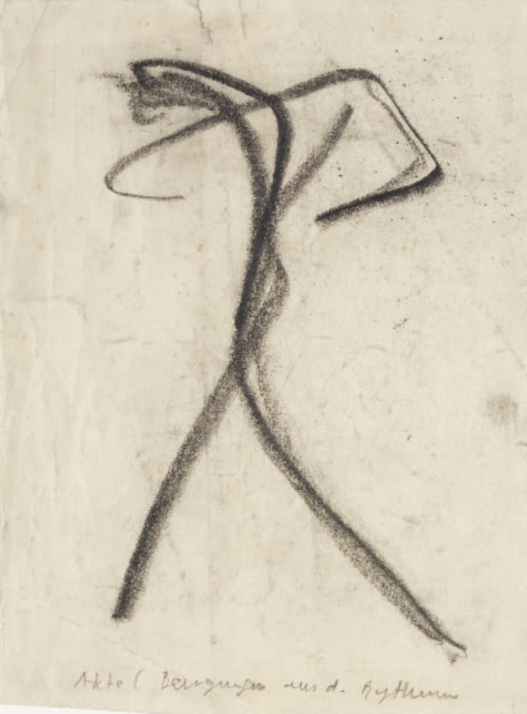
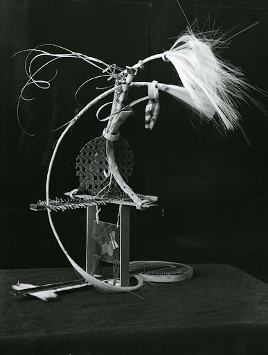
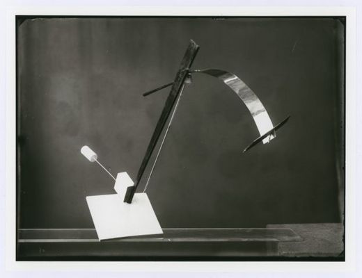
Reduzierte Körperformen, Auffinden der „inneren Bewegung“ und Ausdrucksform, Silhouetten und Schemenzeichnungen. Dreidimensionale Studien mit Würfeln als Raumkompostionen standen ebenso im Wechselspiel zwischen rationaler Formfindung und expressionistischem Selbstausdruck.

„Nachdem er [Itten] einige Gänge gemacht hat, steuert er auf eine Staffelei zu, auf der ein Reißbrett mit einer Lage Schmierpapier steht. Er ergreift eine Kohle, sein Körper sammelt sich, als ob er sich mit Energien ladete, und geht dann plötzlich zweimal nacheinander los. Man sieht die Form zweier energischer Striche, senkrecht und parallel auf dem obersten Schmierbogen, die Schüler werden aufgefordert, das nachzumachen. […] Dann kommandiert er’s im Takt, dann läßt er dasselbe Exercitium stehend ausüben. Es scheint eine Art Körpermassage damit gemeint zu sein, um die Maschine auf das gefühlsmäßige Funktionieren hin zu schulen.“ – Paul Klee über Ittens Vorkursübungen

Berühmt sind auch Ittens Bildanalysen. Einerseits betrieb er Form- und Strukturanalysen, bei denen Bilder der alten Meister nach ihren grundlegenden Gestaltungsprinzipien untersucht wurden. Formaspekte wie kompositorischer Aufbau, proportionale Verhältnisse und Verteilung von Hell und Dunkel wurden in skizzenhaften Bildern analysiert. Im Gegensatz dazu standen die Empfindungsanalysen, bei denen es darum ging, den Formausdruck, die emotionale Botschaft eines Gemäldes zu erfassen. Dabei wurden auch oft nur einzelne Teilaspekte eines Bildes (Rhythmus, Farbe, Stofflichkeit) zum Gegenstand der Analyse gemacht.

Und heute…?

Um in dieser Recherche nicht völlig in geschichtlicher Aufarbeitung zu versinken und stärkeren Gegenwartsbezug herzustellen, möchte ich anhand eines Beispiels zeigen, wie die Grundidee das Vorkurses an einer modernen Hochschule weiterlebt.

UdK Berlin: Visuelle Kommunikation

Der Studiengang Visuelle Kommunikation der Universität der Künste in Berlin bietet in sogenannten Klassen die Vertiefungsrichtungen Informationsdesign, Grafik-/Kommunikationsdesign, Illustration, New Media, Geschichte und Theorie der visuellen Kultur, Interface- und Interactiondesign, Raumbezogenes Entwerfen und Ausstellungsgestaltung, Design für Wirtschaft und Werbung sowie Gestaltung des bewegten Bildes. Allen diesen Vertiefungen (welche als moderne Nachfahren der Bauhaus-Lehrwerkstätten Ton, Glas, Farbe, Holz, Metall, Gewebe und Stein gesehen werden könnten) voraus gehen zwei Semester mit dem Namen „Grundlagen des Entwerfens“ – ein Vorkurs also, mit dem Namen Basics. Auf der Website ist zu lesen:

„Die Basics sind der Einstieg in das vierjährige BA-Studium Visuelle Kommunikation. Im 1. und 2. Semester setzen sich die Studierenden hier mit elementaren Fragen und Möglichkeiten der Gestaltung auseinander. Im Zentrum steht, die unterschiedlichen Medien kennenzulernen und deren gestalterische Sprachen mit digitalen und analogen Werkzeugen zu erproben. […] In den Semesterprojekten durchlaufen die Studierenden exemplarisch alle Phasen des Entwurfsprozesses – von Recherche und Konzept über Variantenbildung bis hin zur Produktion. […] Ziel ist, die Studierenden zu befähigen, mit den Werkzeugen und Entwurfsmethoden eigenständig umzugehen. Sie lernen, die eigene Arbeit zu reflektieren, diskutieren und präsentieren; sie erfahren, was es bedeutet, Autorschaft für gestaltete Inhalte zu übernehmen. Das Grundstudium will Raum für die Entwicklung einer eigenen gestalterischen Haltung bieten und damit die Teilhabe an aktuellen fachlichen Diskursen ermöglichen.“

Gerade der letzte Satz zeugt von den Nachwehen von Ittens Selbstentfaltungs-Ansatz seines Vorkurses. Weiters liest man:

„Die Betrachtungsfelder Bild, bewegtes Bild, Raum und Interaktion werden als Projekte bearbeitet. In einem Projekt werden alle Phasen des Entwurfs wie Recherche, Konzept, Skizze, Variantenbildung und Realisierung durchlaufen. Pro Semester werden in der Regel zwei Schwerpunkte gesetzt, die sich über einen Zeitraum von mindestens vier Wochen erstrecken. Die Lehre findet – abhängig von Fragestellung und Entwurfsphase – in verschiedenen Formaten statt: Präsentationen, Diskussionen, Gruppen- und Einzelgespräche, Vorträge, Referate und Workshops.“ Im Laufe ihres Wintersemesters setzen sich die Basics-20 beispielsweise jede Woche mit drei grundlegenden Gestaltungsdisziplinen auseinander: Zeichnen, Fotografie und Typografie. Alle Grundlagen-Labore vereint dabei das gemeinsame Semesterthema Licht und Schatten. Wechselnde Schwerpunkte und Inhalte heben sich hier somit vom statischen Bauhaus-Grundkurs ab.

Ein Beispiel für die Inhalte dieses Kurses sind Übungen zu den Gestaltgesetzen. „Im ersten Schritt gilt es, anhand eines morphologischen Kastens die Parameter visueller Gestaltung zu bestimmen. Die hierbei erlernten Grundkenntnisse wenden die Basics in den nächsten Aufgaben an. Sie setzen sich mit verschiedenen Gestaltgesetzen auseinander und integrieren diese bewusst in ihre Arbeit. Hierbei stehen neben der Anwendung der sogenannten Gestaltgesetze die visuellen Mittel Form und Farbe im Mittelpunkt der Entwurfsarbeit.“

Ein Semesterprojekt „Kinetische Objekte“ erinnert speziell an Ittens dreidimensionale Objektmontagen, hier werden … „möglichst viele dreidimensionale Varianten eines einfachen Alltagsgegenstandes; einer Büroklammer; analysiert. Der dabei generierte Erfahrungsschatz bereitet – ergänzt durch visuelle und textliche Recherchen im Kontext von Physik, Mechanik, Kunst, Gestaltung und Alltag – die Ausarbeitung eigenständiger Entwicklungen kinetischer Objekte vor. Dieses Vorgehen dient dem Erkennen unterschiedlicher Funktionsweisen und ästhetischer Qualitäten. Das Skizzieren von kinetischen Objekten ermöglicht dabei das (abstrakte) Begreifen und Erfahren von Bewegungen und Lagerelationen im Raum. Elementare Auseinandersetzungen mit Materialien wie Papier, Pappe und Draht erweitern das in der Beobachtung erschlossene Fundament für die Produktion von kinetischen Objekten. Die Resultate zeugen von der tiefgreifenden Auseinandersetzung mit den Phänomenen Bewegung und Raum.“ Auch die Zeilsetzung dieses Kurses liegt somit in Ittens Tradition: spielerisches Erforschen der Verhältnisse von Körper und Raum.

In der weiteren Recherche ergaben sich viele Parallelen zur Bauhaus Tradition, neben konkreten Aspekten wie Experimenten mit Farbe und Material vor allem der Kerngedanke zum Fokus auf gestalterische Grundlagen sowie dem experimetellen Zugang mit dem Ziel der persönlichen Entwicklung.

Das Vermächtnis des Bauhauses und speziell des Vorkurses ist also – wenn auch in wesentlich weniger esoterischen Ausformungen – ein Erfolgsmodell, welches heute noch (paradoxerweise speziell im Kommunikationsdesign, welches in dieser Form kein konkretes Ziel der frühen Bauhausausbildung war) seine Anwendung findet.

Blog Post 3 – Max Mathews

1951: CSIRAC

Der Name dieses Computers lautete ausgeschrieben: „Council of Scientific and Industrial Research Automatic Computer“ und war Australiens erster digitaler Computer. Er hatte einen Lautsprecher, der ursprünglich die Aufgabe hatte, die Forscher mit Ergebnissen der Rechenaufträgen zu informieren. Allerdings begann ein Mitarbeiter eines Tages für diesen Lautsprecher Melodien zu programmieren, die dann durch den Lautsprecher ausgegeben wurden. Leider gibt es keine Originalaufnahmen mehr, Zeitzeigen berichten jedoch von einem Klang der einem abtauenden Kühlschrank ähnelte. Die Universität von MAnchaster baute kurz darauf einen ähnlich funktionierenden Computer, der Melodien ausgeben konnte.

Max Mathews

Max Mathews war es, der 1957 das Programm „Music 1“ schrieb. Es konnte Digitale Klänge auf einem Computer erzuegen. Die digitale Bild- und Tonübertragung war zwar bereits erfunden, jedoch wurde sie ausschließlich in der Telegraphie und Kommunikation verwendet.

Angestellt bei den Bell Labratories setzte er sich in den Kopf, mit dem IBM 704 Computer Musik zu machen.

„…man musste ein Nerd sein, denn zum einen brauchte der Computer 20 Minuten Rechenzeit, um überhaupt einen Klang von einer Sekunde zu errechnen. Zum anderen musste man dann mit dem vom IBM 704 ausgegebenen Magnetband eineinhalb Stunden durch New York City zu einem anderen Gebäude fahren, das einen Digital-Analog-Wandler besaß und wo man das Ganze dann überhaupt erst anhören konnte. Und zuletzt gab es auch noch keine höheren Programmiersprachen – alle Programme wurden in Maschinensprache geschrieben und liefen nur auf diesem einen Computer.“

IBM 704

Trotzdem schaffte es Mathews, das Programm „Music 1“ zu schreiben.

„Es war monophon, kannte nur die Sägezahnschwingung und alles, was man kontrollieren konnte, waren Lautstärke, Frequenz und Tonhöhe. Heraus kam damit als erste Komposition digitaler Musik überhaupt das 20 Sekunden lange Stück “In the Silver Scale”, das mit alternativen Stimmungen experimentierte.“

Auf „Music 1“ folgte „Music 2“, das bereits 4-Stimmig war. Es hatte ähnlich wie die Grundlage nahezu aller Synthesizer Kleine Makros, die verschiedene Funktionen beinhalteten (ähnlich wie Module analoger Modularsynthesizer), konnten beliebig miteinander verbunden werden. 1961 wurde dann auch an der Sprachsynthese gearbeitet und das von einem Computer “gesungene” Stück “Daisy Bell” wurde durch den Film “2001 – Odyssee im Weltraum” bekannt.

Mathews entwickelte noch weitere Versionen des Programms, doch einen „Nachteil“ hatten sie alle: sie konnten nicht live gespielt werden. Persönloichkeiten wie zum Bispiel Robert Moog änderten das nach und nach. Aber dazu mehr im nächsten Blog Post!

Data visualization in health systems.

Knowledge is power. Nowadays all kinds of sensors are continuously gathering data about our behavior, our physical activity levels, and different health indicators like blood pressure, blood oxygen levels, and more. All of this can be monitored through phones, smartwatches and other IoT devices conceived specially for medical applications

What happens with all this data? Raw data is useless if we don’t know what we are looking for.

A good strategy for data visualization is the key to the proper use of data.

When trying to create a better user experience for both health professionals and patients, we need to distinguish which information is needed for each side and how it should be presented:

Medical Staff:  An overloaded system can be helped by synthesizing and simplifying the amount of data that the doctors need to analyze.

A good presentation of numbers and facts can help the doctors identify low-risk patients faster, so they can prioritize and leave more time for those who really need it.

Patient: Being a patient is already a stressful situation. Medical terms that patients are not familiar with and uncertainty don’t help make the situation more comfortable. Feeling lost and uneducated is not the feeling of reassurance that a medical visit should give.

Presenting facts and figures in a clear and didactic way will make the patient feel included in the process and learn about the condition, gaining implications for the treatment.

_ Literature

http://ehealthmasterminds.com/visualize-your-data/

https://www.eecs.harvard.edu/~kgajos/papers/2020/fischer20visualization.pdf

https://www.therapeuticshub.com/data-in-healthcare/

[Data Safety #2] User’s rights

As I commented in my first post the GDPR was approved by the European Commission in 2018 to protect the privacy and rights of individuals with regard to personal data. These rights apply to any person whose personal data (PD) is processed by a controller or processor.

  • Personal data (PD) is any form of data that can be used to identify a person. It obviously refers to your name, identification number, location data and online identifiers, but also to physical and demographic factors such as physical, psychological, genetic, mental, cultural data or even a person’s social identity and opinion.

This touches directly on aspects such as online marketing, but also on some specific areas such as health or scientific research. They would need to disconnect that data from other personal identifiers, creating identification codes to disaggregate the information. But all of this concerns developers or back-end programmers more than designers, so I’m going to make a brief list of the rights that I do think we should know impetuously:

  • Right to be informed: the subject must know that their data is being used and why, among other things, a good example is this one from EasyJet:
EasyJet Screen about their privacy policy
  • Right of access: the subject is guaranteed to know what data has been collected about him and how it has been processed.
  • Right to rectification: allows the subject to make changes on their data to correct them.
  • Right to Oblivion: guarantees subjects the possibility of deleting their data if they do not want to be processed anymore and also that the controller stops storing them.
  • Right to restriction of the process: right of the subject to limit the processing of his data.
  • Right to obligation of notification: user must be notified of modifications, rectifications, restrictions or deletions of procedures
  • Right to data portability: allows the subject to request the personal data that has provided to a controller and to transmit that data to another controller of them choice.
  • Right to object: the subject can say that does not want them data to be processed or to be further processed.
  • Right to subjective data: includes not being subject to a decision based solely on an automatic process, this directly attacks the so-called profiling.

Let’s take an easy example, if in the fitness app you use to count your steps, the company decides to sell your GPS location data, it will need to inform users before and that they give you consent both to collect and store this data and for the other uses that will be given to them.

Returning to our protagonist, cookies are not only regulated under the GDPR, but also by the EU regulation of ePrivacy, which has come to be known as the cookie law. This law is interesting because aims to simplify the rules regarding cookies and streamline cookie consent in a more ‘user-friendly‘ way. In practice it, among others means that EU websites and websites with EU visitors, will not need to show those cookie consent pop-ups anymore.

Hurray, that is indeed more user-friendly and less of a hassle for website owners. For that to happen, we need to understand common pain points that users have and establish interface patterns that designers and developed could easily use. In any case, although the forms are flexible, we must remember the obligation that the site options offer users to accept or reject the use of cookies or other identifiers.

This might also work against the business goals of the company that is heavily dependent on advertising and maximizing customer fees. However, there is a fine line between techniques used to keep users on the site and exploiting their privacy.

And it will be a complicated task, because, although all the information must be provided in a clear and sensitive way, it must also be done in a comprehensive manner. The organization’s policy page should clearly show:

  • Information about the organisation that will process your personal data
  • The reason why the organisation will use your personal data
  • How long your personal data will be kept
  • Details of any other company or organisation that will receive your personal data
  • Information about your data protection rights (access, rectification, deletion, complaint and withdrawal of consent).

Most laws lag behind technological advances, so both are constantly changing. Therefore, as designers we need to take these rights into account when designing screens and interactions. All this applies not only to web design, but also to the design of mobile applications and devices with the so-called Internet of Things (IoT).

Special mention to those who work with minor subjects, since the law speaks of this group of age specifically and have different rights!

I am sorry that the post is so theoretical, but it was necessary this base to build on it, the following entries will be more based on user interviews and practical examples.

See you around!

Literature and references:

#3 AR – a problem solver in the fashion industry?

The aim of this blog entry is to demonstrate the main problem online apparel retailers are facing.

Do we have a problem?

Indeed. It’s Holiday season. This means it’s the most popular time of the year for online shopping. When shopping online, a quarter of holiday shoppers intend to return items at a later date, when purchasing them. As a result, ecommerce brands register the most returns throughout December, January and February. But high e-commerce return rates happen throughout the year and across all industries. With a return rate of 12.2%, apparel retailers struggle with the second highest return rate out of all industries and lie above the average return rate of 10.6%.

When having a closer look at return rates by category, it is visible that womenswear has the highest return rate of 23%. Followed by Footwear with 20%. Although the figures presented here relate to the combined product categories of multichannel, they reflect the trend in digital sales.

But why does the fashion industry have so many returns?

It is a fact that returns are the new normal of e-commerce and central to customer experience. Many customers buy with the explicit intention to immediately return some or all of their items. It is known that around 70% of fashion returns are related to size and fit, a challenge that doesn’t occur when ordering a TV or a coffee table for instance. The issue of size and fit contributes to the problem, because when customers are not sure what size they need they order multiple sizes of one item, with the certainty to send back the rejects. 

Consumer preference-based returns like size, fit and style drive the majority of returns in fashion items. Non-preference-based reasons like detective products or account for 10% of fashion returns. In the following, the return reasons with the percentage are stated.

  1. Size too small: 30%
  2. Size too large: 22%
  3. Changed my mind: 12%
  4. Style: 8%
  5. Not as described: 5%
  6. Defective: 5%
  7. Other or not specified: 18%

And why is returning clothes a problem?

The high return rates are actually not only an economic problem for retailer, but also an environmental issue when facing the fact, that free shipping and returns come with a high unsustainable cost. It’s estimated that return shipping in the US alone creates 15 tons of carbon emissions per year. That’s the same amount produced by five million people. Moreover, in some cases returned items get destroyed by the retailer due to cost and time aspects (see picture below).

So, when preventing the likelihood of returns, retailers reduce the brand’s carbon footprint. The less returns, the less resources are wasted.

How can online fashion retailers reduce their return rates?

For starters, brands need to check that all public-facing content—including product descriptions—are accurate and detailed. If the product arrives differently than expected, there’s a high chance of it being returned.
In order to provide more details on items’ fit and size, AR technology comes into use.

Using AR on e-commerce websites

Buying clothes in-store, naturally has some advantages over shopping online. The ability to see in person, try on, and interact with products before purchase, makes returns less likely. Now, to bring those advantages to online shopping, AR technology should help customers to experience an in-store shopping experience when shopping via a device. Retailers can use AR to show what their products look like tried on, in a customer’s home, or next to an item they own for size comparison.
AR prevents the reason behind the majority of returns: the fact the item looks different in person than it did online. 

As a further step, my upcoming blog entry will focus on the market of AR in general and Virtual Fitting Rooms in detail.

References

https://fashionunited.de/nachrichten/mode/augmented-fashion-experience-wie-augmented-reality-kunden-fasziniert-und-zum-mode-accessoire-werden-koennte/2020051935697

https://www.shopify.com/enterprise/ecommerce-returns

https://www.reboundreturns.com/blog-articles/returns-conundrum-blog

https://f.hubspotusercontent10.net/hubfs/2182667/The%20Returning%20Conundrum.pdf?utm_campaign=IMRG%20Report%20-%20July%202021&utm_medium=email&_hsmi=140696218&_hsenc=p2ANqtz-8K4OK-9cu2w0SgS3F7Hxhq9BfXJAwV9iAP11ROVu-_9SJt3PfMrvfHiKB03e0g880hjiNyvU0JH2BwNbpUqlJFCq-f5w&utm_content=140696218&utm_source=hs_automation

https://3dlook.me/blog/how-to-impelement-ar-in-fashion/

_How Accessible Were 2021’s Games?

_Many game studios made pushes into the field of accessibility and the appeal of accessibility in games is growing ever more.

_For example, back then NAUGHTY DOG made UNCHARTED 4 and supplied it with options for motor impairments, and in 2020 they released THE LAST OF US: PT.2 and with their enormous advancements in inclusion they won the award for best innovation in accessibility. There is considerable work done in the various fields of the elimination of different barriers are getting explored one after the other. Back in 2018 we mostly talked about text customization, now we’re at full-blown shader alteration by AAA-titles.

_Mark Brown does a big analysis of each year game releases and examines them in all regards of accessibility and highlights their several achievements.


_Literature & Resources

  1. https://youtu.be/-IhQl1CBj9U How Accessible Were 2021’s Games? Mark Brown, GMTK
  2. https://youtu.be/RWQcuBigOj0 How Accessible Were 2020’s Biggest Games? Mark Brown, GMTK
  3. https://youtu.be/vi98rAn4uXE How Accessible Were 2019’s Biggest Games? Mark Brown, GMTK

#3 — Universal Design

As the glossary in my last blog entry shows very well, there are already existing concepts which cover topics that I planned to bring in the context of UX and its establishment during my research. So, in upcoming blog entries, I’ll take a closer look at the following terms: Universal Design, Inclusive Design, Accessibility, Green UX, UX Metrics and everything I’ll come across within this research that turns out to be central for my research topic.

This Blog entry will cover universal design, its 7 principles and its (socio-) ecological impact.

“The power of the Web is in its universality. Access by everyone regardless of disability is an essential aspect.“

— Tim Berners-Lee

Universal Design has its origins in architecture and it is seen variously as a design approach, a process, a paradigm, or as a design attitude leading to a design strategy. This strategy overall aims to create environments that can be used by everyone to the greatest extent possible. Universal design is based on the idea that a design which meets the needs of excluded groups, such as the elderly, children or persons with disabilities, will also improve the product experience of a broad range of social groups. 

While universal design is often mentioned along with related concepts like accessibility and inclusive design, it can be distinguished by its goal of creating a single design solution that can serve as large a diversity of users as possible.

Universal design is not only a theoretical concept, there is a guidance within 7 principles, how a designer can achieve universality in design. 

7 Principles of Universal Design

The 7 Principles of Universal Design were developed in 1997 by a working group of architects, product designers, engineers, and environmental designers led by the late Ronald Mace at North Carolina State University. According to the Center for Universal Design at NCSU, the principles “can be applied to evaluate existing designs, guide the design process, and educate both designers and consumers about the characteristics of more usable products and environments.”

Principle 1: Equitable Use

The design is useful and marketable to people with diverse abilities.

Principle 2: Flexibility in Use

The design accommodates a wide range of individual preferences and abilities.

Principle 3: Simple and Intuitive Use

Use of the design is easy to understand, regardless of the user’s experience, knowledge, language skills, or current concentration level.

Principle 4: Perceptible Information

The design communicates necessary information effectively to the user, regardless of ambient conditions or the user’s sensory abilities.

Principle 5: Tolerance for Error

The design minimizes hazards and the adverse consequences of accidental or unintended actions.

Principle 6: Low Physical Effort

The design can be used efficiently, comfortably and with a minimum of fatigue.

Principle 7: Size and Space for Approach and Use

Appropriate size and space is provided for approach, reach, manipulation, and use regardless of user’s body size, posture, or mobility.

“Experiences that hit all levels put users in a state of flow, or total immersion into their task. This is called deep pleasure.”

— Mimi Yu

Moreover, the research gave me some examples where universal design implies added value for ecology and socio-ecology. In the article „Designing for the future? Integrating energy efficiency and universal design in Belgian passive houses“ by Ermal Kapedani it was said that energy efficiency (EE) and universal design (UD) are two important fields addressing parts of the environmental and social pillars of sustainability.

Another article examined whether universal design combined with a socioecological approach improves measured accessibility compared to existing fitness facilities. It was shown that universal design coupled with a social ecological approach improves accessibility in fitness facilities and results in a reasonable payback time. It led to higher scores than comparison facilities and excess revenue exceeded the extra cost of accessibility enhancements. Therefore, Universal Design combined with a socio-ecological approach leads to successful results.

Japan 

Japan is well known for a very well implemented universal design approach and acts as a model country in regards to providing accessibility. Japan has built efficiency into the experience, removing friction and guiding you through a range of services from renting an apartment to taking out the rubbish. Train stations are one of the best examples of universal design and equitable use, allowing a wide range of people to access the station.

Sources:
https://www.sciencedirect.com/science/article/pii/S2214629618307084
https://www.sciencedirect.com/science/article/pii/S1936657420301382
https://uxdesign.cc/what-japan-can-teach-us-about-ux-and-universal-design-cc05535fc8ac
https://universaldesign.ie/what-is-universal-design/the-7-principles/the-7-principles.html
https://careerfoundry.com/en/blog/ux-design/universal-design-principles/
https://www.tpgi.com/ux-series-universal-design-and-digital-accessibility/
https://us.misumi-ec.com/blog/one-for-all-universal-design/

Nature ontologies

Ontology is a anthropological/philosophical discipline that refers to the subject of existence. It’s about how we perceive the world, we classify it, we act in it.

Philippe Descola is a French anthropologist that has dedicated his research to nature ontologies across cultures. His idea is that the concept of “nature” doesn’t exists and is just a social production centered on human point of view. The belief of the existence of nature is to say that some entities exists thanks to something that is not human willingness. Very typical of occidental cosmologies, naturalism makes us thinks that nothing happens without a cause. That way, naturalism is so implemented in our ways of thinking that it determines our points of view and our view on others and world.

But naturalism is not the only way to perceive nature. In the book Par-delà nature et culture1 (Beyond nature and culture), Descola identifies four different ontologies: totemism, animism, analogism, and naturalism. He classifies them considering the continuity of two parameters :

  • interiority : do objects have intentions, a purpose, like me ?
  • physicality : do those objects share the same physical properties as me ?

Totemism believes in a similarity of the physicality and of the interiority. It gathered humans and non-humans into categories depending on certain physical or psychological attributes. For example the Australian aboriginal people all have a totem. You are not called by your name, but by the totem like Mr Kangaroo, Mrs Ignam and so on. A totem can also represent a clan, a generation. It means you share some attributes with this totem and then you are connected by physicality and interiority.

Animism see a discontinuity of the physicality but a continuity of the interiority. In other words, what can make a difference between humans and non-humans is just the skin. Going beyond the physical differences, animals and plants have the same soul and purposes as humans. You can interact with the same as you do with other people. For example, some aboriginal people of the Amazonian Forest discuss every morning the dreams they had in the night. In those dreams, plants and animals are taking a human appearance and speak human language to deliver messages.

Analogism says that physicality is different, either interiority. Here, the world is divided in a myriad of different individualities, all physically different (not the same kind of life) and in their interiority too (not the same purposes). It is the way of thinking of Aztec and Incas people, or of the Chinese civilization. The world is composed of an infinity of hierarchic relationships between every living beings. It is often related to the polytheists religions that give different attributes to gods.

Naturalism is the way all occidental have been raised. Here, we put a bareer between us humans and whatever else we consider as nature. Despite that we have the same physicality, we don’t have the same interiority. We share the same physiological properties, but we have completely different purposes in life. Because this way of thinking is so widespread in our culture, it’s nearly impossible for us to understand other ways of thinking and to have the feeling that we are part of the nature. Besides, the word “nature” can only be found in occidental languages, you don’t have it the Japanese or Chinese civilizations.

Naturalism led to the separation of nature and culture and is the direct source of all our actions concerning nature. For centuries we’ve been told that it was different from us. Is it even possible nowadays to think out of the naturalist prism ?

Sources :

  1. Descola Philippe, Par-delà nature et culture, 2005

_The Game Awards 2021

_On December 10th THE GAME AWARDS for the year 2021 took place in LA, where great games get acknowledged and, stating the obvious, awards. Also is this an event for game developtent companies to present their new projects to the whole world.

_Since 2020 there is an award in place for “Best Innovation in Accessibility”, which recognizes debvelopers that are pushing the medium forward by adding features, technologies and content to help games to be played by an even greater audience. Last year, this award was given to NAUGHTY DOG STUDIOS for their immense dedication to publish the most accessible game n a long time: THE LAST OF US PART II. This year, THE GAME AWARDS made the extra effort to make their show more accessible, including an audio-descriptive stream, an ASL (American Sign Language) stream and closed captions. Even on site one could see ASL interpreters standing in front of the stage, bringing ASL to the audience. The award itself was presented by Morgan Baker (Accessibility specialist and designer; also judge in this category) and Jacksepticeye (webvideo producer).

Games are for everyone.


They stated that it’s about honoring people, who work as hard as possible to share their work with as many people as possible by discovering new and creative methods to encourage inclusion. This year’s nominees were:

  • Far Cry 6 (UBISOFT)
  • Forza Horizon 5 (PLAYGROUND GAMES)
  • MARVEL’s Guardians of the Galaxy (SQUARE ENIX)
  • Ratchet & Clank: Rift Apart (SONY)
  • The Vale: Shadow of the Crown (FALLING SQUIRREL)


_Quick Summaries on what each nominee accomplished with accessibility options in their games:

Far Cry 6. This shooter is a quite unexpected newcomer in accessibility, with a wide variety of color customizations for different aspects of the game, like enemy laser pointers, to see where they are going to fire. Also closed captions, a colorblind mode, and texts to speech options.


Forza Horizon 5. The option to enable a in game sign language interpreter was added to this new racing game, besides of many other accessibility customizations.


MARVEL’s Guardians of the Galaxy. Various settings to alter gameplay and certain aspects of it, like changing received damage, ammunition costs, timers, and cooldowns.


Ratchet & Clank: Rift Apart. Options to customize the visual appearance of the game, like depth of field, screen shake, colors, high contrast outlines and more.


The Vale: Shadow of the Crown. A very interesting nominee; a game solely and entirely told through audio and almost no graphics with a focus on narrative and storytelling – perfectly designed to be accessible for blind and low-vision players.


_The winner for best Innovation in Accessibility this year was Forza Horizon 5 (also Best Audio Design & Best Sports/Racing Game) made by PLAYGROUND GAMES. They stated, that their team were so committed to accessibility, so they made it to one of their core pillars of game design in this project. According to them, there is a billion players with some sort of disability which makes gaming a challenge for them – they are happy to be creators who can add options and features which open the ‘magic’ of video games to more and more players.


When everyone plays, we all win.


_Immediately after watching this award category and its winner I pondered, what are the exact benefits of ASL as opposed to subtitles? Apparently, ASL – provided by a skilled interpreter – makes it easier for sign language users to keep track of the conversation, who is currently speaking; by taking on the certain aspects of the speaking character. This is achieved through the fact that ASL works completely differently as language, with a different grammar, syntax, and stylistic nuances. Also, subtitles rarely indicate music, sound effects or the atmosphere of the situation. In conclusion, ASL in conjunction with subtitles can greatly enhance the experience of games for people with hearing disabilities.

_Literature & Resources

  1. https://youtu.be/OS4m2O3V93o?t=10643
  2. https://thegameawards.com/news/innovation-in-accessibility-award-added-to-the-game-awards
  3. https://www.ubisoft.com/en-us/help/far-cry-6/gameplay/article/accessibility-features-in-far-cry-6/000099043
  4. https://www.digitaltrends.com/gaming/the-vale-shadow-of-the-crown-interview/
  5. https://www.theguardian.com/film/filmblog/2008/nov/28/deaf-subtitles-sign-language-film

#2 — Glossary

Hello again. The first blog entry was meant to be like a kick-off entry/overview for the process of research within this project. It consists of information, assumptions, opinions and perceptions. To answer the questions I asked myself i have to close some knowledge gaps before. It will be important during my research to recheck these assumptions and to find a best solution approach within my topic. 

Before I follow up on the content and questions from the first entry, I would like to clarify and define terminologies I will work with. Therefore this blog entry is used as a small glossary for UX related terms I came across within my research already and which I will update continuously in course of my further research. Additionally the glossary should help me in my research to follow a clear direction and to avoid misconceptions.

There we go:

A

++ A/B Testing

A/B testing is the comparison of two designs against each other to determine which performs better.

++ Accessibility

The practice of designing experiences for people who experience disabilities. Those with difficulty with any of the five senses of sight, hearing, smell, touch or taste may be benefitted by using products and services that have been designed with accessibility in mind.

++ Agile UX

Agile UX adds UX design and research methods to the agile methodology. The most important driver for Agile UX is the close cooperation between developers, UX designers and UX researchers during the entire process of product development. Ideally, every sprint entails a design and/or research goal. By planning, testing, optimizing and re-testing elements throughout the project, the UX team is able to roll out a final product that has already been validated by their target users.

B

C

++ Corporate Identity (CI)

The corporate identity concept can be seen as a strategic concept for positioning the identity of a company and defining a clear uniform self-image, both within the company and in the corporate environment. By developing a clear “we-awareness”, the corporate identity concept is intended to establish a corporate culture internally as a network of lived behavioral patterns and norms. Decisions are made on the basis of a uniform corporate image or identity and corporate mission statement. This enables a significantly higher compatibility and synergy of corporate activities and releases considerable motivation potential through identification with the company and its policies.

++ Cognitive Biases

Cognitive biases are errors in reasoning, memory or other cognitive processes that result from holding onto existing beliefs regardless of contrary information. There are more than 100 documented cognitive biases, commonly categorized in four categories: biases that arise from too much information, not enough meaning, the need to act quickly, and the limits of memory. Cognitive biases are particularly important to be aware of while conducting research, as a way of arriving at truer findings instead of relying on personal preferences. Example: Designer Bob loves minimalist design, and exhibits confirmation bias when he decides to approach his new UI project with an ultra-minimalist approach.

++ Customer Experience (CX)

CX refers to all the different interactions a user has with a brand through its different channels and products, and how a user feels about them. It has a profound impact on brand trust.

++ Customer Journey Map

User journey maps depict an entire process that a hypothetical user can go through. From the information process, to the booking process, to the purchasing process. This mapping goes far beyond a single product or service. It also considers everything that lies outside of individual touchpoints (such as a website).

Customer journey maps visualize how users would achieve their goals and complete tasks. Ideally, research should show the pain points and customer needs within this map. Journey maps are often presented as timelines to demonstrate interaction points covering the beginning, middle and end of an experience.

D

++ Design Thinking

Design thinking is a non-linear, iterative process that teams use to understand users, challenge assumptions, redefine problems and create innovative solutions to prototype and test. Involving five phases—Empathize, Define, Ideate, Prototype and Test—it is most useful to tackle problems that are ill-defined or unknown.

++ Discursive Design

Discursive Design is about exploring how design can be used for good-, prompting self-reflection, igniting the imagination, and affecting positive social change.  Discursive design (derived from “discourse”) targets the intellect, prompting self-reflection and igniting the imagination and expands the boundaries of how we can use design; how objects are, in effect, good(s) for thinking.

E

F

G

H

I

++ Inclusive Design

The British Standards Institute (2005) defines inclusive design as: ‘The design of mainstream products and/or services that are accessible to, and usable by, as many people as reasonably possible … without the need for special adaptation or specialized design. Inclusive design does not suggest that it is always possible (or appropriate) to design one product to address the needs of the entire population. Instead, inclusive design guides an appropriate design response to diversity in the population through: Developing a family of products and derivatives to provide the best possible coverage of the population. Ensuring that each individual product has clear and distinct target users. Reducing the level of ability required to use each product, in order to improve the user experience for a broad range of customers, in a variety of situations.

J

K

++ (UX) KPIs

In business administration, the term “key performance indicators” is generally used to refer to the success, performance or capacity utilization of a company, its individual organizational units or a machine. UX KPIs are key performance indicators that can be used to manage and coordinate UX in companies. They are intended to help integrate UX into the company and increase the UX maturity level.

L

M

++ Mental Model

A user’s mental model is a conceptualization or internal explanation each user has built about how a particular system works. As Norman says (1990), it is a natural human response to an unfamiliar situation to begin building an explanatory model a piece at a time. We look for cause-and-effect relationships and form theories to explain what we observe and why, which then helps guide our behavior and actions in task performance.

According to Norman, each user’s mental model refers to a product of many different inputs. Two core variables are “knowledge in the head” and “knowledge in the world”. Knowledge in the head comes from mental models of other systems, user expertise, and past experience. Knowledge in the world comes from other users, the work context, common cultural conventions, documentation, and the conceptual design of the system itself. 

N

O

P

++ Persona

A persona is a fictional representations of a user group you’re designing for. Personas help stakeholders understand who you have in mind when you make design decisions, and act as a reminder to teams that “You are not your user.” Contrary to popular belief, personas are not to be taken as one actual person, but rather as a mix representing a group of users with similar behaviors and mental models. Personas are often created early in the design process so the designer knows who it is designed for.

Q

R

++ Return On Investment

A measure for evaluating business performance. In traditional finance, ROI is the most common “profitability ratio” most often calculated by dividing net profit by total assets. The general idea of ROI helps product teams evaluate whether certain efforts are worth pursuing.

S

T

U

++ User-Centered Design

An approach for designing a product or service (user interface design), in which the end user is in the center of the process.

++ Universal Design

Universal Design is the design and composition of an environment so that it can be accessed, understood and used to the greatest extent possible by all people regardless of their age, size, ability or disability. An environment (or any building, product, or service in that environment) should be designed to meet the needs of all people who wish to use it. This is not a special requirement, for the benefit of only a minority of the population. It is a fundamental condition of good design. If an environment is accessible, usable, convenient and a pleasure to use, everyone benefits. By considering diverse needs and abilities of all throughout the design process, universal design creates products, services and environments that meet peoples’ needs. There are 7 principles universal design follows.

++ Usability

Usability is a measure of how well a specific user in a specific context can use a product/design to achieve a defined goal effectively, efficiently and satisfactorily. Designers usually measure a design’s usability throughout the development process—from wireframes to the final deliverable—to ensure maximum usability.

++ Usability Testing

Usability testing is the act of evaluating products or services by testing them with users. During usability tests, researchers observe participants who attempt to complete tasks. The goal is to identify usability problems, collect qualitative and quantitative data and determine participants’ reactions to an experience.

++ User Interface (UI)

UI is the medium through which users interact with an experience, product or device. Your mobile screen, the automated checkout kiosks at grocery stories, the keyboard on your laptop and the way Alexa responds to your voice are all examples of user interfaces.

++ User Journey

The path(s) that users take to complete tasks or achieve their goals. From the perspective of analytics software like Google Analytics, journey maps visualize “a person’s experience during one session of using a website or application, consisting of the series of actions performed to achieve a particular goal.”

++ UX Analytics

UX Analytics are important for knowing how User Experiences are going. There are different tools to obtain analytics metrics. While companies used to run focus groups, client interviews and in-lab studies, today the right testing software enables organizations to conduct user research online to scale and quantify results continuously.

++ UX Design (UXD)

UXD is the practice of affecting the user experience through a user-centered design process, with a focus on usability and making user interfaces easy to understand. User experience design is a broad field containing many subfields like information architecture, research, UI design and more. Contrary to popular belief, user experiences designers cannot design all the possibilities of an end-user’s experience (too subjective and vast), but these professionals can apply a design process to help users complete the most important actions.

++ User Experience

User Experience (UX) is everything that happens to a user while interacting with a product, service or general experience. This includes the person’s emotions, attitudes, reactions and behavior during the experience. As a design field, UXBeginner defines user experience at three levels: Level 1 (broadest): the general experience anyone can have with a product or service. Level 2 (as philosophy): Placing the user – and their experience – as the priority and origin of truth for product design. Level 3 (as a way of doing things): UX leverages design thinking, processes, tools and techniques (wireframes, sitemaps) in order to create and affect the user’s experience.

V

W

X

Y

Z

Sources:
https://www.interaction-design.org/literature/topics
https://www.sciencedirect.com/topics/computer-science/user-mental-model
https://careerfoundry.com/en/blog/ux-design/ux-design-glossary/
https://uxmastery.com/resources/glossary/
https://www.uxbeginner.com/glossary/
https://djangostars.com/blog/ui-ux-terms-everyone-should-know/
https://medium.com/@workatplay/the-persona-is-past-its-prime-meet-the-mental-model-a41ac415906d
Interface Design : Usability, User Experience und Accessibility im Web gestalten
http://www.inclusivedesigntoolkit.com/whatis/whatis.html
https://wirtschaftslexikon.gabler.de/definition/key-performance-indicator-kpi-52670