Critical Evaluation of a master’s thesis

Künstliche Intelligenz – ethisch “banal”? Über Herstellbarkeit und ethische Implikationen (schwacher) Künstlicher Intelligenz.

(eng.: Artificial intelligence – ethical “banal”? producibility and ethical implications of (weak) artificial intelligence)

By Clemens Lauermann BSc.

University: Karl-Franzens-Universität Graz

Level of Design

The Design of the Thesis seems to be as one would expect from a traditional master’s thesis. There is not much play around the traditional norm, although, at least in the version I read, all the footnotes were highlighted, which gave the first dull look a fun twist. The font is very sharp/thin with high contrast that I really enjoy reading. It adds everything with a layer of professionalism and correlates well with the topic of psychology. Throughout the text, you can find a lot of cursive highlighted words, which are subtle, but very nice in my opinion. Here and there are some pictures, which add nicely to the otherwise very text-heavy work.

Degree of Innovation

The thesis is definitely the topic of the time – even though it was written in 2018, it has become an even bigger discussion in 2022 guided by all the advancements made in AI Technology. Many Views are drawn from different subjects thus the thesis is a very interesting accumulation of different sciences of different times. Old principles are put into a new context.

Independence

It seems that the piece is written by a professional – tons of literature was used while also combining different views from different topics. Therefore, I would judge the thesis as rather independent and informative.

Outline and structure

Besides an introduction and the resume at the end, the author divided the piece into 3 topics which provided a great reading. The Views of Ai from the past until now – the difficulties with perception – ethical agents

Overall the work is strongly based on dissecting more difficult papers on psychology and philosophy which is sometimes hard to understand, as some principles are often very shortly mentioned. Still, on the surface, everything is understandable. Additionally, the work is well structured.

Degree of communication

I love that the subject is handled with a good amount of more difficult and also easy to understand principles. I could imagine, that someone who doesn’t like philosophy could have a more difficult time. Still, everything seems very professional and in a good length.

Scope of the work

Overall, the thesis provides 104 pages, with little to no pictures and a couple of links to videos in the end. Hence, there is tons of information inside the piece. Some chapters could even give more insight, but the author mentioned, that it would explode the number of pages. It fully covers if not more what someone would expect of a master’s thesis.

Orthography and accuracy

The Thesis is very well written. Sometimes it is more difficult to follow, as the author often refers to many different authors, which, if you are not fully focused, could make it impossible to understand, what is said, the first time. Other than other, I could not find any spelling nor other mistakes.

Literature

The Bibliography ranges from books from 1979 to online articles from 2018. What makes this thesis such a nice read is the diversity of topics, that were already discussed a long time ago while the new technology puts that into new perspectives. Additionally, there are a couple of video links from 1973 to 2018.

Lauermann, C.: Künstliche Intelligenz – ethisch “banal”? . über Herstellbarkeit und ethische Implikationen (schwacher) Künstlicher Intelligenz. Graz, 2018.
Kritische Bewertung einer Masterarbeit

Intro

Im Rahmen der Lehrveranstaltung “Proseminar Master’s Thesis” sollte eine Masterarbeit, welche a) zum eigenen Thema passt und b) an einer anderen Universität verfasst wurde, analysiert und bewertet werden. Da sich meine eigene Masterarbeit thematisch im Bereich User Interface & User Experience Design von Apps im Gesundheitssektor (konkret: Gestational Diabetes Mellitus [“Schwangerschaftsdiabetes”]) bewegen wird, habe ich meine Suche daran ausgerichtet. Nachdem meine Suche im OBV keine zufriedenstellenden Ergebnisse bot, wurde ich schließlich bei Google fündig.

Bewertete Masterarbeit:

Idsø, Nanfrid: Mobile Application to Improve Self-Management in Type 1 Diabetes. Ungedr. Diss. University of Bergen. Bergen 2021

Aufgerufen am 30.11.2022 unter: https://bora.uib.no/bora-xmlui/bitstream/handle/11250/2762435/Master_Thesis_15_06_2021.pdf?sequence=1&isAllowed=y

Gestaltungshöhe

Die Gestaltungshöhe ist meiner Meinung nach in Ordnung, aber etwas lieblos – Hat man keine hohen Ansprüche an Layout und Design, ist die einfache und sehr standardmäßige Gestaltung der Arbeit durchaus zufriedenstellend.

Für Überschriften und Fließtext wurde eine gut leserliche Serifenschrift verwendet, der Zeilenabstand ist jedoch relativ gering, wodurch die Leserlichkeit wiederum beeinträchtigt wird. Die Schriftgrößen sind in meinen Augen gut gewählt und auch das Seitenlayout wirkt dank relativ viel Weißraum nicht überladen. Auf andere Farben als Schwarz und Weiß wurde verzichtet.

Alles in allem also absolut solide. Als Studierende aus dem Kreativ- und Designbereich würde ich jedoch meinen: Da ist noch Luft nach oben.

Innovationsgrad

Den Innovationsgrad der Arbeit kann man sowohl aus thematischer, als auch aus umsetzungstechnischer Sicht bewerten.

Thematisch kann ich lediglich eine Laien-Schätzung abgeben: Da Smartphones und digitale Anwendungen immer stärker im Gesundheitsbereich Anwendung finden, bin ich der Meinung, dass die Arbeit grundsätzlich am Zahn der Zeit ist. Für eine konkrete Einschätzung habe ich (noch) zu wenig Hintergrundwissen zum wissenschaftlichen Stand von mobilen Anwendungen zur Unterstützung von Diabetes-Selbstmanagement. Jedoch gibt es bereits zig Anwendungen für Diabetes Typ 1 Patient*innen auf dem Markt, weshalb der thematische Innovationsgrad auf mich mäßig wirkt (6/10).

Aus Sicht der Umsetzung liegt meine Bewertung ebenfalls im mittelmäßigen Bereich. Der*Die Autor*in griff zu gängigen Methoden und Tools wie beispielsweise dem User-Centered-Design Prozess, Personas oder einem Cognitive Walkthrough. Dies ist nicht negativ gemeint, da gängige Methoden wie diese sich nicht umsonst bewährt haben und ich selbst plane, auf ähnliche Tools zurück zu greifen.

Selbstständigkeit

Der*Die Verfasser*in arbeitet in einem umfangreichen Theorieteil sowohl medizinische als auch projektrelevante Grundlagen auf. Daraus schließe ich, dass er*sie sich intensiv mit der Thematik auseinandergesetzt hat und eine gute Basis für eine selbstständige und fundierte Umsetzung des Praxisprojektes geschaffen hat. Dieses Praxisprojekt – ein Prototyp einer App – wurde in Zusammenarbeit mit einer Studienkollegin entwickelt und evaluiert, welche jedoch nicht (Co-)Autorin der Masterarbeit war, wie ich herausfand. In der Danksagung wird erwähnt, dass ebendiese Kollegin eine große Motivatorin und helfende Hand desder eigentlichen Verfassers*Verfasserin war. Daher gehe ich grundsätzlich von einer hohen Selbstständigkeit aus, frage mich aber, ob die Arbeitsleistung ohne fremde Hilfe hätte erbracht werden können.

Gliederung und Struktur

Die Gliederung der Arbeit finde ich sehr gut und logisch gelöst. Es sind alle “Standard-Kapitel” (z.B. Abstract, Abbildungsverzeichnis, Tabellenverzeichnis, Quellenverzeichnis, etc.) vorhanden und auch sonst wurde ein klarer Faden durchgezogen. Nach der Einführung kommen Theorie, Literaturanalyse und Methodik, gefolgt von der praktischen Umsetzung des Projektes und der abschließenden Diskussion. Alle Kapitel sind nummeriert und es gibt drei Hierarchie-Ebenen – nicht zu viel und nicht zu wenig, wie ich finde.

Kommunikationsgrad

Die Arbeit wurde an einer norwegischen Universität verfasst, in englischer Sprache. Der Text liest sich flüssig und ist mit einem B2 (oder höher) Sprachniveau sehr gut verständlich. Informelle Ausdrücke wie “I” oder “my” kommen äußerst selten vor. Viel eher wird das Passiv verwendet, was dem formellen, wissenschaftlichen Stil einer Masterarbeit viel mehr entspricht.

Umfang der Arbeit

Insgesamt umfasst die Arbeit 109 Seiten, davon bilden 76 Seiten den Kern. Die einzelnen Kapitel sind – die Seitenanzahl betreffend – untereinander einigermaßen ausgewogen. Damit liegt der Umfang meiner Meinung nach im Normalbereich und ist bei einem Standard-Layout mit geschätzten 12pt. Schriftgröße gut getroffen.

Orthographie sowie Sorgfalt und Genauigkeit

An manchen Stellen wird im Text deutlich, dass es sich bei dem*der Verfasser*in vermutlich nicht um eine*n Native Speaker handelt, jedoch konnten beim Überfliegen der Thesis keine groben Fehler in Rechtschreibung oder Grammatik festgestellt werden.

Im Bezug auf Genauigkeit und Sorgfalt ließ sich eine durchdachte und sorgfältige Arbeitsweise feststellen. Da und dort gibt es kleine Abstriche, wenn beispielsweise eine Konkurrenzanalyse lediglich aus sechs Bulletpoints und wenigen Stichworten besteht. Dies macht es für den*die Leser*in schwer, die Schlussfolgerungen des*der Autors*Autorin nachvollziehen zu können. Zudem werden manche Begrifflichkeiten, Methoden oder Modelle nur kurz erklärt, wobei es oftmals etwas mehr Tiefgang benötigt hätte. Trotzdem erhält man als Leser*in relevante Inhalte in angemessener Dosis. Dies mag eventuell an der englischen Sprache liegen, da es dabei oft weniger Worte bedarf als im Deutschen.

Literatur

Der*Die Verfasser*in gab 41 Quellen in seiner*ihrer Arbeit an. Das kommt mir für eine Arbeit im Umfang von 76 Seiten etwas gering vor. Wenn man jedoch bedenkt, dass ein großer Teil davon dem selbst entwickelten Projekt gewidmet ist, ist es wiederum nachvollziehbar. Auffällig ist, dass viele Internetquellen verwendet wurden, was als zweifelhaft bewertet werden kann. Bezüglich der Zitierweise lassen das Quellenverzeichnis und die Angaben im Text auf IEEE schließen.

Evaluierung einer Masterarbeit

Quelle: Felsberger, Andreas(2015): Lebensmittelverschwendung entlang der Food Supply Chain. Eine qualitative Untersuchung von Strategien zur Food Waste Reduktion im österreichischen Handelssektor, https://netlibrary.aau.at/obvuklhs/download/pdf/2415784?originalFilename=true (Zugriff am 30.11.22)

Ich habe mich für die Masterarbeit mit dem Titel „Lebensmittelverschwendung entlang der Food Supply Chain –Eine qualitative Untersuchung von Strategien zur Food Waste Reduktion im österreichischen Handelssektor“ von der Alpen Adria Universität Klagenfurt ausgesucht.

Gestaltungshöhe

Die Gestaltungshöhe in dieser Arbeit ist sehr gering. Die Arbeit ist meiner Meinung nach wie eine normale wissenschaftliche Arbeit aufgebaut. Das Layout ist nicht in irgendeiner Art kreativ gestaltet. Die Arbeit selbst ist aber gut aufgebaut und die Kapitel sind gut strukturiert.

Innovationsgrad

Ich persönlich finde die Arbeit vom Innovationsgrad her sehr aktuell da Lebensmittel Verschwendung auch heutzutage noch brandaktuell ist und die Strategien, die in der Arbeit erwähnt werden, auch heute noch gut umgesetzt.

Selbstständigkeit

Der Autor hat meiner Meinung nach sehr selbstständig die Arbeit verfasst sie ist sehr umfangreich und genau. Auch die empirische Untersuchung wirkte mit großer Sorgfalt geschrieben. 

Gliederung und Struktur

Bei der Gliederung und Struktur ist mir aufgefallen, dass kein Abstrakt in der Arbeit vorhanden ist. Der restliche Teil der Arbeit ist gut strukturiert  es gibt ein Inhaltsverzeichnis, Einleitung, eine empirische Untersuchung und den Schluss. Am Ende der Arbeit wird noch das Literaturverzeichnis und der Anhang  angegeben. Die Nummerierung der Kapitel ist logisch und gut gestaltet. Was mir sehr gut gefallen hat ist dass der Autor unter dem Punkt „Ziel und Gang der Arbeit“ eine Grafik eingefügt die den genauen Aufbau und Strukturierung der Arbeit beschreibt.

Kommunikationsgrad

Es ist klar zu erkennen, um was es in der Arbeit geht. Schade finde ich nach wie vor, dass die Arbeit keinen Abstrakt hat, wo nochmal alles kurz und knackig zusammengefasst wird. Die Grafiken, die verwendet werden, unterstützen aber sehr gut das Geschriebene.

Umfang der Arbeit

Die Arbeit hat um die 124 Seiten was meines Erachtens sehr umfangreich ist. Es gibt einen sehr langen Theorie Teil wo alle wichtigen Begriffe erklärt werden und auch die Empirische Untersuchung ist sehr ausführlich beschrieben.

Orthographie sowie Sorgfalt und Genauigkeit

Auf den ersten Blick habe ich als groben Fehler nur entdeckt, dass der Abstrakt in der Arbeit fehlt. Auf den ersten Blick wurden alle Zitierregeln eingehalten und auch die Abbildungen wurden korrekt angegeben. Auch die Sprache der Arbeit  ist gut und verständlich formuliert. 

Literatur

Im Literaturverzeichnis sind über 10 Seiten unterschiedlicher Quellen angegeben 7 Seiten davon sind nur Bücher und 3 Seiten Internetquellen. Ich konnte dort keine Auffälligkeiten finden. Auch die Quellenverweise sind als Fußnote am Ende einer Seite was ich persönlich gut finde da es den Lesefluss nicht zerstört.

Critical Evaluation of a master’s thesis

I analyzed master’s thesis by Yao Guo with the title „The Mapping Between Interactive Art and Classical Rhetoric: An Analogy Approach“. He has studied on university of art Linz in the institute „Interface Cultures“. In the thesis, the author first gives an overview about the history of rhetoric and the main characteristics of it and further tries to find similarities in interactive art.

Level of design

The thesis’ design looks like the classical design of most theses. The author used simple justified text, which sometimes is separated with images. But since the design is really simple, it is also easy to follow and you can really focus on the content. But just from the look of it, you would not think that this is a thesis of a art/design student.

Degree of innovation

In my opinion, the topic is very innovative. The author states in the beginning of the master’s thesis that the topic has not been addressed before and as I also stated in the beginning, I have not heard of something similar as well. Also through research on this topic I have not found a comparable work.

Independence

Focussing on the feeling I had when reading the text, I thought that he wrote the thesis independently. Especially in the chapter, where he tries to find similarities between the elements of rhetoric and interactive art, you get the feeling that he really understood what he was doing in order to be able to find those similarities. He also analyzes his artistic work that he did in the past and tries to find out which characteristics of rhetoric where more prominent than the others. As a last step, he also creates a diagram to analyze other art pieces. But, unfortunately I cannot be sure if everything written in the statements are correct, because there are a lot of sections, where no citations are used at all. Also, there where a few passages that were formatted like literal quotes but missed a citation, so I was not sure if that was something he thought or if it was a quote from another person.

Outline and structure

In my opinion, the structure made sense. He started with giving an introduction to rhetoric and outlined its main characteristics. Then, he states analogies between interactive art and rhetoric and uses artworks from other artists as examples. After that he analyzes a few of his own projects and evaluates how present those rhetoric elements in his work are. After that he visualizes a diagram on how to rate the presence of rhetoric elements in media art pieces. Each of the chapters was building on the previous one so overall the structure was great.

Degree of communication

As I will also mention later, the thesis unfortunately has a lot of spelling mistakes, which made it a bit hard for me to always understand what he wrote about. Occasionally image and tables where used to create a better understanding of the topic, which I appreciated.

Scope of the work

The scope of work is okay for a master’s thesis. With 56 pages, the thesis is not very long but it gives a good overview of the topic, although I think there is also a lot of potential to dive even deeper into the topic.

Orthography and accuracy

Unfortunately, I found a lot of spelling mistakes. Some of them where words that did not fit in the sentence, other ones where words that should not been there at all. There where also some minor mistakes, like the left out space and some singular/plural mistakes. Sometimes it was necessary for me to read a sentence or paragraph twice in order to understand what it was really about. In the chapter where he analyzes his own work, he mostly writes in first person (he writes about the artist) but then switches to the first person to explain his intentions while working on the project, which was a bit confusing for me. In general, unfortunately the thesis was not easy to read for me.

Literature

He mainly used books as literature which are a mixture out of older and newer ones. The bibliography contains also a view web resources, unfortunately there is no link to the websites included. As I mentioned before, in the thesis there where passages which missed a quotations, so some statements are not traceable. He also used Wikipedia as a resource for at least two times but did not include it in the bibliography.

Resource

Guo, Yao: The Mapping Between Interactive Art and Classical Rhetoric. An Analogy Approach (2016). In: https://phaidra.kunstuni-linz.at/detail/o:1433#?q=Yao%20Duo&page=1&pagesize=10 (zuletzt aufgerufen am 30. 11. 2022)

Evaluation of a master’s thesis submitted to a foreign University

For the third task of the Proseminar Master’s Thesis course, I have chosen to evaluate Yasmeen Sultana’s master’s thesis entitled “Open-Source Audio Platform for Embedded Systems” submitted for the degree of Master of Science in Information Technology at the University of Applied Sciences Kiel in 2018.

The evaluation is based on the following criteria:

Level of design

The composition of the work is formal and thus fits very well with its technical character. The title and subtitle are very well formatted, making the text easy to follow. Figures and tables are placed and scaled correctly and therefore blend into the structure perfectly.

Degree of innovation

The work has a great degree of innovation as it delivers new audio software built upon open-source technologies. The development of this software is a considerable contribution to the open-source community and can be further used or built upon.

Independence

The work is an original and innovative idea based on independent research and interest. The technologies used are given, but the work expands their capabilities and thereby can be considered innovative.

Outline and structure

The work is clearly structured and therefore easy to follow and understand. The chapters are logically ordered and correspond perfectly to the table of content while a list of figures, a list of abbreviations, and a list of tables are also included.

Degree of communication

Although the language used in this work is scientific, it is easy to understand because the sentences are logically worded. The author remains factual throughout the text and never uses the 1st person. 

Scope of the work

The work encompasses both a practical and a theoretical part. First, the technical background is presented, introducing all the theoretical knowledge needed to carry out this project. This is followed by the technical implementation of the hardware setup, followed by the evaluation of the product, and a discussion about the results. 

Orthography and accuracy

I’m not a native English speaker, but based on my knowledge, I found the text very coherent and did not find any spelling mistakes or other orthographic errors.

Literature

The author mainly uses specialist literature from the fields of audio and digital signal processing. Wikipedia articles are also used as a source, which is a bit surprising but does not undermine the quality of the work.

References:

  1. Sultana, Yasmeen. “Open-Source Audio Platform for Embedded Systems,” 2018. https://www.creative-technologies.de/wp-content/uploads/2018/01/Open-Source-Audio-Platform-for-Embedded-Systems.pdf. 

Evaluation of Master Thesis

Technology as bridge between health professionals and patients.

Author: Julia Neunteufel
University: Paris Lodron Universität Slazburg

_______________________________________________________________________________________

Level of design

The design is a bit basic and poor. It looks like a very technological and scientific thesis but the author didn’t take the opportunity to play with design options. Once said that the overall structure of the content is very clear and clean, which makes the thesis perfectly readable and manageable.

Degree of innovation

The thesis seems to dig very deep into innovative procedures related to a human-centered approach to treating the topic of eHealth and mHealth. She mentions also design thinking processes that aren’t usually connected to the eHealth topics when approached by the scientific community. I think she really tries to link the coldest side of medical and technological topics and human psychology. Therefore I think this work might not be innovative when choosing the processes to go through but it is innovative in the way she connects human behaviour and emotions to a very well-known scientific topic.

Independence

The author uses many resources which help her by providing valuable information but she is the only one involved in the development of the master thesis. – Of course, supervised by her tutor. I think she makes a very good design process on her own, using different tools to reach her final goal.

Outline and structure

As I already mentioned in the design section, the master’s thesis is an extensive work structured in different parts in a clean and clear way. It is very easy to find specific parts or chapters thanks to its good organization in the index and she structures it in a very organic way according to the design process, helping the reader from the beginning to create a complete idea of what a research paper like this one entails.

Degree of communication

The author offers clear and fluent communication throughout the entire work. In some parts where the use of more technical words is required, she manages to make the content equally understandable and accessible to the reader, without avoiding the use of appropriate terminology.

In other sections, she uses a much more concise and shorter style, in a more schematic format, but which also helps to understand other types of material and always in an organic way. I think he knows how to adapt his writing style very well to the context he is developing at the time, and he manages to make this subject, which at times may not be very attractive, seem accessible and interesting to many types of audiences.

Scope of the work

The work focuses on how technology can serve as a link between patients and medical professionals. Under this title, she focuses on topics related to human behavior, technological tools commonly used in medical practices (focusing especially on cardiology), eHealth, and mHealth, as cutting-edge examples of technology designed already taking into account the human-centered approach.

Orthography and accuracy

She writes the work in English. As far as I’ve read, I haven’t found any major spelling mistakes. It is obvious that English it’s not her mother tongue because the vocabulary she uses tends to be simpler than other papers or works from authors whose mother tongue is English. It’s still very well written and there is also usage of specific terminology, giving the text a scientific accuracy about the topics she is dealing with.

Literature

She uses many references both from books and scientific papers on the various topics she deals with, as well as from web pages where statistics from previous medical and psychological studies over the years can be found, medical and psychology journals, and articles related to human-centered design and the development of the user experience in the medical field.

EVALUATION OF MASTER’S THESIS

Task 3 – Proseminar Master´s Thesis

Title                   Investigating Dark Pattern Blindness

Author               Matthias Sluijpers

University         Utrecht University (UU)

LEVEL OF DESIGN

The author of this master’s thesis kept the design rather minimalistic and probably used a standardized preset given by university. Simple headings, a single-column grid, and even margins define the layout. The only visible personalized design element is a very simple and low-impact graphic on the front page. However, a clear structure is given to the reader, which is of course crucial for a scientific paper.

DEGREE OF INNOVATION

The term “deceptive design pattern” (formerly “dark pattern”) is very young for a scientific topic and was first mentioned only in 2010. Nevertheless, the topic is very present and often dealt with in the context of ethics in digital design. Furthermore, there are already various studies about dark pattern-blindness, so it is nothing completely new. As stated by the author himself the question on useful countermeasures for deceptive design patterns would have been a step further and more innovative.

INDEPENDENCE

The work contains both a comprehensive search of the literature and a very detailed empirical method of data collection, analysis and interpretation. This suggests a neat and independent work. It can be said that the work stands on its own and does not require any swerving, additional research or deep prior knowledge on the part of the reader.

OUTLINE AND STRUCTURE

According to the table of contents, the thesis is divided into seven chapters, which in turn are broken down into up to three further sub-levels. The theoretical research, the objectives of the thesis, the method and the results are clearly delineated from each other. The literary and empirical parts complement each other well and result in a coherent overall concept.

DEGREE OF COMMUNICATION

In general I would say that the text is easy to read and understand. The author does not use a lot of technical jargon and most unknown terms are explained within the thesis. Tables, screenshots of the web applications shown and various infographics support the textual presentation of the results of the experiment. The appendix also contains the transcript of the experiment for review.

SCOPE OF THE WORK

The entire work comprises 230 pages, which makes it seem very time-consuming and precisely elaborated. In addition, the planning, execution and evaluation of the experiment is carried out in above-average detail. Even if, according to the author, some results did not turn out as desired and as a result the hoped-for comparisons could not be drawn, the work standard for a master’s thesis is definitely met.

ORTHOGRAPHY AND ACCURACY

Since English is not my native language, I found it a bit harder than usual to evaluate the orthography and accuracy of the text. All in all I would say that it is pretty well written and I could not find any obvious mistakes. The only thing I noticed is that the author often repeats the same words and phrases in sentences or paragraphs.

LITERATURE

It can be seen from the bibliography that the sources used cover a lush period from 1970 to 2022, and thus older and very recent works are consulted. The quotations are largely from conferences and articles and only very occasionally from experts’ books. Additionally a lot of internet sources are cited, however those are mostly from known authors in the field and trustful sources. Within the citations, the download links (e.g. Researchgate) of the full texts have been inserted, which looks a bit unprofessional.

Sluijpers, Matthias: Investigating Dark Pattern Blindness. Unpublished. Master’s Thesis. Utrecht University. Utrecht 2022

MIDI switch idea

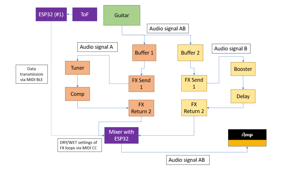
Another thought raised during the meeting was the extension of the project hypotheses. While I primarily focused on not interrupting the player’s natural hand movements, “non-invasive” could also refer to rig compatibility. The setups would therefore fulfill the working hypotheses even more if they could be used in conjuncture with a conventional guitar rig consisting of effect pedals and do not require an additional laptop or other “invasive” measures. Following this train of thought, I came up with a system that enables the guitarist to use his or her own amp and effect pedal chain in conjunction with at least the left hand setup.

As can be seen in the picture, the idea is to build a kind of MIDI-controlled signal splitter with a built-in mixer. After the splitter, the two audio signals are fed into two different FX loops. One loop would be the “dry” loop with effects that are usually ON; namely tuner, compressor, etc. The other FX loop would be the “wet” loop that contains effects that can be added to the dry signal such as reverb or delay. The ToF sensor and the ESP32 #1 send MIDI CC data to another ESP32 that is contained in the MIDI switch. According to the MIDI CC data received, this ESP32 then controls the DRY/WET ratio of the two FX loops.

Firstly, the described switch was simulated in Pure Data and, of course, worked as expected. However, as the switch involves processing audio signals with the ESP32 just acting as a MIDI CC receiver and controller, the main question was how to switch and split signals using hardware components only. With no prior experience of electrical components and their possibilities, substantial research was done regarding this field. Firstly, the basic functions of classic effect pedals had to be understood. The research yielded some results: it was concluded that in order to switch between to signal chains, a MOSFET or a relay had to be used. Both are electrical components that can act as a switch that can be controlled for example by the output voltage of a microcontroller pin. These suspicions were conveyed to my supervisor, who confirmed them.

Consequently, a relay was purchased at Neuhold. Being new to electrical components, including relays, the first challenge was to get the relay to act as a switch to turn on/off a LED controlled by an Arduino Leonardo. The Arduino Leonardo was chosen because its pins can output 5 Volts which are necessary for the relay to be activated. The pins of the ESP32 can only output 3.3 Volts which is not enough voltage to activate the relay. However, with the Arduino Leonardo, turning the LED on and off using the relay was successfully done. Subsequently, my supervisor provided me with a so-called Darlington transistor which can turn a 3.3 Volts input into a 5 Volts output. Thus, by using the Darlington transistor, the ESP32 with its 3.3 Volt output could now be used to activate the relay. Using two audio jacks, the relay could be successfully used to connect and disconnect a guitar signal played through the circuit.

Kritische Bewertung einer Masterarbeit

Aufgabe III Erstellung eines Blogeintrages

The master’s thesis I decided to write about bears the title “Timing-improved Guitar Loop Pedal based on Beat Tracking” and is written by Daniel Rudrich. It was submitted in 2017 at the Institute of Electronic Music and Acoustics (IEM) of the University of Music and Performing Arts Graz (KUG).

I chose the thesis because it documents the development of a tool for guitar which I am planning to do as well for my master’s thesis.

Level of design

Since I am a sound design student myself and no expert/professional (yet) I cannot make a general statement concerning the difficulty or ambition of the project. However, to me and my competences in this field, the project appears to be quite challenging and requires advanced in knowledge in sound and programming.

Degree of innovation

I am a guitarist myself and therefore can relate to the described problem concerning accurate looping. In my opinion, the “timing-improved guitar loop pedal” can be considered quite innovative since I do not know of an existing commercial product that already does the same thing.

Outline of structure

The thesis appears to be very well structured. In the beginning, a brief introduction to the topic at hand is given. Then the problem that the thesis wants to solve is described and, subsequently, the main objective of the thesis (developing an algorithm, which analyses the recorded phrase and supports the musician by aligning the start and stop cues such that the gap is reduced and not perceivable anymore) is stated. Afterwards the development of the mentioned algorithm is documented. Finally, the algorithm is tested through conducting listening tests followed by a conclusion.

Scope of the work

The thesis comprises 76 pages and is therefore quite extensive. To me, the theoretical and practical parts appear well balanced, taking up an equal amount of pages. The theoretical parts also act as a relevant basis for the practical research which was not the case with the master’s thesis I reviewed for the previous task.

Orthography and accuracy

Admittedly, the thesis was not read completely. However, the parts read for this analysis were free of any grammatical or formatting mistakes.

Literature

The bibliography contains 33 citations which is quite an amount for a project documentation. Furthermore, the citations appear to be solely journal articles or books which is also very positive.

Since I was not involved in the project, I cannot say anything regarding the criteria “independence” and “degree of communication”.

Conclusion

All in all, I think this master’s thesis represents a very positive example of “how to do it”. Featuring the development of a challenging practical workpiece and including some theory relevant to the topic, it fulfils the research objective it sets out to solve.

Meeting with Master’s thesis supervisor

This week I had a meeting with Katharina Groß-Vogt, one of our teachers at IEM concerning supervision of my Master’s thesis. Unfortunately, my current supervisor Marian Weger cannot serve as my supervisor, so I had to find someone else. As I know Kathi from our Sonification lectures and she is an expert in sonic interaction design, I thought that she will be very suitable. Luckily, she liked my project and agreed to supervise my Master’s thesis.

During our meeting, some interesting issues were raised that I had not thought of previously.

#1: The right hand setup currently works with an IMU sensor strapped to the back of the hand. A new idea would be to use another ToF sensor that is attached to the body of the guitar. If angled in the correct way, it could also measure the distance variations of the hand and, thus, achieve a similar effect as the IMU sensor. The advantage of this approach would be that the guitarist must not wear the sensor and can move his or her hand more freely. Additionally, the programming for the ToF sensor is a little bit more straightforward. This new sensor approach was tested. An attachment device was designed to fit the ToF sensor onto the guitar body. Then a code was made that measures the changes in distance if the strumming hand is moved. These changes in movement were then mapped to a Wah-Wah effect in Pure Data. The results are similar to what can be achieved with the IMU sensor. However, the hand must be in a specific position for the effect to work. Furthermore, the code must also be fine-tuned a little bit more. No final decision regarding the sensor of the right hand setup has yet been made, because, at the moment, the development efforts are focused on something else.

#2: In order to ensure usability of the system, it was suggested to involve expert guitarists in the development process sooner than previously planned. In so doing, a more user-centered design process could be achieved that already takes in the guitarists’ insights during the main development phase and not in the 4th semester when the products are already finished. This could prevent the unfortunate scenario in which the guitarists test the finished setups and suggest improvements, but there is no time left to implement the desired ameliorations before the master’s thesis submission deadline. Thus, the plan is to hold interviews with four to five expert guitarists that were shown the video demonstration and informed about the current state of the system. For these interviews, an interview guideline will be developed. The goals will be to:

  • Receive the current opinion of guitarists concerning the system
  • Find out more about their live setup and requirements concerning live gear
  • Gain new insights on how the products could be developed further and become more user-friendly

So far, a first draft of the questionnaire has been created. However, the questions must be reworked. Additionally, expert guitarists must be found. I know two to three guitarists that fit the category that may agree to be interviewed. The search for other guitarists will be conducted at the KUG’s jazz guitar institute.