_TASK III: Critical Evaluation of a Master’s Thesis


For my review of a Master’s Thesis, I chose the work of Mikel Elias Polzer with the title “Designing Casual Games for Subverting (Hetero-)Normative Attitudes”. I came across this work by researching with the Austria-wide online tool of the FH library.


_Level of design

There was almost no design aspect to it, other than the most basic formatting was done in terms of layout. Structure was done quite okay and there were the occasional pictures and visualisations in it, but they only served the purpose to explain certain points in the thesis. Although the choice of font and typography was done in a very safe way, where nothing can go wrong that easily – from a readability standpoint the forced full justification text is a quite difficult to enjoy whilst reading; so, there is room for improvement on this front. The use of bright red and blue on text looks in the end – mainly just off. It makes certain things look like the rough outline or something, which still needs to be discussed – for me it does not give the impression of being done when text is highlighted red.


_Degree of innovation

The thesis deals with interesting and important topics for our current century, mainly the perception of gender in games – there is only little work done on this field because it is a rather unexplored discipline. To now quantify it by just that parameter would be possible, but not justified. Therefore, I consider this thesis as an innovative piece of scientific work.


_Independence

It relies heavily on citations, but the experimental and scientific approach of this work would qualify it as a very good independent thesis.


_Outline and structure

Something which struck me a little odd was the fact that the author included a full curriculum vitae on the 4th page. It was straight after the cover and the acknowledgements before the table of contents. I guess it must be some requirement of the university where this thesis was published; yet I do not see the need of giving a detailed look at the person’s life before I read their thesis. Also, on another note, the CV was equipped with the full name, nationality, birthday, and even email address – form a data protection standpoint a problem. Otherwise, was the structure well laid out, you had enough introduction to the upcoming topics, and nothing felt out of place. The ending was merely a quote and had only little conclusion to offer, it ended all rather abruptly. At least the whole PDF was formatted as an interactive file, so you could easily use the in-file links to hop between chapters, sources, and citations.


_Degree of communication

The heavy use of parentheses makes reading and following – on top of very long constructed sentences which could use a break here and there – makes reading this thesis a little bit more challenging. It’s not your everyday easy evening read.


_Scope of the work

The work did not try to get everything under one hat, it clearly decided for one aspect and honed right into this. The author talked about the talking points they wanted and had to and then got straight into experiments which they called ‘semi- quantitative testing’ to get a grasp on the subjective perceptions of various participants.


_Orthography and accuracy

Sometimes poor wording and occasionally spelling mistakes in terms of misplacing commas into words. Besides that, I was not able to locate any graver mistakes. The only thing I would point out is the misuse of the basic hyphen “-“ instead of the classic “–“ en-dash – but that’s more of a style and typography issue which I take a bit personal, otherwise it’s alright.


_Literature

The literature consists of a huge and vast library of books from different fields, but all coming from a certified scientific aspect. There were also a lot of books which I also already came across in my research or I knew already.


_Source

Polzer, Mikel Elias: Designing Casual Games for Subverting (Hetero-)Normative Attitudes. Master’s Thesis, University Vienna, 2017. In: https://utheses.univie.ac.at/detail/42249 (zuletzt aufgerufen am 01.12.2022)
Evalulierung Masterarbeit

Echtzeit. Daten. Haushalt. Die Schlagwörter für meine Masterarbeit stehen fest, jetzt ist die Frage, wie man sie gemeinsam verständlich unter einem Dach kombinieren kann.

Da der nächste Schritt die theoretische Recherche, sowie das Verstehen der technischen Umsetzung sein wird, hab ich bewusst eine Masterarbeit ausgewählt, die folgendes intensiv behandelt.

Masterarbeit von Micha Severin

“Konzeption und Realisierung einer Plattform zur Echtzeit-Netzwerkdatenanalyse” der Fakultät Technik und Informatik der Hochschule für Angewandte Wissenschaften Hamburg, aus dem Jahr 2017

Gestaltung.

Da bei dieser Arbeit das Design nicht im Vordergrund steht, beinhaltet sie keine visuelle Umsetzung, dennoch ist die Arbeit schlicht, verständlich und ordentlich aufgebaut. Auffällig ist die bewusste Hervorhebung der Quellen durch rote Schriftfarbe.

Innovationsgrad.

Der Autor beschreibt in seiner Motivation, das Unternehmensentscheidungen immer mehr auf Datenverarbeitung und -analysen basieren. In einer immer digitaler werdenden Gesellschaft finde ich, vor allem hinsichtlich des Erscheinungsjahr von 2017, ist dies eine sehr innovative Thematik.

Selbstständigkeit & Gliederung und  Struktur.

Die Arbeit beinhaltet einen Autor und ist daher selbstständig verfasst, hinsichtlich Arbeitsweise habe ich allerdings keinen Einblick in den Entstehungsprozess. Durch die Arbeit selbst, zieht sich ein ersichtlicher roter Faden, und sie ist sehr strukturiert aufgebaut. Besonders hervorzuheben sind die Zusammenfassungen am Ende eines Kapitels, in dem der Autor seine Erkenntnisse kurz wiedergibt.

Kommunikationsgrad & Umfang der Arbeit.

Die Arbeit beinhaltet 123 Seiten, das Thema, sowie die Forschungsfrage sind klar und verständlich formuliert und durch einen strukturierten Aufbau der gesamten Arbeit kann man den Forschungsweg klar nachvollziehen, wodurch die Arbeit in Kommunikation und Umfang ordentlich ausgearbeitet ist.

Orthographie sowie Sorgfalt und Genauigkeit.

Sachlich und professionelle Formulierungen, sowie die Verwendung von Fachjargon spiegeln Professionalität und Sachlichkeit wieder. Die Arbeit wurde sorgfältig gelayouted, sowie auf Rechtschreibfehler überprüft, folglich sind keine Auffälligkeiten zu finden.

Literatur.

Sechs Seiten der Arbeit sind reines Literaturverzeichnis, welches representative Quellen aus der Informatikbranche aufweisen. Die angegebenen Zitationen mit Onlinezugang, sind ebenfalls von vertrauenswürdigen und professionellen Herausgeber:innen, wodurch die Arbeit einen thematischen und hochwertigen Content aufweist.

Critical Evaluation of a master’s thesis

Designing Future-Friendly Content: Modeling production data for industrial applications by domain experts

By Diana Solkazian

Level of design

The layout was designed according to the guidelines of the FH in Salzburg, therefore it is in Times New Roman with consistent spacing and has a serious look.

Degree of innovation

The thesis is about the development of an engineering tool integrated in an international software platform from the Austrian company Copa-Data. Different methods were compared and analyzed and UCEID was used in the end. User tests and the development of high-fidelity prototypes was another part of the work.

Independence

The work is autonomous and in cooperation with Copa-Data. The author wasn’t just highlighting the progress and the results of the thesis, but also included unexpected events occurred during the usability tests. Which also gave her valuable learnings because she did remote tests for the first time. These are also little details that show that the work was developed independently.

Outline and structure

The table of content is well structured and gives a great overview over the thesis. The structure is very clear and logical, and each chapter ends with a summary. The author added a list of figures, that gives deeper insights especially to designers who want to take a quick look at the documentation of the project without the theoretical research. She used an appendix for all other relevant prototypes, the survey and the link to the figma prototype.

Degree of communication

Diana has a very accurate literary expression, and her writing style is at a very high level. This makes her work even more sophisticated. She presents a theoretical background and has a clear understanding of the topic. The author uses many references to other sources and breaks down the complexity of the work in many interesting smaller paragraphs. This makes it very easy and fascinating to read. She was very thorough, and her thesis gives a great example of the structure, terminology, and case study of a master’s thesis. She could have shown more of the product or the documentation, but this was probably not possible because of privacy reasons.

Scope of the work

The UCEID framework was the basis of her methodology. She also used a user-centered approach and the ecological interface design to develop the new interface. The results are based on user testing and a survey. Concluding there is a good variety of theoretical background and methods being used.

Orthography and accuracy

I couldn’t find any errors or misspelling in the thesis. She has a very deliberate way of expressing herself that guides the reader through her work.

Literature

When you look through the resources you see that Diana researched in detail about the different topics. There are many online sources, but also books found on google books and scientific sites. The sources are comprehensive and correctly cited. 

Solkazian, Diana: Designing Future-Friendly Content: Modeling production data for industrial applications by domain experts. Mag. -Arb. FH Salzburg. Salzburg 2021.

BEWERTETE MASTERARBEIT:

Robert Clarke

University of California

Acoustic Ecology and Sound Mapping the University of Central Florida Main Campus

Aufgerufen am 01.12.2022

https://stars.library.ucf.edu/cgi/viewcontent.cgi?article=7768&context=etd

Meine bewertete Masterarbeit ist eigentlich eine Dissertation, da Sie aber sehr gut zu meinem Thema passte ( → Soundmap) empfand ich sie als passend.

Gestaltungshöhe

Die Arbeit ist vermutlich ohne konkrete Formatvorlage gestaltet worden, nicht sehr originell oder kreativ, aber auf jeden Fall Stiltreu. Indizien für die freie Gestaltung sind zum Beispiel der Große Zeilenabstand, und das Einrücken des ersten Satzes in einem Absatz, was nicht störend ist, ich mir jedoch auch nicht vorstellen kann, dass eine Universitaet dieses Format vorgibt. Auf Umrahmungen oder sonstige Stilmittel wurde verzichtet, trotzdem wirkt die Arbeit nicht zu trocken und Bilder unterstreichen immer wieder Sinnvoll das Geschriebene.

Innovationsgrad

Das Thema behandelt Soundmaps respektive auf Laermbelastung an einem Universitätscampus in Florida. Die Dissertation wurde in dem Fach Philosophie abgelegt, darum gelten meiner Meinung nicht dieselben Kriterien, welche von einem Sounddesign Studiengang geltend sind. Als Sounddesign Student muss ich sagen, dass ich die Idee nicht allzu innovativ finde. Der Autor hat sorgfältig gearbeitet und tatsächliche Probleme sichtbar gemacht ( → Lärm), aber nicht unbedingt einen neuen Ansatz geschaffen oder einen neuen Weg eröffnet.

Gliederung und Struktur

Die  Arbeit umfasst mit Anhang 102 Seiten und 4 Kapiteln, die Unterkapitel sind nicht nummeriert (was ich schrecklich finde und sie deswegen nicht zaehle). Die Kapitel teilen sich auf in:

1 Introduction, 32 Seiten – Erzählungen zum Hintergrund und der Themenfindung, sowie Projektübersicht

2 Place, Space and Campus Design,  21 Seiten – Campus Design und Vorstellung verschiedener Bereiche der Universität

3 Methodology, 30 Seiten – Research, Recording und Erstellung der Soundmap

4 Bringing it all back home, 12 Seiten –  Analyse, Reflexion und weitere Forschung

Die Kapitel und Seitenzahl sind ausgewogen über die gesamte Arbeit verteilt, nur dem letzten Kapitel  fehlt es etwas an Fülle. 

Kommunikationsgrad

Die Sprache ist simpel, nicht überladen mit Fachbegriffen, gut verständlich aber trotzdem auf angebrachten Niveau, was ich als sehr angenehm empfinde.

Umfang der Arbeit

Die Arbeit umfasst 102 Seiten, wobei der Kern 93 Seiten umfasst. Da ich nicht weiss, was bei einer Doktorarbeit üblich ist, kann ich nur nach den Kriterien der Masterarbeit urteilen und das finde ich als angebracht.

Orthographie sowie Sorgfalt und Genauigkeit

Der Autor hat über einen Zeitraum von 4 Jahren ein umfangreiches Soundarchiv erstellt und dieses aufbereitet. Er unterstreicht Statements mit Begründung, Notwendigkeit und Zitieren, somit gehe ich davon aus, dass sorgfältig gearbeitet wurde. Absätze wurden alle sinnvoll gestaltet, sind nicht zu kurz oder lang und die Arbeit lässt sich flüssig lesen.

Literatur

Die Literaturliste umfasst 5 Seiten und etwa die Hälfte aller Quellen stammt aus dem Netz. Viele Quellen sind aktuell, manche aber auch aus 1970 (Zur Verteidigung, dies betrifft hauptsächlich philosophische Werke, z.B. Martin Heidegger). Da der Großteil des Werkes eigenes schaffen war, kann man diese Anzahl womöglich vertreten, es scheint mir trotzdem etwas wenig zu sein.

Analyis of a master thesis

Kuliraniyil Jose, Shibu: HOW REAL IS THE VIRTUAL? AN ONTOLOGICAL INTROSPECTION INTO VIRTUAL REALITY. unabr. Masters’ thesis. University of Innsbruck. Innsbruck 2019

introduction

In the Master’s thesis “How real is the virtual? An ontological introspection into virtual reality” from Shibu Jose Kuliraniyil, the author poses the question of ‘reality’ in a virtual world, which by its very addition of ‘virtual’ does not seem to be real. He discusses both the definition of the concept and the development of virtual spaces, as well as the advantages and disadvantages that exist around the topic. Furthermore, Kuliraniyil ties in current examples from the state of the art around virtual reality. The author’s main wish is to give the readers a better understanding of virtual reality with the help of his work and at the same time to list and compare the different approaches to the topic.

Level of design

The written pdf file has a very clear and simple form in terms of layout and design. Written in a classic font, it contains both recurring line spacing and legible paragraphs, which drives the reading flow throughout. This indicates that there was most likely a uniform university thesis template. As for the colour scheme of the Master’s thesis, it is kept very simple: Black writing on pure white paper. Citations are not noticeable at first glance, as they have been cleverly worked into the justification. Only when you look more closely at the footnotes do you realise that a lot of citations have been made. The bibliography is a real battleground when it comes to paragraph shifts and different font formatting.

degree of innovation

The topic of virtual reality is more topical than ever and is already being used purposefully in many fields of work. However, the thesis question is very vaguely defined and leaves far too much room for interpretation. With a more interesting main question, the master’s thesis would definitely be more worth reading, but in its current form it resembles a thick textbook from an upper secondary school with a focus on computer science.

Independence

The work appears to be written in the same way through and through, which leads me to conclude that the likelihood of cheating is very low. The text feels like it was written by one person alone from start to finish without help from others.
The work itself is very dependent on further supporting literature, as many passages are worded in a way that is very incomprehensible to lay people.

outline and structure

Kuliraniyil divides his work into three main parts: Exploring Virtual Reality, Advantages and Disadvantages of Virtual Reality and a Philosophical Questioning of the Concept of Virtual Reality. There are thus 3 main chapters, each with 3-5 sub-chapters. These are in turn split into sub-sub-chapters. In my opinion, the 4th subdivision into sub-sub-chapters is not necessary and makes the table of contents unnecessarily long, especially since some chapters are no longer than half a page. The entire work is very theoretically structured and contains no physical workpiece that is described. However, I find the division into three sections very pleasant, as one is thus forced to deal with the topic in different ways.

degree of communication

As far as the level of communication of the work is concerned, as a person who has already dealt with the topic a bit, I feel that the written text is quite understandable. However, many terms are probably too sophisticated for every reader to understand the content of the work. In my eyes, it also seems as if the work was translated into English after the fact, as many words are very stilted and forced into the sentence structure. On the plus side, the author does elaborate on some of the difficult-to-understand terms in the footnotes.

scope of work

The Master’s thesis “HOW REAL IS THE VIRTUAL? AN ONTOLOGICAL INTROSPECTION INTO VIRTUAL REALITY” deals with an enormously extensive topic. In my opinion, the master’s thesis was written without a concrete question, which makes the elaboration very superficial and much too far-reaching. Many questions are answered that no one has asked and therefore I find that the text feels more like an encyclopaedia entry than actually a well thought-out master’s thesis. The author covers too many topics and gives a very general overview of Virtual Reality.

orthography and accuracy

Due to the imprecision in defining the topic, the text initially feels uncharitable. However, the care with which the individual chapters were written should not be underestimated. It is noticeable that the author personally cares about the content of his work and has dealt with the topic sufficiently. The text is very clean and even a quick read-through does not reveal any gross spelling mistakes or the like. All in all, the Master’s thesis seems well thought out.

literature

The bibliography is a formal disaster; it switches between italics and normal, links to further reading are blue and underlined and the paragraph jumps back and forth constantly. There is no list of figures, but this is due to the fact that there are no illustrations. As far as the literature itself is concerned, there are many books and online documents, but you also find a lot of Wikipedia articles, which indicates not very qualitative research. At the end of the directory, I was very disappointed, as the work had seemed very credible until then and.

conclusion

All in all, it can be said that the content of Shibu Jose Kuliraniyil’s Master’s thesis was written to a very high standard. However, the design of the thesis was completely disregarded and no qualitative literature was used. I recognise the effort that went into the writing of the thesis, the design and structure of the master’s thesis are fine.

ProMa | Critical Evaluation of a Master’s Thesis

Evaluation of the master’s thesis: From live to interactive electronics by Artemi – Maria Gioti, written in 2015.

Level of Design

The thesis was handed in at the University of Arts in Graz, which, like most universities, has a rather specific and strict style that theses need to adhere to. In the case of the University of Arts in Graz, this means an estimated font size of 11 and double line spacing on a white A4 sheets. The whole thesis is (even in its PDF-version) in black and white without a single spot of color to be found.

This of course makes it rather difficult to evaluate the design of this thesis – knowing that there was basically no design of choice involved. However, I still find this very minimal and “scientific” style to be rather pleasant, as long as the work sticks to a standard scientific structure, too.

Degree of Innovation

The thesis topic seems very innovative – live performance in symbiosis with software agents is a topic that strives to explore new ground on various levels: The technical background. the musical aspects, as well as the whole artistic perspective of performative arts.

Independence

I do not feel like I am in a position to evaluate the independence of this thesis. However, since the topic seems to stem from very individual interests, I am confident that the thesis was conducted with at least sufficient independence.

Outline and Structure

While the outline seems generally logical to me, I was heavily missing an introduction. The first part of the thesis is structured into background and terminology of the topic, which is an interesting and refreshing approach considering the field of performative arts. The second part talks about Gioti’s work, the system that she performed live with. While this becomes clear when reading, I still would have preferred to get to know about the approach to the structure within an introductory chapter. It also counts to say that the thesis is very short, with 26 pages in total. If it was longer, the outline might have been even more confusing and would have definitely needed structural guidance.

Degree of Communication

The author communicates very professionally in English, with complex enough sentences, that are still not too difficult to read. However, I feel like there is too much of an avoidance of writing first person statements and in turn too much passive voice, which are leading to some confusion about subjects in some sentences in my opinion.

Scope of the Work

While the topic seems very interesting, the thesis clearly turned out rather short. The theoretical first part is very general and also on point, and while there does not seem to be missing anything substantial, it also does not seem very specific – which is something I would usually expect from a master’s thesis.

The second part is well written and crisp, but extensive enough. This makes the first part slightly seem like a mandatory small effort contribution to the thesis to become complete.

Orthography and Accuracy

The thesis looks clean and well written. I did not come across any spelling mistakes or typos, however, there is a wrong page number stated in the table of contents.

Literature

For the small amount of pages, there seems to be an okay amount of references. Unfortunately a lot of the references are very old. I would estimate almost half were published more than 15 years before this thesis was written.

Gioti, A. From live to interactive electronics. Masterarbeit, 2015.

Analysis of a Master Thesis: Gamification in Tourism – A Design Thinking Approach to Memorable Experience Design.

For this exercise, a master thesis written by Rolf Oftedal, Markus Hasler Sveen & Kristian Listou Riksheim for the school of economics and business at the Norwegian University of Life Sciences was analysed. The paper was written in 2021, so it is quite current (it mentions the pandemic) and its title is “Gamification in Tourism – A Design Thinking Approach to Memorable Experience Design”.

Level of design

The design is quite simple. It certainly shows the formality of the subject and the document, but it can look a bit sloppy when it comes to displaying images.

In terms of text and font sizes, it is a very good design. Differentiating between the different sections is easy at a glance thanks to the separations. 

It could have been more pleasant if more images or graphics had been used to show the content quickly and visually.

Degree of innovation

The topic of tourism and gamification is quite common. Many designers are using these concepts as a way of addressing users. This may make the topic not very innovative, but it still has a lot to be explored and is seeing its peak with the emergence of COVID-19. Many tourism companies are considering gamification as a means of reaching the public again.

Independence

The project appears to have been carried out independently. It is true that it is done by a group of three people, but the analyses of each example and all the details of the project are their own conclusions.

Outline and structure

The presented structure is very well organised and gives you important data at a first glance thanks to the abstract divided into background, purpose, method and findings. With only one page it gives you a clear and straightforward summary. 

The organisation is progressive and takes you from theoretical beginnings to a practical end with many results. At no point is any content shown that has not been explained before, which makes the reading a very simple task. The authors follow the chosen study method throughout: Empathise, Define, Ideation & Prototyping and Testing & Iteration.

Degree of communication

Referring back to the previous point, it is very easy to read as the more complex terms are explained throughout. 

Moreover, as it is a project carried out by different authors from different disciplines, the content is very complete and the explanations are simplified as much as possible.

Scope of the work

It is a very comprehensive project with three authors coming from different fields. This ensures that the content covers everything that is needed. 

It may be a project that individually could be considered too much work, but as a team and with a good organisation, an exemplary result can be achieved.

Orthography and accuracy

Spelling is correct, and accuracy is exemplary. Information from different backgrounds is visible, making it a comprehensive work.

Literature

The document is correctly cited and has an extensive bibliography (more than four pages). It is true that at a quick glance it is difficult to see the points cited as there are no footnotes, but they still include a correct citation type.

Oftedal, R; Hasler, M; Listou, K. “Gamification in Tourism – A Design Thinking Approach to Memorable Experience Design.“ Master’s Thesis, Norwegian University of Life Sciences, 2021. https://bit.ly/3XMGNnB

Analyse: Die immersive Klangwelt, Das Kino als Ort zwischen Realität und Abstraktion

Masterthesis


von Michael Nguyen
betreut von Prof. Jörg U. Lensing
an der Fachhochschule Dortmund im Jahr 2021

Die These des Autors ist, dass immersiver Sound die technischen Defizite von klassischem Film gegenüber Videospielen oder VR auszugleichen vermag.
Der Autor führt sein Werk mit der schwierigen Begriffsdefinition der Immersion ein und entwirft auf dieser Basis ein Komponentenmodell, um die Immersion im Film durch Sound zu bewerten. Dieses Analysemodell konkretisiert der Autor anschließend mit Beispielen, bevor er die Ergebnisse seiner Masterarbeit präsentiert.

Gestaltungshöhe

Die Gestaltung der Arbeit ist sehr trocken. Die Groteskschrift deutet darauf hin, dass das Design selbst gewählt wurde und nicht von der Hochschule bestimmt wurde. Orange (Farbe der Hochschule) und ein mittleres Blau sind die einzigen 2 verwendeten Farben. Zitate sind großzügig eingeschoben und nach allgemeinem Standard in kleinerer Schrift und die Fußnoten gleichen dem Indiesgn Standardfußnoten. Bilder sind sehr klein gehalten. Wenn die Arbeit wirklich selber gestaltet wurde, finde ich die Wahl der Schrift und der Farben nicht vorteilhaft. Die Bilder geben durch die geringe große das Thema Immersion gar nicht wieder.

Innovationsgrad


Da es Objektbasierten Surround Sound schon seit den 70er Jahren gibt und Kinos seit Ende der 80er schon echte Mehrkanalsysteme verbauten, sehe ich den Film eher als Pionier der Immersion als etwas, dass hinter VR oder Videospielen nachhinkt. In dem sehe ich die Arbeit weniger innovativ. Andererseits lässt die Schnelllebigkeit von der Unterhaltungsindustrie oft keinen genauen Blick auf das, was eigentlich passiert zu, aus dem Grund finde ich den Versuch der Definition von Immersion aus Sound Design Perspektive einen relevanten Beitrag zum Diskurs.

Gliederung und Struktur


Immersion wird in 8 Komponenten und 154 Seiten definiert. Das gliedert sich in eine allgemeine Einleitung, die Erklärung der Analysemethode und die Definition der einzelnen Komponenten, von technische über kognitiver bis hin zu emotionaler Komponente. Das eigene Masterprojekt wird in 14 Seiten beschrieben, wobei das eigene Gestaltungskonzept etwa die Hälfte davon einnimmt. Die Arbeit kommt mit 4 Hauptkapitel aus, wobei das einen Anhang inkludiert.

Kommunikationsgrad


Die spräche, ist sehr genau und verweist oft an andere Stellen der Arbeit. Da die Arbeit sehr stark auch die Definition von Immersion aufbaut, ist das auch gut nachvollziehbar.

Umfang der Arbeit


Mit insgesamt 252 Seiten ist die Arbeit bestimmt auf der umfangreicheren Seite.

Orthografie sowie Sorgfalt und Genauigkeit


Gesetzt wurde die Arbeit, wenn auch in dem unglücklichen Design sehr sorgfältig. Beim schnellen Durchschauen der Arbeit finden sich keine fliegenden Zeilen oder Worte und auch keine Umbrüche über Seiten hinweg. Inhaltlich wird eine gute theoretische Grundlage gebaut, die eigne Gestaltung fällt hier etwas unter den Tisch.

Literatur

Das Literatur-, Abbildung- und Filmverzeichnis erstreckt sich über die letzten 18 Seiten und fällt somit sehr umfangreich aus. Die Textquellen gleichen der menge her den Internetquellen.

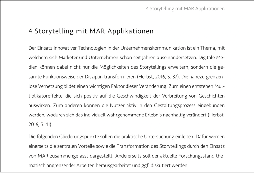
Analyse Masterarbeit: Mobile Augmented Reality und Storytelling

Titel: Mobile Augmented Reality und Storytelling

Untertitel: Eine Untersuchung von Mar Applikationen hinsichtlich ihres Storytelling-Anteils und dessen Auswirkung auf den absatzorientierten Erfolg. 

Autorin: Kiana Kusch

Aufgerufen am 1.12. unter: https://opendata.uni-halle.de/bitstream/1981185920/13752/1/Masterarbeit%20Kiana%20Kusch.pdf

Level of design

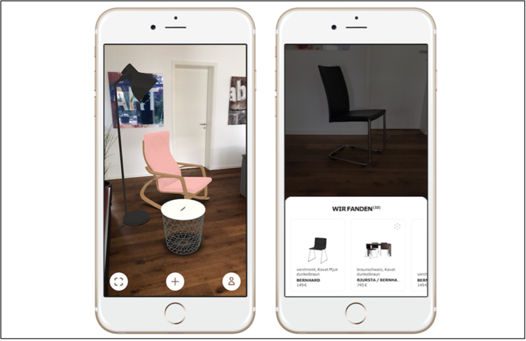
Diese Masterarbeit wurde an der Hochschule Anhalt an der Fakultät Wirtschaft verfasst. Es ist nicht direkt eine Design-orientierte Masterarbeit, deshalb gibt es nicht wirklich einen Gestaltungsaspekt. Die Schrift ist sans-serif, sehr geometrisch und geradlinig, was einen wissenschaftlichen Charakter herstellt. Die Autorin verwendete eine starke hierarchische Ordnung in ihrer Schrift, wodurch man klar zwischen Überschrift und Fließtext unterscheiden kann. Ansonsten beinhaltet die Masterarbeit wenig Bildmaterial, bis auf einige wenige Mockups. 

Degree of innovation

Diese Masterarbeit wurde im Jahr 2018 verfasst. Zum damaligen Zeitpunkt gab es bereits einige gut etablierte Augmented Reality-Anwendungen, deshalb ist der Innovationsgrad nicht besonders hoch. Die Autorin beschäftigt sich hauptsächlich mit der Kombination von Augmented Reality und Storytelling, was für mich eine spannende Mischung darstellt. Dadurch steigt der Innovationsgehalt der Arbeit wieder etwas an. 

Independence

Es gibt keine offensichtlich qualitätsschädigenden Einflüsse auf diese Masterarbeit. Sie wurde nur von Kiana Kusch verfasst, steht in keinem Zusammenhang mit einem Unternehmen oder ähnlichem. Auch bei der Methodik sehe ich keine problematischen Faktoren. 

Outline and structure

Diese Masterarbeit ist sehr umfangreich, sie umfasst 161 Seiten. Dabei sind 87 Seiten Inhalt, danach beginnt bereits der Anhang, wo statistische Auswertungen gezeigt werden. Der Aufbau der Arbeit ist klar strukturiert: Zuerst werden Storytelling und Augmented Reality näher beschrieben, danach geht die Autorin auf die Methodik ein und am Ende werden die Ergebnisse dargestellt. 

Degree of communication

Kiana Kusch hat einen sehr klaren und angenehmen Schreibstil, dadurch wird ihre Arbeit leicht verständlich und nachvollziehbar. Allerdings sind einige Teile eher informell geschrieben, was nicht ganz für eine Masterarbeit passt.

Scope of the work

Wie bereits erwähnt, umfasst diese Masterarbeit 161 Seiten. Ab Seite 87 beginnen die Zusatzkapitel wie zum Beispiel das Literaturverzeichnis, Abbildungsverzeichnis und der restliche Anhang mit Umfrageergebnissen. Die einzelnen Kapitel sind klar unterteilt und deutlich voneinander abgegrenzt. 

Orthography and accuracy

Ich habe keinen einzelnen Tippfehler gefunden, das weist auf ein gutes Lektorat und eine genaue Arbeit hin. Alle formalen Kriterien wurden eingehalten.

Literature

Kiana Kusch bezieht sich in ihrer Masterarbeit auf sehr viele unterschiedliche Quellen. Einige davon sind kommunikationstheoretische Klassiker, andere moderne und innovative Werke. Alles in allem eine gute Mischung und eine umfangreiche Literatursammlung zum Thema Augmented Reality und Storytelling.

MIDI switch two

While switching between two FX loops was now theoretically possible, a DRY/WET control still needed to be implemented. My supervisor suggested using the schematics of a splitter and a mixer found on the Internet. As the name already suggests, the splitter splits the incoming guitar signal into two separate signals. These signals each have their own FX loop and go through different effects. Then, they are reconciled in the mixer, where the DRY/WET ratio of the two signals is set and they are both unified into one signal that is then sent on to the amp. The unfortunate part was that by using this method, no bypass switch using relay, MOSFET or Darlington transistor was necessary anymore. Nevertheless, important things have been learnt and the research and tests than were not completely for nothing.

Having never worked with schematics before, basic knowledge about reading and understanding schematics and the components involved had to be acquired. Then, it was decided to start of with the splitter and the necessary parts were bought at Neuhold. Luckily, a sound designer colleague could help me out with a 1uf Elko transistor which was not available at Neuhold. With all parts gathered, it was tried to assemble the circuit. The circuit was assembled on a breadboard. The advantage here is that the parts are not soldered and, thus, fixed in their position. Consequently, mistakes can be more easily remedied. Following the instructions, the circuit was built. To great surprise, it seemed to work. The circuit was tested using two guitar amps and a guitar. The signal of the guitar could be split up to go into both amps at the same time. Thus, the test was deemed successful. However, the two split-up signals appeared to be weaker than the one signal. According to my supervisor, this could be because of the use of different transistors than recommended in the schematic. It will be tried to acquire the correct transistors in order to remedy this problem.

With the splitter working, the mixer had to be built. The mixer posed a greater challenge. Fortunately, my supervisor provided me with the parts necessary. The building of the circuit, however, proved to be quite complicated. The schematic was firstly recreated in the DIY layout creator that lets you create circuits in a graphical way. With the circuit drawn like that, the actual circuit was built on a breadboard. It was testes by plugging in two guitars at the inputs and the output was plugged into an amp. The test was successful: Both guitar signals went through the circuit and into the amp. Furthermore, their individual volume levels could be adjusted using the potentiometers at the input. Nevertheless, I am not entirely sure that everything was done correctly – it just seems too good to be true.

Unfortunately, both parts, splitter and mixer, could not be tested in conjuncture due to the lack of two (!) crocodile clamps that are used to connect the audio jacks to their inputs and outputs. Thus, I cannot simulate the whole signal flow and experiment with the two FX loops yet. However, I have decided to solder cables to the remaining audio jack to be able to test my setup.