Type Specimen #2

Erste Seiten des Type Specimen Books von The Minimalist

Um diese Lehrveranstaltung für dieses Semester abzuschließen, möchte ich in diesem letzten Blogbeitrag die ersten Seiten meines Type Specimen Books präsentieren. Die Analyse anderer Specimen Books, die ich zum Inhalt des letzten Beitrages gemacht habe, diente nun als Grundlage für diese ersten Layouts: eine kurze Beschreibung der Schrift, eine Übersicht über alle in der Schrift vorhandenen Zeichen sowie Beispieltexte in unterschiedlichen Größen. Des Weiteren sollen anhand typografisch sehr unterschiedlich gestalteter Seiten die Möglichkeiten der Schrift gezeigt werden. Jedes Layout soll dabei trotzdem den Charakter der Schrift optimal in Szene setzen. Die Essenz der Schrift The Minimalist ist die Reduktion auf das Wesentliche: die simple Linie. Nahezu kein Kontrast in der Strichstärke und Formen, die aus der Symbiose von Kreis und Geraden entstehen zeichnen die Schrift aus. Die Schrift umfasst einen Schriftschnitt (Regular), der als Display Font Verwendung finden soll. Als solche vermittelt sie dem Layout einen minimalistischen Stil, sanft und luftig. Opulenz hat keinen Platz und soll es auch nicht haben. The Minimalist schafft Bühne für das Wort.

Des&Res 2. How to bring Lab closer to the streets

Today, design is rapidly developing in various areas of our lives. Design thinking began to be used in medicine, biology, products, and much more. People realized that by combining different disciplines we can achieve much better results. At the university, we are often told that by gathering specialists from different fields, we can consider the same project from different angles and understand it more holistically by looking at it from the faces and perspectives of different people. Now global companies clearly select employees with different backgrounds and different temperaments to work on the same task. At Design Week 2022 in Graz, we also had such an amazing experience.
This year, as students of Fh-Joaneum, we had the opportunity to work at Karla Molins Pitarch’s workshop, which was called UXD How to bring Lab closer to the streets. We spent a whole week working on the project from the very beginning to finish. The task was to understand and convey complex information with the help of design for people who are not related to biology in any way. The tutor divided us into two-person groups and we, as people with different backgrounds, had to design something new for our consideration.
From day one, we received a special Toolkit designed by Karla. It was supposed to help us in the process of creating our product. The purpose of the toolkit itself was to unite people from different areas and facilitate the process of joint work with the help of detailed information describing each step in the design process. The toolkit itself contained such subdivisions as knowledge, transdisciplinarity, applied design research, and outreach. Everything started with the lab and led to the street. Each of the divisions contained points that had to be completed in order to move to the next step. Each of the divisions was described in detail so that people who encountered the process for the first time could find everything they need and understand what to do next. Personally, the toolkit really helped me, even though I have been working with the design thinking method for quite some time. He helped me remember the process and follow it in detail. I plan to use it also in the process of writing my master’s thesis.
Unfortunately, we, people who did not have general knowledge of the topic of biology, needed to understand the theme of our workshop from the basics. Our task was to realize what chromatin is and how DNA is built on its basis. We needed to create some design system that would tell people who need clarification what exactly chromatin is.”Chromatin is a nucleoprotein that forms the basis of chromosomes. It consists of DNA and proteins (mainly histones). Chromatin is found inside the nucleus of cells of eukaryotes and archaea that have histones. In a broader sense, chromatin is sometimes also called the substance of the nucleoid in bacteria. It is in the composition of chromatin that genetic information is realized, as well as DNA replication and repair.
The first day was quite busy. We were divided into two personal groups and we started brainstorming. The task was a joint effort to understand what chromatin is and show us what it is associated with the studs. In the further process, it really helped, because many of us found the beginning of bare ideas in brainstorming. My colleague and I decided to design a game that would mechanically show the operation of chromatin and DNA. We decided to target schools and educational institutions as places to use the game, and students became our main target group. The most difficult thing was to explain to someone what chromatin is if you are not an expert in it yourself. Especially when you have one day of experience with the topic.

The next day we were scheduled to design low-quality prototypes and we moved to the next stage with Carla’s toolkit. We were still trying to figure out how chromatin works and how to show it in a game for children so that they do not lose interest and it helps them in the learning process. The main element in the game was the transfer of genes from one DNA stream to another. We wanted to give children the opportunity to collect good genes and get rid of bad ones. It was important to involve the players in the process and allow them to play a major role. After the first layouts and attempts, we decided to test the game on our colleagues in order to identify the main problems in the process and be the first to receive feedback from users. After the testing process, we realized that we made several mechanical mistakes in the game itself and that is focused on the process of creating DNA and not on chromatin. In the end, we added a few interesting things so that the main thing in the game still remains chromatin. In order to better understand the processes that take place during the creation of DNA, we began to look for people in our circle of friends who are professionally connected with biology, this really helped in the final result. The last day turned out to be the most difficult because it was then that we had to finish all the drafts so that we could present them well the next day. Under the pressure of time and our efforts, we tried to finish everything before the final deadline.
A little about the game itself. The game is based on the process of DNA creation and gene transport. The main element is the player, which is attached to his individual DNA. When a player chooses to collect more good genes from a chromatin point or throw bad genes at one of their opponents, they open themselves up and are vulnerable to attacks. The game is designed for 2+ players because the main task is to take away as many good genes as possible. The person with the best genes wins. Also, the game stops when the first player gets rid of all bad genes.

The whole design week ended with a presentation, everyone could show what he had been working on all these days. Personally, I want to add that I would never change my workshop to another one. An incredible experience, working with wonderful people, and a wealth of knowledge. The week turned out to be productive and interesting.

This is service design thinking

For my project work after the summer I will be working with the emergency room (ER) in Trondheim to improve their patient experience. My design supervisor for the project recommended that I read the book: “This is service design thinking: Basics, tools, cases” to get an overview of the process I should apply to such an open task. Service design is not new to me. It is, in a way, what I study in Trondheim, however I had never read a whole book on the topic before. I read the book and this article is a summary of the things I learned. 

Basics

There really is no good definition for service design. It is an evolving field and its borders are unclear. However there are five principles that always apply to service design.

User centered

To make services you have to include the customer in some way, since services can not exist separately from the user experience. However, making your services user centered is not always easy. The book uses this example: “Think of two customers. Both were born in 1948, male, raised in Great Britain, married, successful and wealthy. Furthermore, both of them have at least two children, like dogs and love the Alps. One of them could be Prince Charles and the other one Ozzy Osbourne.” Data is important, but you can not use it alone. The designer has to get an insight into the cultural and social context as well as the motivation of the users. It is also important to have a common language that you share with your users. This makes operations like customer service much easier.

Co-creative
Everyone can be creative, and they should! Putting the customer at the center of the process involves opening creation up to them as well. As more stakeholders are added such as cashiers, customer service operators and management, more opportunities for co-creation opens up. These people know exactly what they need to do their job effectively and only by allowing them into the process can they show that to the designer. It also makes transitions across interactions smoother. Making it vital to the service design process.

Sequencing

Imagine your service as a movie. An ever changing picture for the user that takes place over a certain period of time. It is important to arrange the pictures in such a way that they make sense, and tell the story that you want to tell. To influence this one can map out all of the different interactions the user has with the service, so called touchpoints, and arrange them in the best way possible. Perhaps some steps occur too early, or crucial information is not given at the right time. It is also important to think about the user’s action before they encounter your service. For example, imagine going to the hairdresser, the first point you should consider is when the user thinks about getting a haircut. Where, what, and how they get information are important points to consider if you want to capture the customer at an early stage.

Evidencing

Some services, like housekeeping at a hotel, are designed to be invisible. However, if customers do not notice it and it shows up on their bill, they are not going to be happy. Imagine your last holiday, you probably brought home some souvenirs. Pictures, a jar of sand or a shot glass with a flag on it. These all help you remember the experience you had and evidencing for service design works the same way. As a physical object to remind you of something and prolong the user experience. However, there is a limit to this. Think of junk mail as evidencing gone too far.

Holistic

Completely holistic design is sadly impossible. The world is just too complex for us to take every single thing into account. However, one should always strive to see the bigger picture. The context around the service is very important to consider to ensure user satisfaction. The also says: “At the level of the service sequence, there should be a focus on alternative customer journeys. There are always a number of alternative touchpoints and approaches, which need to be taken into account. Sequences change and need to be repeatedly reappraised from various perspectives to ensure a great customer experience. Hence, it is important to map the mood and feelings of all stakeholders throughout the service journey.” Holistic thinking is important to ensure satisfaction.

The book summarizes it better than I could: “service design thinking supports the

cooperation of different disciplines towards the goal of corporate success through enhanced customer experiences, employee satisfaction, and integration of sophisticated technological processes in pursuing corporate objectives.”

Tools

There are many tools presented in the book. I want to highlight two that I found interesting and plan to use. 

Stakeholder maps

Stakeholder maps are created by making a list of all known stakeholders to the service and then mapping it out visually, often grouping by internal and external stakeholders. Furthermore stakeholders with similar tasks or many interactions can be clustered together making it easier to spot potential synergies. Flows between different stakeholders can also be visualized, materials, money, information or labor. This also contributes to a simpler overview of a complex system.

Service blueprint

A service blueprint specifies and details each specific part of a service. This is then presented visually, usually showing the chronology and level of the touchpoints with the customer as well as what is going on in the background. Service blueprints should be made collaboratively, bringing together people from different departments, as well as users, to create a more holistic overview. This might also create understanding between different departments. It should also be a ‘living document’ that changes when the service or service provider does to give an up to date image.

Summary

There were also some cases in the book that were interesting as they laid out how these tools, methods and principles could be applied in a real life environment. I really enjoyed the book as it made many principles I had learned about before more concrete and laid them out in an easy to navigate way.

VR – Project, Workstation

Unity

https://unity.com

Als funktionelle Basis für das Projekt wurde die Gameenigne Unity gewählt, da diese für wissenschaftliche Zwecke frei zur Verfügung steht und eine professionelle Arbeitsumgebung bietet. Zudem ermöglicht Unity durch die große Verfügbarkeit freier Assets (Erweiterungspakete die nach Projekt individuell hinzugefügt werden können) die Möglichkeit, mit vergleichsweise geringerem Aufwand auch visuell ästhetische Welten zu erschaffen. Außerdem ermöglicht es die Vergleichsweise einfache Einbindung von XR.

Fmod

https://fmod.com

Fmod ist eine Audiomiddleware die Programm- und Formatübergreifend Musikdateien laden und abspielen kann. Fmod wurde gewählt, da es ebenfalls für wissenschaftliche Zwecke frei zur Verfügung steht und DAW ähnliche, tiefere Bearbeitungsmöglichkeiten bietet als Unity.

Google Resonance Audio

https://resonance-audio.github.io/resonance-audio/

Resonance Audio ist ein plattformübergreifendes SDK für Spatial-Audio und findet in XR, Games und Videos Einsatz. Resonance Audio encodiert Soundquellen in einen Ambisonicstream (bis zu dritter Ordnung) und decodiert diesen am Ende in eine binaurale Ausgabe.

Gendered experiments: my conclusion to designing gender-neutral

NOTE: In order to make communication easier, in this blog post I will refer to stereotypically perceived male design attributes of the components of a corporate identity (image, logo, graphics, logo and colours) as “male” and typically female assigned as “female”. As this bases on stereotypes it in no way suggests that this is always the case and that design attributes can be categorised in such a way. Society nowadays is so diverse and ultimately the division into male and female is not possible. However as it was my aim to find these “grey areas” between stereotypically male and female design to be able to pinpoint where gender-neutral design starts, I will use these stereotypical assignments I researched in semester 1.

My aim for the semester was to test gendered design and what characteristics make a design more targeted towards a certain gender. I was hoping to see if there is a generalised formula you can utilise if you want to adapt branding/ design to be considered gender-neutral. I wanted to keep a certain aspect to base the design on and decided to keep the imagery static while step by step changing other gendered characteristics like typography, graphics, logo and colours.

After having experimented with different layouts and different industries using gendered characteristics, the outcome can be found in the specific blog posts. Here is the detailed analysis.

Experiments in fashion

MALES. What I already expected before starting to work with designs for fashion imagery was that there would be differences between the different styles and their perceived gender. Street style on the one hand is usually perceived very male, however in the last few years has started to shift to often being unisex. Therefore I wanted to see if this change has impacted the way we design for this style industry. I also wanted to take a closer look at other styles like business which is still very classic and therefore more targeted towards males or “preppy” where the male fashion is often already quite feminised. In general, I was also aware that choosing imagery that only portrayed men, would influence the perceived gender already a lot.

I have to say I was quite surprised by the outcome of the fashion experiments. In the areas, like street style where I expected the transition to be easier, I feel like the step-by-step targeting towards women did not completely work but on the other hand, the imagery related to business was more successful. I do believe the “moods” of the images here had quite a large impact on the design as a whole, so perhaps using imagery with both genders would make this easier. As already stated throughout the different experiments, I felt like the images, typography and colours had the most impact in the end, so I started to focus on those.

FEMALES. Here I also structured the experiments into categories and expected some areas like street style to be easier to make perceived male and high fashion to be the 2nd. Accessories (sunglasses, beauty, scarves) I expected to be the hardest as this is an industry typically targeted towards women.

In general, it was a lot harder to change female designs to male, as expected. From the research in the first semester it was clear that male stereotypes of being perceived less strong aka. female was associated with failure as a man, so this transition not working does not surprise me. In the areas like street style, however I feel like it was easier.

Experiments in other industries

As touched upon before I wanted to analyse if people effect the way we perceive a gender in design. For that I chose the categories product (drinks) and interior design as both are very diverse and rather gender-neutral. Here I could really closely analyse the impact of different components of a corporate identity.

For both product and interior design, I feel like the transition to the opposite gender worked. As assumed before the lack of people and therefore gender-neutrality probably helped with that. Here I think the colours were the biggest impact on the design and usually were, in my opinion, the point of transition. In general, these industries provided a lot of space for interpretation and gave me room to experiment quite a lot.

Conclusion

In general, it can be said that changing the perceived gender is not as easy as it seems to be. A lot of factors also play a role that are not taken into consideration between the components of a corporate identity like the mood of the imagery, the presence of people or the often associated gender with an industry (like cars, sports, beauty, etc.). As assumed, turning male into female designs was much easier due to the societal issues with masculinity vs femininity and the female “disadvantage”. However some industries where a change is on track, like in street style, it is not as big of an obstacle. I do believe however, that I have not as hoped discovered clear “grey areas” which indicate gender-neutrality and can give an indication on how many female vs male characteristics equal gender-neutral design. I believe it has much more to do with a lot of other factors that have be considered individually when wanting to design gender-neutral. Some factors do have a larger impact than others, like colour, image or typography but in the end, unfortunately there is no “one rule fits all” solution to gender-neutrality in design.

Other experiments: product & interior

After experimenting with graphic design in fashion, I wanted to see what kind of differences may occur within other industries. I decided to focus on the industries: product (drinks) and interior design as these are considered quite gender neutral. I wanted to see if giving these gendered characteristics will impact the perceived gender and if changing to the opposite will do the same.

Experiment 1: Product design (male to female)

Experiment 2: Product design (female to male)

Experiment 3: Interior design (male to female)

Experiment 4: Interior design (female to male)

Thoughts

I am quite surprised by the outcome as I believe changing the gendered characteristics actually had an impact on the design. Even in smaller considered changes like typography, you could already see the difference and slight tendencies towards the opposite considered gender. However, between the industries I do not see as much of a difference in the impact which is also surprising. This shows that there may be differences in industries if you compare the outcome of the fashion industry. A deeper analysis however will follow in the conclusion blog post.

Zusammenfassung Food Photography

In den letzten 2 Semestern habe ich mich ausführlich mit dem Thema Food Photgraphy auseinandergesetzt. Dabei habe ich mich mit Themen wie die Geschichte der Food Photography der Einfluss der Sozialen Medien auf unser Essverhalten sowie den Trends „Instagrammable Food“ und „Homemade Food“ beschäftigt.

Meine erster Blogeintrag handelte vom Food Styling, welches vor allem in der Werbung und in Filmen zum Einsatz kommt. In der Werbung sollte das Essen so köstlich wie möglich aussehen, dazu werden bestimmte Tricks verwendet. Ein Trick davon wäre bei Bier, Caffè und Milch den Schaum mit Flüssigseife zu machen. Dadurch entsteht ein stabiler Schaum, der natürlich und attraktiv aussieht. Das gleiche ist mit Pfannkuchen und Ahorn Sirup. Echter Sirup wird von den Pfannkuchen zu schnell aufgesogen, um ihn zu fotografieren, deshalb ersetzen die Fotografen ihn durch Motoröl.

Die Geschichte der Lebensmittelfotographie geht weit bis ins 19. Jahrhundert zurück. Man sagt, dass die Lebensmittelfotografie um 1832 begann, als ein französischer Erfinder für die Komposition eines Stilllebens mit einer Schüssel, einem Becher und einem Stück Brot ausgezeichnet wurde. Und in den 1930er Jahren produzierten Unternehmen wie Kraft Foods, Campbell’s, Bakers und Nabisco farbige Lebensmittelanzeigen mit Rezepten für Verbraucher in Zeitschriften. In den späten 60er und frühen 70er Jahren hatte sich die Lebensmittelfotografie einen schlechten Ruf erworben, weil Berichte über Lebensmittelmanipulationen und Fälle auftauchten, in denen Lebensmittel gefälscht und manipuliert wurden, um sie besser aussehen zu lassen, als sie waren. In den frühen 80er Jahren war schwarzes Plexiglas der angesagte Hintergrund. In den 2000er Jahren wurde ein sauberer und weißer Look von der Trendsetterin Martha Stewart beeinflusst. Es wurden Leinentischdecken und alte Requisiten mit hellerer Beleuchtung verwendet. Im Jahr 2010 gab es eine Rückkehr zum Trend der geraden Kamerawinkel. Der derzeitige Trend ist nach wie vor, die Farben frischer Lebensmittel auf Weiß zu präsentieren. Die weißen Teller bringen eine Frische und einen sauberen Hintergrund für die zu präsentierenden Lebensmittel.

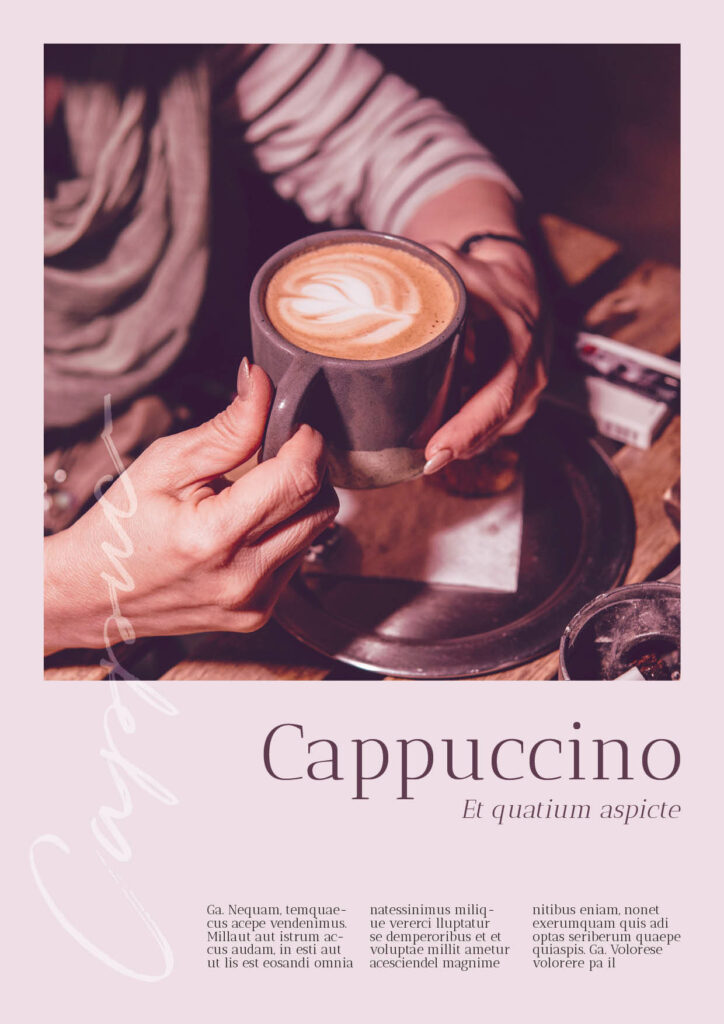
Global gesehen werden Lebensmittel in den verschiedenen Kulturen der Welt unterschiedlich dargestellt. International stehen kleinere Größen für Luxus und teuer. Quantität wird in der amerikanischen Esskultur mit Qualität assoziiert. Heutzutage vermitteln die sorgfältige Zubereitung und das Styling der Speisen dem Betrachter den Eindruck, dass das Bild gerade vor dem Verzehr fotografiert wurde. Gute Food-Fotografie muss ein Gefühl von Frische und “Hausmannskost” vermitteln und gleichzeitig appetitlich aussehen. So bekommt der Betrachter Lust, die Rezepte selbst zuzubereiten oder sie sich liefern zu lassen.

Früher wurden Lebensmittelfotografien nur zu Werbezwecken in Zeitschriften, Kochbüchern und Auslagen von Geschäften gezeigt und eingesetzt. Heute ist die Lebensmittelfotografie überall zu finden. Neben den üblichen Orten, an denen Lebensmittel zu sehen waren, wie z. B. in Lebensmittelgeschäften und im Fernsehen, tauchen Lebensmittel jetzt auch an öffentlichen Orten auf, wie z. B. an Tankstellen, Bahnhöfen, auf dem Flughafen in mobilen Food Trucks und natürlich in den sozialen Medien. Die Lebensmittelfotografie ist heute wichtiger denn je, denn sie ist ein wichtiger Bestandteil unseres täglichen Lebens und wird rund um die Uhr gezeigt.

Die meisten Lebensmittelfotos lassen sich in drei Kategorien einteilen: Redaktionell, Rezept und Verpackung. Auch wenn verschiedene Trends und Stile eine wichtige Rolle bei der Darstellung von Lebensmitteln spielen, sind es die unterschiedlichen Kategorien der Food-Fotografie, die der Fotograf vor der Planung der Fotosession verstehen muss.

Die redaktionelle Fotografie kommt vor allem in Zeitschriften, Websites, Blogs und anderen Medien, vor die sehr schnelllebig sind. Diese Art der Fotografie wird vor allem von Food-Bloggern verwendet. Sie ist ungezwungener und entspannter, so dass das Essen nicht perfekt sein muss. Die Zutaten, die für die Zubereitung der Speisen verwendet werden, können im Hintergrund gezeigt werden, um die Authentizität des Rezepts zu unterstreichen.

Rezept- oder Kochbuchfotografie ist genau das, was der Name vermuten lässt. Diese Bilder werden in einem Kochbuch, einer Rezeptbroschüre oder auf einer Rezept-Website gezeigt. Sie sind etwas genauer definiert, da der Betrachter visuell sehen muss, wie das Essen aussehen wird, wenn das Rezept fertig ist. Diese Bilder werden immer wieder betrachtet, um sicherzustellen, dass der Leser bei der Zubereitung des Rezepts keinen Schritt oder keine Zutat übersieht.

Von den drei Kategorien (Redaktionelle Fotografie, Rezeptfotografie und Verpackungsfotografie) ist die Verpackungsfotografie die schwierigste. Für diese Art der Fotografie gibt es verschiedene Einschränkungen. Was die Verpackungsfotografie schwieriger macht als die beiden anderen Kategorien, ist die Arbeit an den Lebensmitteln innerhalb der Parameter des Verpackungsdesigns. Manche Lebensmittel passen perfekt in ein Layout, andere wiederum erfordern einen anderen Winkel oder eine andere Positionierung des Lebensmittels oder des Tellers, damit sie passen.

Ob redaktionelle, Rezept- oder Verpackungsfotografie, das Fotografieren von Lebensmitteln erfordert Geduld und Kommunikation mit dem Kunden und dem Food-Stylisten während des gesamten Prozesses.

Wenn man durch die sozialen Medien wie Instagram, Twitter oder Facebook scrollt, wird man mit Bildern von perfekt zubereiteten und absolut köstlich aussehenden Mahlzeiten konfrontiert. Es hat den Anschein, dass wir in Bezug auf unsere Ernährung stark von anderen Menschen beeinflusst werden – insbesondere von denen, die uns am nächsten stehen. Forschungen haben ergeben, dass je enger und stärker die Beziehung zwischen zwei Menschen ist, desto mehr Einfluss haben sie auf die Lebensmittelwahl des jeweils anderen.

Wissenschaftler sind zunehmend besorgt darüber, dass lebensmittelbezogene Inhalte in den sozialen Medien dazu führen, dass wir anders über Lebensmittel denken. Die Algorithmen der sozialen Medien fördern Inhalte, mit denen sich die Nutzer mehr beschäftigen. Aber es ist nicht nur die Werbung der Lebensmittelindustrie, die dafür verantwortlich ist – jedem von uns ist es heutzutage möglich, die Menschen online zu beeinflussen.

Studien haben zwar ergeben, dass soziale Medien uns dazu bringen können, anders über Lebensmittel zu denken, und dass wir uns in der Regel mehr mit Inhalten über ungesunde Lebensmittel beschäftigen, aber es ist noch ungewiss, ob sich dies tatsächlich auf unser Verhalten im Alltag auswirkt.

Deshalb wird die Frage aufgeworfen, ob man den – derzeit weniger wünschenswerten – sozialen Wert gesunder Lebensmittel mithilfe von Anstößen verbessern und so die Menschen zu einer gesünderen Lebensmittelauswahl anregen kann. Anstöße oder auch “Nudges” genannt sind einfache Interventionen, die die Entscheidungsstruktur des Einzelnen verändern. und ihn dazu bringen, in eine vorgegebene Richtung zu handeln, ohne seine Entscheidungsfreiheit einzuschränken.

Der Begriff „Du bist was du isst“ bekommt auf Social Media eine neue Bedeutung: Essen und Getränke sind zu Statussymbolen geworden, mit denen man sich gerne schmückt und profiliert. All dies bedeutet, dass Farbe bei Lebensmitteln und Getränken wieder willkommen ist und zelebriert wird, insbesondere auf den Social-Media-Plattformen, die diese Trends hervorrufen. Es ist ein neues Zeitalter der vielfältigen Auswahl, und noch nie war es so attraktiv, sich von anderen Lebensmitteln hervorzuheben. Instagrammable”-Lebensmittel sind Lebensmittel, die entweder großartig aussehen oder in irgendeiner Weise hervorstechen wie zum Beispiel durch ihre Farbe, Textur oder ihren Zutaten.

Durch Instagram und Co. werden neue Food Trends geschaffen und somit neue Maßstäbe für die Produktentwicklung gesetzt.  Das bedeutet, dass aktuelle Farben, auffällige Formen und köstlich erscheinende Schichten und Texturen entscheiden mit darüber, ob ein Produkt erfolgreich sein wird oder nicht. Da auf Social Media der Fokus auf dem Visuellen liegt, müssen die Erscheinung des Produkts sowie die Verpackung perfekt aufeinander abgestimmt sein. Natürlich bestimmt am Ende der Geschmack über den Erfolg des Produkts.

Die Menschen kochen seit der Pandemie vermehrt zu Hause mit den Zutaten, die sie im Kühlschrank haben. In den sozialen Medien wie Pinterest oder Instagram findet man unzählige DIY-Rezepturen aus Omas Küche. Angefangen von selbst gemachten Sirupen bis hin zu eingekochten Marmeladen, Kompotten oder fermentierten Früchten. Die Menge und Vielfalt an kreativen Rezepten sind so groß, dass man kein Kochbuch mehr für zuhause benötigt, sondern sich unzählige Rezepte gratis in den sozialen Medien holen kann. Im besten Fall stammen sogar die verwendeten Zutaten aus eigener Produktion. Vor allem im Trend sind biologische und vegane Produkte, die am besten auch noch regional sind.

Das Wort „hausgemacht“ verspricht also nicht nur Geschmackserlebnisse frei von Zusatz- und chemischen Aromastoffen, sondern sich selbst als Macher zu erleben und kleine Erfolge zu feiern, dass motiviert viele Menschen, am Trend zum DIY-Food teilzuhaben.

In weiterer Folge möchte ich gerne ein kleines Interview mit einer Food Bloggerin auf Instagram führen sie kann mir sicher auch Tipps für meine Food Bilder geben. Denn ich würde sehr gerne einmal selber ein professionelles Food Foto machen und dabei auch lernen wie man am besten Licht, Setting und Kamera anwendet und natürlich wie man die Bilder im nachhinein am besten bearbeitet.

First experiments: female fashion

After experimenting on male imagery, I wanted to do the same for females. I categorised into 3: accessories focussed, high fashion and street style. Step by step I changed different components from the corporate design to make it fit more into male stereotypes.

Experiment 1: Accessories

Experiment 2: High fashion

Experiment 3: Street style

Thoughts

For the very stereotypically female images like the accessories industry, it is hard to add male characteristics to change the perceived target group. For other industries like high fashion and street style, altering was easier. Again, the characteristics like colour and typography made the most impact in my opinion and I am quite happy with the results. I would like to analyse next how other characteristics in different more neutral market industries like product design or interior design can affect the design and its perceived gender stereotype.

Eine zweite Position

Nachdem ich im letzten Post den Zauberlehrling des Digitalen bemüht habe – eine Position die mir ehrlicherweise nicht besonders liegt – konnte ich dennoch einigen Ansichten einen gewissen Realitätsbezug nicht verwehren. Umso mehr möchte ich diesmal einen Gegenpart einnehmen, einen künstlerisch-ganzheitlichen Idealisten.

Zu den relevanten Fragen:

3. Wie sollte man den sich verändernden Arbeitsbedingungen in der Lehre begegnen? (technologische Entwicklungen, Trends)

Kritisch. Technologie ist immer nur ein Werkzeug, solange man weiß, was man weshalb erreichen will, ist ein Werkzeug austauschbar und lässt sich gerade in digitalen Zeiten sehr leicht erlernen. Trends haben ein Ablaufdatum und wiederholen sich, Gestaltung kann nur aus der Substanz heraus erfolgen und darf keine Dekoration im technologischen Wandel sein. 

4. Ist eine Spezialisierung oder eher eine Generalisierung der Ausbildung anzustreben? (wenige Bereiche sehr fokussiert und umfassend zu lehren oder viele Bereiche aufzuzeigen ohne zu sehr ins Detail zu gehen)

Die Generalisierung um Gestaltungsfragen ist ein Kernelement, unabhängig vom Anwendungszweck oder der Technologie; Kontrast, Form, Farbe, Komposition und Gewichtung sind universelle Prinzipien, ob für Bildaufbau im Film oder Screendesign. Wichtiges aus einer Masse an Information zu extrahieren, filtern und für Kommunikationsaufgaben aufzubereiten setzt ein breites Spektrum an Wissensgebieten und Interessen voraus.

5. Sind analoge Ansätze heute noch sinnvoller Bestandteil einer Ausbildung?

In der Rückbesinnung an alte, technologisch einfachere oder in den Möglichkeiten limitierenden Technologien liegt ein über der aktuell lieferbaren Softwareversion hinausgehendes, konzeptionell basiertes Verständnis von Gestaltung. Befreit von Trends, kann mit Reduktion auf wenige Mittel das Verständnis um grundlegende Zusammenhänge besser transportiert werden. Schließlich ist der Mensch ein analoges Wesen; dessen Erfahrungswelt sich zwar um Digitales erweitern lässt – tiefgreifende Erkenntnis; ein be-greifen; kann aber im analogen meist viel stärker gefördert werden. So kann beispielsweise in den limitierenden Eigenschaften von analoger Fotografie – eventuell verstärkt durch den gespiegelten Blick einer Mittelformatkamera mit Schwarz-Weiß Film – ein viel stärkeres Verständnis von Bildaufbau erreicht werden.

6. Macht Programmschulung in Zeiten von Youtube Tutorials noch Sinn?

Programmschulung darf als Teil einer zeitgemäßen Ausbildung nicht fehlen, kann aber nur einen untergeordneten, als Basis dienenden Anteil haben, da Programme viel zu schnell überholt sind oder durch andere ersetzt werden. Ambitionierte GestalterInnen werden immer einen Weg finden, die Werkzeuge so zu benutzen, wie es der Gestalterischen Idee und dem Konzept dient. 

7. Sollten möglichst viele Projekte aus der wirtschaftlichen Praxis gemacht werden oder mehr Raum für künstlerisches und intellektuelles Experiment gelassen werden?

Wirtschaftliche Realität soll nicht vollständig außen vor gelassen werden, die persönliche, gestalterisch-konzeptionelle Entwicklung muss jedoch in Projekten herausgearbeitet werden, deren Limits nicht allein durch das möglichst reibungsfreie Durchwinken von Kundengeschmäckern definiert sind. Gestaltung im Sinne einer gesellschaftlichen und sozialen Verantwortung muss das Ergebnis eines persönlichen Entwicklungsprozesses sein, der sich in künstlerischer und intellektueller Hinsicht selbst hinterfragen soll und als Experiment den Raum zum Scheitern geben muss. 

Grundlegend kann gesagt werden, dass eine Ausbildung, die GestalterInnen hervorbringt, welche sich nicht nur in der gegenwärtigen sondern auch in der zukünftigen Arbeitswelt; in Konkurrenz zu künstlicher Intelligenz; behaupten sollen, nur durch einen möglichst breit aufgestellten, kritischen und scharfsinnigen gestalterischenVerstand als oberstes Ziel auszeichnen kann. Im Kern der konzeptionelle Grundgedanke einer Kommunikationsaufgabe; das Herz der Botschaft, welche durch gezielte, bewusst eingesetzte Mittel der visuellen Kommunikation in den idealen Fluss zwischen Sender und Empfänger gebracht wird. Eine starke Grundlagenausbildung kann also nur im Zentrum dieser Ausbildung sein; Gestaltgesetze, Komposition und Wahrnehmung auf der visuellen Ebene, Konzeption und Ideenfindung sowie Informationsaufbereitungen und Kommunikation auf der geistigen Ebene. Die realitätsbezogene Umsetzung muss durch Mittel von Medien und Marketing unterstützt sein, nicht ohne jedoch gerade diese Aspekte kritisch zu hinterfragen. Die Anwendung dieser Prinzipien kann in verfeinerte Abstufung den jeweiligen technologischen Ansprüchen angepasst werden, jedoch darf die Anpassung nicht über die Anforderung gestellt werden. 

First experiments: male fashion

To stay within the topic of fashion branding, I decided to firstly experiment within the fashion graphic design industry. I structured the experiments based on different fashion styles as I think different styles are more likely and some less likely to be considered “more” or “less male/female. Based on “male” considered images, I changed components within typography, logos, graphics and lastly colours to showcase the process of adding more and more stereotypically considered female components of design. Here is the outcome:

Experiment 1: Street style

Experiment 2: Business style

Experiment 3: Preppy style

Thoughts

As I assumed I feel it’s quite hard to make male dominated pictures “more female” only through changing characteristics such as typography and graphics. Even after completely changing colours of the design, I think the designs still are quite male dominated through the imagery. This makes me assume that imagery has a very high impact within gendered design. Colours as well as typography however, also have quite a large impact, whereas graphics and logo have less. As assumed in fashion styles like “preppy” it was easier to regender the design and make it more stereotypically female, whereas street style and business style was harder. The outcome to me actually feels more feminine despite the “male” imagery. I am excited to see if the female imagery shows a similar outcome, as previous research suggested.