It is very important to bear in mind that a children’s space must be suitable for its users. Children’s facilities are often the most complex to accommodate, as they need to be accessible to accompanying adults as well. In addition, as in any other facility, it is necessary to take into account people with reduced mobility, adapting heights and sizes.
Let’s remember that all the above details are determined according to the age range of 6 to 8 years old. Not only because this is the target public of this project, but also because at this age it is necessary to limit the range as it is a time when physical and personal changes occur rapidly.
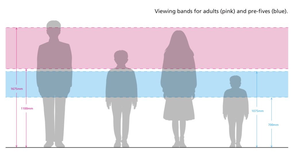
Taking into account this range, it is necessary to know the approximate height of our audience. In this case, it is very similar between the sexes and is between 115 cm and 127 cm tall. This means that any table, chair, device or sign should be within the range of vision and accessibility of a person of that height.
Knowing this, an analysis of the correct heights and spaces can be carried out. Reference is made to a guide for Glasgow museum exhibitions and a standard accessibility guide for exhibitions.
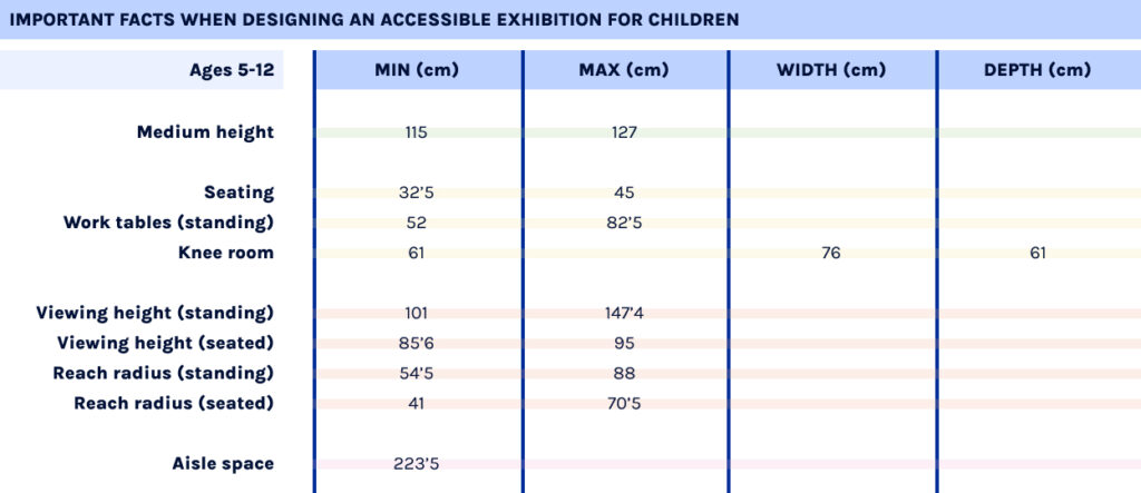
These guidelines determine that for ages 5-12 years, seating should have a minimum height of 32.5 cm and a maximum height of 45 cm; while standing desks should be between 52 cm and 82.5 cm. The knee space under these tables should be 61 cm high, 61 cm deep, 76 cm wide.
In addition, a child’s viewing height is between 101 cm and 147.4 cm when the child is standing; and 85.6 cm and 95 cm when the child is sitting. This allows a reach radius of between 54.5 cm and 88 cm when standing and 41 cm and 70.5 cm when seated.
This includes the recommended widths between tables, walls or shelves. This should be a minimum of 183 cm to allow space for two wheelchairs. In any case, a space of 223.5 cm is recommended for specific areas for children.
A summary table of all these concepts is included below.
Breathing is becoming increasingly important for stress relief. However it is not only good for controlling the body, but also for controlling wind instruments for example the flute.
With the development of the Hyper hybrid flute, an attempt was made to integrate the profound role of breath control into a digital flute and to take it in advance it was successful. In principle, musicians can control not only the volume, but also articulation, octave, micro-tones, etc. through breathing techniques on wind instruments. However, most existing digital versions do not capture the various effects of breathing as is possible in analogue. Instead, they rely on additional interface elements. An interface was developed that converts real-time breath data into MIDI controls. The Hyper-hybrid Flute can be switched between its electronic and acoustic modes. In acoustic mode, the interface is identical to the regular six-hole recorder. In electronic mode, the interface recognizes the player’s fingering and breathing speed and converts them into MIDI commands.
SIDE NOTE: Definition of MIDI: MIDI stands for Musical Instrument Digital Interface, which means “digital interface for musical instruments”. It is a language that allows computers, musical instruments and other hardware to communicate with each other. The MIDI protocol includes the interface, the language in which the MIDI data is transmitted, and the connections needed for the hardware to communicate.
The Hyper-Hybrid Flute interface has three contributions in particular:
It simulates that acoustic property of the flute where higher breathing speed leads to higher octaves and more micro-tonal pitch bending.
By exaggerating the parameters, the interface is expanded into a hyper instrument.
A simple toggle supports the change between electronic and acoustic mode.
To detect if the hole is covered by a finger when playing the flute, a ring-shaped capacitive sensor is placed on each of the six holes and the breathing rate is measured by a BMP085 air pressure sensor.
Changing state
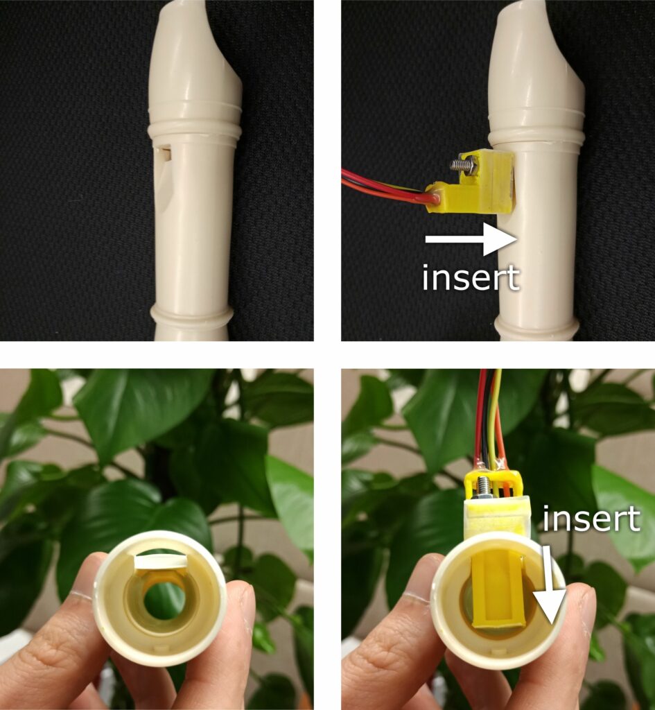
To enter the electronic mode, the musician inserts the air pressure sensor into the mouthpiece outlet. This mutes the recorder and simultaneously exposes the sensor to the air pressure in the recorder, from which the breathing speed is calculated. To enter acoustic mode, the player releases the air pressure sensor from the exit port, so that the playing of the interface is acoustic and the air pressure sensor is not triggered. The picture below shows the prototype with the attached sensors.
Controlling Octave and Micro-tone via Breath
The influence of the breath on the micro-tone and the octave can be modeled as follows:
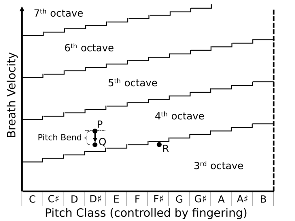
Harder blowing at a pitch leads to an upward micro-tonal pitch bend.
When the breathing speed exceeds a specific threshold, the pitch jumps up an octave.
Such threshold values for the breathing speed increase with rising pitch. This is shown perfectly in the picture above. The higher the velocity of the breath with holding for example D# the higher the jumps to another octave are.
Measuring the relationship between pitch bend and breath pressure using an acoustic recorder gives a pitch bend coefficient of 0.055. The micro-tone enables the musician to perceive his position relative to the thresholds. This interactive feedback allows them then to calibrate their breathing speed and avoid unexpected octave jumps. Under the bend coefficient > 0.055 the interface becomes a hyper instrument. The micro-tone as a musical device offers an additional dimension of expressiveness.
How does it become a MIDI controller?
To know what pitch the instrument should produce at any given time does not make it a MIDI controller per-se, because MIDI requires a discrete stream of note on and note off events. So the interface must be stateful.
The breath velocity is compared to a threshold to determine whether the instrument should be at rest or producing a note. A rising edge in that signal marks the excitation of the instrument, which fires a Note On event. Meanwhile, a differentiator listens to the pitch and fires its output line when the pitch changes value. The differentiator output, conditioned on whether the instrument is at rest, also fires a Note On event.
What tools are used?
The interface is wireless. All sensors are connected to an Arduino Nano, which communicates with a Processing 3 sketch via Bluetooth. The sketch uses the midi bus library for MIDI messaging. The recorder body is modeled in Fusion 360 and fabricated with MJF 3D printing.
Reflections
In the results of this research, it is very clear that there is still innovation in the field of wind controllers. With the ability to measure octaves, the multi modal music teaching system can be expanded to include breathing technique in the learning outcomes. The MIDI interface is accurate and allows for optimal communication through the musician’s breathing.
Therefore, the hyper-hybrid flute poses as an interesting solution on the path to the digitization of wind instrument and also new didactic concept and learning more immersive. Besides teaching, I especially see this hyper-hybrid flute applied in the context of arts and performance art but also possible in commercial productions where simulations of wind instruments might be useful. Moreover I want to mention the importance of interfaces as bridges from the analogue to the digital world, what this flute also represents. It is of high interest to combine these worlds to create even better and more comprehensive solutions and experiences. Analog and digital, these opposites both have their justification and are to a certain extent equally dependent on each other, and definitely can profit from each others strengths.
I want to close this post with Adrian Belew’s words: “Digital for storage and quickness. Analog for fatness and warmth.”
Ich bekam die Anfrage für die Website eines Unternehmens Fotos vom Büroleben zu machen. Es war mein erstes größeres Shooting ohne weitere beteiligte Leute aus meiner Branche.
Die Fotos mussten als erstes mal inhaltlich zum Thema der Seitenstruktur passen. Also habe ich hier wie üblich einen Shootingplan und ein Moodboard ausgearbeitet. Dafür war es notwendig ordentlich zu recherchieren, weil ich manche Tätigkeiten des Unternehmens – aufgrund der noch nicht fertigen Website – mir recht unklar waren. Es ist ein Unternehmen für Beratung. Hier war dann klar: Die Fotos müssen hell und freundlich sein. Sie dürfen nicht zu streng aussehen, aber müssen Kompetenz vermitteln. Viele lächelnde Gesichter, ruhige Kompositionen. Ich wollte mich zuerst für warme Farben entscheiden. Aufgrund des CD der Firma blieb ich aber bei kühl – neutral.
Meine Vorgehensweise in etwa:
Zeitplan
Moodboard
Recherche/Rücksprache
Shootingplan
Equipmentplan
Statistenplan
Shooting
Aussortieren
Nachbearbeiten
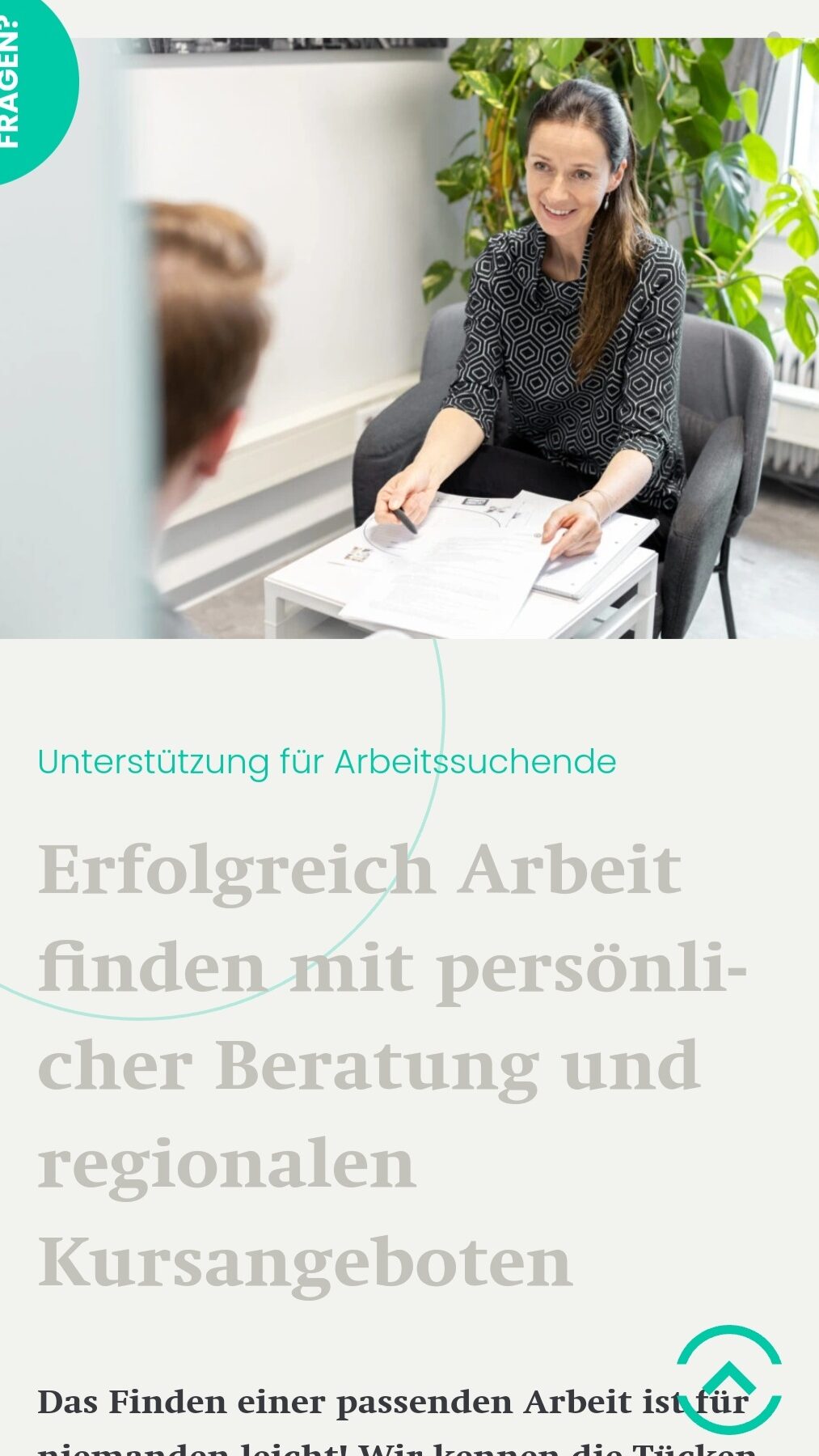
Was was das Outcome meines Experiments zur Bildwahrnehmung: Was passiert denn mit einem Bild auf einer Website? Welchen Unterschied macht die Position?Gerade auf einer Website ist besonder wichtig, wohin ein Bild den Blickfokus lenkt. Bei Fotos, auf denen Köpfe alle nach rechts gedreht sind, verläuft der Blick der Betrachtenden automatisch nach rechts. Will ich das denn hier überhaupt? Diese Folusgeschichte hätte ich besser nutzen können.
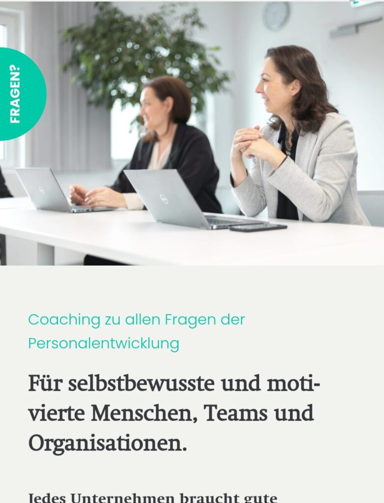
Die abgebildeten Personen lenken den Blick der Betrachter:innen auf den “Fragen?”-Button
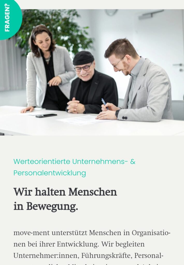
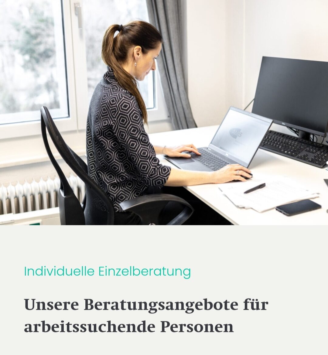
Die abgebildeten Personen lenken den Blick der Betrachter:innen auf den Text darunter
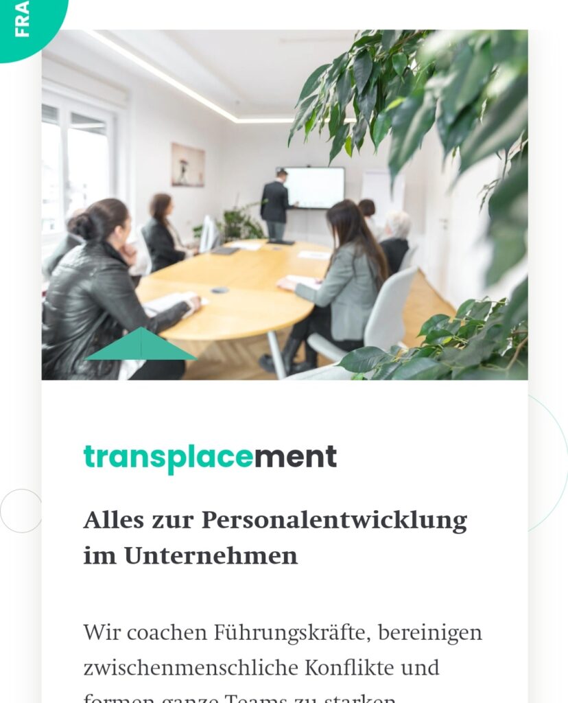
Bilder mit viel Weiß und nur einem klaren Objekt statt zu viel Tumult gefielen dem Kunden immer am Besten. Auf einem Websitefoto sollte nicht zu viel am Bild passieren. Es ist besser, wenn es nur die Atmosphöre unterstützt anstatt abzulenken.
Oft besser Atmosphäre einfangen anstatt mit konkreter Abbildung abzulenken.
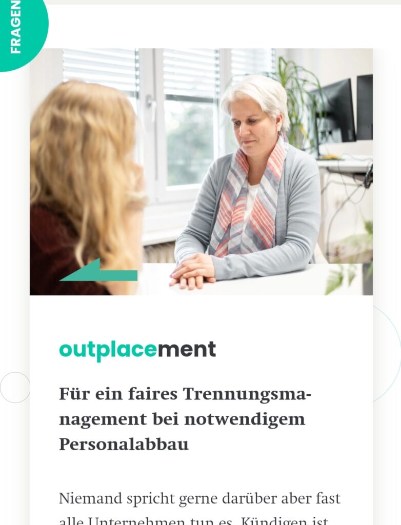
Es viel mir leicht, lächelnde Gesichter einzufangen, die beim Betrachten ein positives Gefühl erwecken sollen. Schwierig wurde es aber bei Unterthemen, die sich um z.B. Arbeitsverlust oder andere Schicksalsschläge dreht. Hier ist nicht sinnvoll fröhliche Personen abzubilden. Nachdem das Unternehmen nur eigene Angestellte und keine fremden Models auf der Website haben wollte, war dementsprechend schwer, ein ernstes bis betrübtes Gesicht vorzutäuschen. Das hat in diesem Projekt so nicht gut funktioniert.
Zu Betrachter:innen gewandte lächende Person VS. weggedrehte neutrale Person erzielen ein ganz anderes Feeling.
Statt traurigen Personen am Bild wurden schließlich neutrale Bilder verwendet.
Ich habe noch viel Luft nach Oben was Bildbearbeitung angeht. Während ich hier nur eine grundsätzliche Korrektur der Bildeinstellungen vorgenommen habe, könnte ich in Zukunft deutlich mehr Stimmung herausholen.
Generally the article addresses the use of universal design for software products that are accessible to musicians with various disabilities. Although I am not specifically involved with music interfaces myself, both privately and professionally, it was very interesting for me as an interaction designer to gain more insights into the field. Even if the article is about two different softwares and how they could be improved in order to be more accessible, there is a lot of information and input that can be applied to any other area or digital product.
Disabilities
Within the first paragraphs of the text the authors tackle the term „Disability“. Rather than seeing disabled people as a minority group, who are not able to act the same way non-disabled people can, they want to create a framework with all people and their individual needs working together and being equally included without having one dominant group. This is also a reassuring theme throughout the whole article: Working with the knowledge and experience of disabled people instead of assuming or trying to „solve“ problems for them. One key finding of their research is to bring disabled persons in the process, begin with an equitable approach and make technology more flexible, robust and inclusive.
Universal Design
As previously mentioned the approach of designing for disabled musicians sets its focus on Universal Design, especially on the first principle – „Equitable Use“, which is summed up in following four points:
1a. „Provide the same means of use for all users: identical whenever possible; equivalent when not.
1b. Avoid segregating or stigmatizing any users.
1c. Provisions for privacy, security, and safety should be equally available to all users.
1d. Make the design appealing to all users.“ [1]
Research Goals
The overall goal of this article is to inspire other designers and spread awareness that there is a lot of potential to make music technology systems accessible by providing information and support. As the title of the paper suggests, the project focuses on home-based disabled musicians in order to to provide access for them to collaborate with each other and perform live, both online and at physical events. Particularly important in this project was, that it is „disabled-led“ by putting disabled people in the foreground and actually start with their input instead of sprinkling in on top in the end.
Interviews
The first stage of the project was an interview phase with 15 home-based disabled musicians from all over the world. They had a diverse range of disabled identities, eg. mobility issues, d/Deaf, Autism, …, however the interviewees were not as demographically diverse as they wished for. For me this was very interesting to see how they handled this by just communicating it open and honest. The following categories of questions were included in the interviews:
the approach of making music
their personal requirements from music making applications (setup, handling, …)
their personal requirements for learning (concentration span, explanation, …)
their personal requirements for performance (real time or pre-recorded, duration of performance, …)
Analysis
At first the project laid its focus on live coding, because it does not require additional hardware like MIDI controllers and can be controlled with various assistive technology like eyegaze or head mouse controllers. Furthermore the bandwidth requirements are reduced in comparison to audio transmission. However the workshop with the target group showed that they are not really into live coding, but would prefer using their existing hardware, which is why the authors decided to shift the focus to audio streaming platforms. Following software tools were analyzed in the paper: Estuary, a live coding interface, Icecast, an audio streaming software, and LiveLab, an open source browser-based interface for sharing video and audio.
Findings
Besides some technical issues with the software there were major political issues in the project. Overall the companies had the feeling that making their products accessible does not fully pay off, so they wanted to restrict the needs to their availability of time and money. One of the main approaches was to make an easy version of the software, which would never be a real part of the main program and therefore not adapted or updated over time. This of course did not match the findings of the interviews at all. Here it was a great concern to put the whole structure and the working process itself above small, surface adaptations. Specifically the musicians wished for a flexible layout, a quick response time, a well documented help, captions in videos, robustness with assistive hardware, accessibility as a part of the main software and including disabled people in the design process. Another main finding was that experiencing being in the community generates and expert knowledge of accessibility, which should always be considered and used in this context.
Conclusio
Personally I felt that the major issue here was definitely a political one. Companies would rather not make it fully accessible due to financials and since it is not regulated by law or state funded they don’t feel obligated to do adapt their products. „Half accessibility is no accessibility“ was definitely a key statement for me in this article. To end my post on a positive note: I liked how the article stressed the importance of including a broad span of needs in any design work and prioritizing workflows and flexibility in order to be accessible for all.
Sources
Amble H C Skuse and Shelly Knotts. 2020. Creating an Online Ensemble for Home Based Disabled Musicians: Disabled Access and Universal Design – why disabled people must be at the heart of developing technology. Proceedings of the International Conference on New Interfaces for Musical Expression, Birmingham City University, pp. 115–120.
by Nathan Villicaña-Shaw, Dale A. Carnegie, Jim Murphy, and Mo Zareei – Apr 29, 2021
In the second half of the 20th century, a new format for multi-sensory artistic expression emerged through integrating auditory elements within visual art practices. These sonic art installations by definition, incorporate acoustic elements into their overall presentation and the realization of the work’s artistic statement. Moreover, Another component of sonic arts that is of importance to later sections is the tradition of exhibition outside of typical art gallery venues.
Following the footsteps of early sonic artworks such as Max Nauhaus’ Listen: Field Trips Through Found Sound Environments (1966), and John Cage’s 4’33” (1952), the Speculātor project explores the implications of augmenting soundscapes without adding sounds or manipulating how visitors physically hear those sounds in-situ.
Behind the project is a careful and deep study of what is meant by Soundscape and when com term was born, particularly delving into the relationship between Natural Soundscape and Music Technology. The interaction between these two players can take place in two different and opposite ways, namely bringing nature into a technological environment, or conversely bringing technology into a natural environment, facilitating in-situ sonic art and musical performances. In this way, the juxtaposition of electronic devices in natural settings can be exploited aesthetically and artistically, obtaining results in a way that cannot be achieved if presented inside indoor galleries.
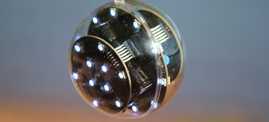
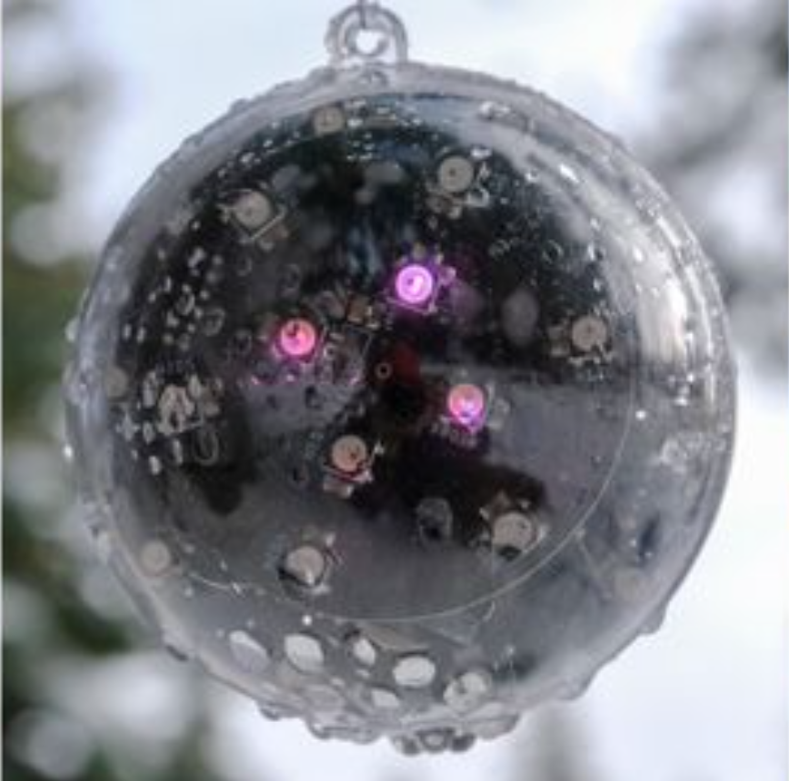
It is in this context that Speculātor was born. Is a small, battery-powered, environmentally reactive soundscape augmentation artefact that provides audio-reactive LED feedback.
Close up of Speculātor v3 unit with an unsanded and unsealed enclosure.
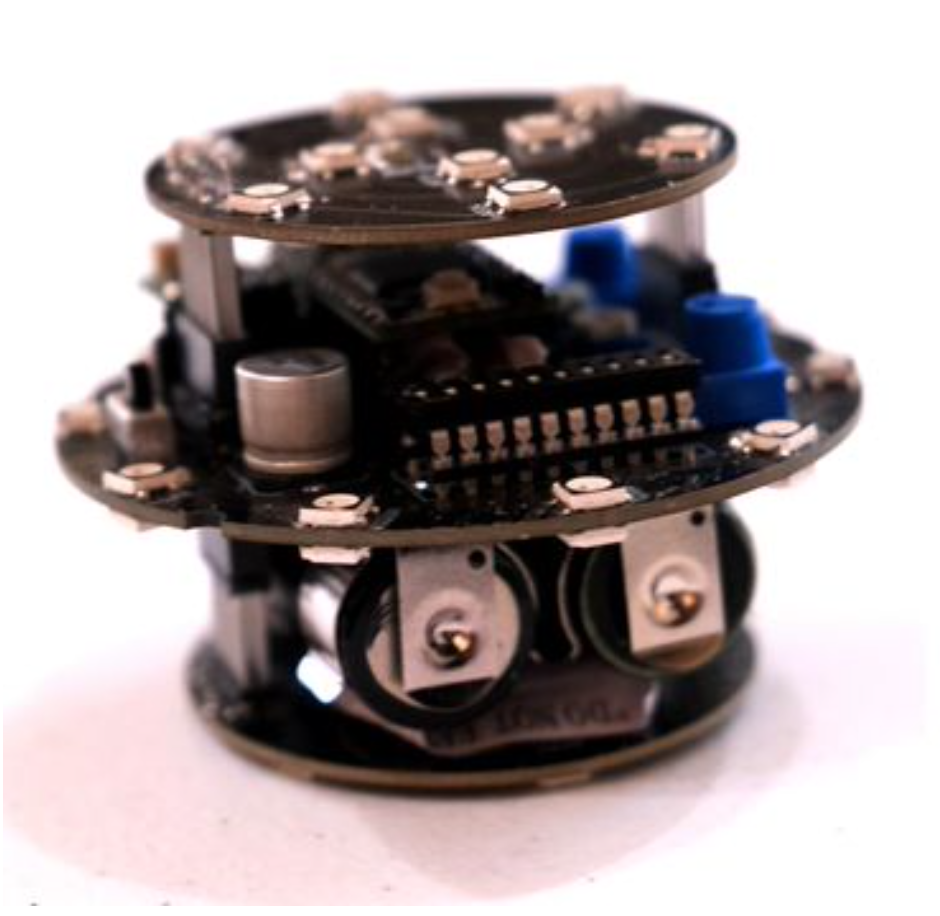
Speculātor hardware from the side.
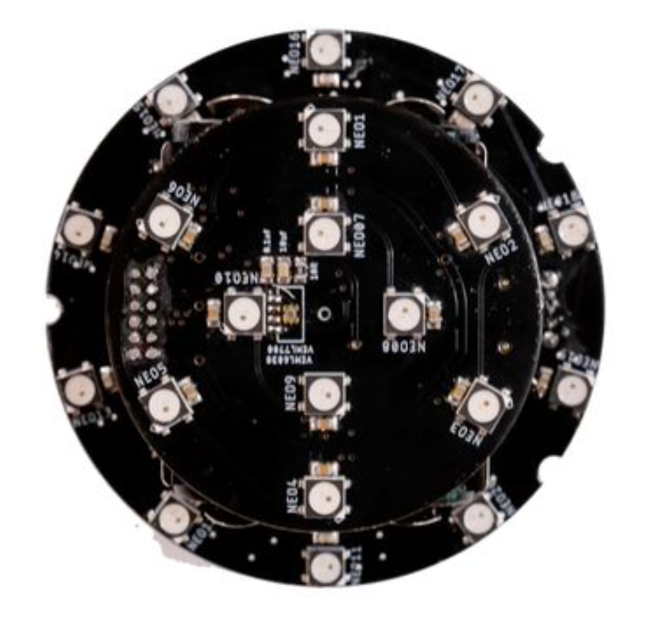
Speculātor hardware from the top.
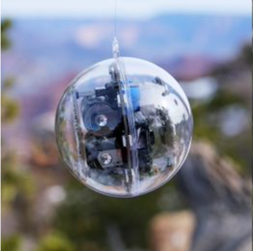
Personally, I’ve found the level of engineering that this “artwork” presents extremely interesting. Indeed, a large number of parameters were taken into account in its design to make it suitable for every situation. It is in fact extremely transportable, modular, and to survive in outdoor, fully-exposed locations, Speculātor uses data collected from a combined temperature and humidity sensor to shut down the system when the enclosure is too hot inside or compromised by liquid ingress.
All this is made possible by complex electronics developed with extreme detail. At the heart is a Teensy 3.2, and connected to it are input and output modules such as microphones, NeoPixel RGB, temperature, humidity, and light sensors, and an autonomous battery. This is then encased in a spherical acrylic shell, making it waterproof, buoyant, and transparent.
This is then encased in a spherical acrylic shell, making it waterproof, buoyant, and transparent.
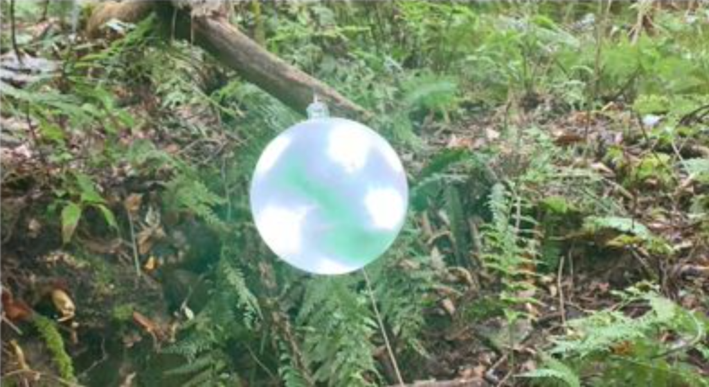
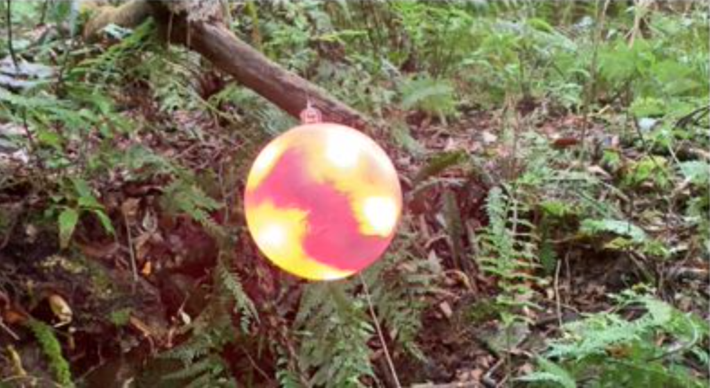
The final effect is a kind of Christmas tree ball, which can be easily hung thanks to a specially created hook on the wrapper, and which needs nothing but itself.
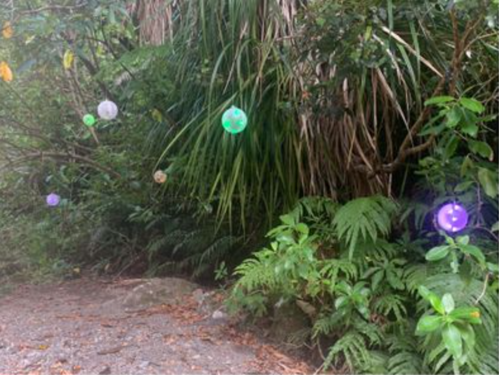
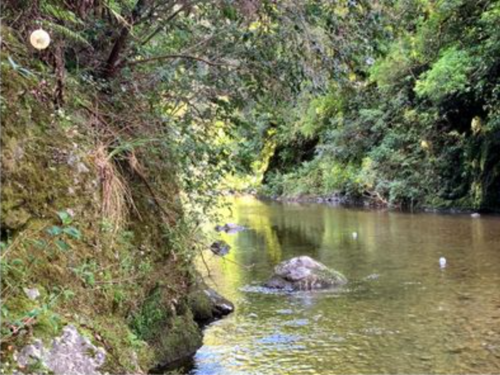
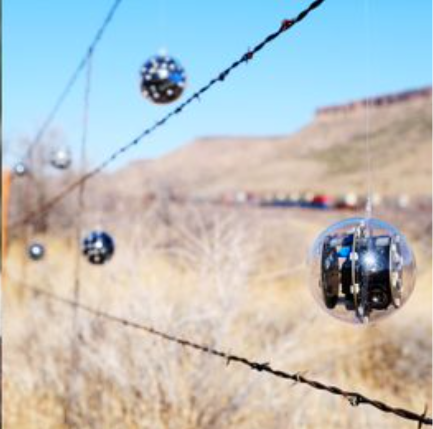
Speculātor units installed in Kaitoke Regional Park in February 2020.
Speculātor units installed in Kaitoke Regional Park in March 2020.
Close-up of a frosted unit displaying song feedback.
Close up of same frosted unit displaying click feedback.
Speculātor is thus placed in natural places with an important sound background since it is the sound that makes it come alive. Indeed, it is placed near waterways and cicadas, making nature the real user of Speculātor.
I found the connections to the work of Bruce Munro, particularly his work “Field of Light,” intriguing. For in the latter, the artist brings technology into the natural environment, creating a new connection that welcomes the audience into a different exploration of their surroundings. Again, technology reflects nature, rather than going against it, and this is perhaps what makes this approach speculative, even though it should not be.
Speculātor explored non-aural approaches to the exhibition of sonic artwork which leveraged visitors’ visual sense to prioritize listening. By focusing on listening instead of speaking, visual soundscape augmentation techniques potentially serve as a promising method for realizing sonic installation art whose artistic focus is the in-situ sonic environment.
Speculātor installed in Grand Canyon, Arizona.
Speculātor installed in Donner’s Pass, California.
Musical Grid Interfaces are now used for around 15 years as a method to produce and perform music. The authors of this article made an approach to adapt this grid interface and extend it with another layer of interaction – with touch interaction.
Touch interactions can be divided into three different groups:
Time based Gestures (bezel interactions, swiping, etc.)
Static Gestures (hand postures, gestures, etc.)
Expanded Input Vocabulary (using finger orientation towards the device surface)
During their experiments, they mainly focused on time based gestures and how they can be implemented in grid interfaces.
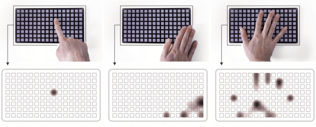
First Prototype
Their first prototype was build out of 16*8 grid PCB with 128 touch areas instead of buttons. This interface was able to record hand movements in a low solution, in order to detect static and time based gestures. But they had problems with the detection of fast hand movements and they could not solve them without having a major change in the hardware.
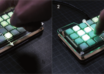
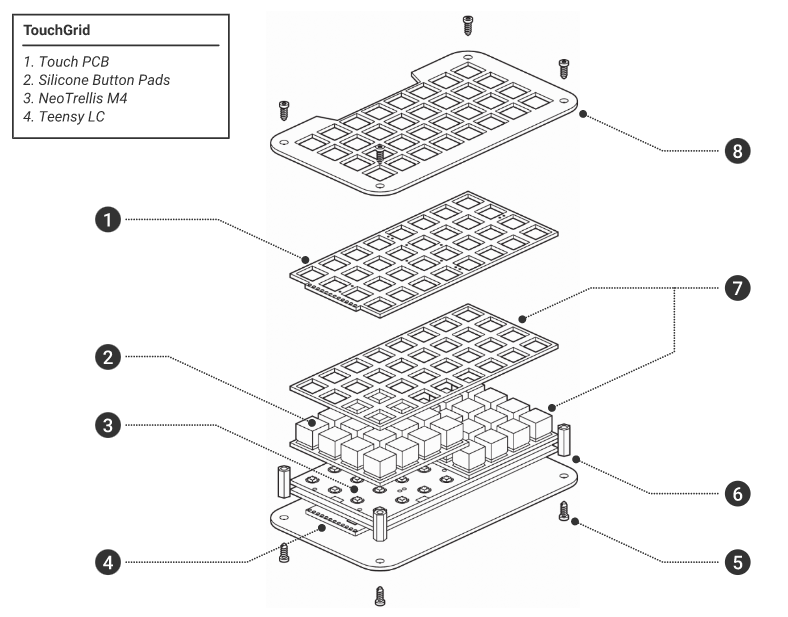
TouchGrid
For their second prototype, they used a Adafruit NeoTrellis M4 consisting out of a 8*4 LED buttons, which are able to give RGB feedback.
They managed to incorporate two time based interactions: Dragging from off-screen (accessing not frequently used features like menus) and horizontal swiping (switching linear arranged content). In order understand the different relationships and features and not overwhelm the users, they also incorporated animations.
Take a look at the video to get a better understanding of the functionalities:
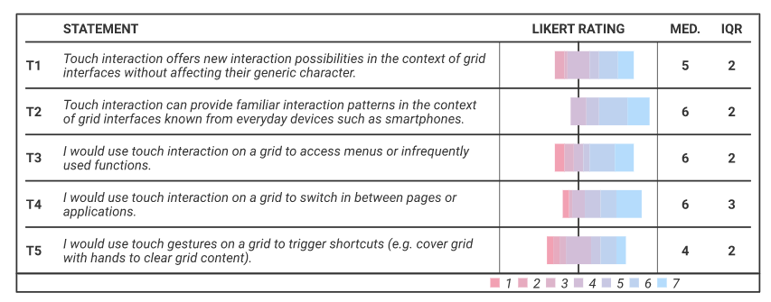
Evaluation
To evaluate their concept, they made an online survey with 26 participants, whom they showed the video above. Most of them stated that they are already familiar with touch interactions and that they can image to use this interface. They even came up with a few more ideas for touch interactions, like zooming in a sequence of data. When they were asked to state their concerns, they said for example that it might get a bit too complex and they feared the malfunction and interference with current button interactions.
Conclusion
With their concept, the authors took a different approach than a lot of other people: Instead of aiming to make touchscreens more tangible, they tried taking already known touch interactions and combine it with the tangible grid interfaces. They try to take the best out of best out of the two worlds and combine it with their TouchGrid. As for now, they are still in the concept phase, focusing on the technical proof of concept and are getting help from an expert group in the evaluation of their concept. For the future, they hope that they can further work on the “[…] development of touch resolution, with which more interactions can be detected and thus more expressive possibilities for manipulating and interacting with sounds in real time are available. Furthermore, combinations of touch interaction with simultaneous button presses are conceivable, opening up currently unconsidered interaction possibilities for future grid applications.”
There are more and more forms of AI in different fields. From assistants on websites, to online bots (cleverbot) and including the famous voice assistants on phones (Alexa, Siri).
I have always found the use of these interesting, not only for the amount of information they contain, but also for discovering the funniest answers (like the ones in the images below). That’s why I find this paper so interesting. Applying all this AI knowledge to the world of music can be complex and at the same time super interesting.
In this paper they talk about COSMIC, a (COnverSational Interface for Human-AI MusIc Co-Creation). This bot not only responds appropriately to the user’s questions and comments, but it is also capable of generating a melody from what the user asks for. In the following video you can see an example (referenced in the same paper).
The complexity of these projects is always in the back of my mind. Knowing how devices are capable of reacting like humans seems to me to be a great advance that at the same time can be a bit alarming.
Still, this case opens up a lot of new opportunities. Using this same system, a new method of learning can even be generated. After all, this bot simply edits parameters of a melody (speed, pitch…) to resemble different emotions. One could therefore learn how different emotions tend to imply different sounds or speeds, or many other details.
Possible Changes will be recorded in this Blogpost:
Several Settings aren’t shown and Screen-Brightness and Volume are on maximum Blocked (fixed). This can be changed in Settings, to how much to block the brightness and sound.
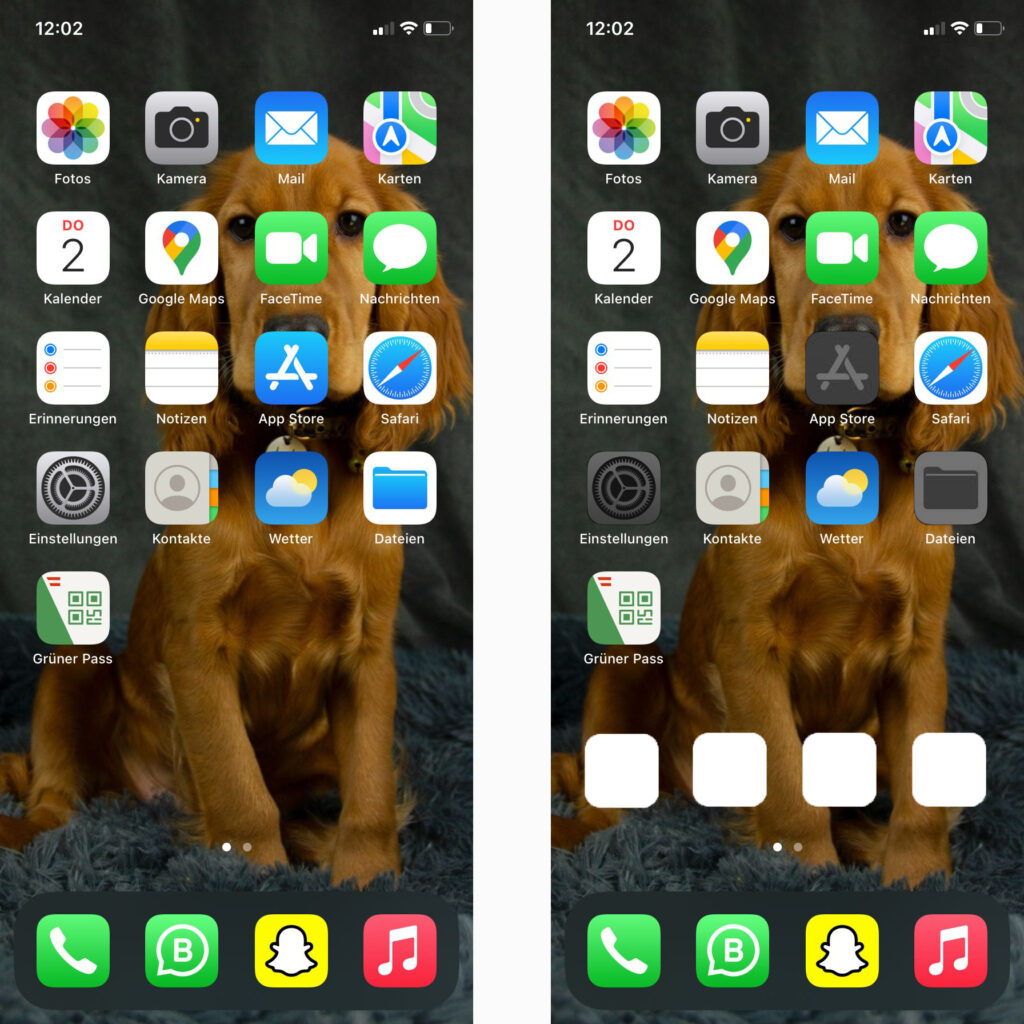
Disabled Apps are Grey and blocked, and can be removed in total from the Home screen. Special contacts (Family) can be added for an immediate call.
All Settings are blocked and can only be unblocked by the Senior Block – App (Name is not fixed yet)
Even here all App-Settings are blocked and can only be unlocked by the Senior-Block app, which is not grey. The only problem here is, in-App alerts such as location, etc. have to be unlocked before. Here is some problem solving required.
Using text in designs for 6-8 year olds can be tricky, especially because at first, you try to avoid showing a lot of information. Even so, it is important to know that the little text that is shown should be very understandable and pleasant.
When children learn to read or even learn what letters are, they start by recognising each character one by one. This is a very slow process and can be very boring and frustrating.
This is why, in children’s books, the typeface usually has a warm and friendly look, with simple letterforms. The aperture of the letters should be rounded and open, not angular or rectangular.
To facilitate legibility, it is not only necessary to take into account the use of adapted language, but also to be aware that the use of condensed typefaces, in italics or the exclusive use of capital letters can be a problem. All these details make typefaces complex and difficult to understand for people who are still in the learning phase.
Apart from avoiding decorative or complex typefaces (realistic typefaces should be adopted), there are other details related to the properties of typefaces that should be taken into account: line spacing, size, x-height and single-storey “a” and “g”.
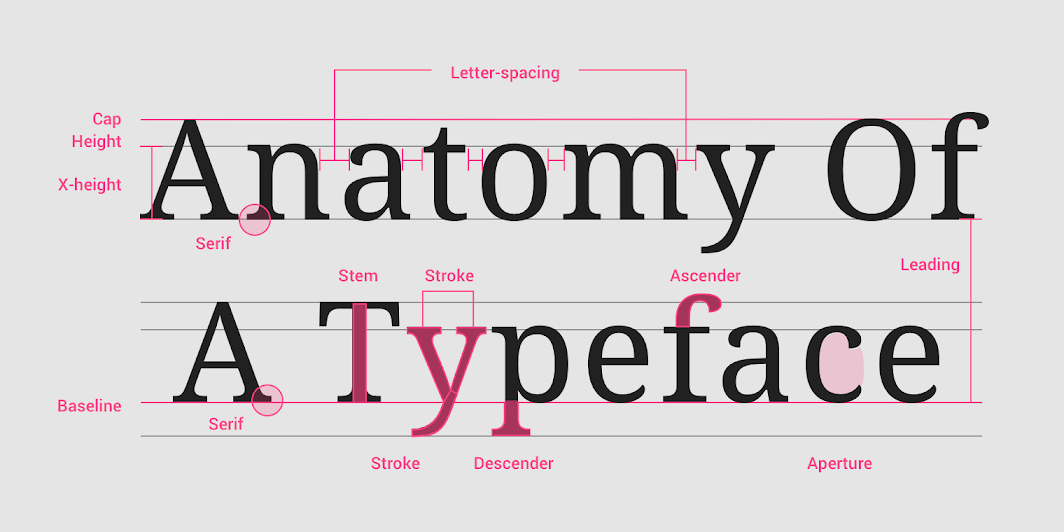
To easily understand these details, an image is shared from Material Design, a page that contains information on all kinds of design elements. In this image you can clearly see the different parts of a typeface.
Firstly, it’s recommend the use of typefaces with a size between 14pt and 24pt (depending on the age). Related to this idea, think about the line spacing of the text, which is recommended to be between 4pt and 6pt bigger.
Regarding the x-height, it is important to know that typefaces with larger x-heights are usually easier to read than those with short x-heights, especially for children.
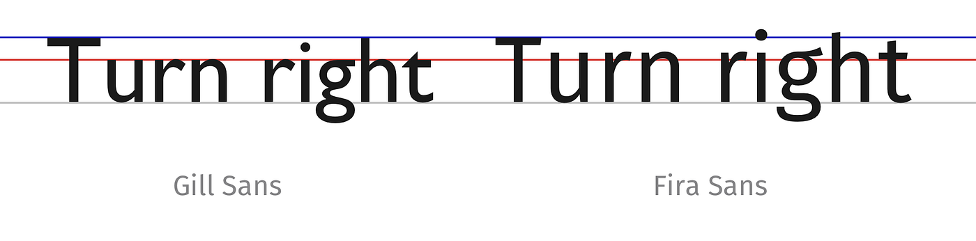
Not only that, but this x-height is a very important point for creating typeface pairs, if their height is similar, it will create more harmony. To better understand this concept, Ricardo Magalhães gives as an example in his article the typeface Gill Sans and Fira Sans.
Although both appear to be the same size with respect to their first letter (in capitals), it can be seen how the x-height (marked by the red line) of the second typeface is larger than the first, so the harmony might not be good.
Finally, for very young readers, texts should use typefaces that have the single-story “a” and “g” (also called children’s characters), as these are the lowercase forms that pre-school and school-age children learn to write. This concept refers to the way the two letters are written.
Double-story letters can be reminiscent of older typefaces, while single-story letters look more modern and simplified. For this reason they are more suitable for a child audience, as they are undecorated, simple and straightforward.
In meinen letzten Blogbeitrag ging es darum, wie man Essen für Social Media so aufbereitet, dass es möglichst bunt und verrückt aussieht, um viele Likes zu bekommen. Jetzt möchte ich einen zweiten Trend vorstellen, der sich vor allem während der Corona Krise entwickelt hat, der sogenannte „Homemade“- Trend. Die Menschen kochen seit der Pandemie vermehrt zu Hause mit den Zutaten, die sie im Kühlschrank haben. In den sozialen Medien wie Pinterest oder Instagram findet man unzählige DIY-Rezepturen aus Omas Küche. Angefangen von selbst gemachten Sirupen bis hin zu eingekochten Marmeladen, Kompotten oder fermentierten Früchten. Die Menge und Vielfalt an kreativen Rezepten sind so groß, dass man kein Kochbuch mehr für zuhause benötigt, sondern sich unzählige Rezepte gratis in den sozialen Medien holen kann. Im besten Fall stammen sogar die verwendeten Zutaten aus eigener Produktion. Vor allem im Trend sind biologische und vegane Produkte, die am besten auch noch regional sind. Immer mehr Menschen interessieren sich auch dafür, ihr Brot selbst zu backen, Sauerkraut selbst einzusalzen, ihren Fisch zu räuchern, Obst zu Marmeladen zu verarbeiten und Gemüse einzumachen.
In trendigen Gastronomie-Betrieben sind auf jeder Getränkekarte mindestens zwei „Homemade-Limonaden“ zu finden, die tatsächlich hausgemacht sind. Klassiker sind etwa Kombinationen aus Früchten, Beeren und Kräutern wie zum Beispiel Erdbeere, Ingwer, Basilikum, Thymian oder Zitronengras.
Selbstgemachte Limonaden
Die Food-Expertin Hanni Rützler kündigte bereits in ihrem Food Report aus 2015 an, dass „DIY Food“ auf dem Vormarsch ist: Was vor Jahrhunderten eine Notwendigkeit zum Überleben war, wird heute zum Luxus, der für Rützler „die reinste Form der Individualisierung“ widerspiegelt. Rützler stellte damals bereits in Aussicht, dass sich der Lebensmittelmarkt dadurch verändern werde. Das ist heute bereits geschehen.
Die österreichische Influencerin Janaklar alias Jana Kaspar mit knapp 200k Followern bietet ihren Followern fast täglich Einblicke in ihr Leben und wie man ganz einfach und lecker vegan kochen kann. Sie achtet darauf nur saisonales Obst und Gemüse zum Kochen zu verwenden und baut auch selbst Gemüse wie Karotten, Salat etc. in ihrem Hochbeet an.
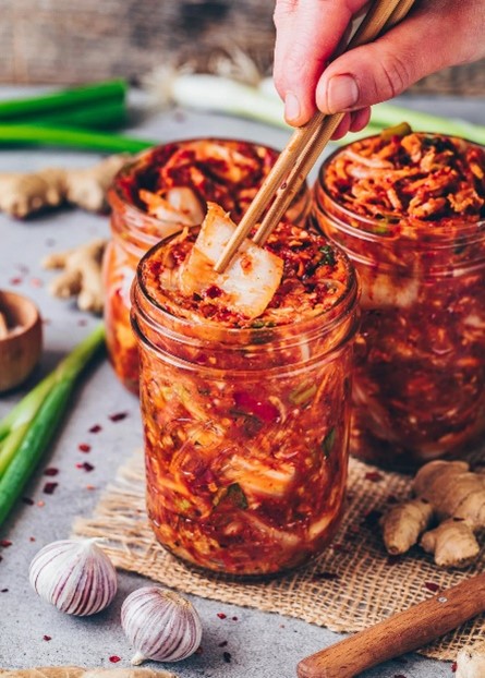
Auch ich lasse mich zu fast 90% von Rezepten aus Social Media inspirieren. Die Rezeptvideos dauern meist nicht länger als 30 Sekunden und sind meistens sehr einfach und schnell zum Nachmachen. Durch Die große Vielfalt an Rezepten lernte ich persönlich auch mehr über die Essenskulturen in den verschiedensten Ländern auf der ganzen Welt kennen. Zum Beispiel wusste ich früher nicht was das koreanische Gericht Kimchi ist.
Kimchi – fermentiertes Gemüse
Es ist eine Zubereitungsart, um Gemüse zu fermentieren, damit es länger haltbar ist. In Korea wird dafür klassischerweise Chinakohl verwendet, allerdings lässt es sich auch aus vielen weiteren Gemüsesorten zubereiten. Durch TikTok lernte ich wie ich Kimchi selbst ganz einfach daheim machen kann. Ich bin mir sehr sicher, dass ohne Social media nie auf die Idee gekommen wäre, Kimchi selbst daheim zu machen.
Das Wort „hausgemacht“ verspricht also nicht nur Geschmackserlebnisse frei von Zusatz- und chemischen Aromastoffen, sondern sich selbst als Macher zu erleben und kleine Erfolge zu feiern, dass motiviert viele Menschen, am Trend zum DIY-Food teilzuhaben.
Quellen
J. Gugler, „Homemade ist gefragt,“ Austria Juice, 21. Dec. 2019. [Online]. Verfügbar unter: https://www.austriajuice.com/de/news-blog/homemade-ist-gefragt. [Zugriff am 1. Jun. 2022].
H. Rützler, „Do it yourself – Hausgemachtes ist sexy,“ Eat Smarter, 24. Dec. 2019. [Online]. Verfügbar unter: https://eatsmarter.de/blogs/food-trends/do-it-yourself-hausgemachtes-ist-sexy. [Zugriff am 1. Jun. 2022]