I used the Christmas holidays to compile the research done in November and December and subsequently wrote my Exposé. I am excited (and also a little bit anxious) to see how it will be received by the staff of the FH JOANNEUM and the KUG. This week, I will also start to work on my final presentation – here the greatest challenge will probably be to reduce the whole project idea to a mere five minutes of presentation time.
Initially, I also wanted to start with some practical work and thus rented an Arduino board and bought some ultrasonic sensors. Unfortunately, January is pretty much packed with tests and final submissions, so I had to put experimenting with the Arduino on the backburner. Nevertheless, I still have the Arduino until the end of the semester so maybe I will still get a chance to try it out…
While for my Walking Soundscape concept (that I wrote about here) it was almost too easy to find existing reference works, now for my Emotional Space sound installation, this proves to be quite the challenge. But to draw inspiration and build upon knowledge from previous works of other people is such a valuable asset that this step should clearly not fall short. I managed to gather a collection of reference works that I affiliate with different aspects of what I want The Emotional Space to become. While in this post I will focus on installations that I found through various resources, I will dedicate my next post to the same topic, but present the findings that were approached in a more scientific way and got a paper published about them. (This categorization is purely made for reading convenience and does definitely not aim to assert that any of the works below are unscientific).
[…] an arrangement is created in which visitors take on an active influence. Rhythm and variance, like in music, are essential components of the installation […]
Why is empathy in medical application design so difficult? Empathy is the ability to empathize with other people’s situations without having to live the same experience. Thanks to it, we can understand the problems they are struggling with and the feelings that they are going through. Unfortunately, in designing for sick people, we cannot feel and close to what they are experiencing now, we can process information only under the prism of our own experiences and the only thing we can do is, at least, generally imagine what a person was going through. That is why we need to do thorough research and talk to patients, but unfortunately, that will not be enough.
In my research, I do not have the opportunity to do an interview yet, but I need at least a little closer to the experience and feelings of one of the target groups. That is why I decided to take the appropriate steps. I found patient interviews and started watching them. I must admit that it is hard because the topic is unfortunately very difficult.
If you are interested, you can watch some interviews on this page: https://www.cancerquest.org/videos/interviews/patient
_XBOX made great efforts into the field of accessibility and implemented a wide array of software and hardware for this purpose. Like a highly sophisticated text-to-speech for system UI elements, a mono toggle of unilateral hearing loss (impairment in only one ear while the other ear is in ‘normal’ limits) and a zoom function. They also included features for real time speech-to-text and text-to-speech ingame – the tech is yet not perfect, also because its difficult to cope with the game specific terminologies and lingo, which can change rather quickly.
_I myself tried speech-to-text out of curiosity in APEX LEGENDS, cause often teammates are very hard to understand or just way too quiet to hear them, but the algorithm may hear them. But to put it shortly, speech-to-text works rather horribly. Often, it’s just an unintelligible array of random words which hardly approximate what has been said; it seems to work best with the English language, then it sometimes gets it right. Mostly. Yet does generate absurdly funny combination of sounds resulting in a fun time at least. But the technology will get better eventually and can enable hearing or sight impaired people to take part in conversations which would otherwise be inaccessible to them.
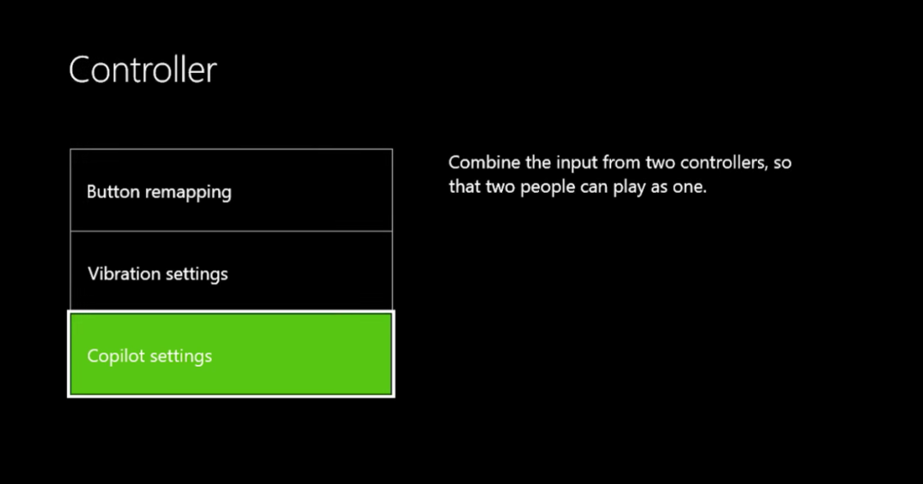
_Also, XBOX introduced the copilot mode, a simple but brilliant solution. Two controllers are connected to the same console and give the same input simultaneously – making it possible for someone else to jump in and help if it is needed. For example, a parents could help their kids getting through difficult sections, while everything else is handled by the kids themselves. Or a blind person could play a game by hearing alone, while another person helps with the walking through the level, which could only be accessible trough sight. Originally it was designed to split the controls between two separate controllers; therefore, maybe controlling one side of the controller with one limb and the other parts of the controller with some other body part, which might not reach the other side of the initial controller. This method can make highly expensive customized controllers obsolete and democratizes technology further. They also published the adaptive controller, a tool for people with various impairments to make it possible for them to customize their inputs even further to their needs.
After analysing a few examples of interactive children’s exhibits and looking at the results obtained from the database, they went on to read and research the 125 Universal Design Principles.
To this end, it was decided to update the progress found, as the book is very comprehensive and detailed.
After reading the first 30 principles, we found some very interesting details that we considered very important to use in exhibitions for children.
These principles and the reasons why they might be interesting are listed below.
Accessibility This is a very important concept in design, but especially in design for children, as it is necessary to adapt the devices so that children can access and understand them. That is why, within the concepts of this principle, operability (everyone should be able to use the design) and simplicity (everyone should be able to understand the design) stand out.
Advance organiser This principle is very important and is somewhat related to the simplicity seen in the previous section. This principle stresses the importance of being able to explain concepts so that everyone is able to understand them. To do this, the idea of using words that children already understand is used, from which the main concept is generated and explained.
Biophilia Effect Spaces reminiscent of nature reduce stress and increase concentration. When planning an interactive exhibition for children, it is necessary to understand that children need to be as concentrated as possible in order to carry out the actions. That is why trying to create a natural environment can help.
Chunking This concept also relates to the way in which information is displayed. It is necessary to divide the content into units in order not to launch too much content in too little time.
Colour Obviously colour is a very important point, which was already analysed previously. In the case of children, more saturated colours should be used to give more excitement and dynamism.
Contour Bias In this case, we talk about the importance of using more rounded edges that make the user feel closer to the object. Still, it is true that straighter edges can be aggressive but they certainly attract the user’s attention. Still, in my opinion, I don’t think it is a necessary thing to use with children.
Constraint and control I place both concepts together as they are related. They consider the importance of knowing how much control the user should have. The constraint relates to the limitations that should be placed on the user. In this way, both work together to limit and leave the necessary freedom to the user.
Obviously there are many more important concepts, but these listed above are, in my opinion, the most important for children. The idea is to finalise the list of principles and add some details about these principles to the databases, to continue analysing interactive exhibits in order to understand the correct and best use of resources to generate the most impactful exhibits for children.
REFERENCES
Lidwell, W., Holden, K., Butler, J., & Elam, K. (2010). Universal Principles of Design, Revised and Updated: 125 Ways to Enhance Usability, Influence Perception, Increase Appeal, Make Better Design Decisions, and Teach Through Design. Rockport Publishers. https://books.google.at/books?id=3RFyaF7jCZsC
In my last research session I came across a very interesting study. The aim of this study was to see if millennials who grew up with minimalism prefer a minimalist or maximalist website design.
Authors:
Ulrik Söderström
Lovisa Carlsson
Thomas Mejtoft
Minimalist web-design is characterized by portraying necessary information, content, and features in the most straight-forward and clean-cut way. On the other hand, maximalist web-design aims for bold color combinations, different textures, images, graphics, and animations. The year of 2018 was truly the year of maximalist web-design, though, some designers claims that the “less is more” movement is on its way (Söderström, Carlsson, & Mejtoft, 2019) p. 92
Naturally, both minimalist and maximalist webpages should be designed in a way which does not harm user experience and the information intake. In the article “Feature Richness and User Engagement” Jakob Nielsen summarizes that the more engaged users are, the more features an application can sustain. But most users have low commitment. Therefore, especially websites must focus on simplicity, rather than features (Nielsen, 2007).
(Söderström, Carlsson, & Mejtoft, 2019) p. 92
Minimalism in web-design means reducing all (unnecessary) elements which are unimportant for user tasks. A minimalist web interface has a clear hierarchy in elements, highlights the most important ones and gets rid of anything which might disturb the user’s perception. This helps to make important messages clearer ergo: it helps the consumer to navigate more easily on the website (Söderström, Carlsson, & Mejtoft, 2019) p.93
Web design, just like language is defined by the way people use it. As the term “minimalism is used widely, it is often hard to pinpoint the exact features of it. To get a clearer picture of minimalist web design features, this thesis refers to a study of the Nielsen Norman Group. In this study 112 minimalist websites were analyzed to find defining features of minimalist websites. The author(s) included a characteristic to be defining if it was present in at least 75% of the websites (Moran, 2015)
Flat Patterns and textures Flat interfaces do not contain any elements like shadows, highlights or gradients or other textures which make the UI elements look three-dimensional. In the survey 96% of the minimalist websites were flat. Removing unnecessary elements totally falls into the philosophy of minimalist design. But: flat design often refers to textures, icons, or graphics of an interface whereas minimalism rather refers to larger content, features, and layout. So, an interface might be flat without being minimalistic. The problem with flat design is that the user often does not see if an element is clickable or not (as all the elements are flat). Clickable elements should be recognizable for the user easily, therefore it might be better to not work with flat icons there.
Limited or Monochromatic Color Palette This trend was recognized in 95% of the sampled interfaces. In most minimalist websites color was specifically used to create visual attention without adding additional design elements of graphics. With less visual information, color palettes will stick out even more for the consumer. Many minimalist designs are often monochromatic or are using one bold color. Almost half of the investigated website (49%, 55 websites) used a monochromatic color palette and almost as many (46%, 52 websites) used one or two accent colors additional to the otherwise monochromatic color palette. Of those 55 monochromatic websites, 51 sites were exclusively using white, black, and grey shades.
Restricted features and elements These characteristics were used in 87% of the investigated interfaces. In a minimalist environment, designers need to eliminate any element which is not required to support core functionalities or the message. Those elements could be:
Menu items
Links
Images
Graphics
Lines
Captions
Textures
Colors
Fonts
Icons
As it is often hard to tell which elements are unnecessary a popular mantra of designers is “subtract until it breaks” which means that unless the absence of an element would cause serious problems, they get rid of it. It can be hard to find the right balance between having clean and reduced website and making sure to not make the primary tasks for the user overly complicated or difficult (Moran, 2015).
4. Maximize negative space Through the elimination of certain elements, negative space, also called white space, is automatically created on a website. A maximization of white space was used in 84% of the examined websites. White space can help the user to absorb the presented information more easily as well as directing the user’s attention. The right use of white space helps to draw the users attention to the important content.
5. Dramatic use of typography When there is a reduced number of elements on the webpage, typography can be a great tool for communicating meaning. In this case the typography can compensate the “missing” elements like graphics or photos and makes the minimalist design more engaging. To establish a clear hierarchy on the website, different variations of font size, weight and style are crucial. Of the examined 112 minimalist webpages, 75% used typography to convey meaning of visual interest.
Additional widely used techniques on minimalist webpages which were found in less cases than 75% by the Nielsen Group were:
Large background images or videos
Grid layout
Circular graphic elements
Hidden global navigation
(Moran, 2015)
After examining the elements of minimalist web-design, the next paragraphs will look into the key features of maximalist design on websites.
The aim of a maximalist web-design would be an organized chaos of different hierarchies, layers, textures, graphics, typography, and colors. Several attributes of maximalist web-designed could be defined by a number of designers.
Grandiose colors: A maximalist web-design should use a large and bold color scheme. Can also contain clashing colors as well as combinations of new and exciting compositions.
Bold Textures: Distinct textures can help to draw attention to certain areas. Those distinct textures could be created by mixing colors with layers of a palette.
Brave combinations: Maximalist websites play with the combination of several elements like images, graphics, animations which contribute to an extreme look.
In the research of Söderström, Carlsson and Mejtoft, the aim was to find out if millennials would prefer a minimalist or maximalist web-design approach. Therefore, two websites were created, both representing one approach. Both websites contained the same content and information and conveyed the same message. The survey involved 16 participants who were classified as millennials. The survey conducted by Söderström, Carlsson and Mejtoft showed that more than half of the participants (62,5%) liked the maximalist webpage the most. 31.3% liked the minimalist webpage the most and 6.2% had no preference between the both pages. 100% of the participants answered that they thought, that the maximalist webpage was the most innovative. Also, 71% of the participants classified the maximalist webpage as “modern”. Participants who liked the maximalist page more described it as more unique, outstanding and that it does create more interest. Many participants perceived that the maximalist design of the webpage suited the content it was made for (an art portfolio). Participants who were in favor for the minimalist page said that the content was presented in a more straightforward way and that it made the content clearer. Further, this party perceived the maximalist page as a bit messy.
It must be said that it is very hard to measure such a subjective matter like the likeability of a website. Furthermore, there are many ways a minimalist or maximalist webpage can be presented, and this study included just one sample. Nevertheless, the authors suggest that it might be case that millennials perceive a maximalist webpage as more innovative as they are used to minimalist design. It must the highlighted that a webpage, maximalist, or minimalist, must always fit the person as well as the purpose (Söderström, Carlsson, & Mejtoft, 2019) In this case, an art portfolio was perceived as a well fit for a maximalist website design, to convey a creative an exciting message.
In my last research session I came a cross an article from:
Ngoc (Rita) To, University of Houston, USA Vanessa M. Patrick, University of Houston, USA
NA – Advances in Consumer Research Volume 45 | 2017
Here are my most important findings from this article:
In some important aspects of marketing, aesthetics plays a very crucial role, for example in product creation, package design or website layouts. Therefore, the consumers perception of “beauty” can be an important trigger for behavior like product choice, the willingness to pay or the perception of quality. (To & Patrick, 2017) p. 258
Recent studies in consumer behavior ask themselves the question which set of aesthetic features impact consumer’s consumption experience. A current study investigates how a specific design style, more precisely how a minimalist or maximalist design style, can influence consumer self-brand connection (SBC). Minimalist design can be characterized through simplicity through basic geometric shapes, limited decoration, and abundant white space. On the contrary, maximalist design is defined by richness, an abundance of geometric patterns with minimal white space. Although those visual elements are very diverse, brands have been using both styles to convey a luxury appeal. For, example, Apple’s minimalist design stands for luxury and high fashion but so does Versace’s, who’s brand image is full of decorative ornaments.
The authors suggest that certain types of aesthetics like minimalism and maximalism arouse distinct functional attitudes. The theory of functional attitudes proposes that people hold certain attitudes because they are useful, and those attitudes serve important social functions. Those social functions can be for instance, allowing people to express their own values (value-expressive attitudes) and facilitate self-presentation (social adjustive attitudes). Further, the authors propose that minimalist design causes more value-expressive attitudes. When people view minimalist art, the experience is often transformed into a more relatable happening, where the viewer can engage with the work of the creator. This effect also happens when a minimalist design is used in brand communication. Consumers get the freedom to develop their own meaning off the brand instead of just receiving the message. For example, the Japanese retail brand “MUJI” has a brand communication concept of “emptiness” which emphasizes simplicity and white space. In this way, consumers get the chance to develop and their own believes and perception of the brand. Due to the freedom of self-expression, which is inherent in its visual aesthetics, the authors suggest that minimalist design enhances SBC through the facilitation of value-expressive attitudes.
In contrast, To and Patrick hypothesize that maximalist design causes more social-adjustive attitudes, as maximalist aesthetics are often used for gaining social approval. The authors draw here from people’s direct experience with maximalist design which often happens in a specific social context where the goal of self-presentation is often in focus. For example, people often come across complex pattern moldings when they visit a cathedral or a five-star luxury hotel. Therefore, consumers seem to have developed a tendency for maximalist design if they seek to present a desirable self-image. Furthermore, people tend to associate maximalist design with impression-management motives to, for example, signal social prestige. Throughout history, well known figures and personalities often used intriguing creations to represent their stature, for example, the ornate interior in the Palace of Versailles. According to the suggestion that maximalist aesthetics are frequently used for gaining social approval, the authors predict that maximalist design enhances SBC by causing social-adjustive attitudes. Because of the different attitudes minimalist and maximalist design triggers in people, To and Patrick propose power as a moderator for the effects. Power in this context is defined as “asymmetric control over valued resources in social relations” (Rucker, et al. 2012) and can either foster agentic or communal orientations. Feeling powerful can lead people to be more agency-oriented (i.e. focused on oneself). This is because being higher in social hierarchy gives people the freedom to follow their own value. On the other hand, feeling powerless makes people more communal oriented, in other words, more focused on others. This is because being in a lower social hierarchy makes you more dependent on others for valued resources.
Therefore, To and Patrick suggest that minimalist design will enhance SBC for high-power consumer, whereas maximalist design will enhance SBC for low power consumers. These hypotheses were tested across five studies. In those studies, packaging design was manipulated in a way that the decorative elements of the package varied while the other features stayed the same. For relevancy reasons, studies one and two will now be elaborated more thoroughly. In the first study, the participants evaluated a minimalist vs maximalist design of a fictional tea brand. Then, their value-expressive and social adjustive attitudes were assessed. To and Patrick found out that minimalist design causes more value-expressive attitudes while maximalist design causes more social-adjustive attitudes. Very interesting is that both packaging designs were experienced as equally attractive and luxurious. In their second study, the authors focused on the hypothesis about power. The study showed that high-power participants felt a stronger SBC to minimalist design while low-power participants felt stronger SBC to maximalist design.
Neue Technologien wie RealTime-graphics und MoCap-Technologien führen seit den 2010er Jahren zu einem immer stärker anwachsenden Auftreten von virtuellen Streamern – Vtubern. In Anlehnung an die traditionelle Influencer-Industrie sind virtuelle Menschen zu Prominenten geworden. Da sich das Ökosystem für Vtuber – zumindest im Europäischen Raum – noch in der Anfangsphase befindet, gibt es noch keine standardisierte Allzweck-Anleitung. Daraus kann man schließen, dass jede Umsetzung unterschiedliche auf unterschiedlichen Plattformen und in verschiedenen Formaten erfolgt. Je nach Nutzer – ob Einzelperson oder Agentur – variieren die Kosten, die Qualität und der Entwurfsprozess erheblich. Um einen virtuellen Charakter zum Leben erwecken zu können, müssen sich Content Creator also mit diversen Fragestellungen rund um Design, Hardware, Software und beschäftigen.
Basics
Das Set
Essenzieller Bestandteil im Inventar eines Vtubers ist eine Webcam oder Kamera mit hoher Auflösung, um Gesichtsbewegungen und Mimik zu erkennen. Ein Mikrofon, eine gute Gesichtsbeleuchtung und ein adequater PC oder Laptop gehören ebenfalls zu den Must-Haves des Jobs. Als Grundvoraussetzung sollten die Kamera eine Auflösung von mindestens 720p und 30 FPS haben. Viele Vtuber verwenden jedoch bereits iPhones anstelle einer Webcam oder kombinieren diese miteinander, um Gesichtsausdrücke besser erkennen zu können.
Für den Ton können entweder spezielle USB-Mikrofone oder ein Gaming-Headsets mit eingebautem Mikrofon verwenden werden. Im Idealfall werden vollwertige XLR-Mikrofone genutzt, da diese besser funktionieren und eine fantastische Audioqualität bieten.
Viel Licht ist wichtig, damit Kamera und Software leichter erkennen können, ob der Vtuber gerade lacht, die Stirn runzelt oder den Mund bewegt. Dazu reicht bei Tag ein heller Standort am Fenster, bei schlechteren Lichtverhältnissen sollten Lampen so arrangiert werden, dass sie das Set ausreichend beleuchten. Marken wie Elgato und Razer bieten spezielle Streaming-Lichter an, die mit den Webcams gekoppelt werden können.
Es macht durchaus Sinn, vor Beginn eines Streams die Internetverbindung zu überprüfen, da es ansonsten während der Live-Auftritte zu ungewollten Pannen kommen kann. Nach Empfehlung von Streamingplattformen wie Twitch sollten mindestens 6 Mbps für 1080p in hoher Qualität bei 60 FPS zur Verfügung stehen. Wenn diese Anforderungen nicht erreicht werden können, leidet die Streamingqualität darunter, jedoch sind 3Mbps in einer 720p-Auflösung bei 30 FPS im notfalls noch im Bereich des Vertretbaren.
Bei Streams mit hoher Bildrate, wie beispielsweise Ego-Shooter-Games, wird eine Uploadgeschwindigkeit von 10-15Mbit/s und ein Bildschirm mit hoher Bildwiederholungsfrequenz benötigt. Bei niedrigeren Internetgeschwindigkeiten und keiner Möglichkeit zur Aufrüstung, ist Live-Streaming in einer ansehnlichen Qualität nicht möglich.
Standcomputer oder Laptop
Prinzipiell gilt, mehr ist besser, besonders wenn es um RAM und Prozessoren geht. Die Grafikleistung ist nur dann von größerer Relevanz, wenn Spiele gestreamt werden. Jedoch sind hierbei GPU-Empfehlungen der einzelnen Spieltitel zu beachten. Ob PC oder Laptop hängt von der Leistungsfähigkeit ab. Ein hochwertiges Gerät steigert den qualitätiven Output des Streams, jedoch gibt es auch preiswertere Alternativen. Die Mindestanforderungen für einen Live-Stream:
Prozessor: Intel i5-4670 oder AMD FX-8350
Arbeitsspeicher: 8 GB DDR3
Grafikkarte: Nividia Geforce 960 oder AMD Radeon R9 280
Betriebssystem: Windwos 7
Bei vorgefertigten Systemen oder wenn der PC selbst gebaut wird, ist auf folgende Anforderungen zu achten:
Prozessor: Intel i5-9600k oder AMD Ryzen 5 3600
Arbeitsspeicher: 16GB DDR4
Grafikkarte: Nivada Geforce GTX 1080 Ti oder AMD Radeon 5700 XT
Betriebssystem: Windows 10
Einige Streamer gehen noch einen Schritt weiter und verwenden zwei Computer oder Laptops, um die Arbeitslast zu bewältigen – einen, um ein Spiel auszuführen und den anderen, um die eigentlichen Streaming-Anforderungen zu erfüllen.
Als guten Ausgangspunkt für angehende Vtuber ohne Vorkenntnisse im Design-Bereich und mit geringem Budget eignet sich VRoid-Studio oder Live2D . Ein großer Vorteil dieser Tools ist, dass sie bereits “vorgeriggte” Basismodelle anbieten, welche sich hervorragend für erste Probeversuche eignen und jederzeit durch Details individuell angepasst werden können. Die Software ist zudem kostenlos. Auch Websites wie TurboSuid, Sketchfab und CGTrader bieten kostengünstigere 3D-Modelle zum Download an.
Hat man als Content Creator viel Zeit und kreatives Talent, ist es möglich mit Software-Programmen wie Blender, Maya oder Zbrush einen völlig individuellen Charakter zu entwerfen. Auch von Unreal Engine gibt es Anwendungen wie Meta Human Creator, um digitale Menschen mit hoher Wiedergabetreue zu erstellen. Es gibt auch Optionen für die Arbeit mit Apps wie ReadyPlayerMe oder Wolf3D. Allerdings sind hierfür gute 3D-Kenntnisse erforderlich.
Das fertige Modell muss dann noch “geriggt” werden, sprich mit einem digitalen Skelett versehen werden, um menschliche Bewegungen so realistisch wie möglich imitieren zu können. Dies kann entweder direkt in Blender oder für 2D-Modelle auch beispielsweise in Live2D Cubism erledigt werden. Für die VRM-Konvertierung benötigt man eine 3D-Animationssoftware wie Unreal, Unity 3D oder iClone, jedoch finden sich Tutorials auf Youtube, wie beispielsweise das folgende für eine Formatierung in Unity:
Eine weitere Alternative zu den kostenlosen 2D- und 3D-Modellen, ist die Möglichkeit den Avatar bei einem Künstler in Auftrag zu geben. Es ist einfacher und geht schneller, als sich selbst mit der Charakterentwicklung und 2D- oder 3D-Umsetzung beschäftigen zu müssen. Allerdings ist diese Option keinesfalls billig. Auf Websiten wie Fiverr und Etsy geht die Preisspanne von 50$ für einfache Avatare, bis hin zu Beträgen im sechsstelligen Bereich für hochwertige und detailgetreue Modelle.
Der Großteil der Vtuber-Einsteiger nutzt Anwendungen von Steam wie FaceRig, Animaze, Wakaru, 3Tene und Vtube Studio, da diese für alles was man so an einfachem Mocap (=Motion Capture, Bewegungsverfolgung) braucht, bieten können. Es gibt aber auch einige beliebte virtuelle Streamer wie Code Miko, die Technologien aus der Videospiel- und Filmindustrie verwenden, wie z. B. 30.000-Dollar-Motion-Capture-Anzüge von Xsens.
Eine weitere beliebte Motion-Tracking Software ist Luppet. Als eine der größten Anwendungen, die von Vtubern verwendet wird, bietet es ein sehr sauberes, genaues Tracking und ist in mehreren Sprachen verfügbar. Allerdings ist es nicht auf Steam erhältlich, sondern nur auf einer japanischsprachigen Website und kostet um die 50$.
Inzwischen ist es außerdem möglich, mithilfe von iPhones mit Infrarot-Tiefenkamera für Face ID (seit der Veröffentlichung des iPhone X, 2017) ein genaueres Gesichts-MoCap zu erhalten als mit herkömmlichen Webcams.
Die Ausrüstung für die Gesichtserfassung wird jedoch immer leichter und einfacher der breiten Masse zugänglich gemacht. Einige Umsetzungen erfordern zwar immer noch Marker im Gesicht und das Tragen eines Helms mit einer auftragsbezogenen Kamera, aber der Markt scheint sich in die andere Richtung zu bewegen – er unterstützt normale Streamer-Setups, die 2D-Webcams verwenden.
Wakaru und Hitogata sind gute Software-Beispiele dafür. Diese beiden kostenlosen Programme bieten eine frei verfügbare Gesichtsverfolgungsfunktion, die leicht in einen 3D-Charakter integriert werden kann. Aufgrund des offenen Algorithmus ist die Verfolgungsqualität nicht die beste auf dem Markt, aber die Bequemlichkeit überwiegt die Nachteile, zumindest für VTuber-Anfänger. Qualitativ höherwertigere, kostenpflichtigere Webcam-Lösungen sind Hyprface SDK und Facerig. Hyprface ist besonders nützlich, um vorgefertigte 3D-Charaktermodelle zu integrieren.
Um die Position der Hände zu verfolgen, benötigen virtuelle Streamer ein optisches Handverfolgungsmodul, auch Leap Motion, genannt. Dieses kann Bewegungen viel genauer erfassen als iPhones oder Webcams und wird oft in Verbindung mit weiterer Ausrüstung verwendet, um Modelle noch realistischer animieren zu können.
Schlussendlich wird der Avatar zum ersten Mal dem Publikum auf Streaming-Plattformen wie Twitch oder Youtube vorgestellt. Unabhängig vom narrativen Inhalt und dem eventuellen Skript, gibt es zunächst noch einige Import-Hinweise zu beachten:
Es gibt zwei Möglichkeiten, das Modell in einem Stream zu übertragen, abhängig von der Anwendung, die für das Mocap des Avatars verwendet wird. Auf der Plattform Steam kann immer nur eine Anwendung ausgeführt werden. Sollte der Content Creator also keinen weiteren Inhalt teilen, kann er einfach die Quelle “Game Capture” auf OBS und Streamlabs verwenden um sein Modell auf einen Hintergrund seiner Wahl zu überlagern. Zusätzlich is bei dieser Methode zu beachten, dass die Transparenz in der verwendeten MoCap-Software immer aktiviert ist und beim Streamen auch zugelassen wird.
Alternativ dazu gibt es auch Vtuber, die während ihrer Streams andere Inhalte teilen, wei beispielsweise Spiele spielen oder gemeinsam mit ihrem Publikum auf Youtube-Videos reagieren. In diesem Fall gibt es Programme wie SUVA für Windows, mit denen virtuelle Streamer ihre Avatare in Unity importieren können und diese dann in Streaming-Anwendungen wie OBS einblenden. Dadurch bleibt das Steam-Konto frei.
In jedem Fall ist es wichtig sich vor seinem Debüt ausgiebig mit allen verfügbaren Programmen und Technologien auseinander zu setzen, um für sich selbst die bestmöglichste Variante zu finden. Um auch in Zukunft mehr Vtuber in die Community zu holen, währe die Umsetzung folgender Punkte ein Anfang:
Mehr Tools zur Erstellung von Avataren für Nicht-Experten, die verschiedene Kunststile unterstützen
Eine All-In-One-Mocap-Lösung für das gesamte Gesicht, den Körper und die Finger, die nur eine Webcam benötigen und damit Kosten und Ineffizienz verringern
Engere Zusammenarbeit zwischen Software- und Hardwareanbietern, um den Integrationsprozess zu vereinfachen und den Prozess zu vereinheitlichen, weiterzuentwickeln und zu konzentrieren
Eine einfache Benutzeroberfläche für Nicht-Entwickler, damit die Nutzung von Software und Hardware einer breiteren Masse zugänglich wird
Demnächst
Bedeutung, Entstehung und aktueller Bezug
V-Tuber Agenturen und ihre Protagonisten
Software und Programme – Was gibt es und wie verwende ich sie?
Entwicklung eines Characters – 2D und 3D Modell
(Erwartungshaltungen von Usern, Protagonisten und Agenturen)
| design challenges and principles from the car navigation system developer company TomTom
As it was stated in my earlier blog entry, one of the current cockpit design trends is the multiplicity of screens in cars. This increasing display real-estate is creating challenges for automotive UX designers in creating an effective driver experience instead of displaying as much beautiful information as possible and as a result distracting the driver.
The navigation system and mapmaker company TomTom is also discussing this topic with their principal UX interation Designer Drew Meehan in a blog post, with insightful content about the design principles to be considered.
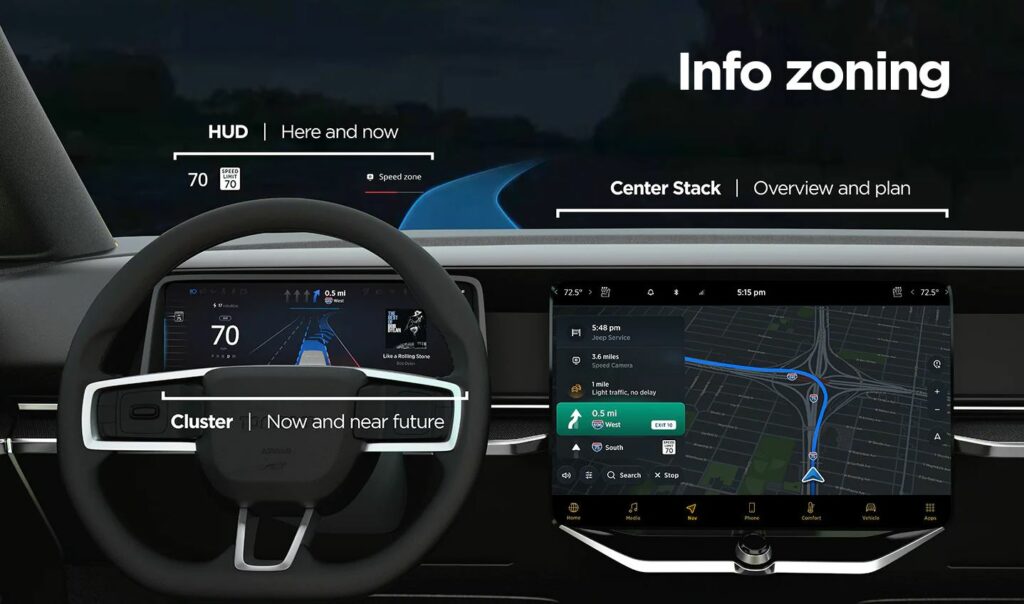
Finding balance in information overload
The keyword of building an interface with informational balance is: “action plus overview”. When looking at several screens, the shown information should be clustered to provide hints for next actions, and further give an overview of the car’s journey. This should be achieved by sorting the information shown on separate screens to compensate each other.
An example would be a car equipped with head-up display (HUD), a cluster behind the steering wheel and a central display. On the HUD only the current status information would be shown, about the “here and now”. The cluster would show information about oncoming actions in the near future. The central stack would have the job to give the complete overview about the journey, arrival time and complementary info such as refueling/recharging possibilities.
This structure creates a flow of eye movement, which helps the driver will understand the information placing easily and know where to look for specific interests.
Information structure by TomTom for in-car interfaces (source: see below)
Challenges in automotive interface design
There are some aspects and strategies that need to be considered when designing in-car interfaces:
Responsive and scalable content according to screen size: complying with different screen sizes in different vehicle models of a brand
Adaptive content: displaying only the needed information for the current driving situation. This requires prioritization of the information according to drivers’ needs. —> if the fuel/battery charging is critical, the next stations should be displayed. If the tank/battery is full, the screens can focus on less data. —> if there is no immediate route change action necessary, e.g. straight highway for 50 km, other data from other driver assistance systems could be shown (e.g. line keeping). —> in the city with intense navigation needs, the best could be to show prompt actions on the HUD, closest to the drivers’ eyeline for easy help.
Creating one interface ecosystem: all screens should be connected and not segregated. The screens and the shown information should create continuity and complement each other.
Customization options: despite good information balance, some people could be overloaded and stressed by multiple screens. They should be allowed to change screen views and positions of content.
TomTom’s UX department has done user research with varied screen info content. They found that “users want easy, glanceable and actionable information”, which reduces cognitive load and stress.
In summary, the UI design has to support the drivers’ actions by showing essential, easily digestable information. It should be placed where the driver mostly expects the content to be and have just the right amount of detail, according to the current driving situation.
In this short blogpost I want to analyze one examples of a deceptive design pattern* that I stumbled across during my research in detail.
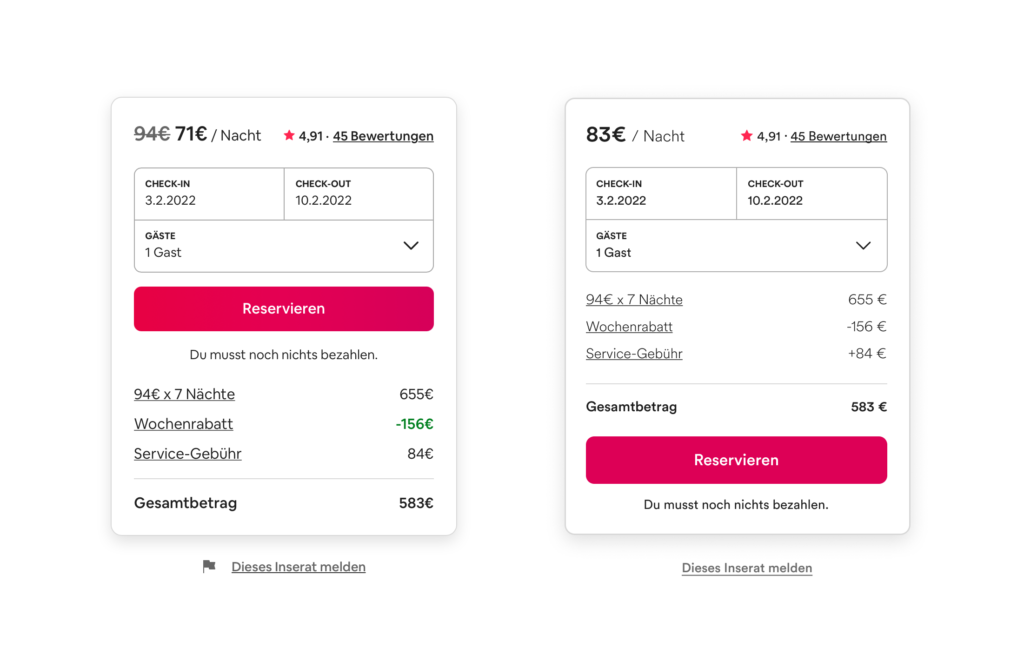
On every detail page of an apartment on airbnb there is a small overview on booking dates and prices (left image). The whole container is basically divided in two parts: a summary with a CTA and the calculation underneath. The hierarchy within this module is clear as the price per night is highlighted with big, bold font style. They use this number as the most representative value even if there are some additional fees added later on and it is not possible to book the apartment at that price. So to get the „real“ price per night the user has to manually divide the overall price for the stay including the service fee by the nights. The CTA is placed above the calculation, therefore some users might click on the pink button before they read about additional fees. Furthermore the weekly discount is displayed twice and highlighted whereas the fee is just in default text style. My suggestion to correct this deceptive design pattern* is to use the correct price per night including all fees, add a plus to the service fee amount and move the CTA to the bottom (right image).